Food & Beverage · by Viktoria Stanevich
Bollicine Wine
 Viktoria Stanevich
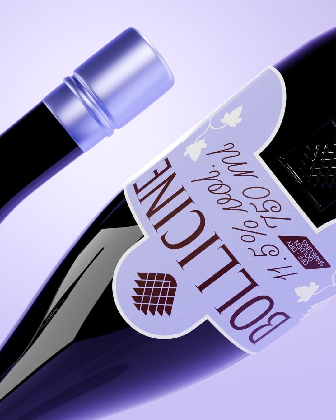
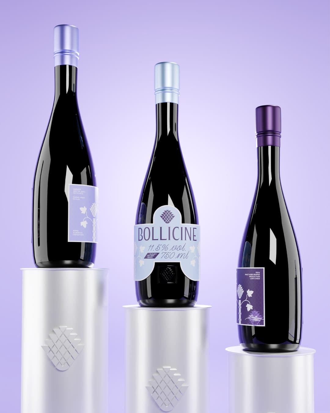
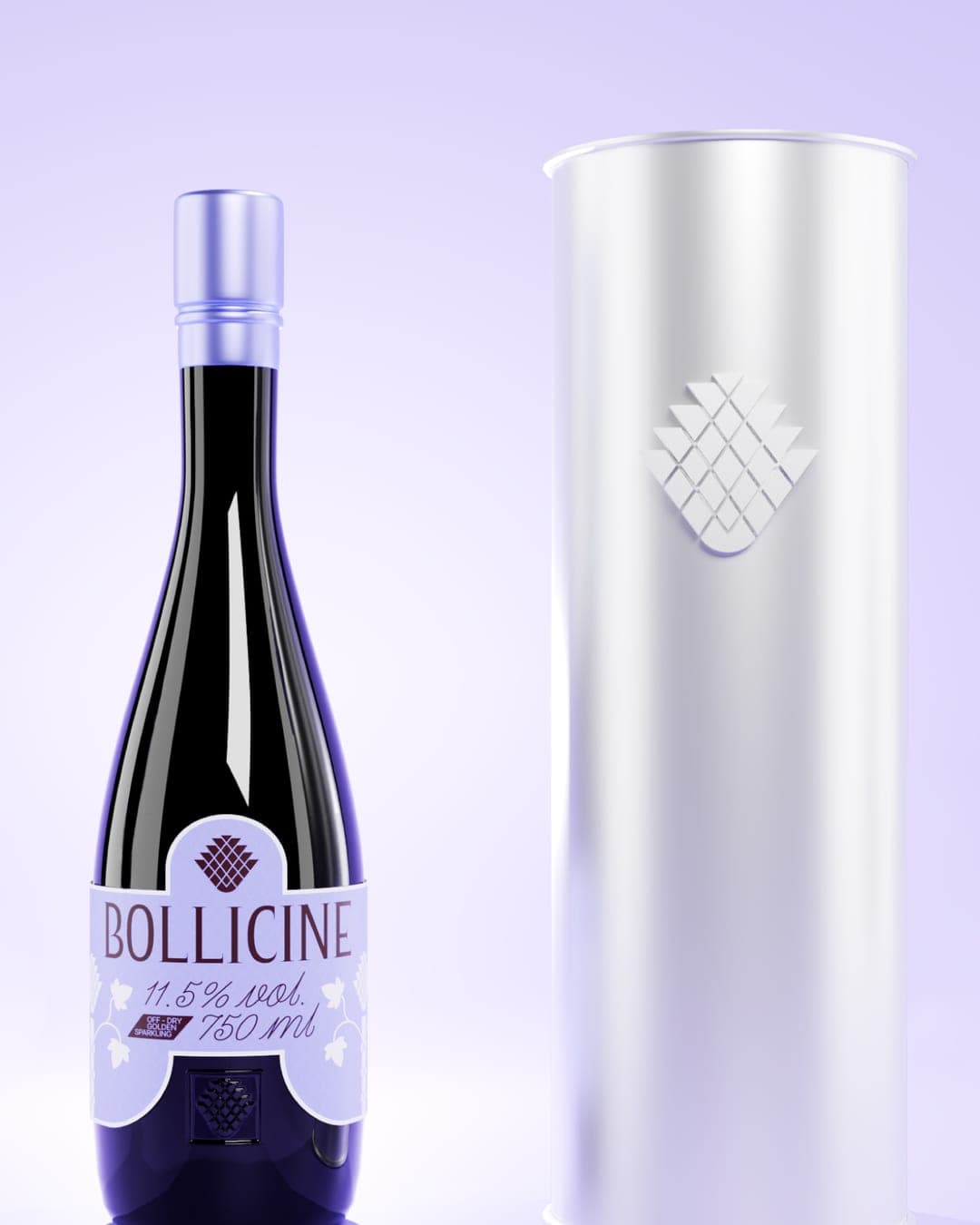
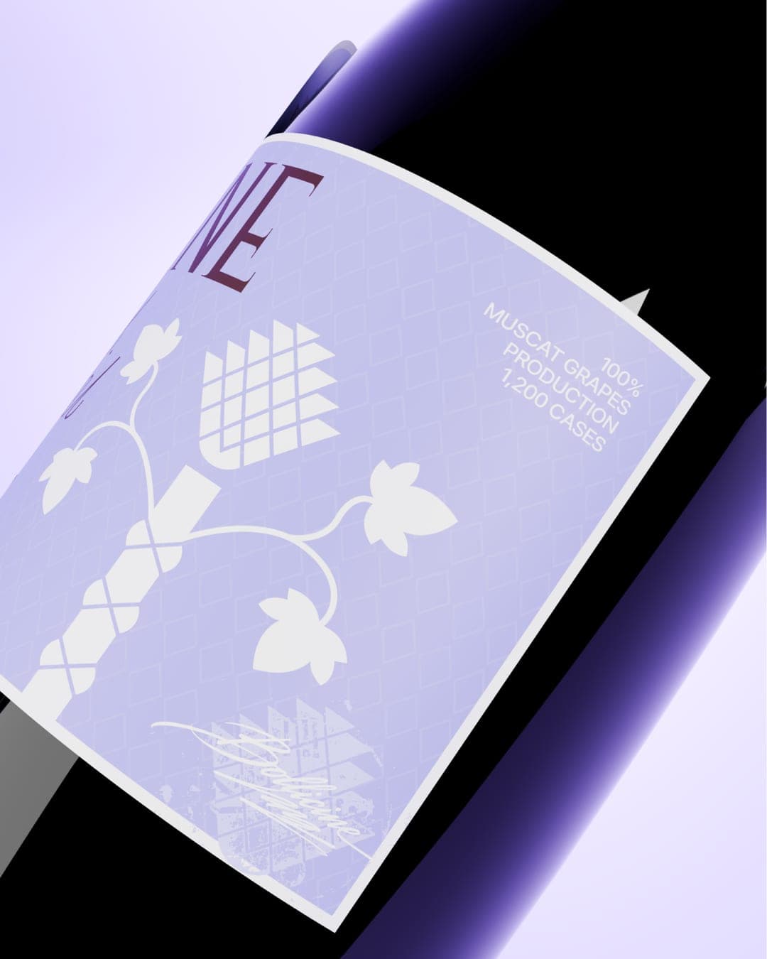
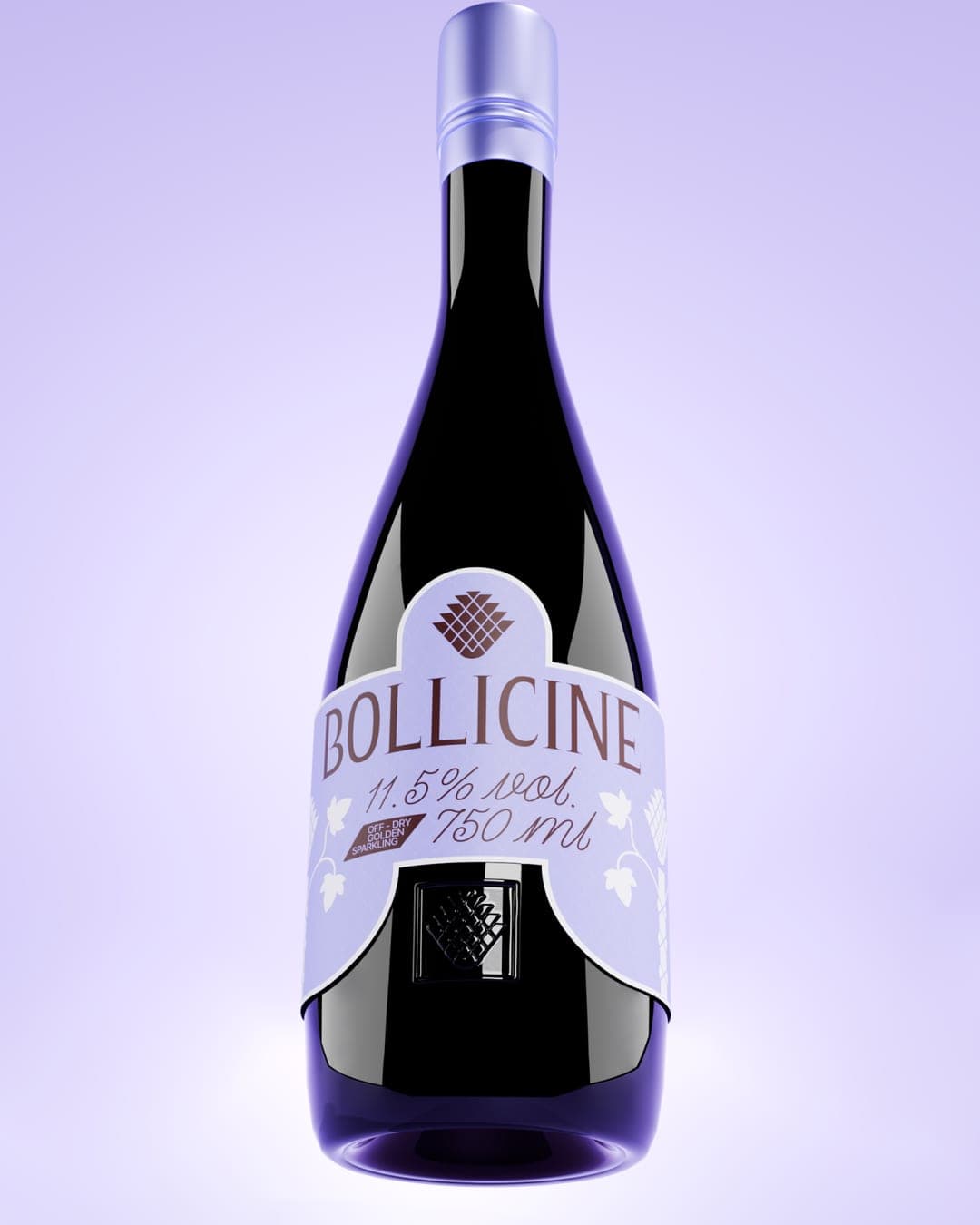
Bollicine is a sparkling wine brand whose identity draws on one of the oldest symbols of celebration: the thyrsus, the pinecone-tipped staff carried by Dionysus, god of wine and revelry. The pinecone at the top of the thyrsus stands for fertility, vitality, and ecstatic joy. I reduced it to a geometric, scale-patterned mark that reads clearly on a label, an embossed bottle base, or a metal tube. The shape also suggests a bunch of grapes, so the mark carries two meanings at once. Each variety has its own color, taken from grapes. I chose a cylindrical tube for its form: it is clean, protective, and easy to recognize. I made it white, so that in the mockups the bottles stand on it as if on Mount Olympus, with the wine raised to the status of something divine.


Color Palette
This brand uses a color palette of 3 colors
Click a color to find brands with similar colors.
Tags
Live score
Scores stay hidden while voting is open, so early votes can't anchor the ones that follow. Check back once the countdown ends.
Votes (0)
No votes yet — be the first.