Hospitality & Travel · by ZAMBI THE STUDIO
CASA AMPARO
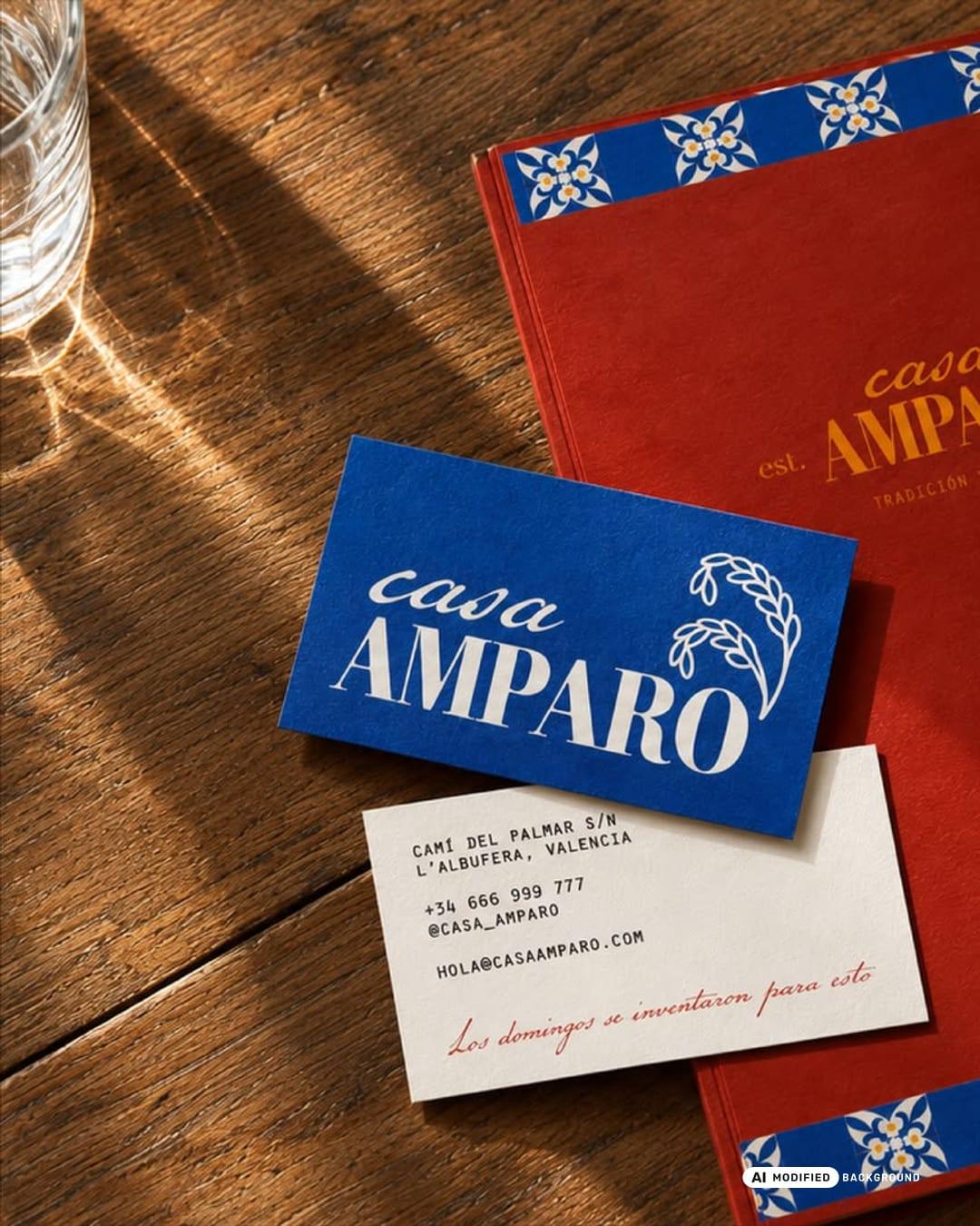
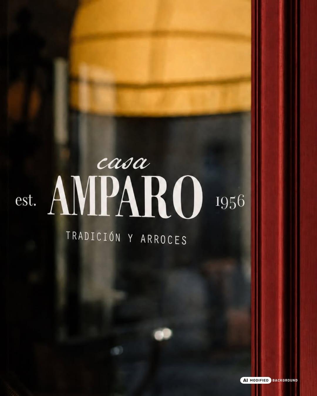
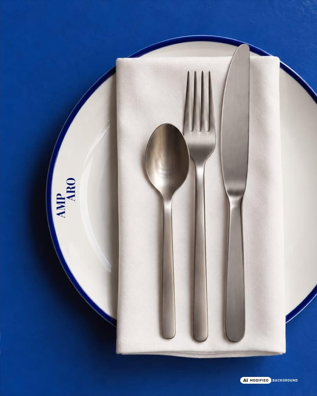
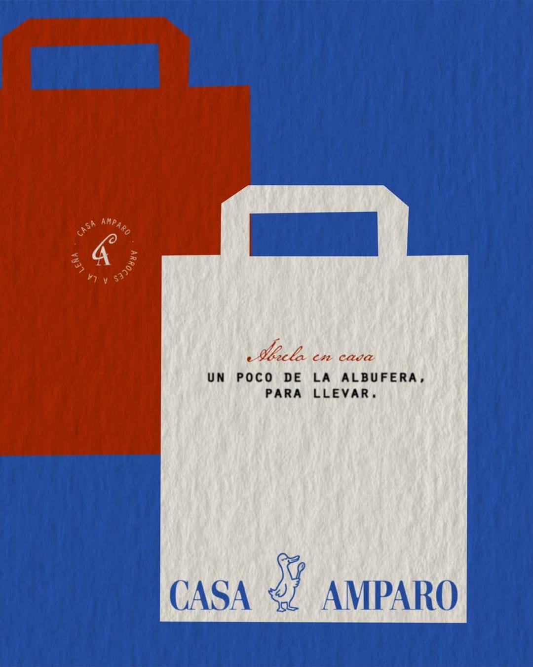
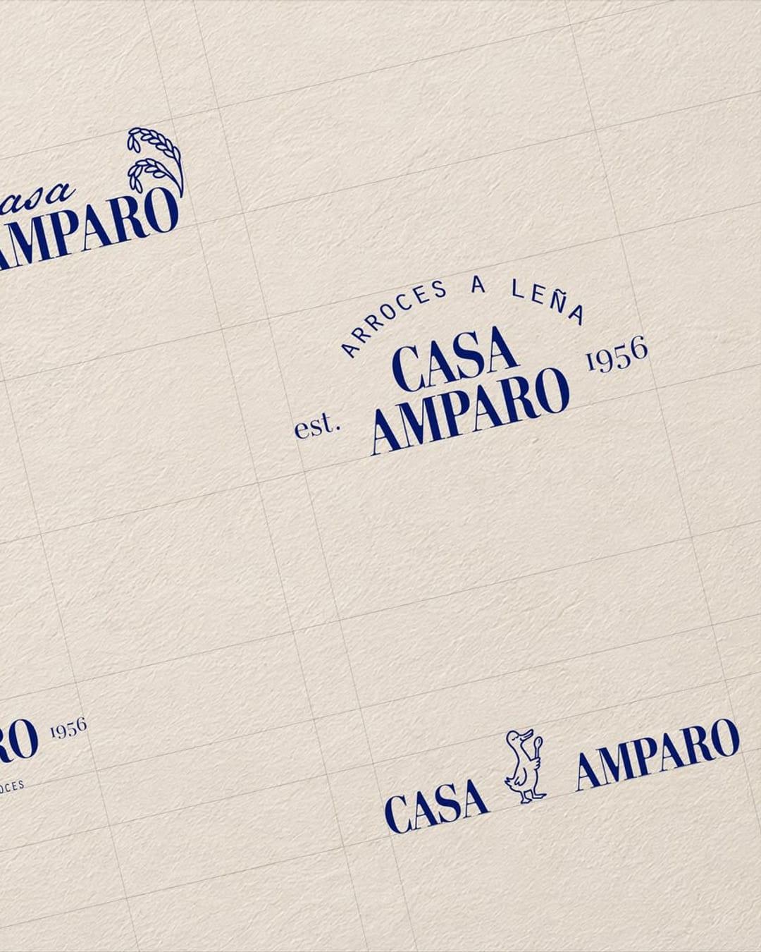
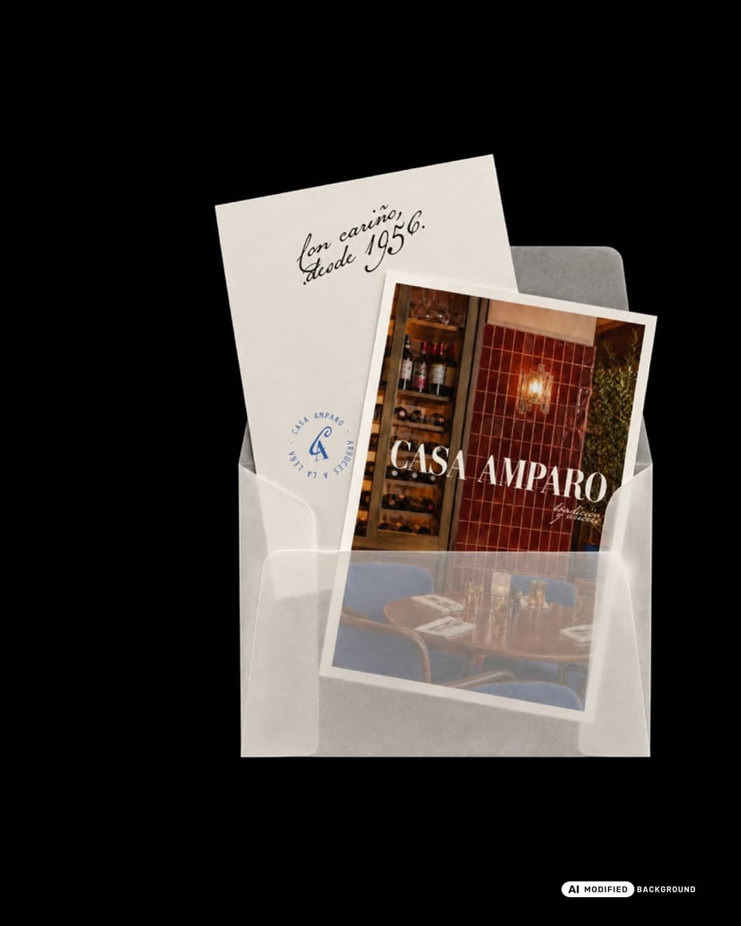
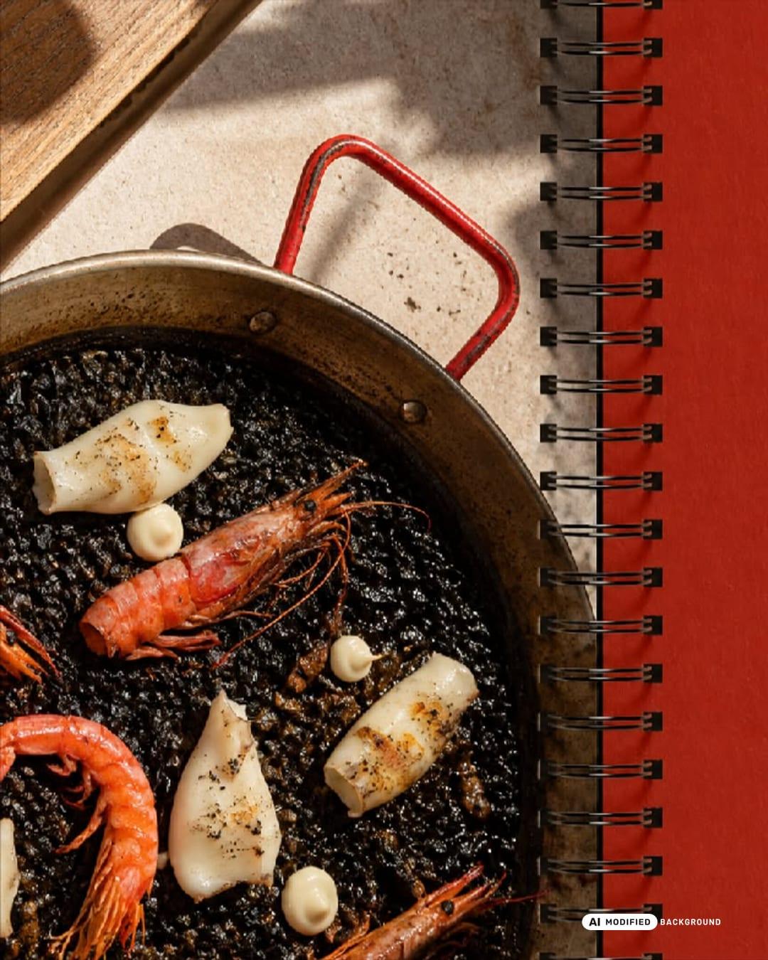
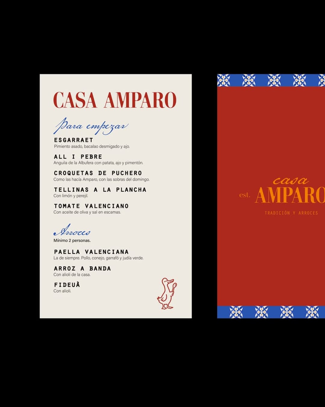
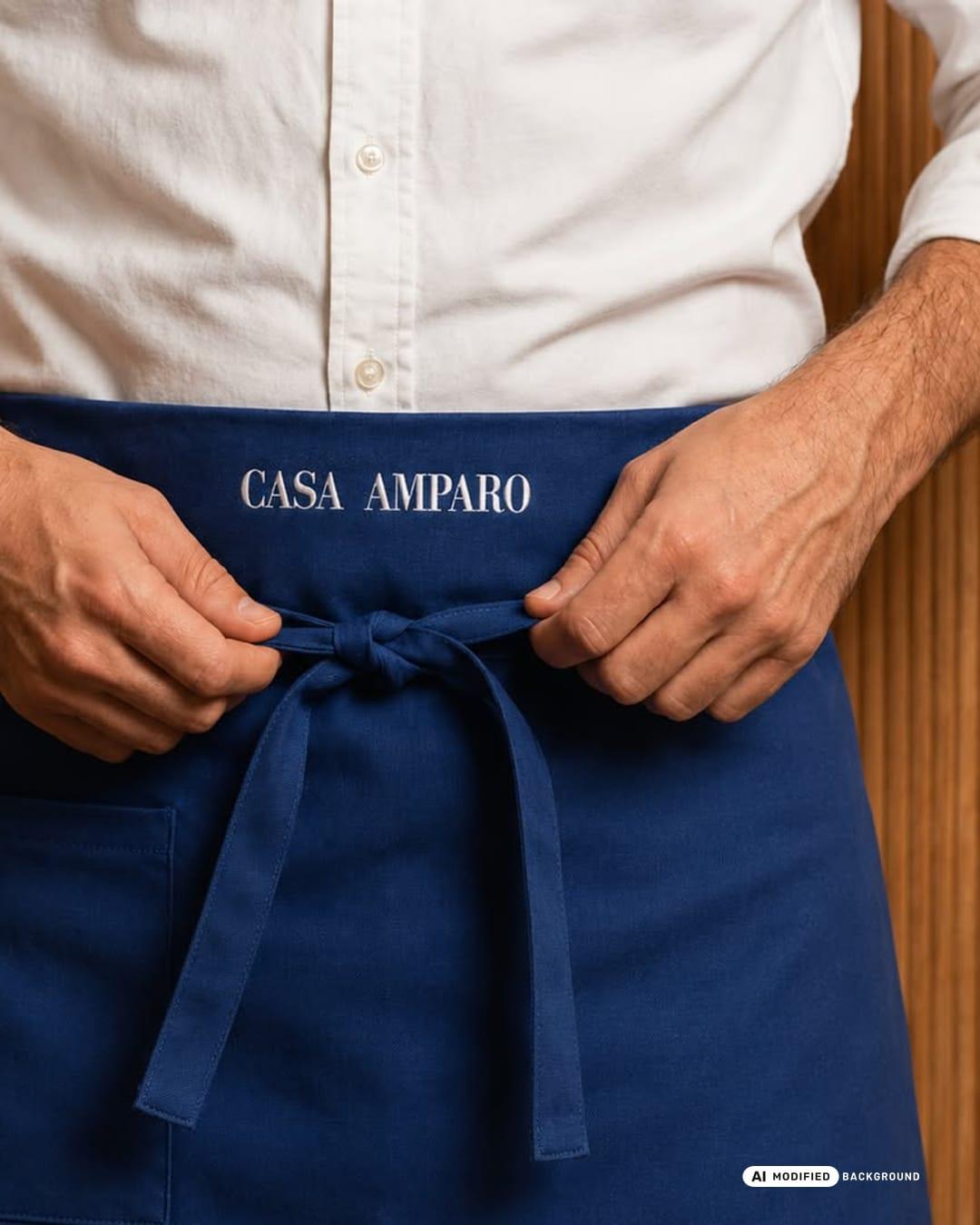
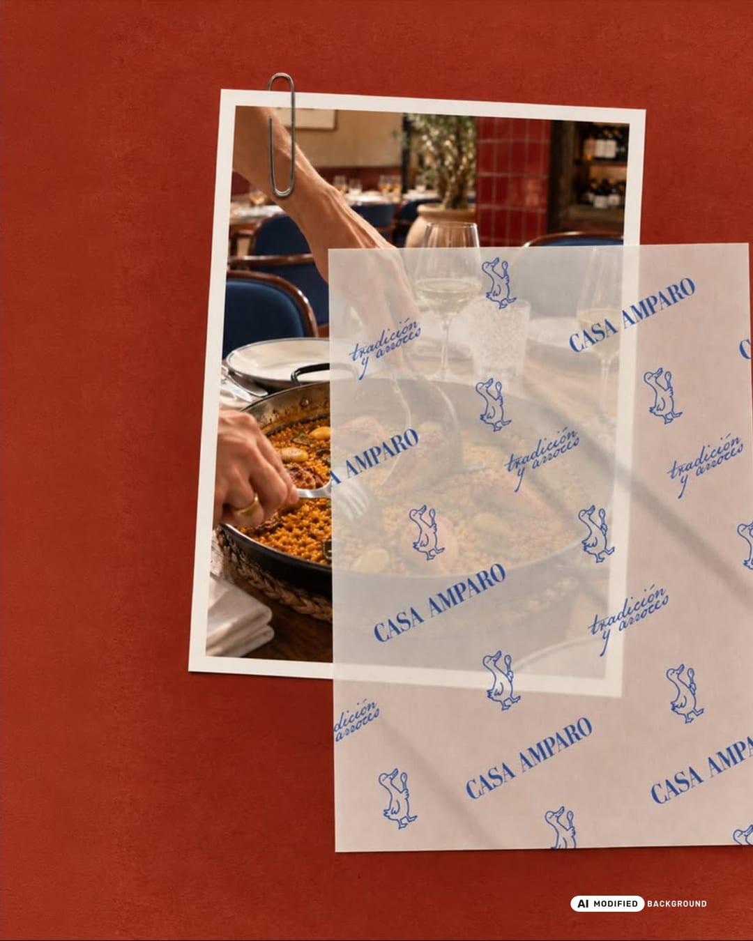
Casa Amparo is a visual identity for a traditional Valencian arrocería, inspired by family heritage, Mediterranean culture and the art of gathering around the table. Rooted in the culinary traditions of L'Albufera, Valencia, the brand brings a contemporary perspective to a familiar concept, balancing nostalgia with a bold and distinctive visual language. The identity combines expressive serif typography, handwritten details, a playful illustrated mascot and a vibrant palette of cobalt blue, deep red and warm ivory. Inspired by traditional Valencian tiles and the character of local restaurants, the visual system creates a recognisable identity that feels both timeless and full of personality. The branding extends across menus, packaging, takeaway materials, stationery, tableware, uniforms, signage and digital applications, creating a cohesive experience at every customer touchpoint. A brand built around tradition, good food and the simple pleasure of coming together. Branding & Art Direction by ZAMBI THE STUDIO.
Color Palette
This brand uses a color palette of 3 colors
Click a color to find brands with similar colors.
Tags
Live score
Scores stay hidden while voting is open, so early votes can't anchor the ones that follow. Check back once the countdown ends.
Votes (0)
No votes yet — be the first.