Food & Beverage · by paulinedsgn
Don Fuego
 paulinedsgn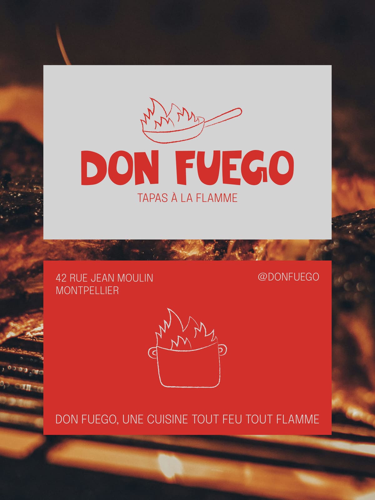
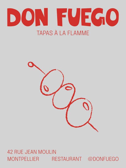
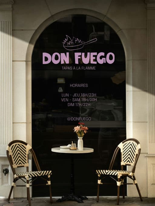
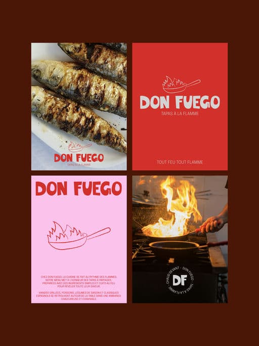
The visual identity of Don Fuego is inspired by fire as both a cooking method and a social experience. The handcrafted logo features irregular, organic shapes to reflect the raw, unpredictable nature of flame and to create a more authentic and approachable feel. The hand-drawn illustrations reinforce this idea using simple and imperfect lines to evoke heat, movement and the cooking process, while adding a playful and human touch. The red color palette is directly inspired by fire, embers and warmth creating a bold and energetic visual impact that immediately communicates the concept. The tapas format supports a shared and convivial dining experience, aligning perfectly with the idea of food prepared over an open flame and enjoyed together. Overall, the brand is designed to feel warm, social, bold and contemporary centered around the idea of bringing people together through fire




Color Palette
Tags
Voting is closed for this nominee.