Home & Living · by Kidults
HumaHome
 Kidults
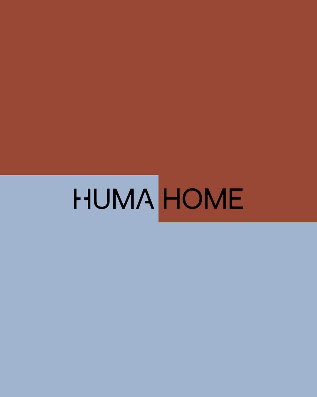
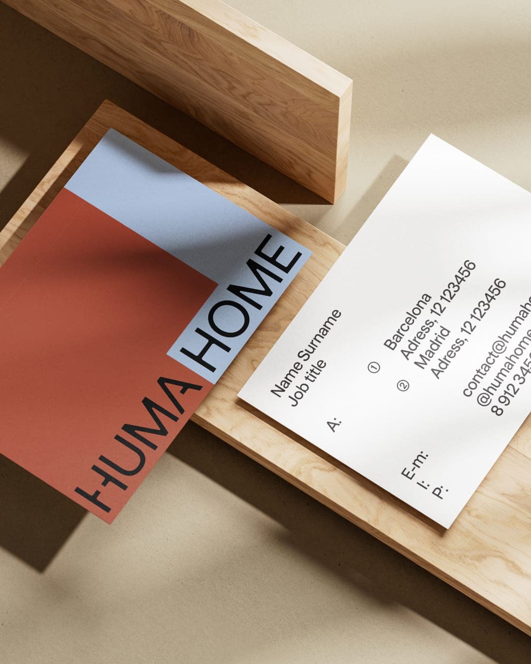
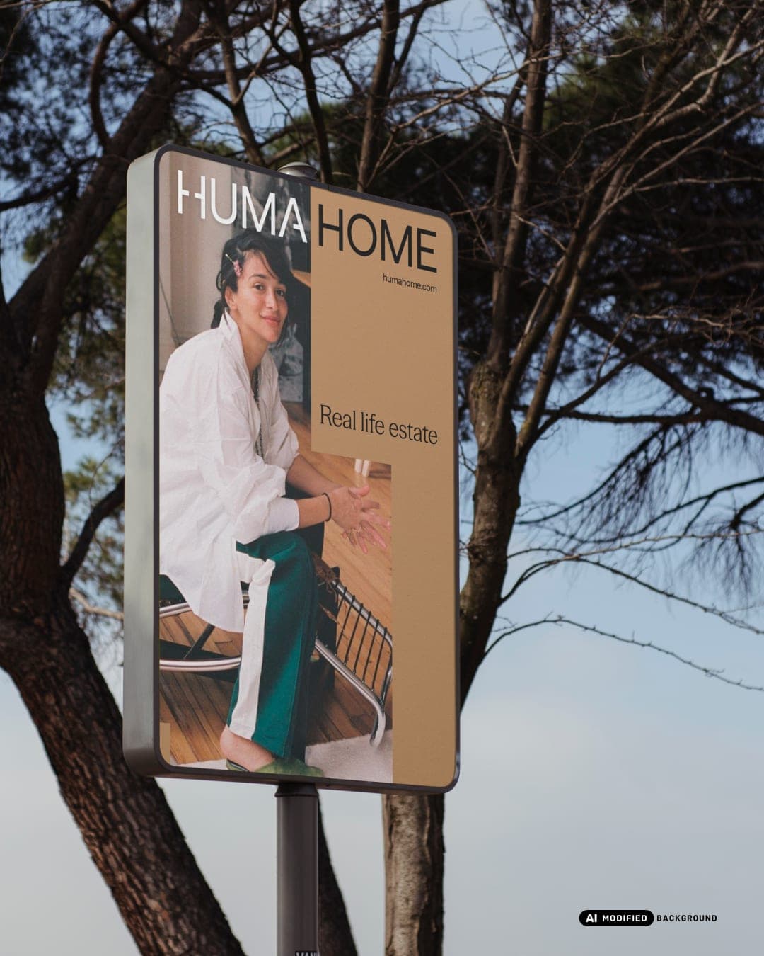
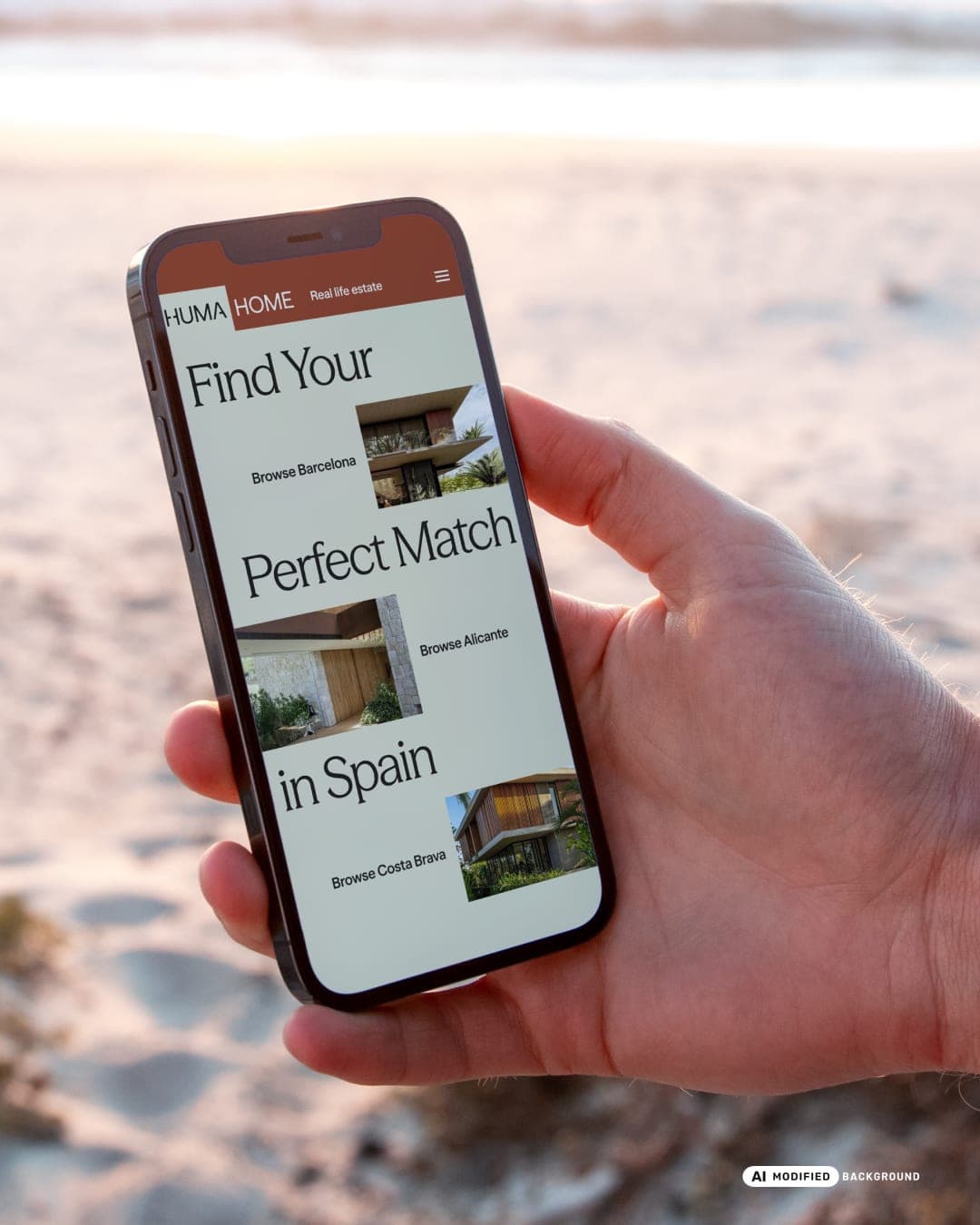
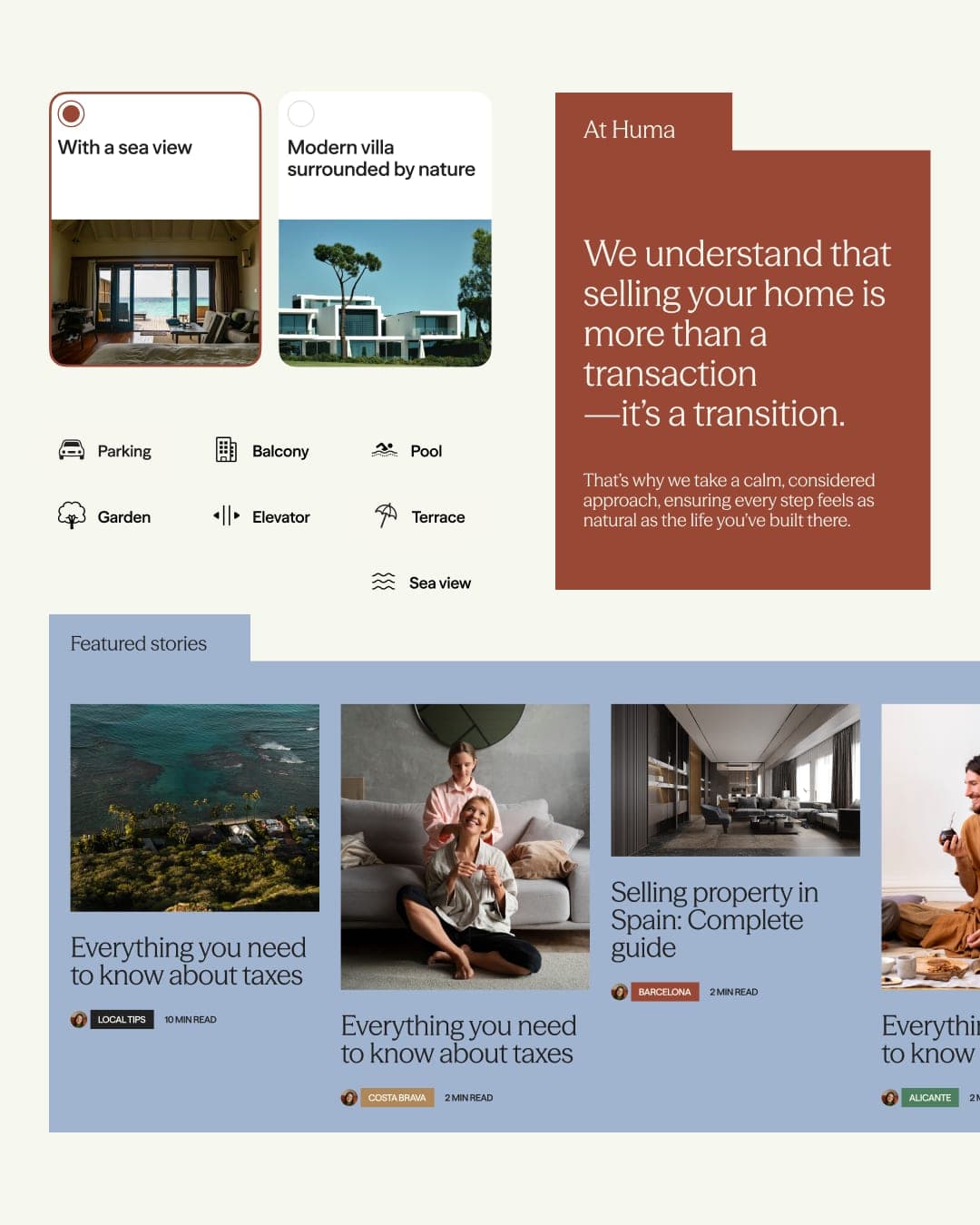
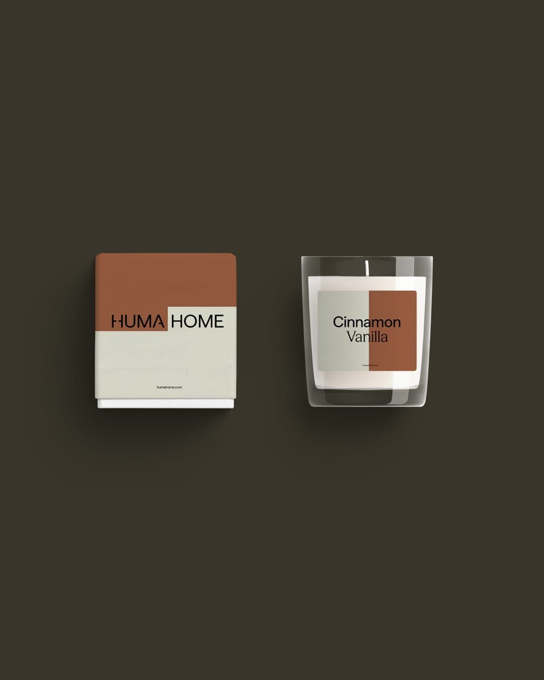
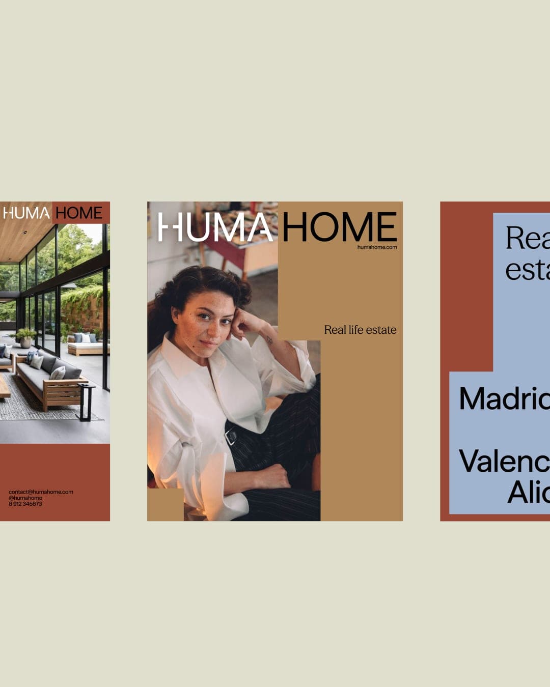
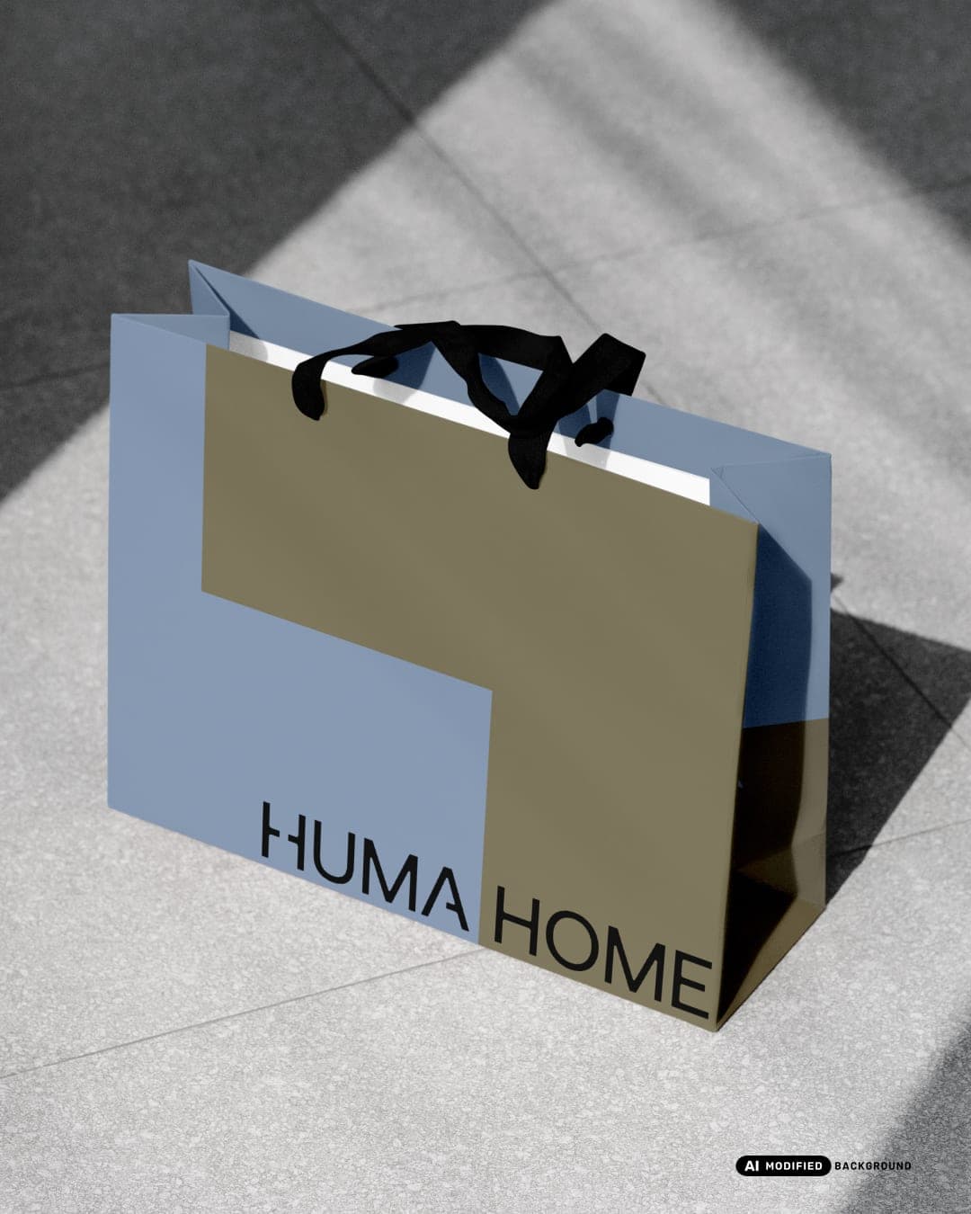
HumaHome is a Spanish real estate agency built around one simple shift: people first, property second. In a market where demand outpaces supply and agencies chase listings rather than buyers, HumaHome helps people find a home that matches the way they actually live. The name puts the human first, and the identity follows the same logic. Brand shapes are drawn from floor plans and bend around the person instead of boxing them in. A warm palette inspired by Ricardo Bofill’s architecture and materials like clay, terracotta and sand carries the brand from social templates and the website to candles and shopping bags. Real life estate.

Color Palette
This brand uses a color palette of 3 colors
Click a color to find brands with similar colors.
Tags
Live score
Scores stay hidden while voting is open, so early votes can't anchor the ones that follow. Check back once the countdown ends.
Votes (1)
| Voter | Design | Strategy | Originality | Story | Overall | |
|---|---|---|---|---|---|---|
 | madns.co from India madnsstudio.framer.website | 7 | 8 | 9 | 8 | 7.80 |