Food & Beverage · by fromsketch.design
KADO
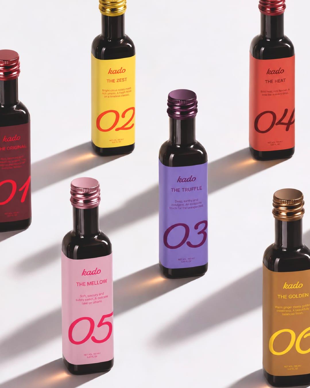
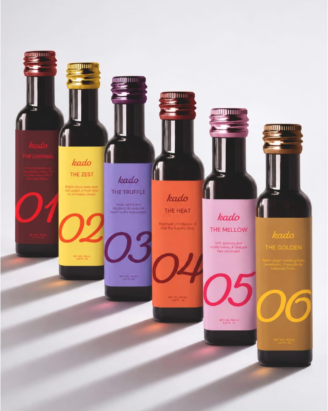
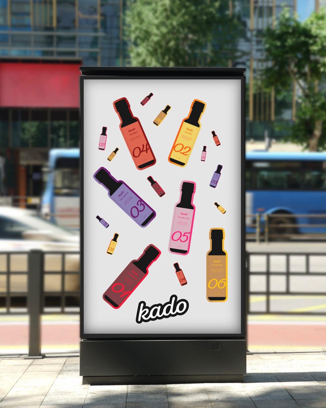
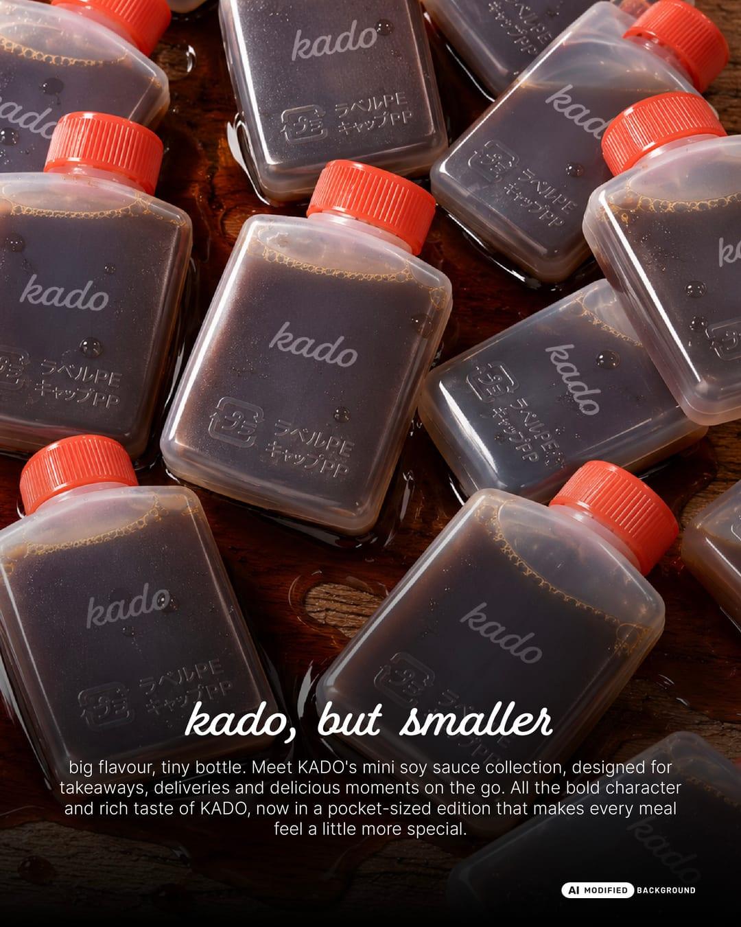
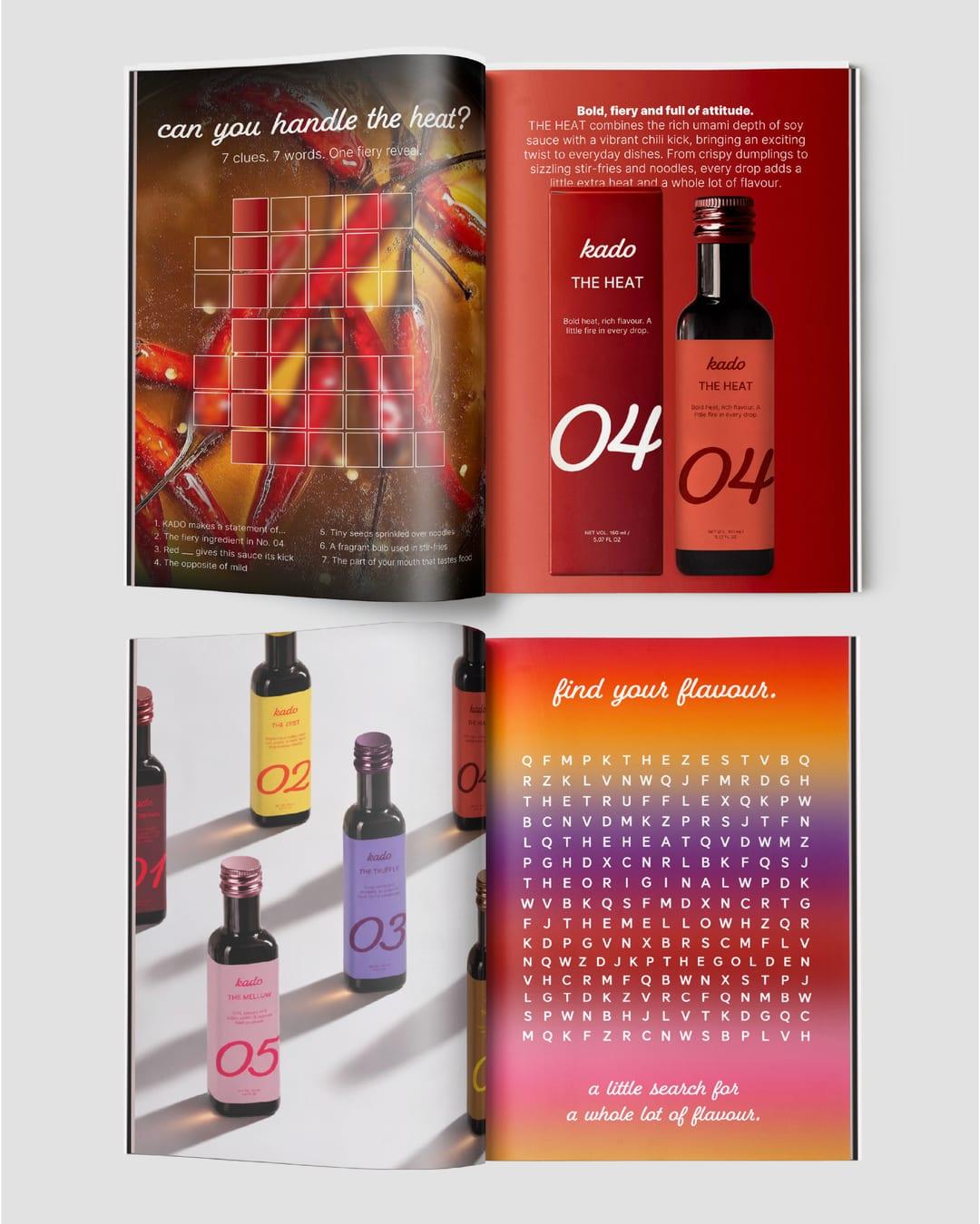
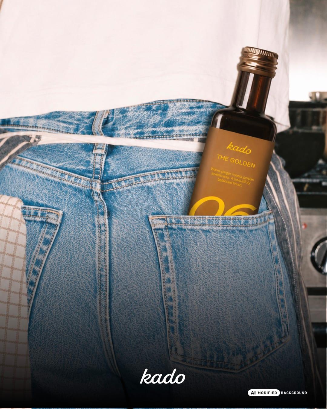
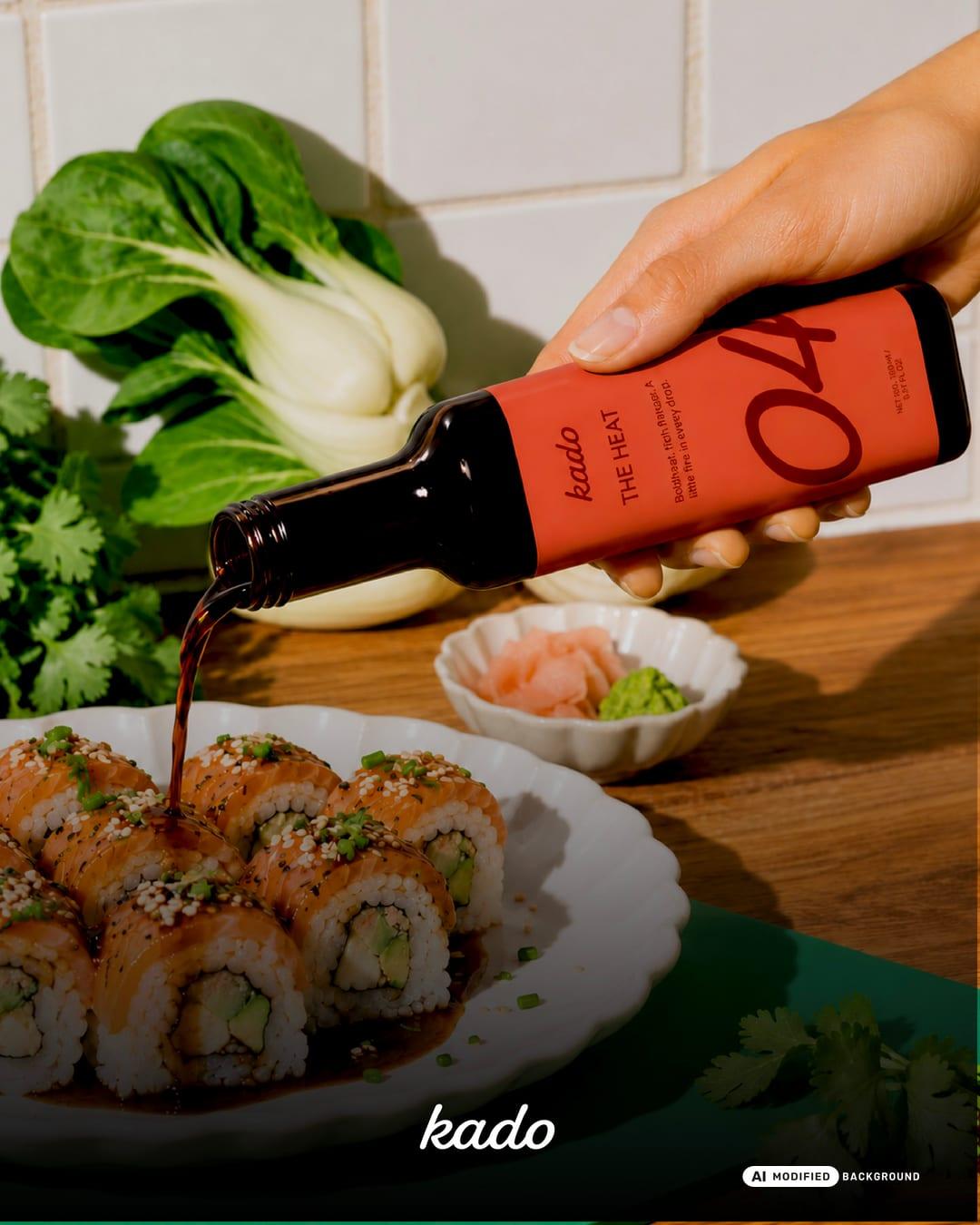
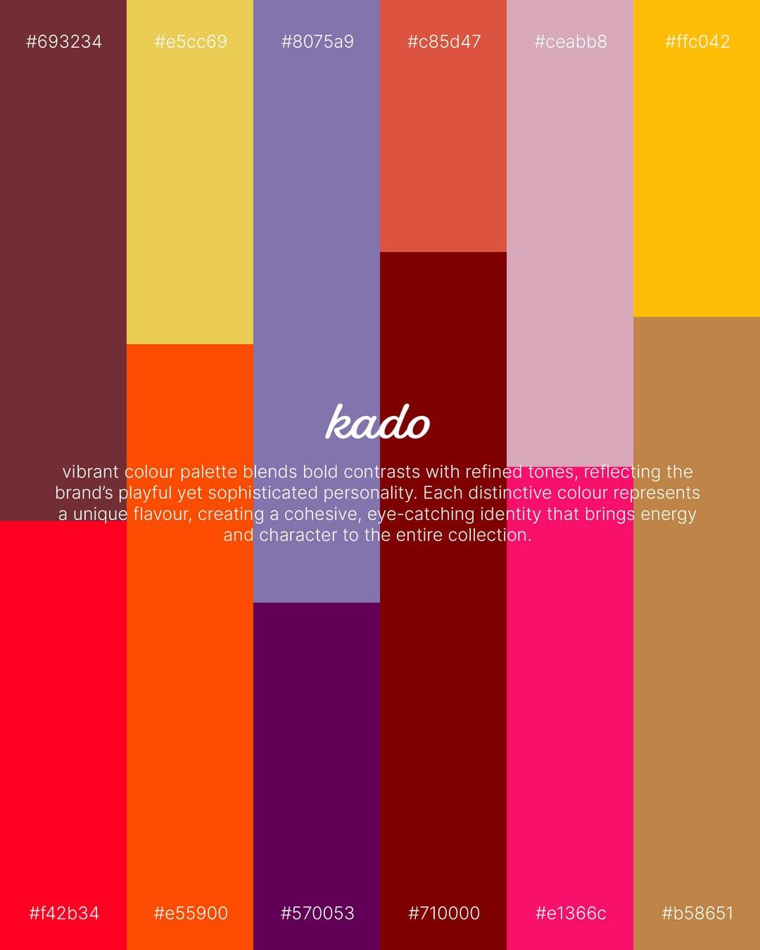
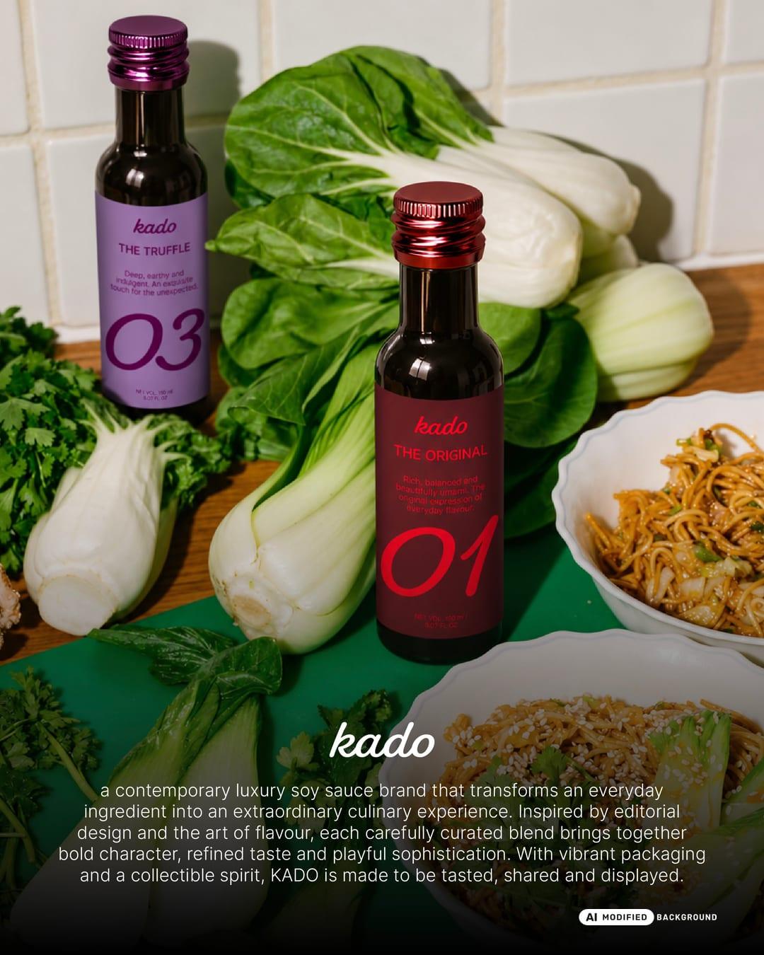
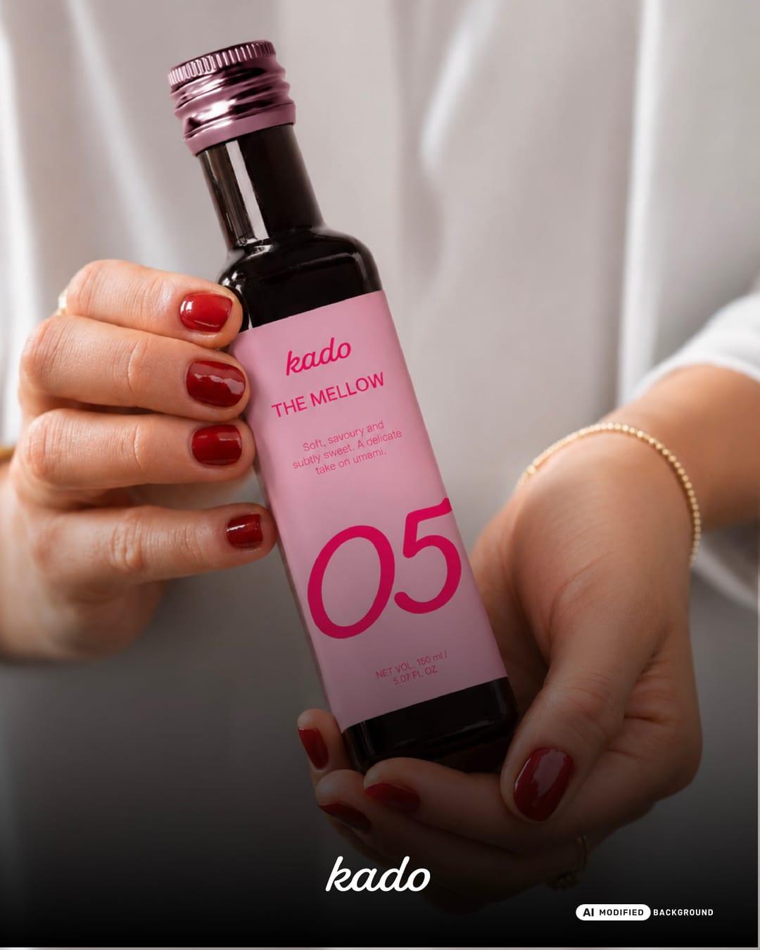
KADO: not just soy sauce. a statement of taste. KADO is a contemporary luxury soy sauce brand that transforms an everyday ingredient into an extraordinary culinary experience. Inspired by fashion editorials, culinary culture and the art of flavour, the identity combines bold typography, vibrant colour palettes and playful sophistication. The collection features six distinctive flavours, each with its own personality, colour story and numbered identity, designed to feel like a collectible edition. The project extends across bottle labels, premium packaging, an interactive editorial product catalogue, custom illustrations, stickers and lifestyle applications. Blending refined aesthetics with an unexpected sense of playfulness, KADO brings a fresh perspective to traditional soy sauce, creating a brand made to be tasted, shared and displayed.
Color Palette
This brand uses a color palette of 3 colors
Click a color to find brands with similar colors.
Tags
Live score
Scores stay hidden while voting is open, so early votes can't anchor the ones that follow. Check back once the countdown ends.
Votes (2)
| Voter | Design | Strategy | Originality | Story | Overall | |
|---|---|---|---|---|---|---|
 | syeda maham from Pakistan | 10 | 10 | 10 | 10 | 10.00 |
 | Designbyhira from Malaysia | 9 | 9 | 9 | 10 | 9.10 |