Link copied
Food & Beverage · by glowhubcreative
L'IRON
 glowhubcreative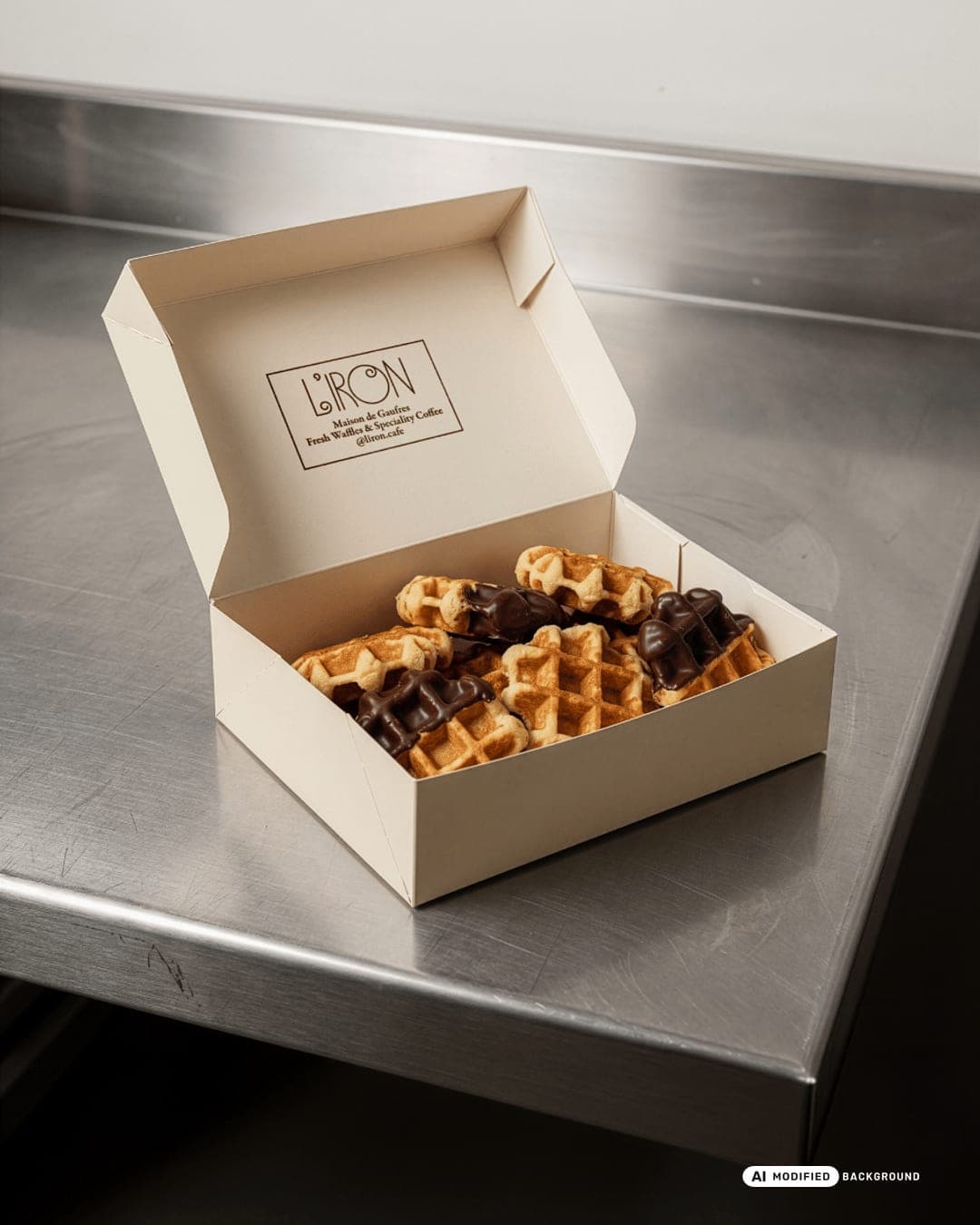
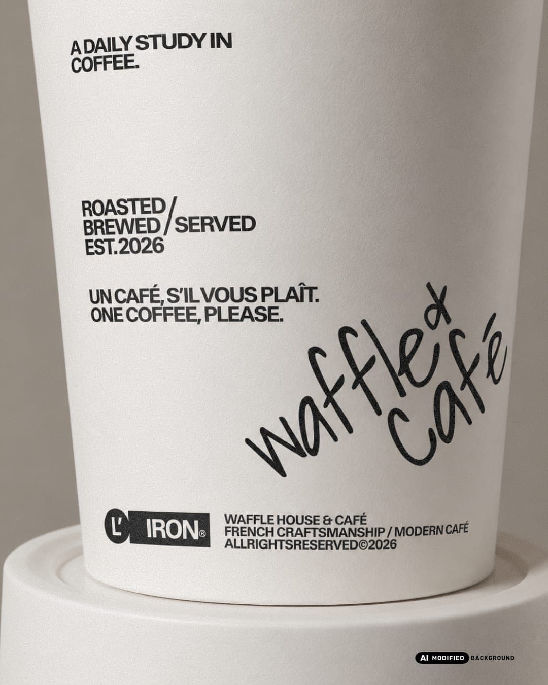
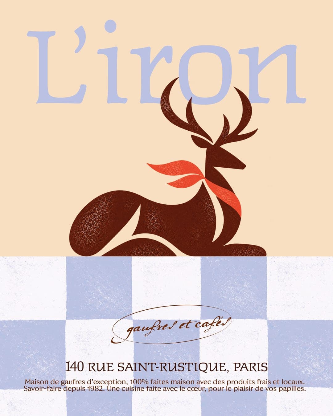
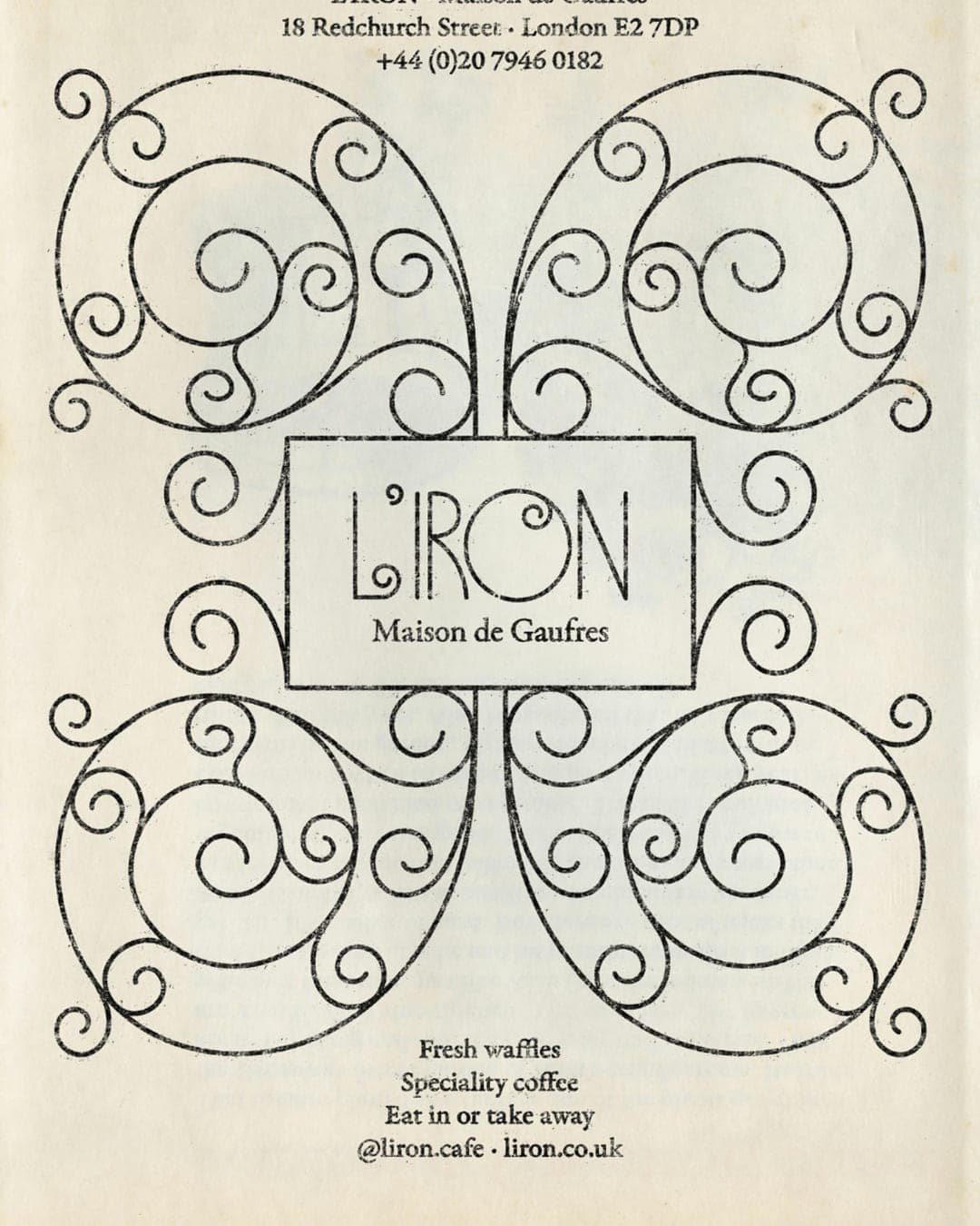
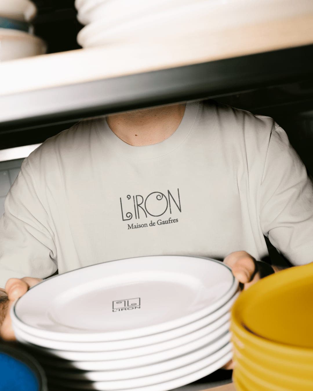
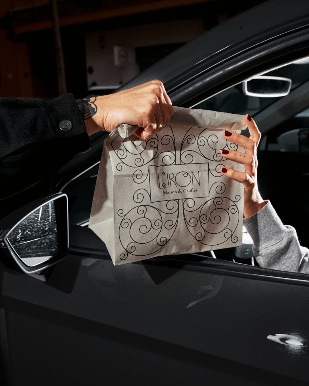
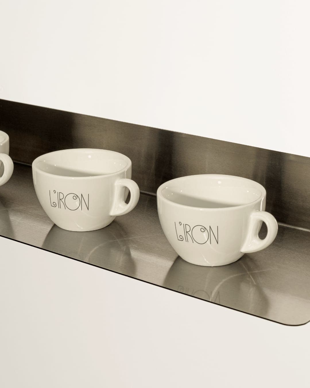
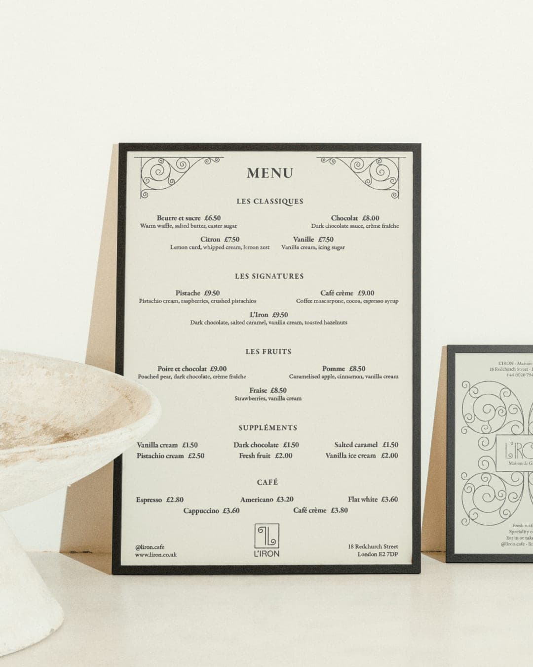
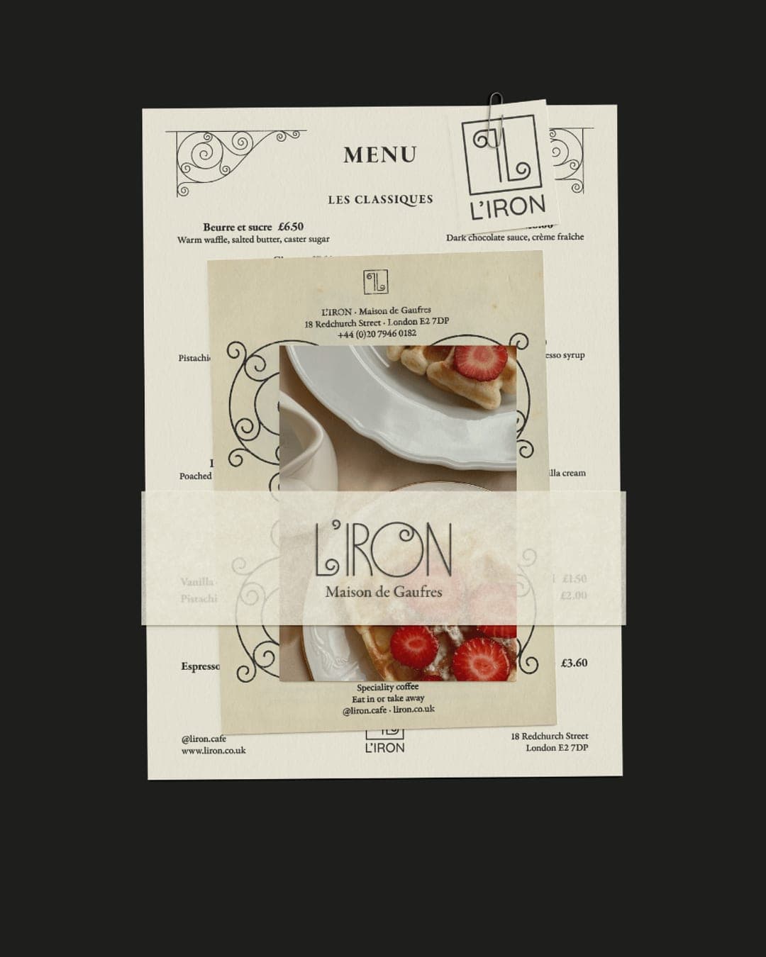
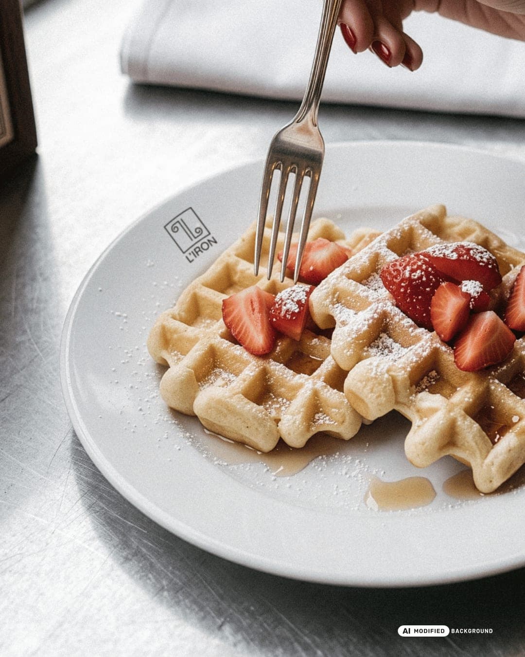
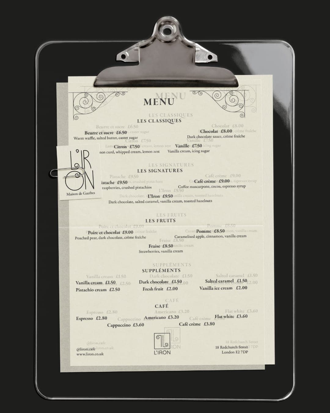
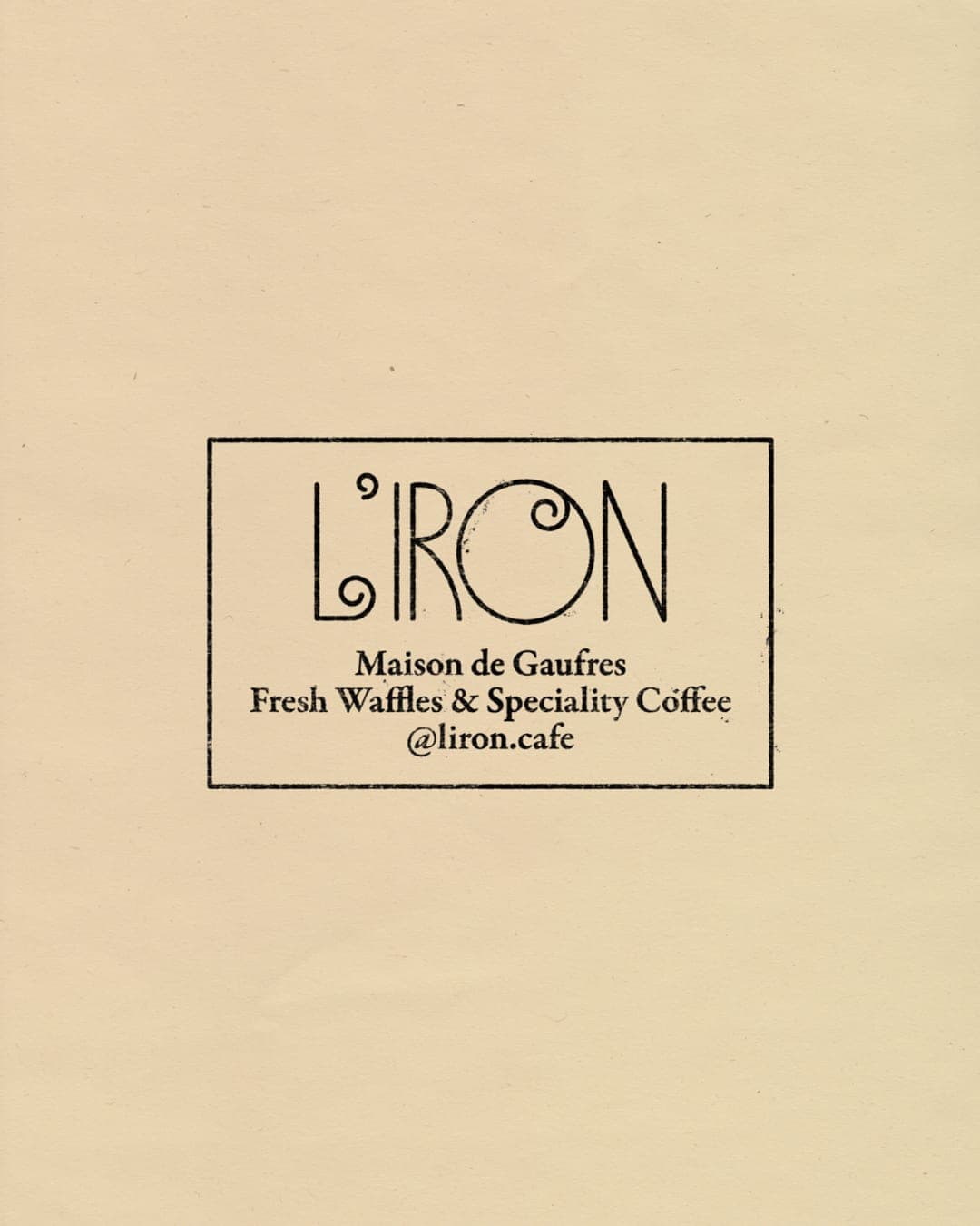
L’IRON is a fictional London waffle house with a French-inspired identity built around custom typography, ornamental details, archival references, and nostalgic food imagery. The project includes packaging, menu design, and a flexible visual system centred on the brand’s distinctive wordmark and pattern.
Color Palette
This brand uses a color palette of 2 colors
Click a color to find brands with similar colors.
Tags
Live score
Scores stay hidden while voting is open, so early votes can't anchor the ones that follow. Check back once the countdown ends.
Votes (0)
No votes yet — be the first.