Link copied
Food & Beverage · by Studio Aslihan
L'IRON
 Studio AslihanPRO
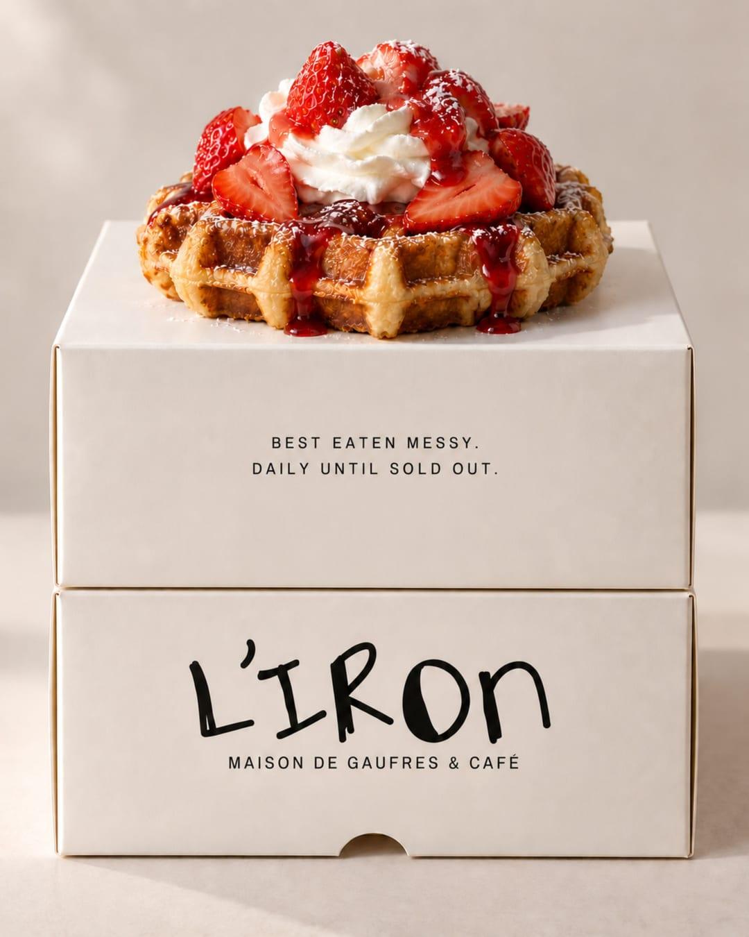
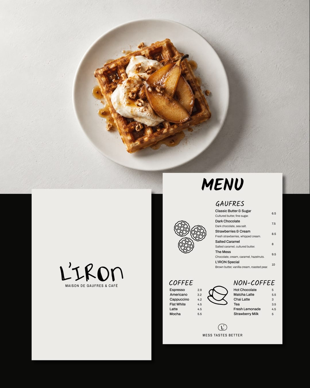
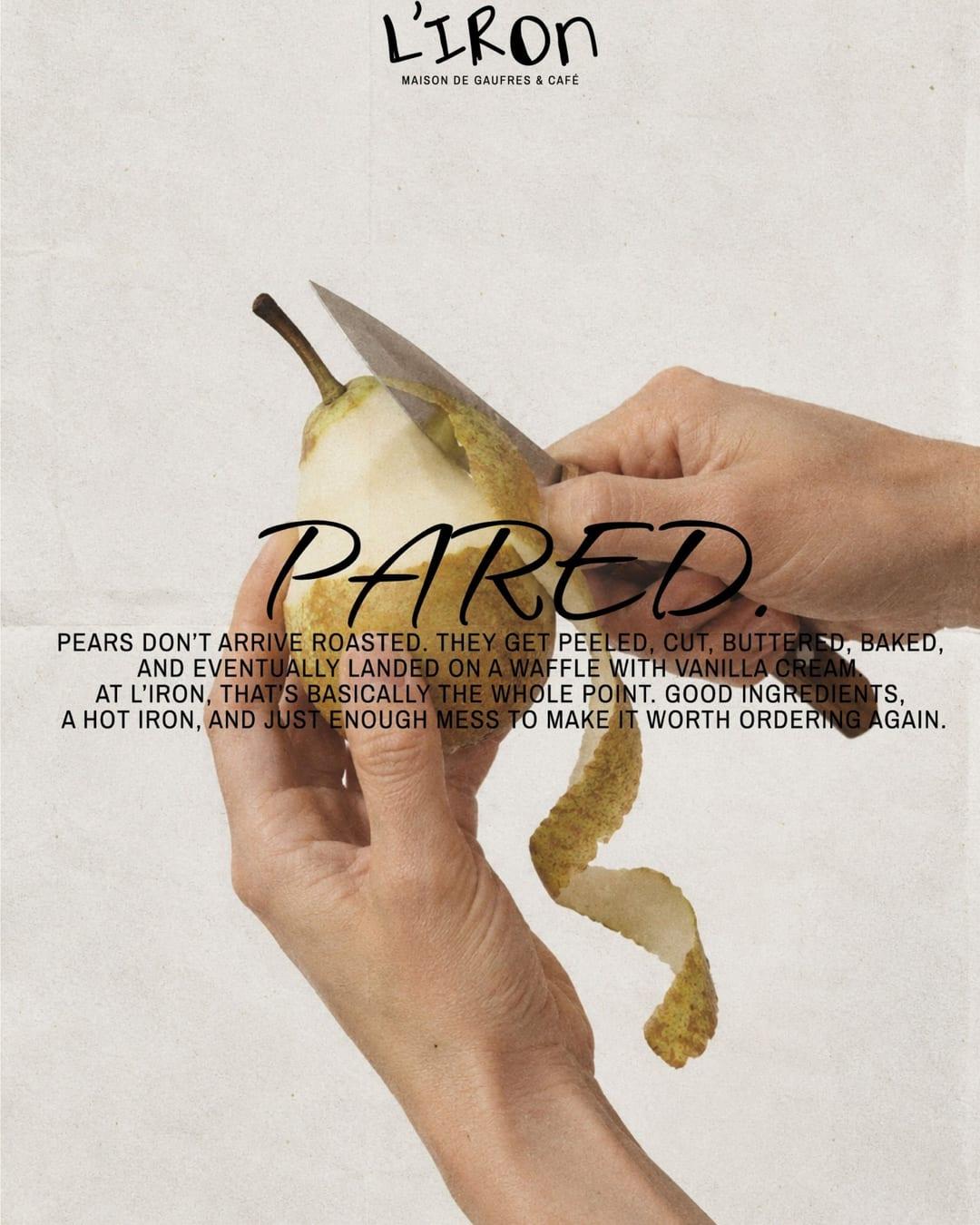
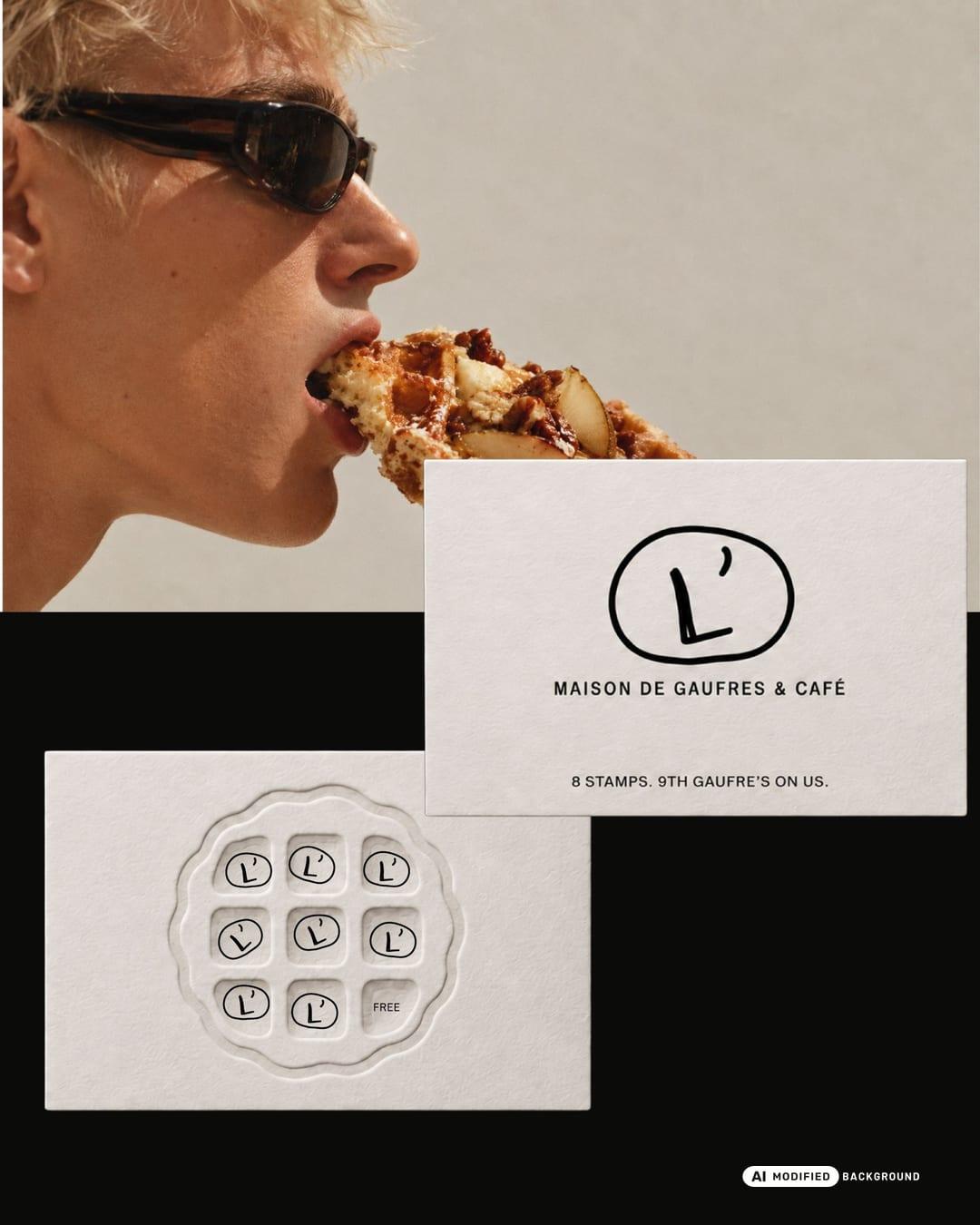
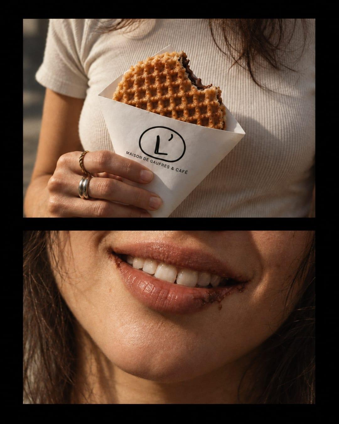
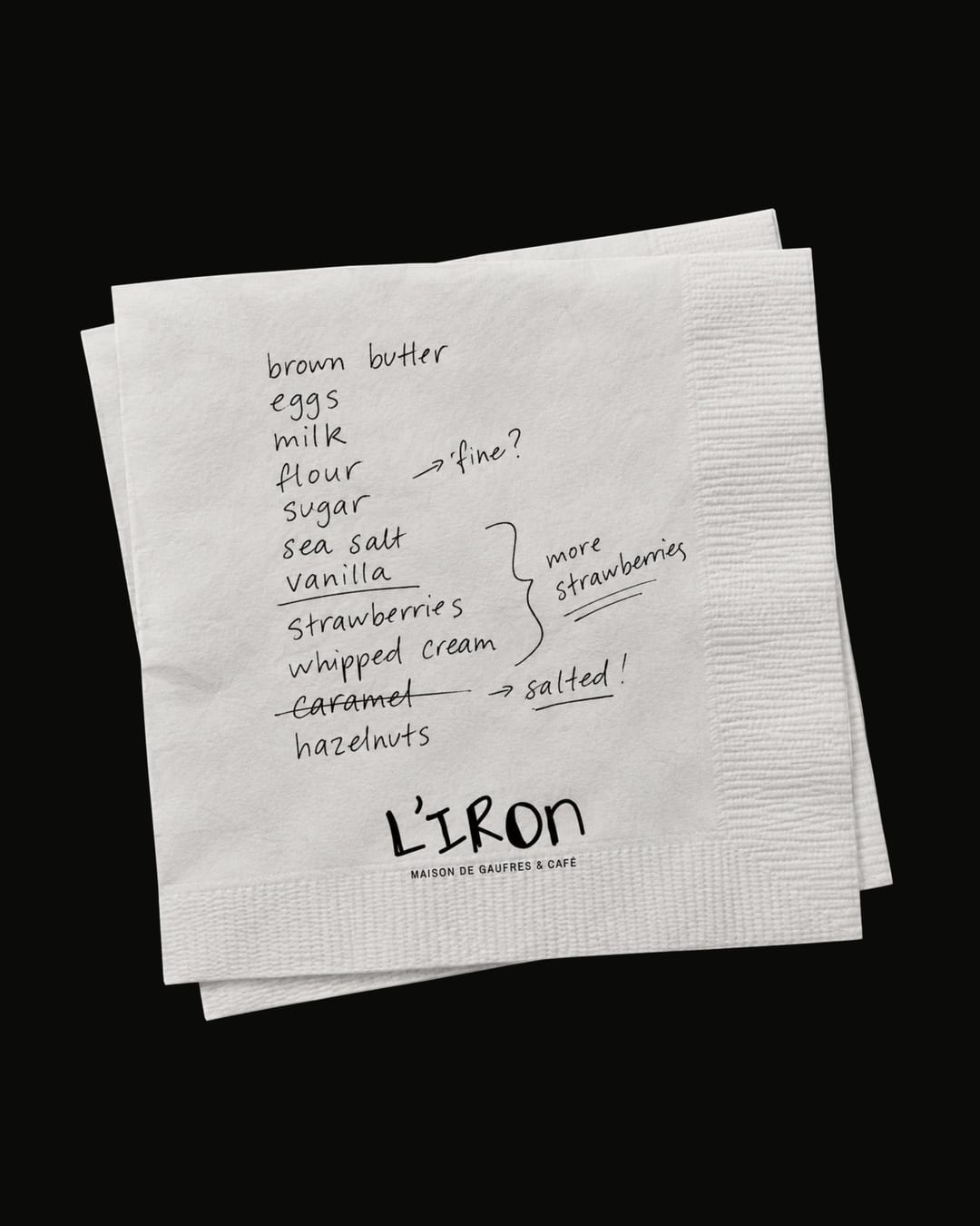
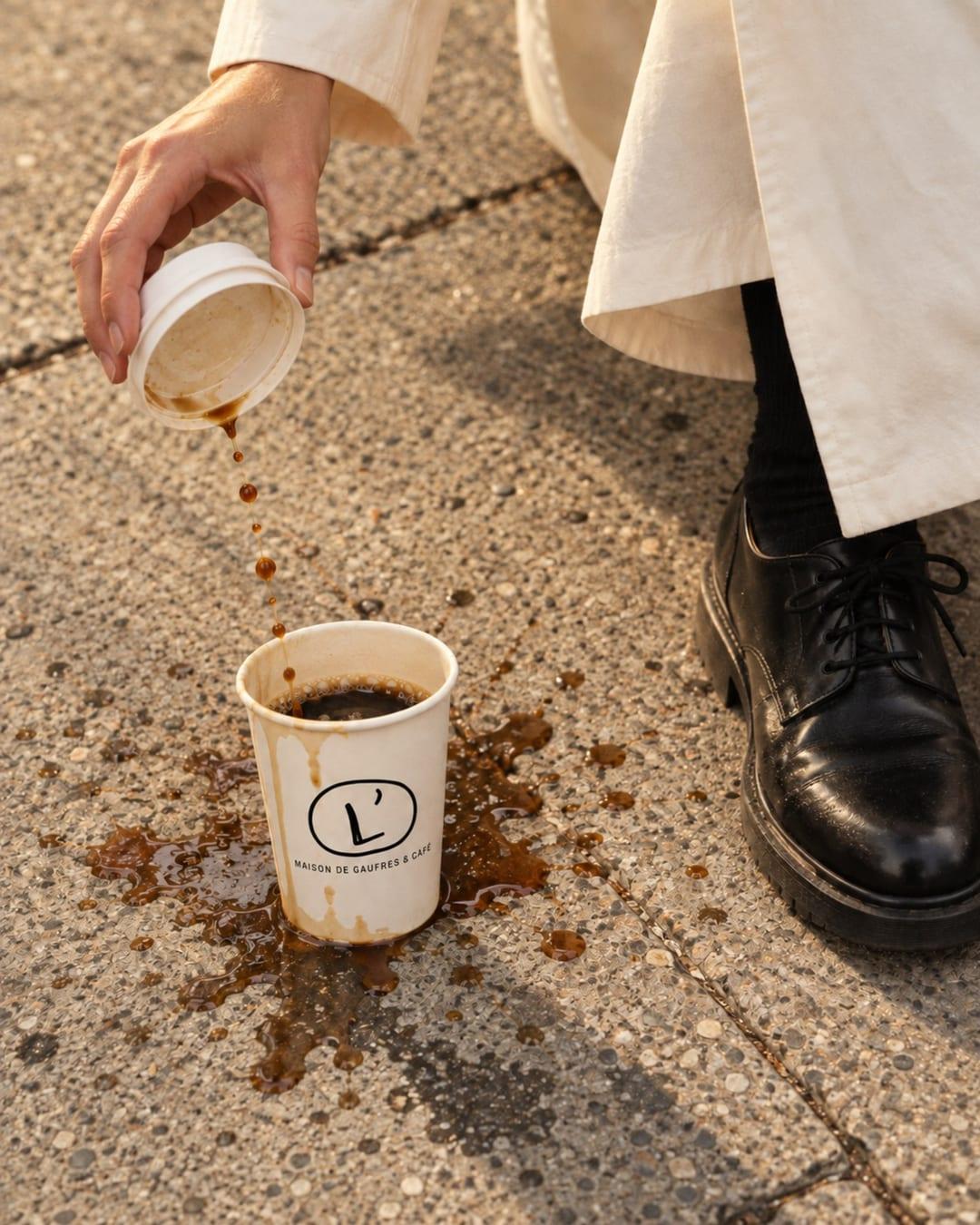
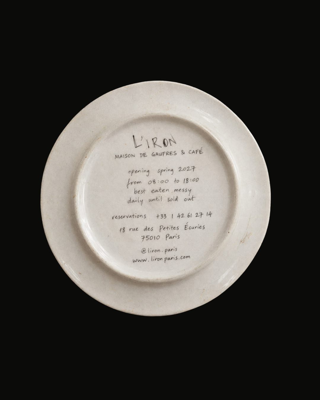
L’IRON, a waffle café identity built around the best part of eating well: the mess. From the hand-drawn logo and packaging to menus, coffee cups and editorial food photography, every touchpoint keeps the brand playful, tactile and easy to recognize.
Color Palette
This brand uses a color palette of 2 colors
Click a color to find brands with similar colors.
Tags
Live score
Scores stay hidden while voting is open, so early votes can't anchor the ones that follow. Check back once the countdown ends.
Votes (5)
| Voter | Design | Strategy | Originality | Story | Overall | |
|---|---|---|---|---|---|---|
 | brandingwithkamelia from Skopje, Macedonia | 10 | 10 | 10 | 10 | 10.00 |
| f | fromsketch.design from Bucharest, Romania | 10 | 10 | 10 | 10 | 10.00 |
| S | Sand design from India | 10 | 10 | 10 | 10 | 10.00 |
 | Designbyhira from Malaysia | 10 | 10 | 10 | 10 | 10.00 |
 | dias.thedesigner from Indonesia diasportfolio.framer.website | 9 | 8 | 9 | 8 | 8.60 |