Agency & Studio · by LINA STUDIO
LINA Studio
 LINA STUDIO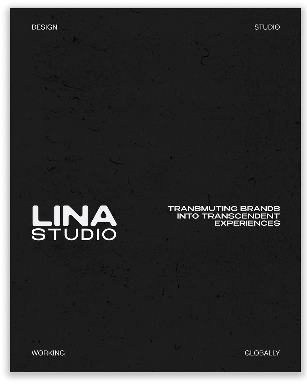
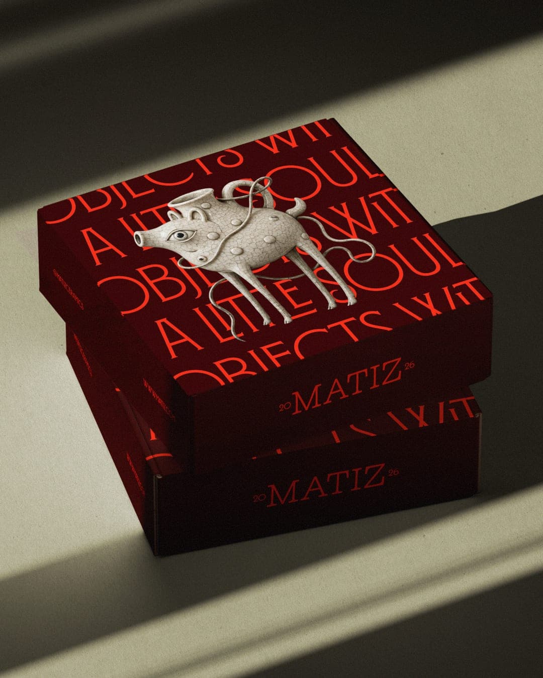
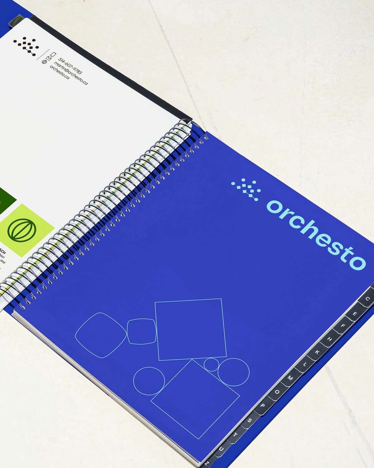
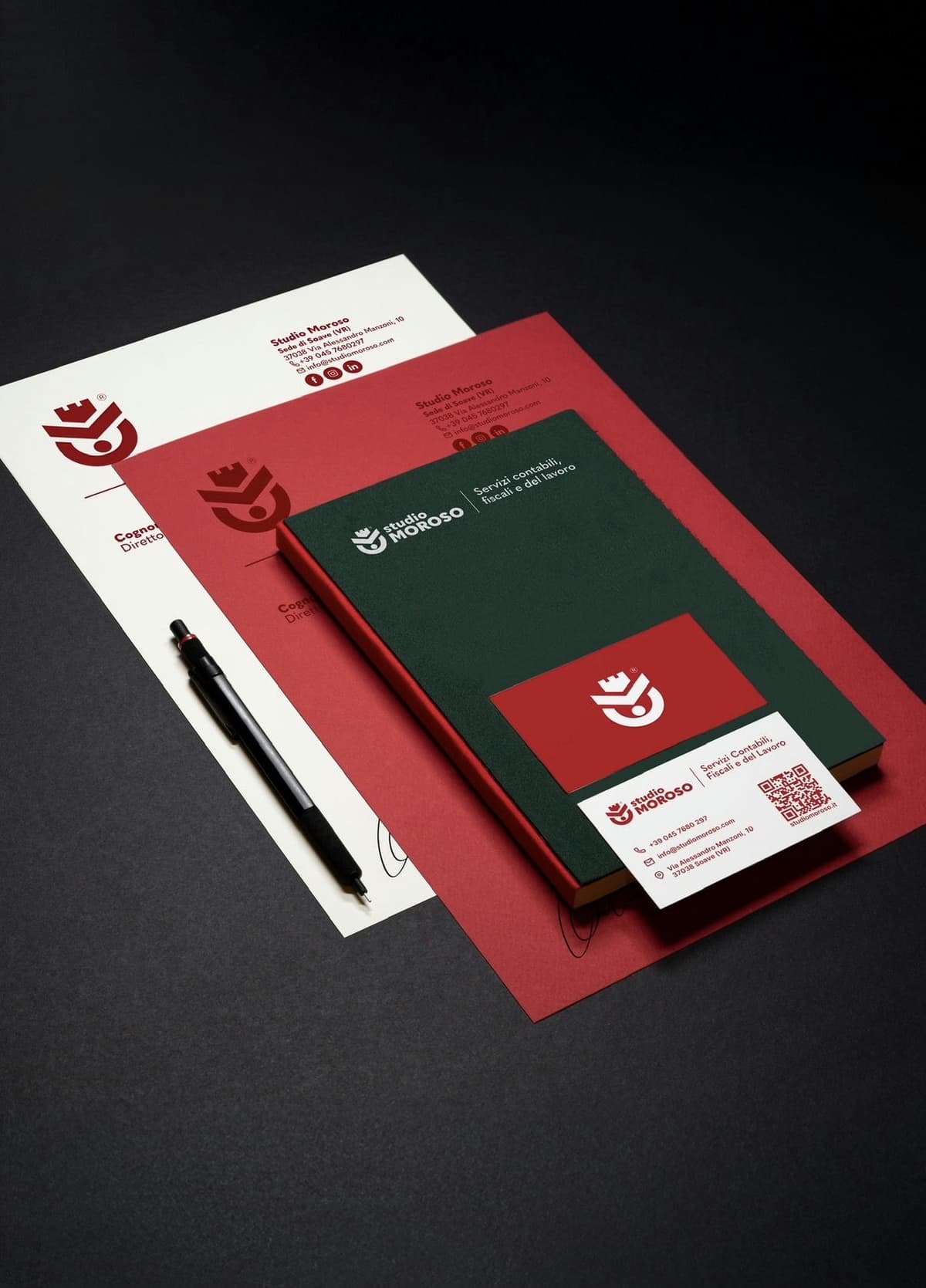
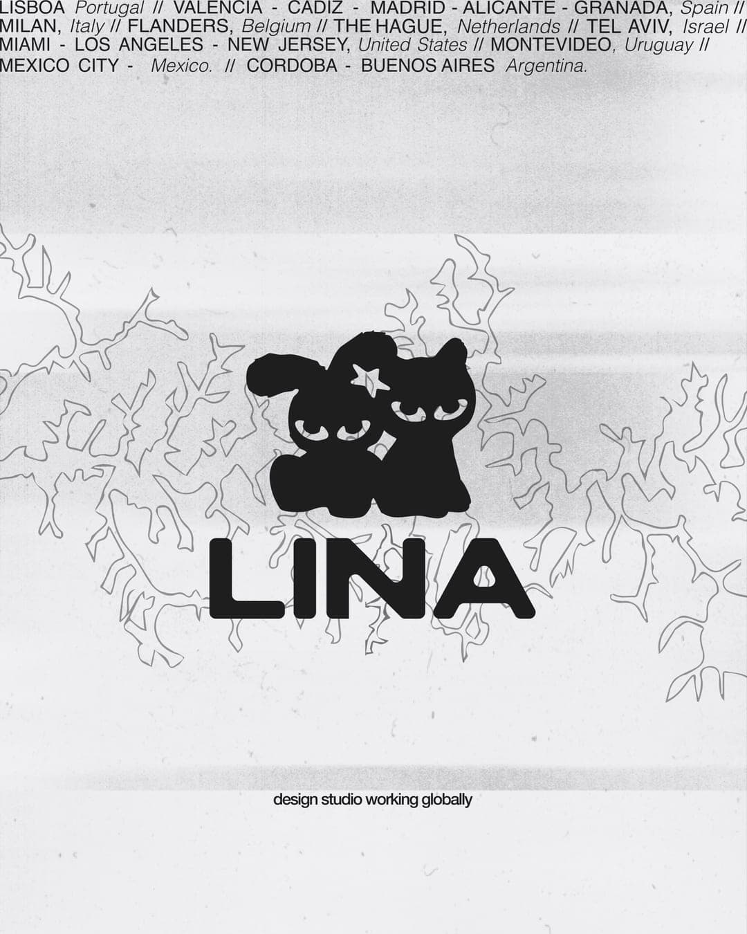
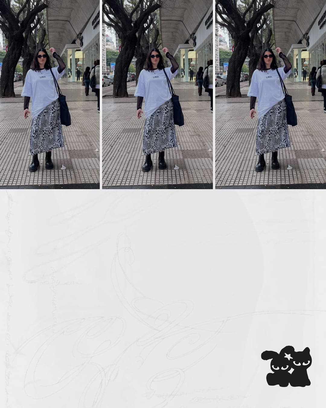
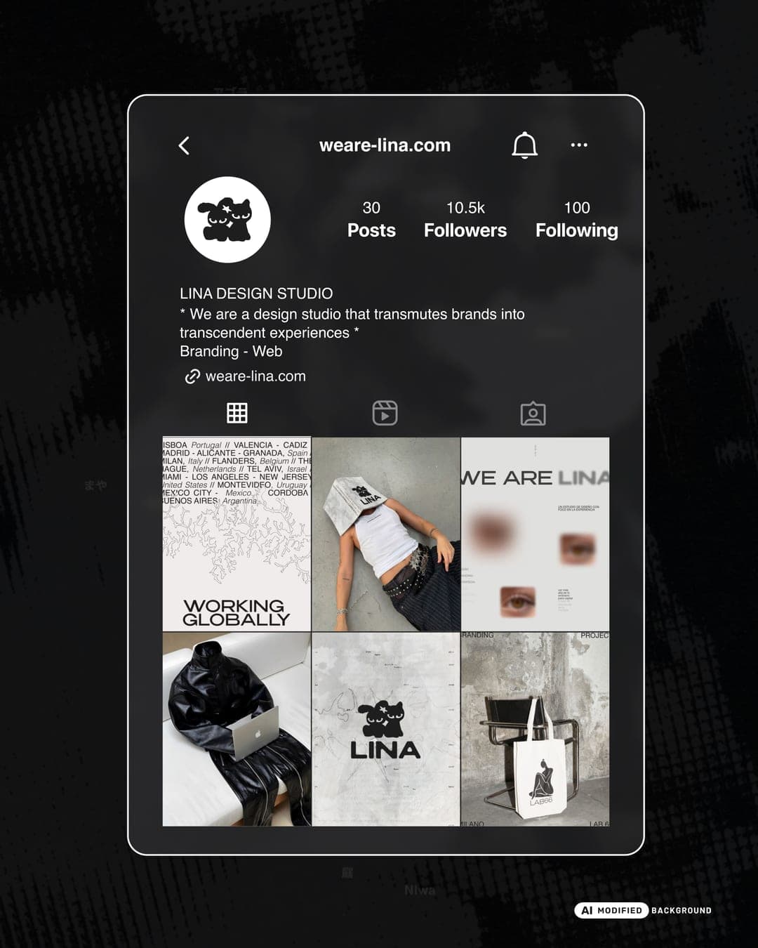
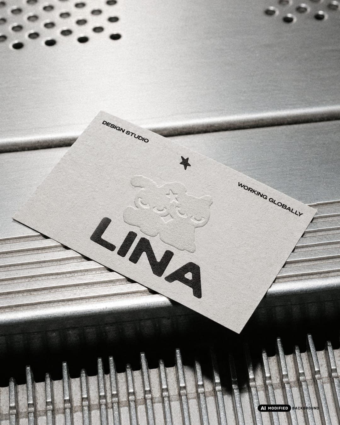
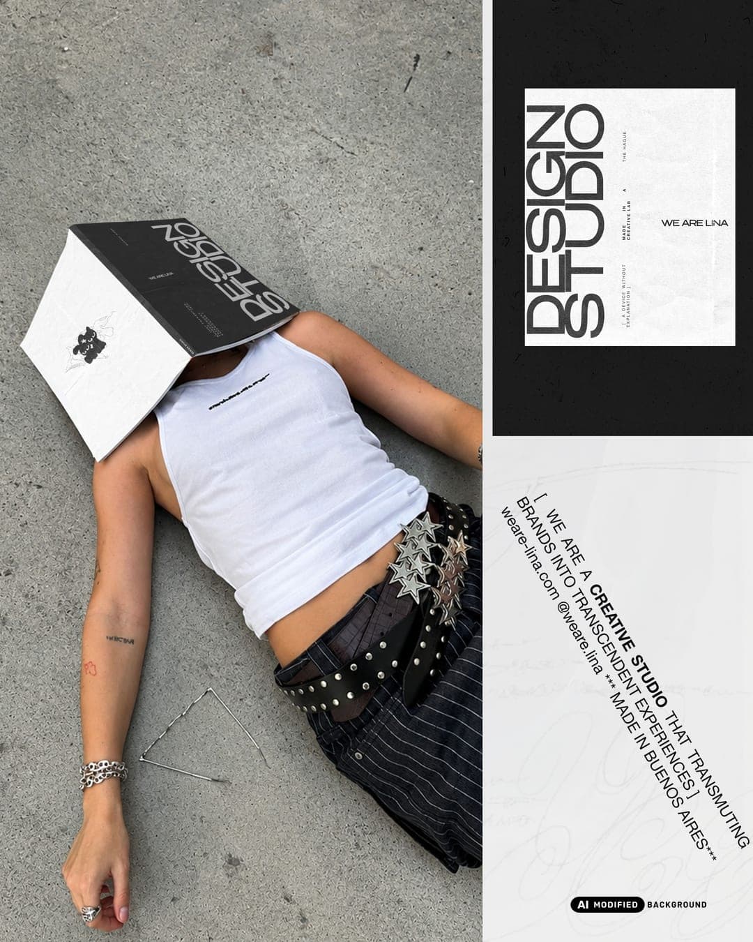
LINA Studio: Rebrand LINA is a design studio born in Buenos Aires in 2021 and working globally, with offices in Buenos Aires and Valencia. After four years and more than 200 brands across 30+ countries, the studio had outgrown its own identity. The rebrand was our chance to do for ourselves what we do for our clients: transmute a brand into a transcendent experience. The new identity sits at the exact midpoint between a cool studio and a boutique one. It is built around a hand-drawn line isotype with characters whose gaze gives the brand a human, living presence, paired with a typographic "LINA STUDIO" logo for quieter applications. Supporting texts are always set in uppercase Helvetica Neue, which keeps the system precise and lets the illustration carry the personality. The result is a premium, flexible system that moves naturally from static to motion, where the line draws itself and the details of the logo become the protagonists.
Color Palette
This brand uses a color palette of 3 colors
Click a color to find brands with similar colors.
Tags
Live score
Scores stay hidden while voting is open, so early votes can't anchor the ones that follow. Check back once the countdown ends.
Votes (0)
No votes yet — be the first.