Food & Beverage · by Lina Yousry
LUKKA - BRANDING
 Lina YousryPRO
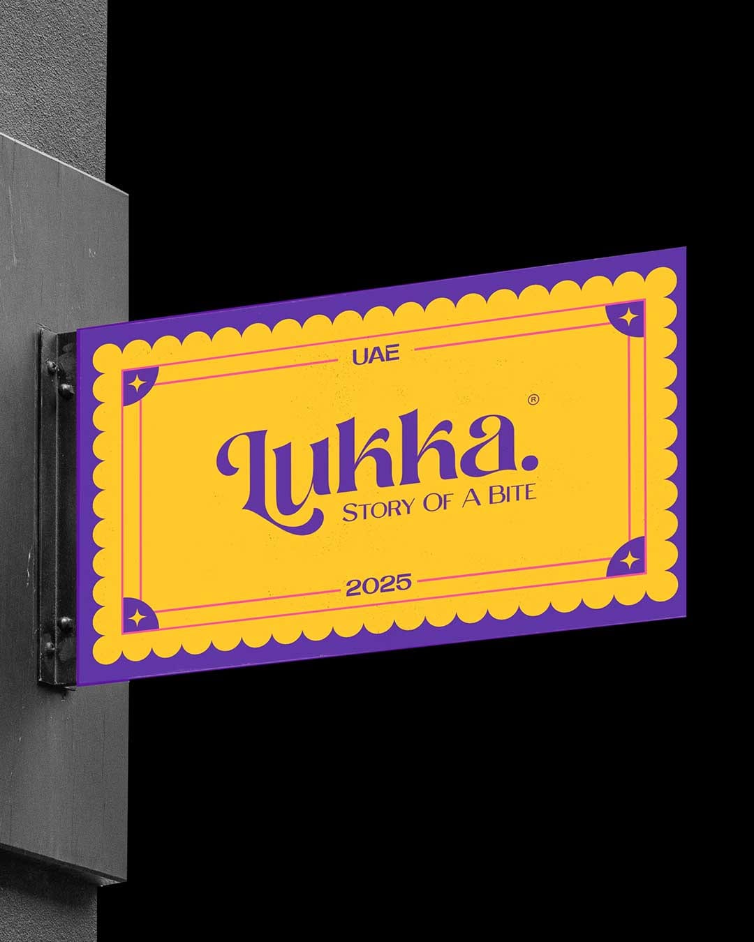
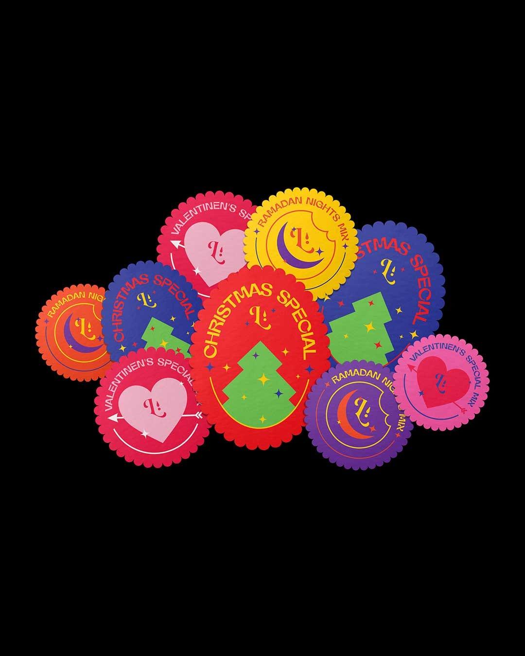
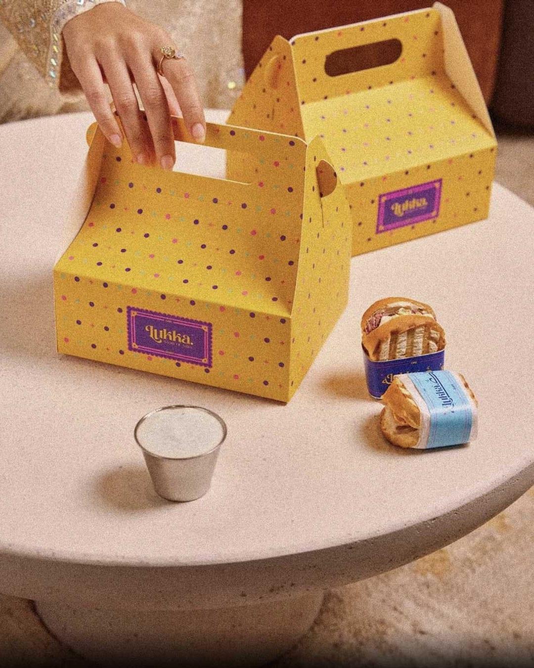
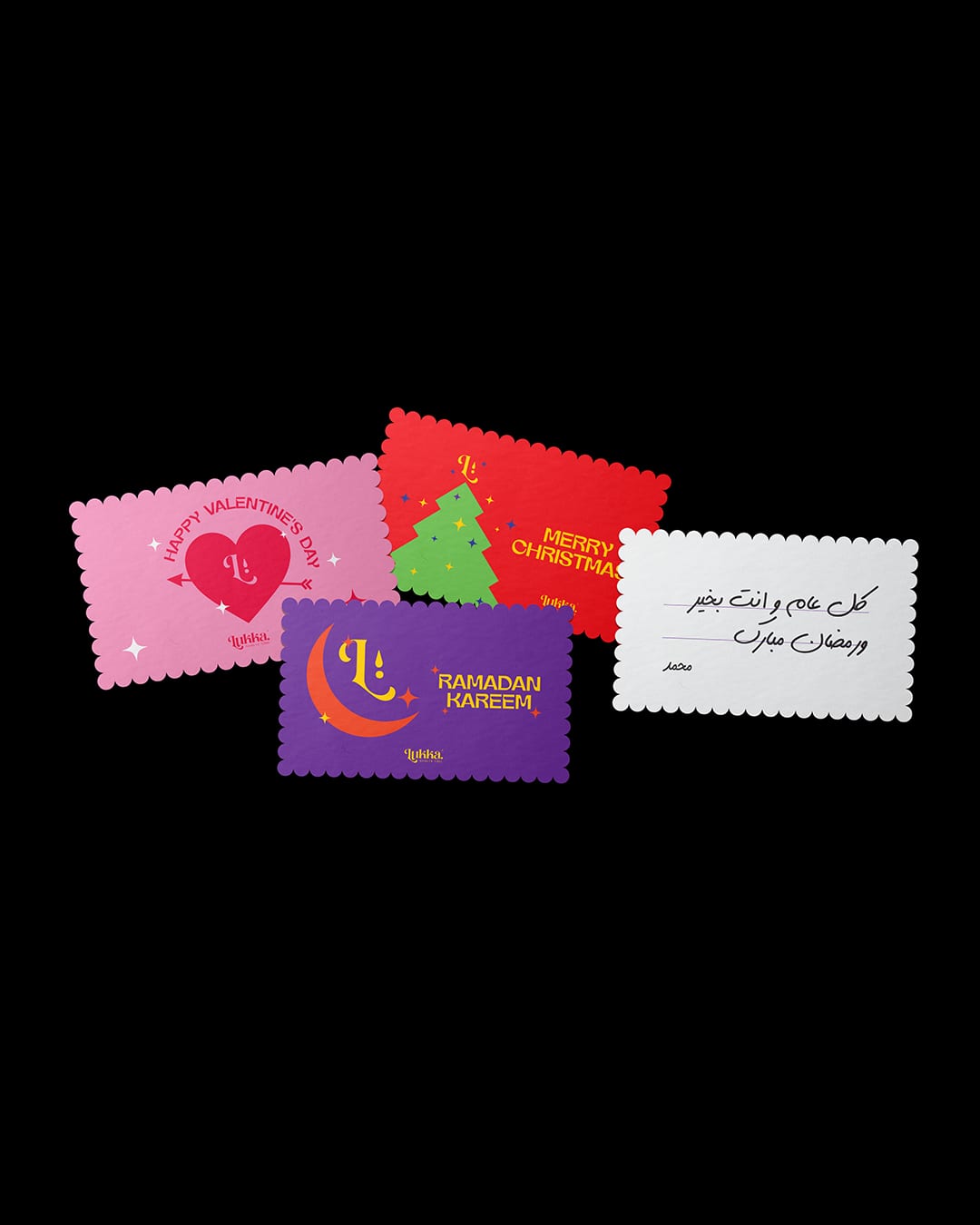
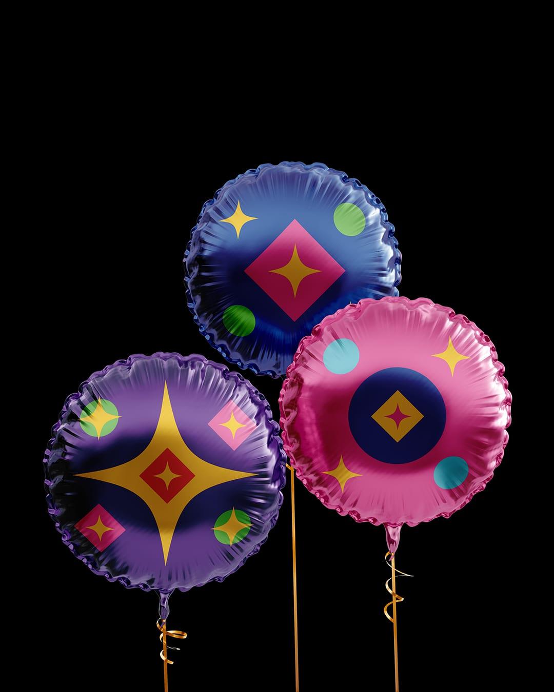
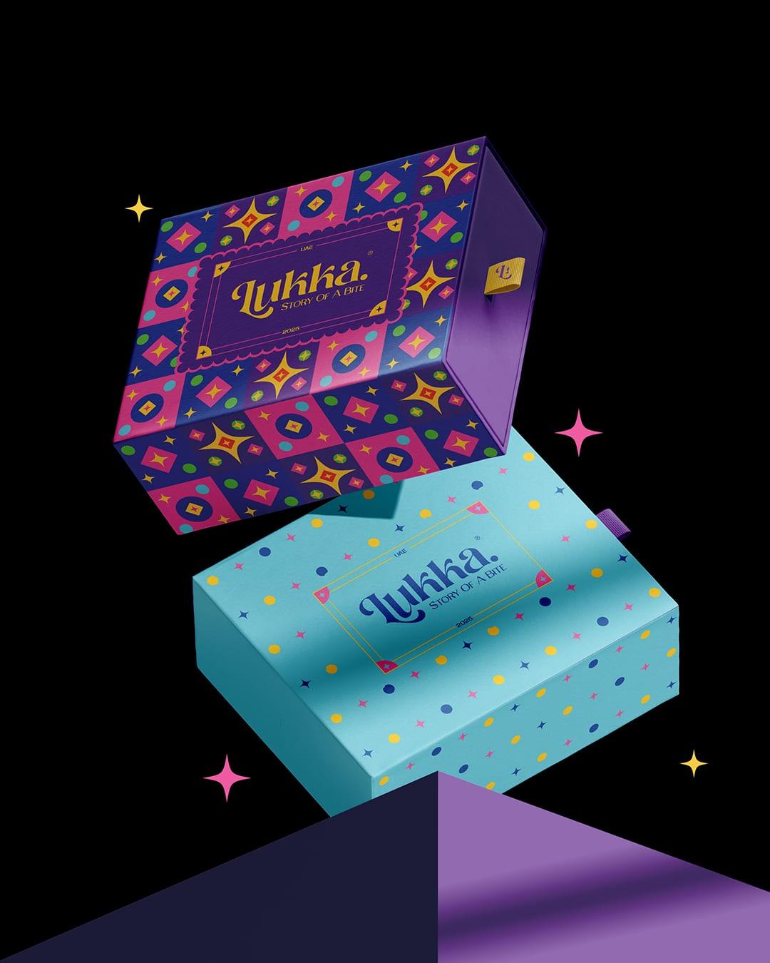
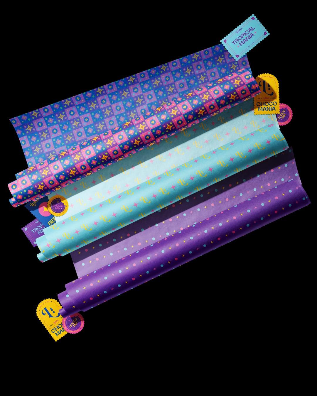
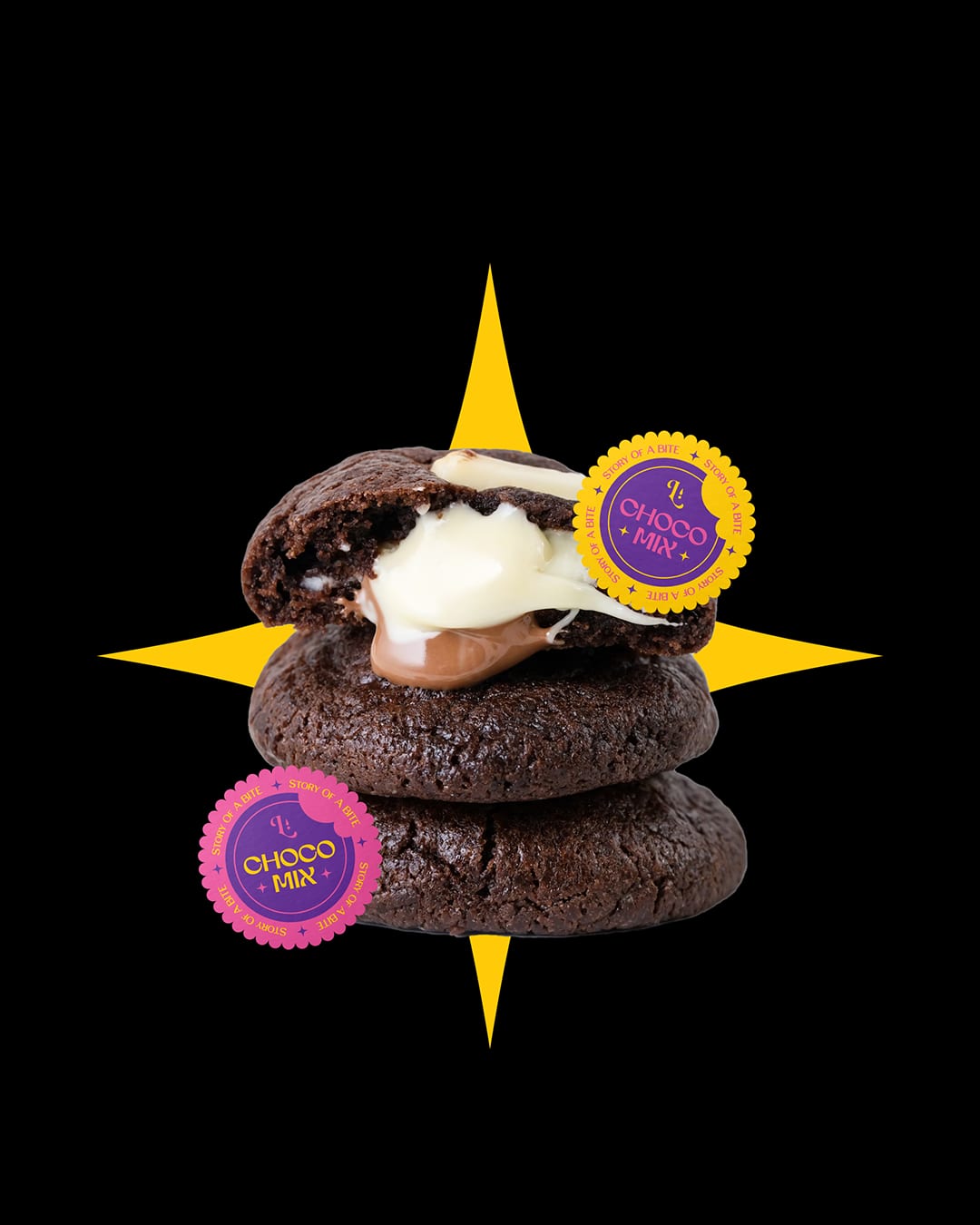
LUKKA - Story Of A Bite The entire branding concept — starting from the name — is inspired by small things that carry great value. A short, friendly name that’s easy on the tongue but strong in value and identity. Much like postage stamps: tiny in size, yet rich in meaning, used to represent places, countries, events, or even people. Fruit stickers also play a key role in the visual language. With their distinctive shapes and familiar charm, they are used to express the variety of flavors found within the products. Bold, joyful colors complete the mood of the brand, creating a sense of happiness, curiosity, and playfulness.

Color Palette
This brand uses a color palette of 3 colors
Click a color to find brands with similar colors.
Tags
Live score
Scores stay hidden while voting is open, so early votes can't anchor the ones that follow. Check back once the countdown ends.
Votes (0)
No votes yet — be the first.