Entertainment & Media · by Sarah
Matiz

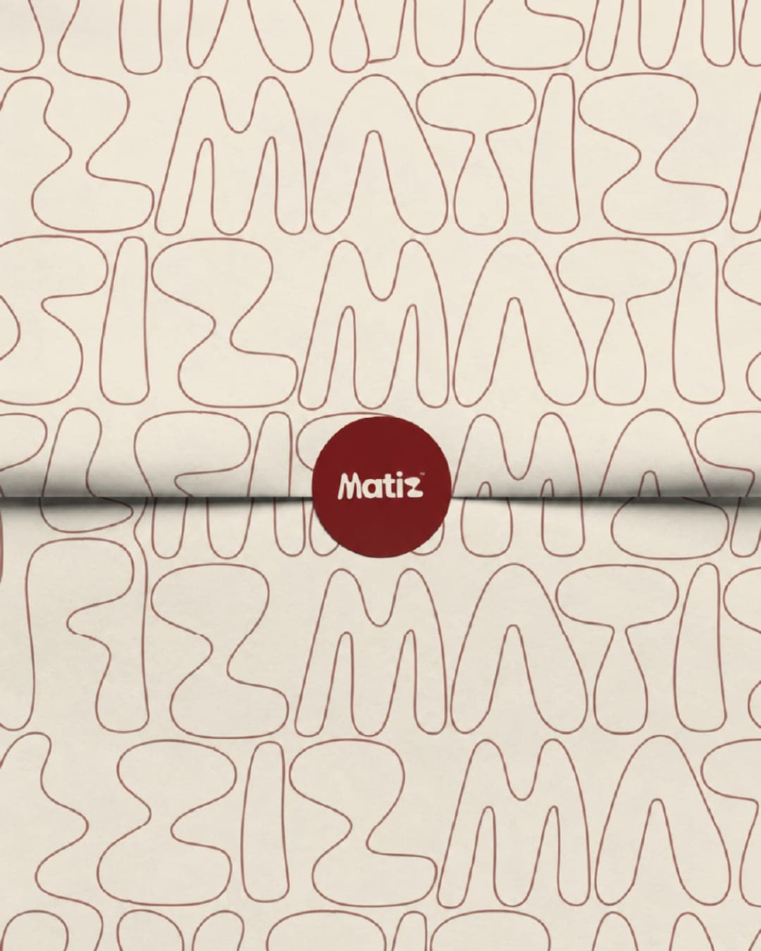
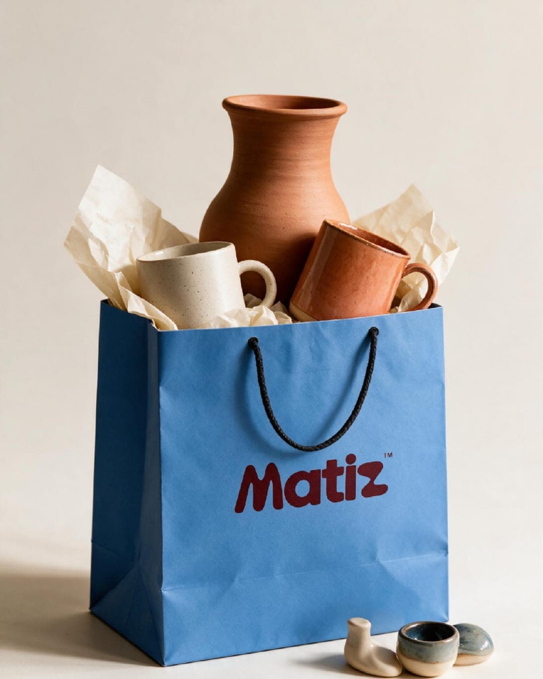
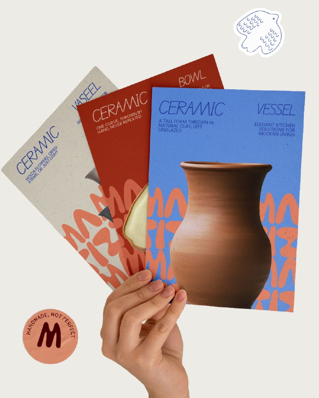
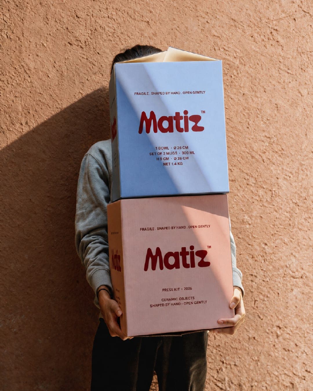
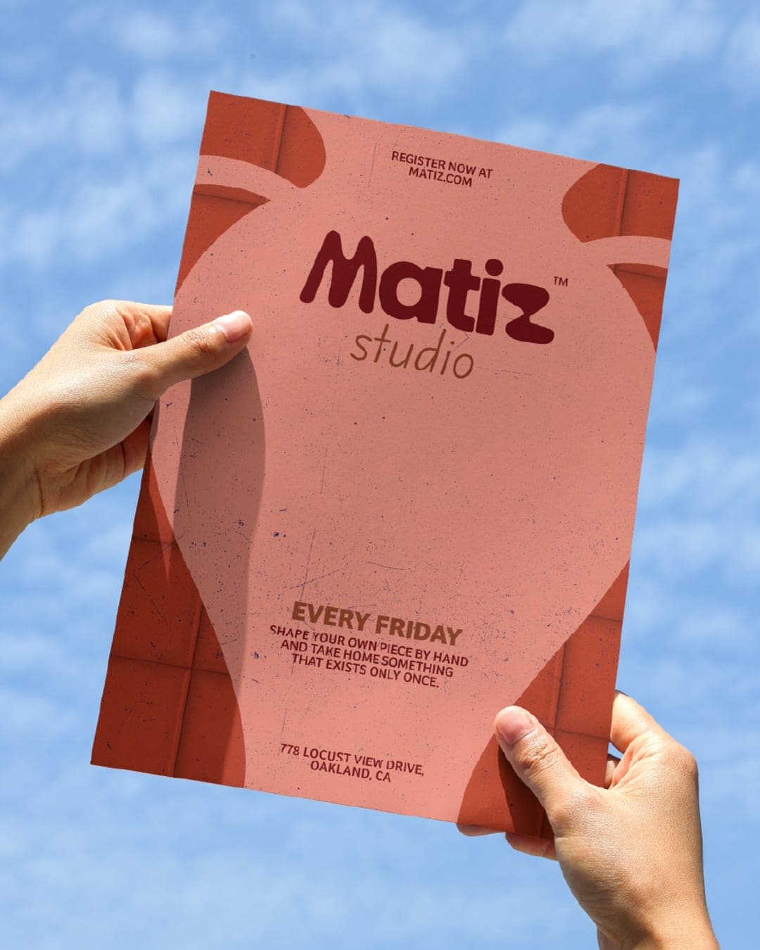
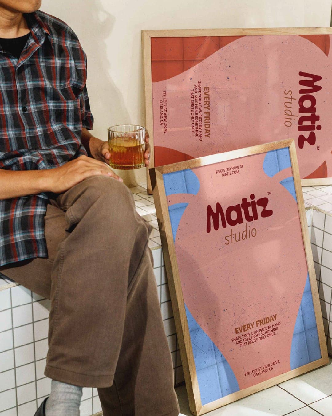
Matiz creates handmade ceramics shaped from raw clay and finished with natural pigment, keeping every texture and imperfection the hand leaves behind. The MATIZ logotype behaves like clay soft, pressed, never quite symmetrical. Each letterform is a hand-cut shape rather than a typeface, so no two curves in the word match. The mark carries the same logic as the objects it sits on. Innocent in the shapes soft forms, drawn icons, quiet type. Creator in the colour, and in the choice to build the mark from shapes instead of letters. · Behaves like clay — soft, pressed, never quite symmetrical · Hand-cut shapes, not a typeface · No two curves match · Same logic as the objects it sits on
Color Palette
This brand uses a color palette of 3 colors
Click a color to find brands with similar colors.
Tags
Live score
Scores stay hidden while voting is open, so early votes can't anchor the ones that follow. Check back once the countdown ends.
Votes (0)
No votes yet — be the first.