Voting closed
Link copied
Food & Beverage · by jamila-ahmadova
Oaten
 jamila-ahmadova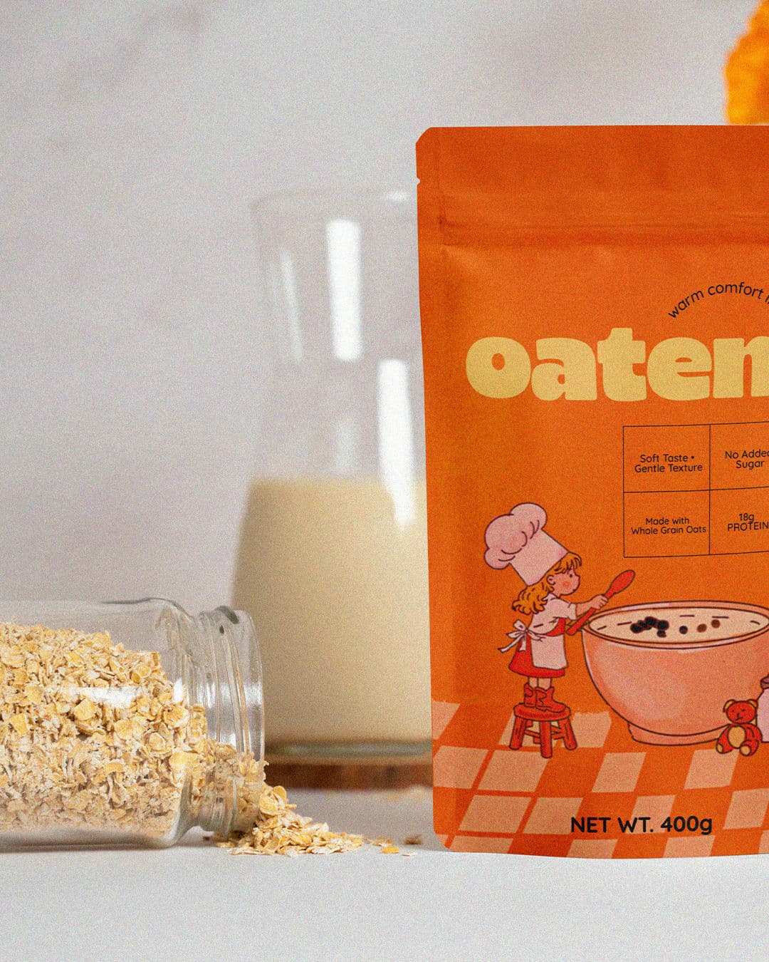
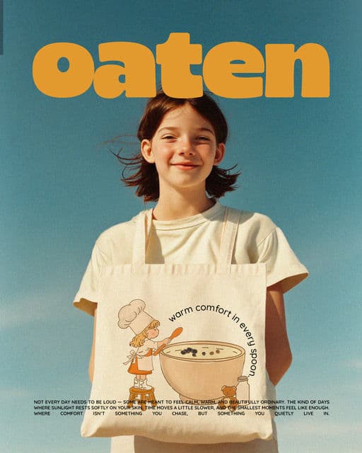
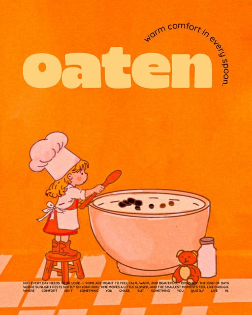
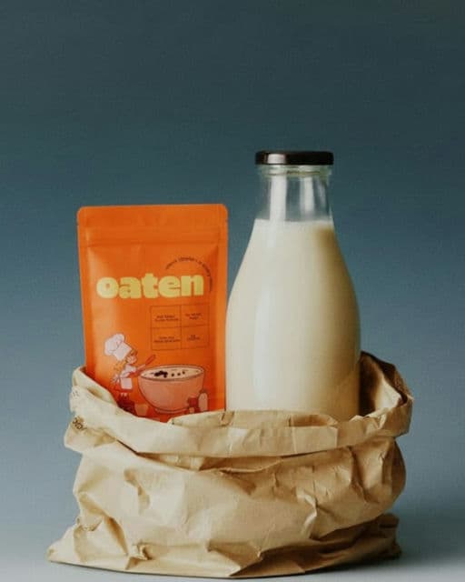
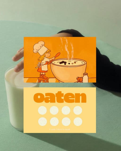
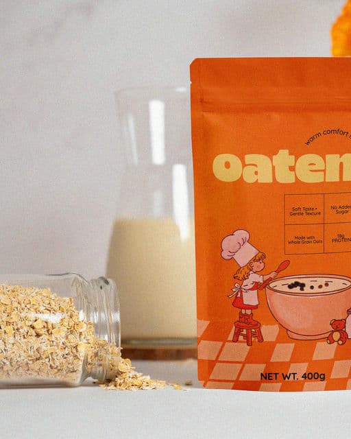
This packaging is designed to feel like a quiet morning wrapped in warmth. The rich orange tones and soft illustration evoke comfort, memory, and the gentle rhythm of home. The small girl beside the oversized bowl becomes a symbol of care, simplicity, and the joy found in everyday rituals. Clean, minimal information allows the emotion to breathe without distraction. Altogether, it doesn’t just present a product — it tells a story of warmth in every spoonful.

Color Palette
Tags
Voting is closed for this nominee.