Food & Beverage · by Borja Menez
ORTIZ
 Borja Menez
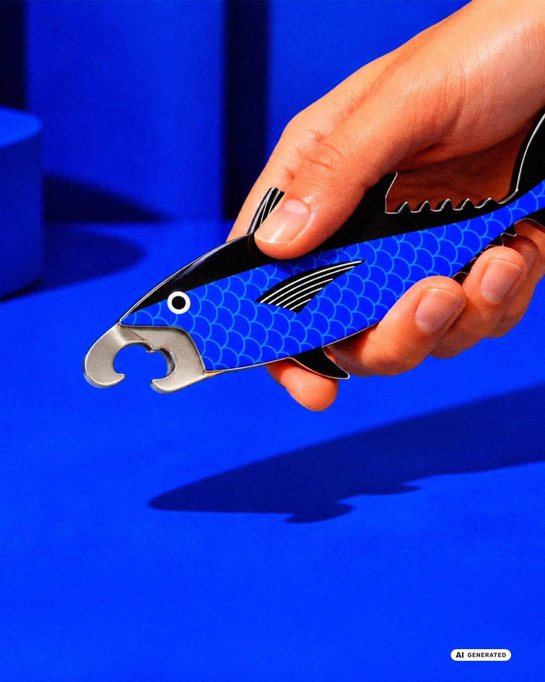
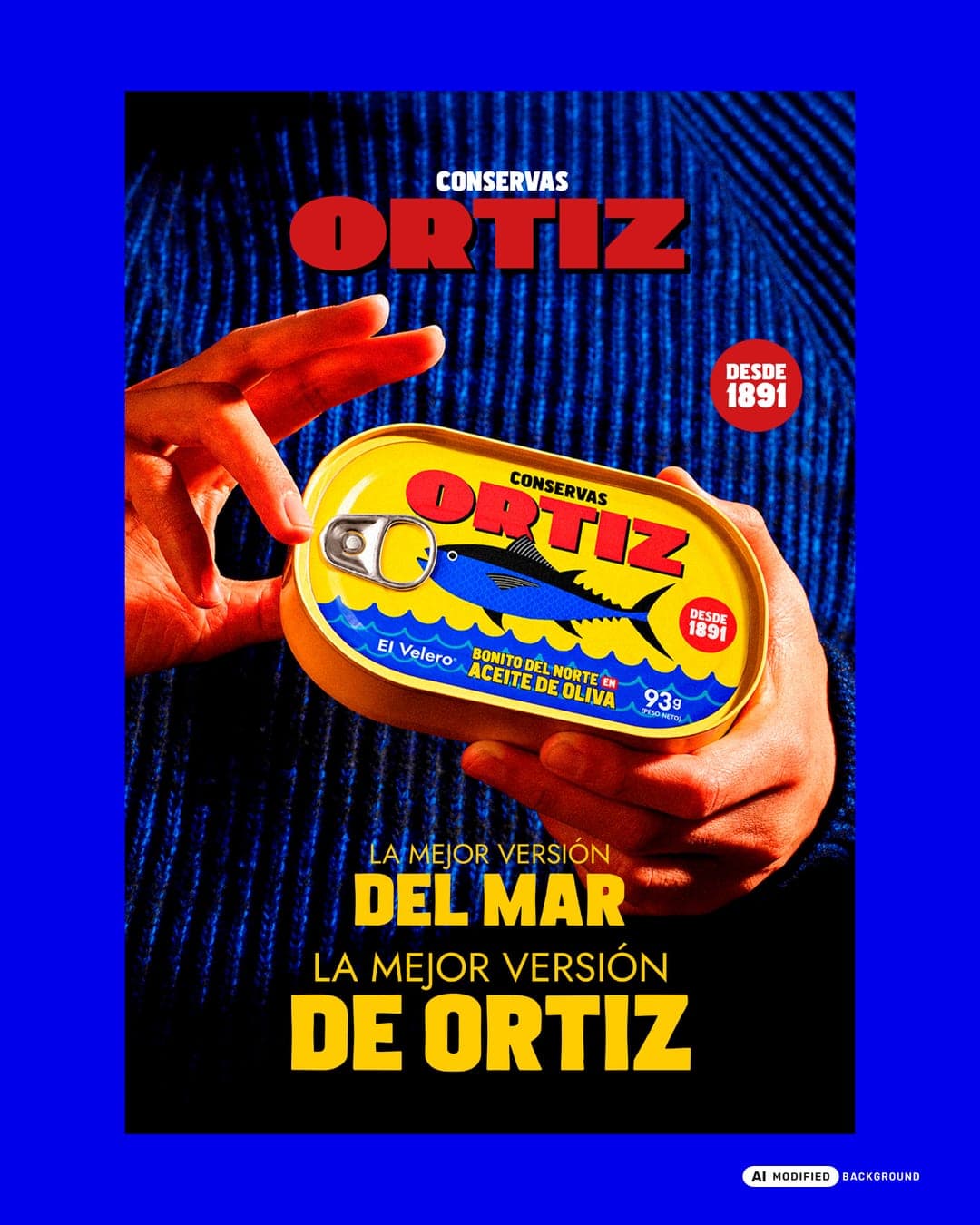
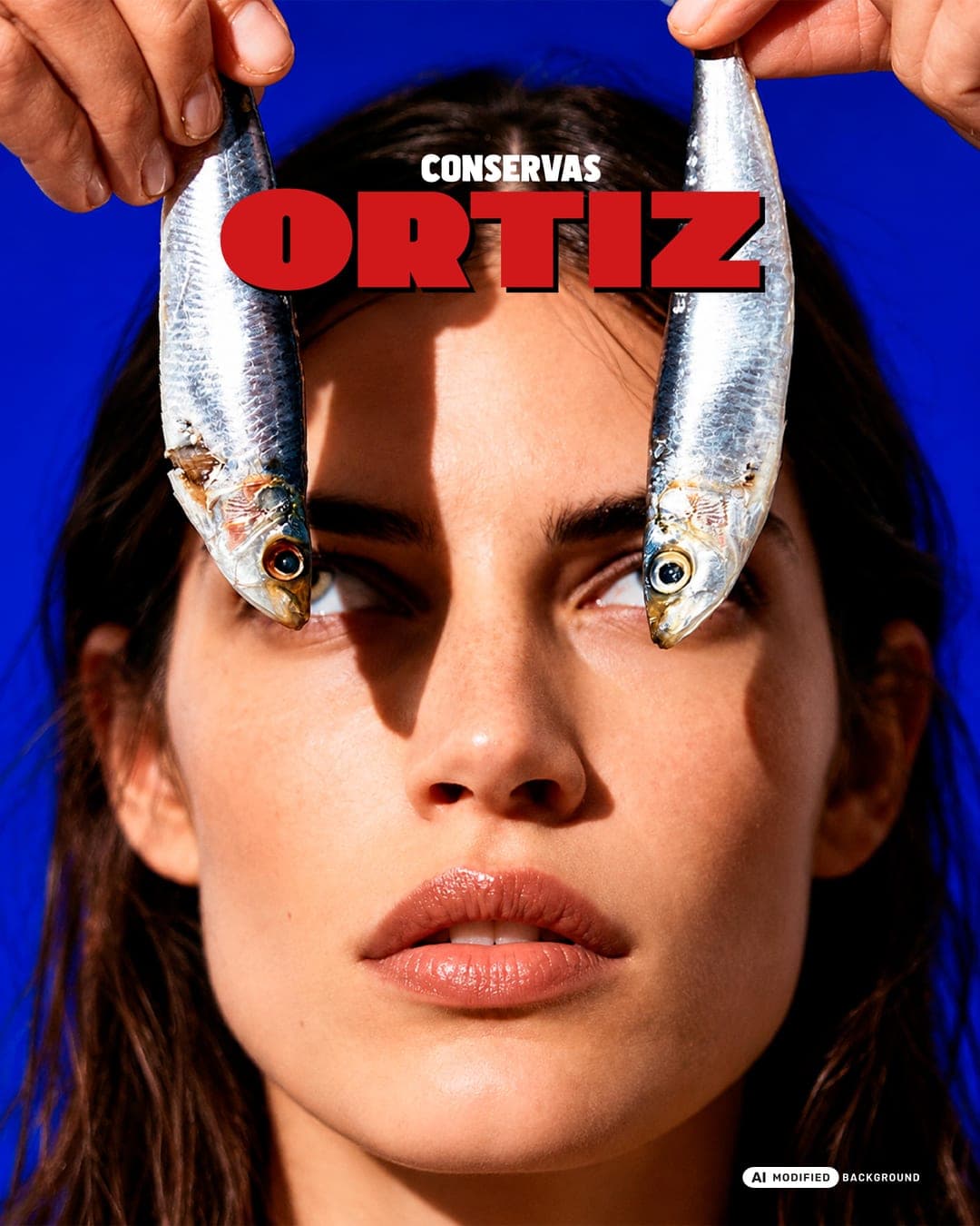
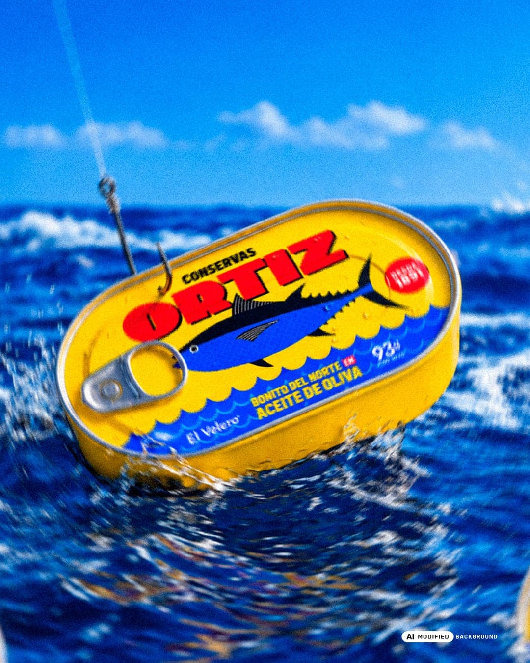
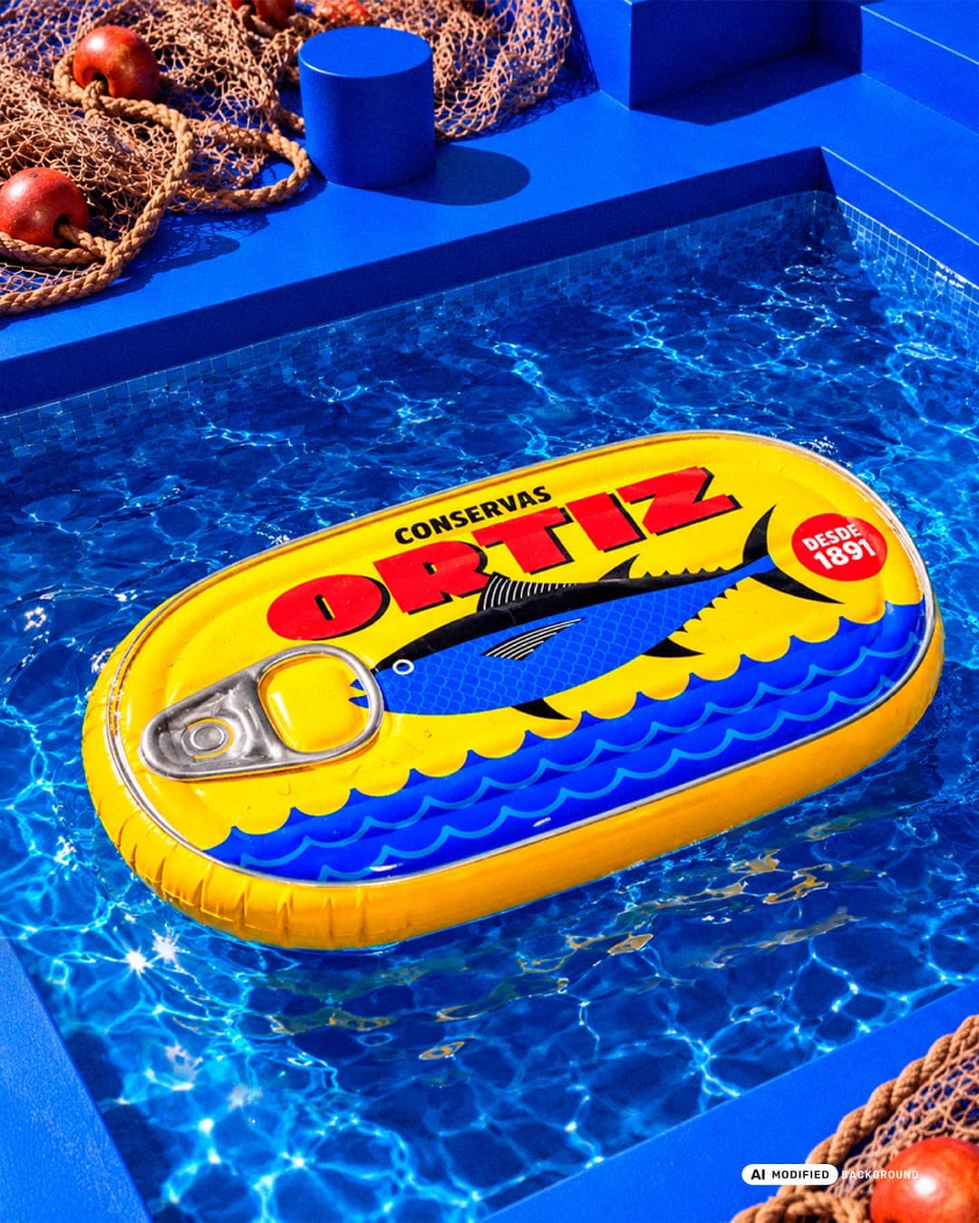
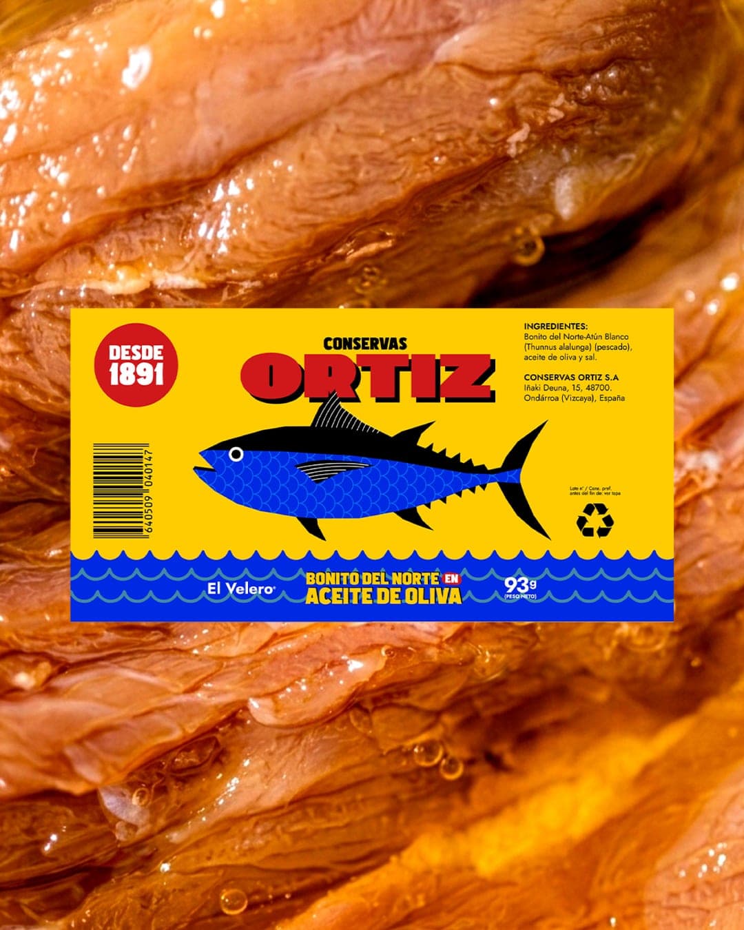
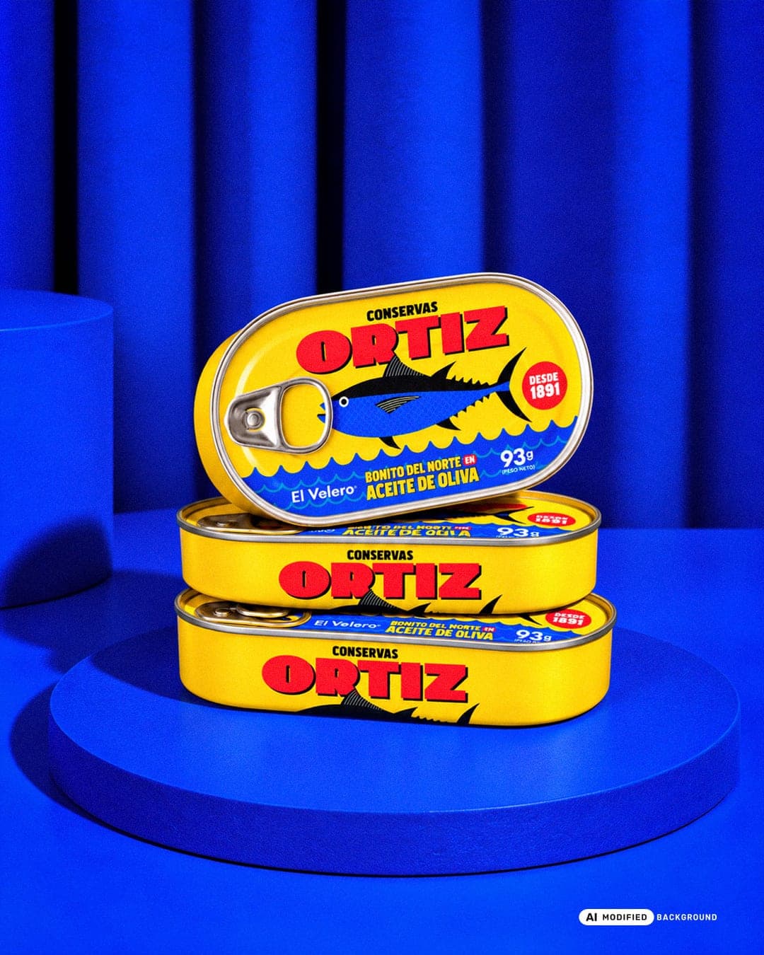
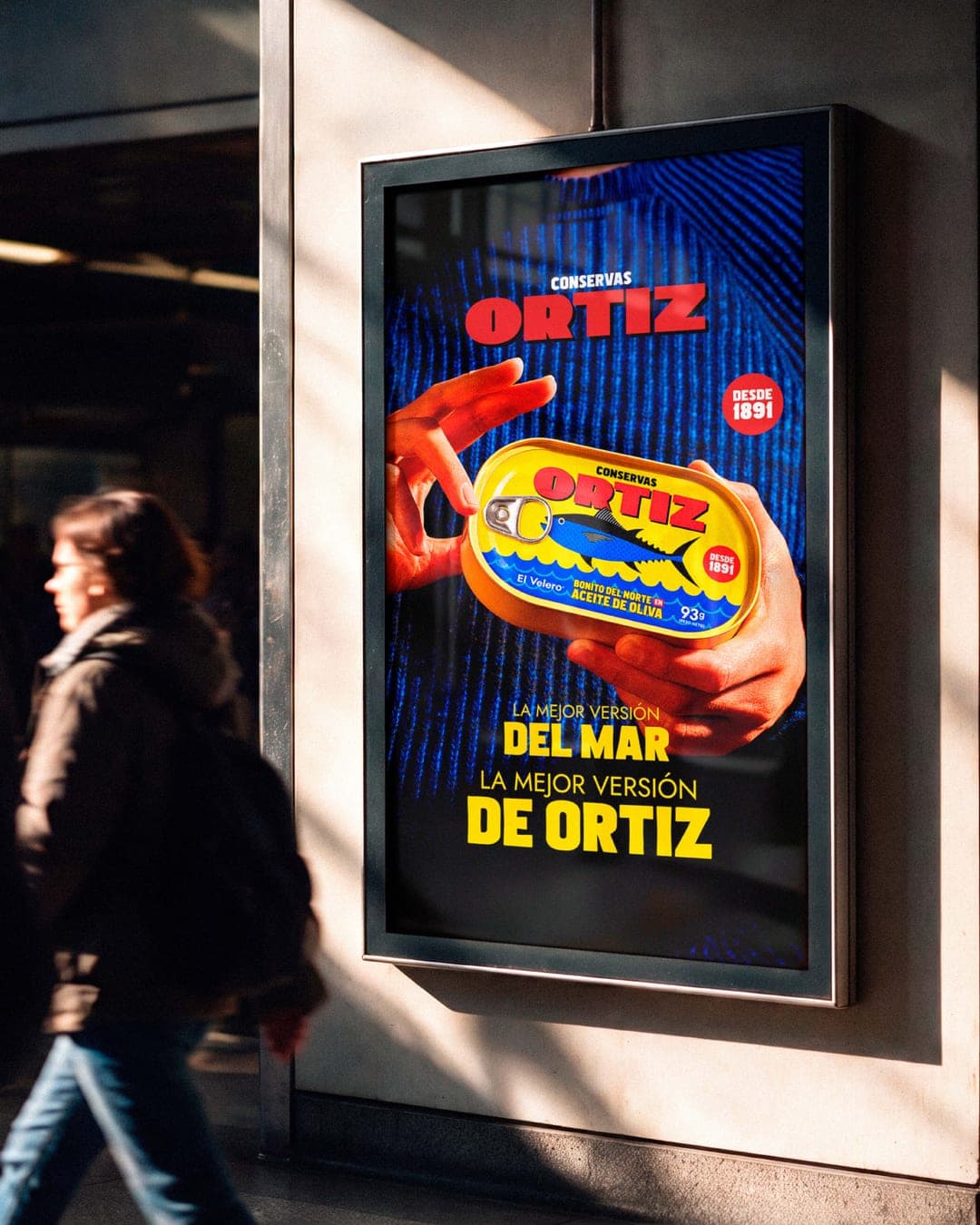
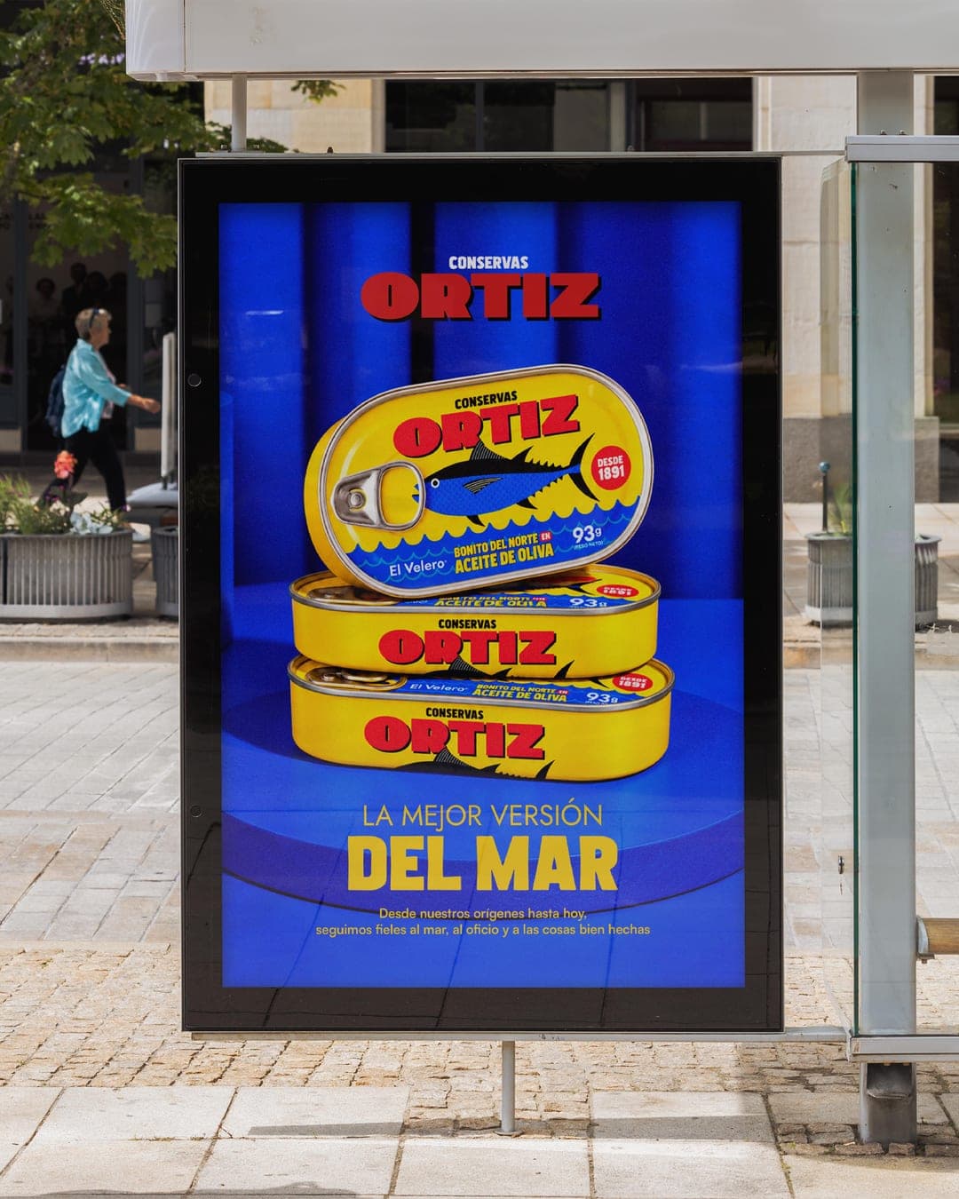
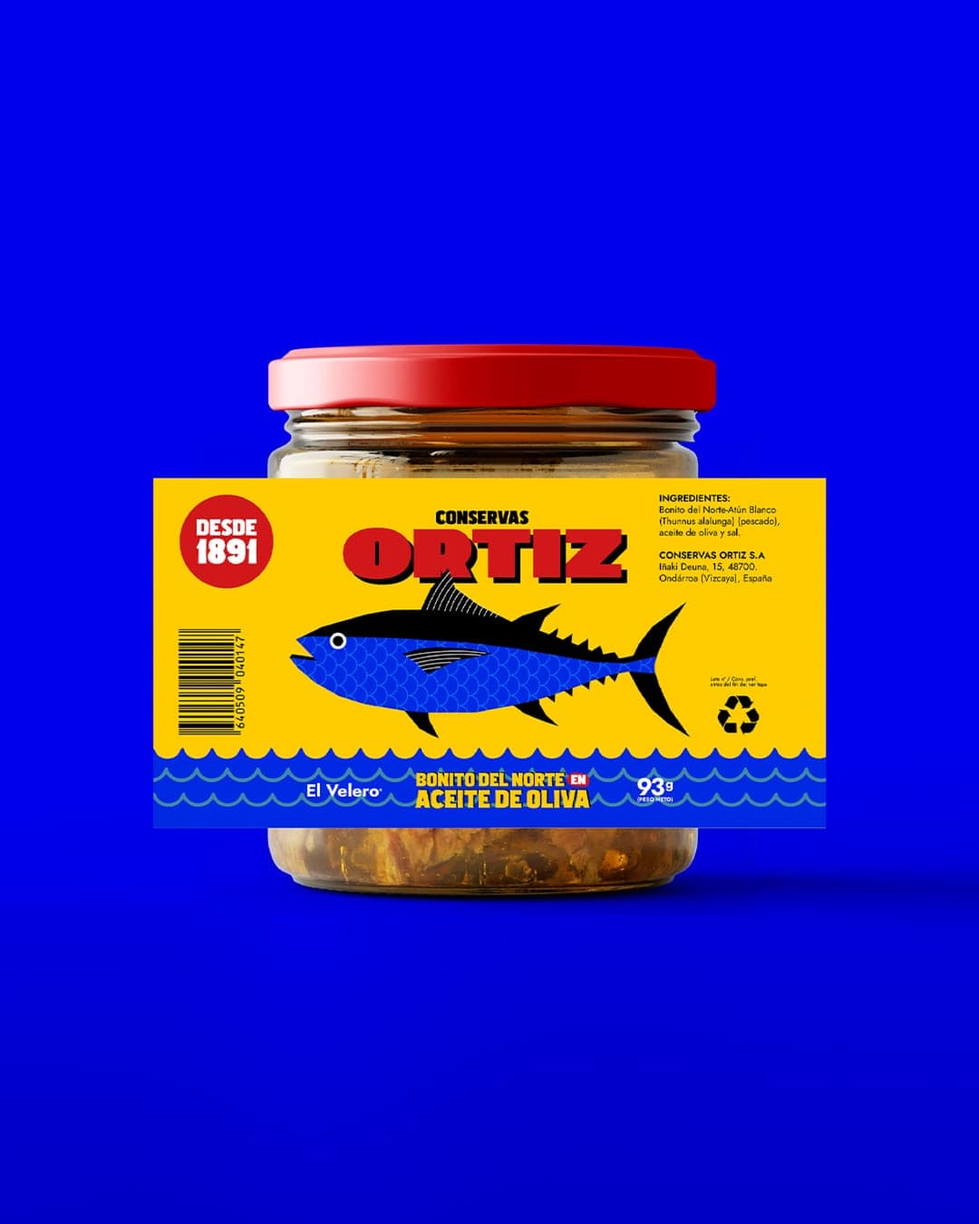
Ortiz is a Spanish preserve brand rooted in the sea, with a history that goes back to 1891. This project reimagines its visual identity through a bold, contemporary art direction that brings together vibrant colours, striking fish illustrations, and a distinctive graphic language inspired by the world of fishing and the character of traditional canned goods. More than just a packaging redesign, it's about bringing a familiar brand into a new visual territory. From the iconic yellow tins to unexpected objects and playful campaign imagery, every application celebrates Ortiz's heritage while giving it a fresh, confident personality. Because some things don't need to change. They just need to be seen differently.
Color Palette
This brand uses a color palette of 3 colors
Click a color to find brands with similar colors.
Tags
Live score
Scores stay hidden while voting is open, so early votes can't anchor the ones that follow. Check back once the countdown ends.
Votes (2)
| Voter | Design | Strategy | Originality | Story | Overall | |
|---|---|---|---|---|---|---|
| F | Fuse Collective from Lodz, Poland www.fusecollective.com | 5 | 5 | 1 | 7 | 4.40 |