Food & Beverage · by brandingwithkamelia
Rocco's
 brandingwithkamelia
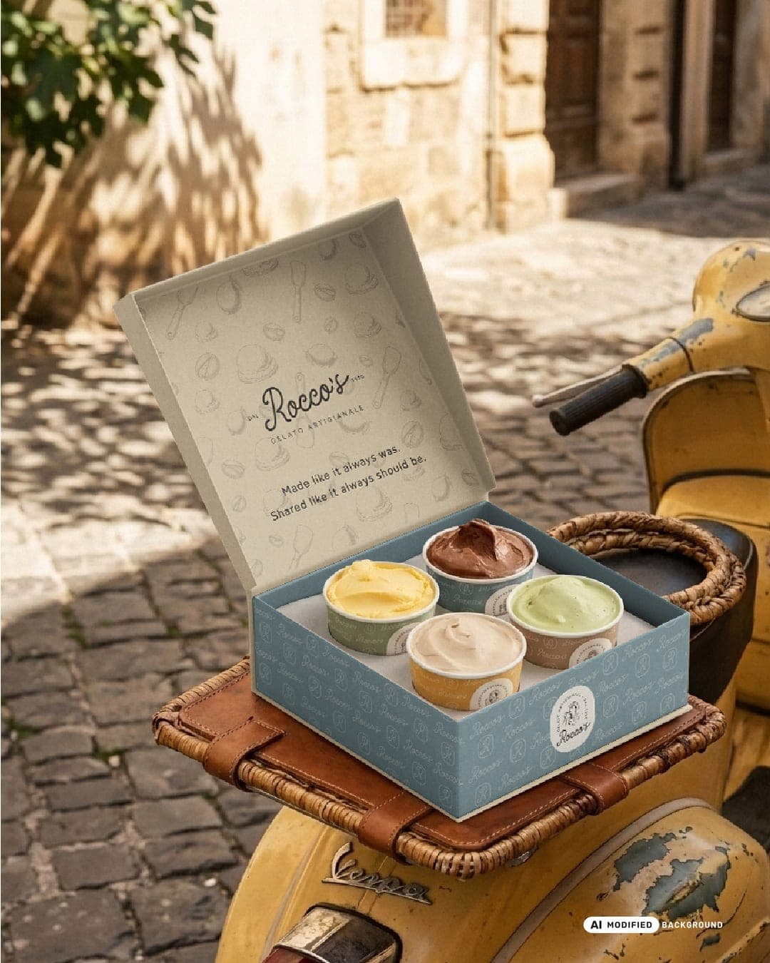
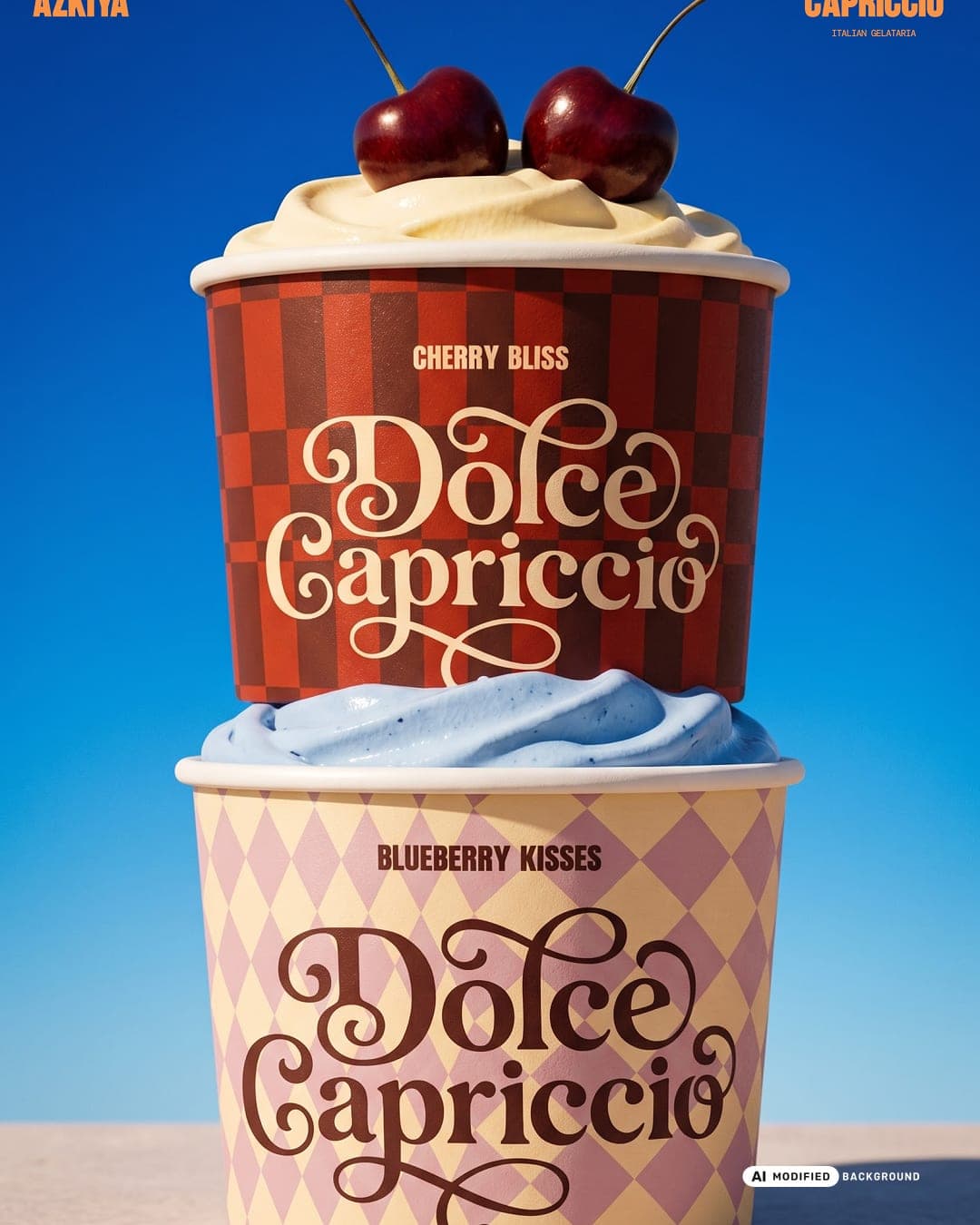
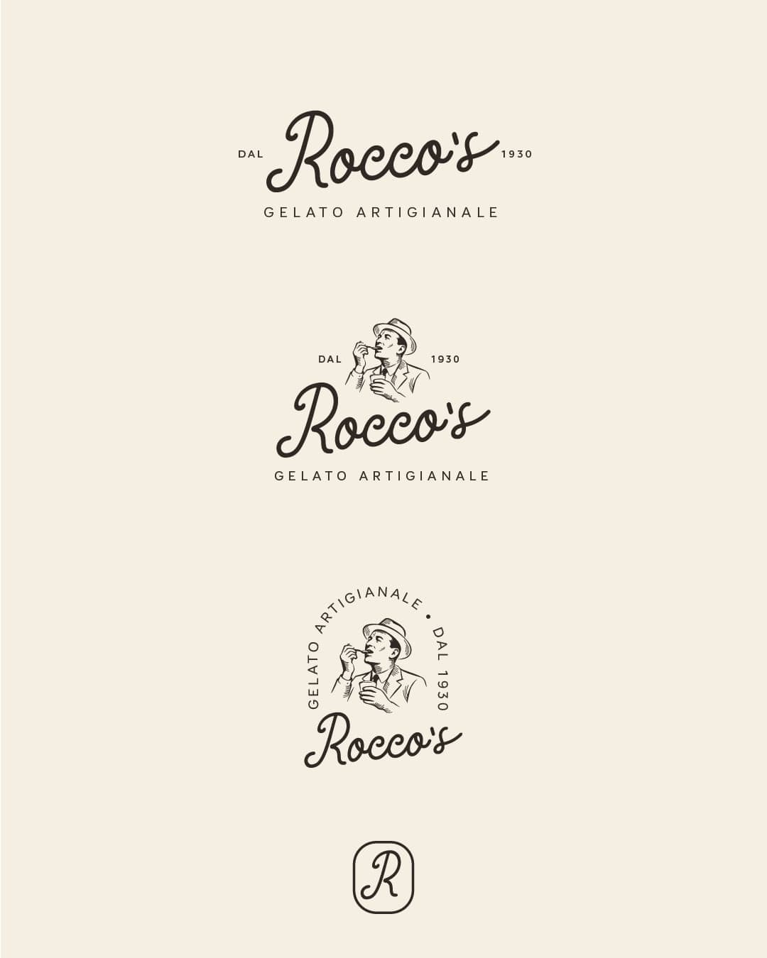
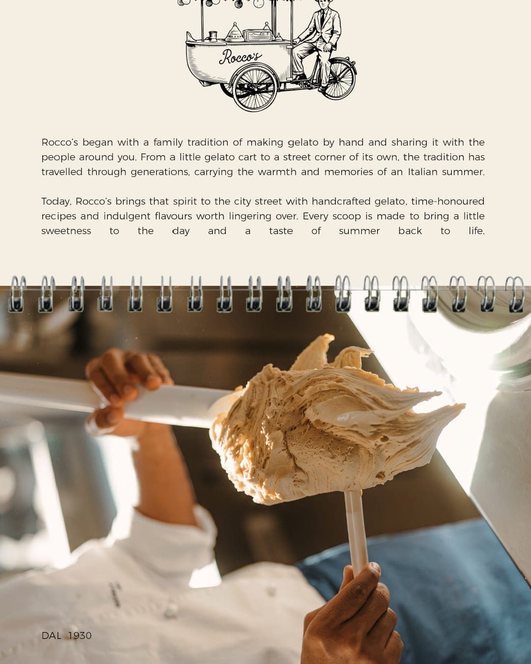
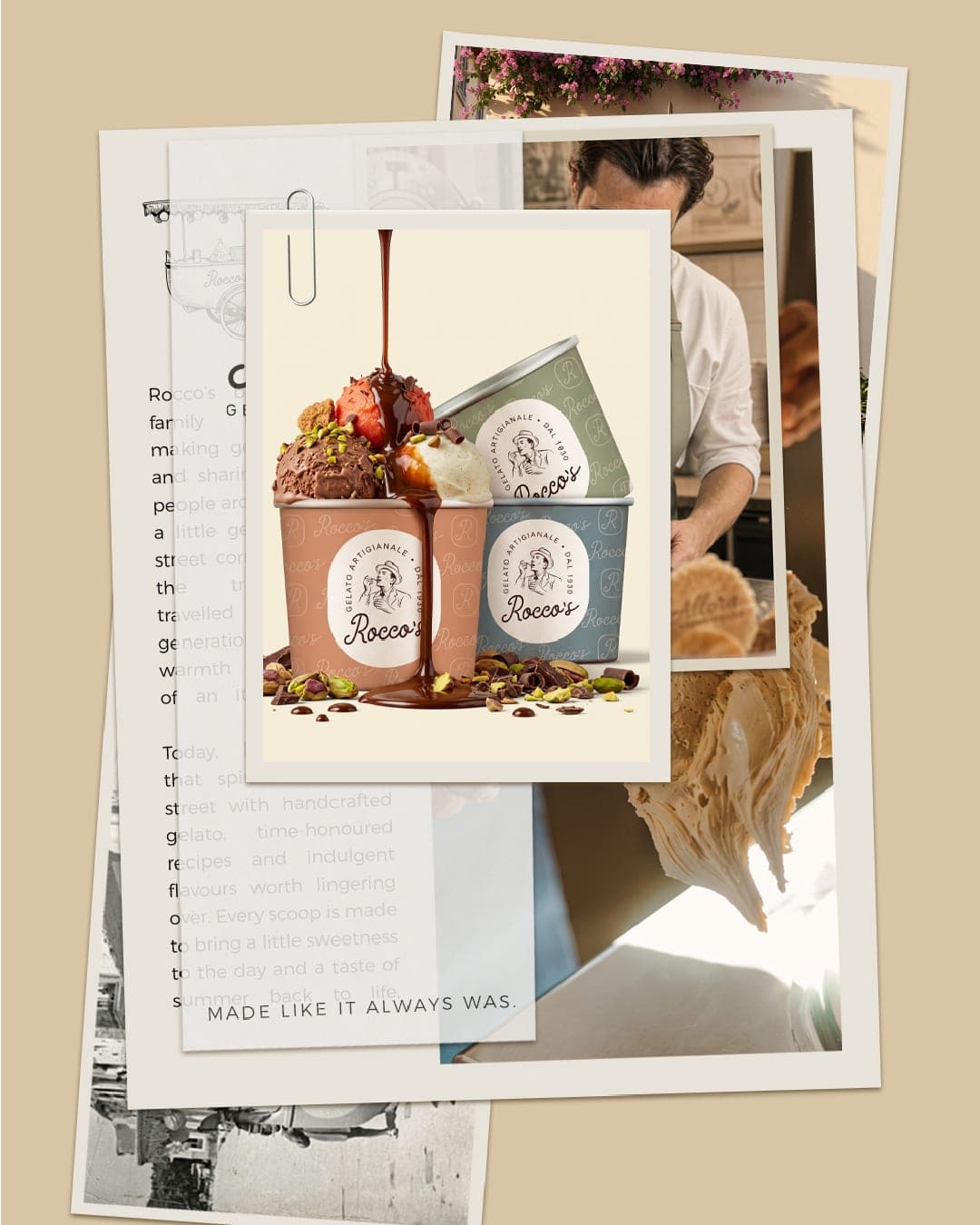
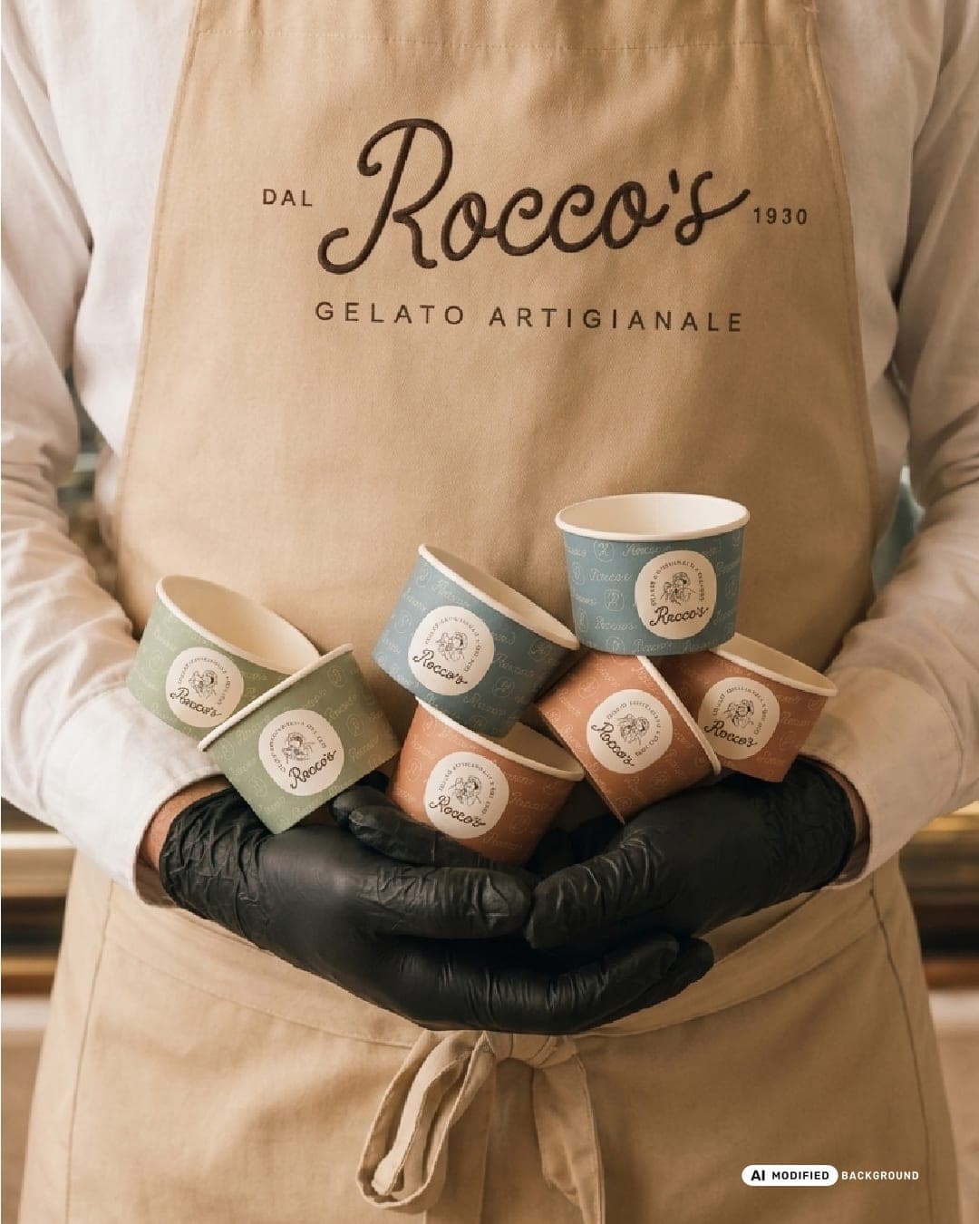
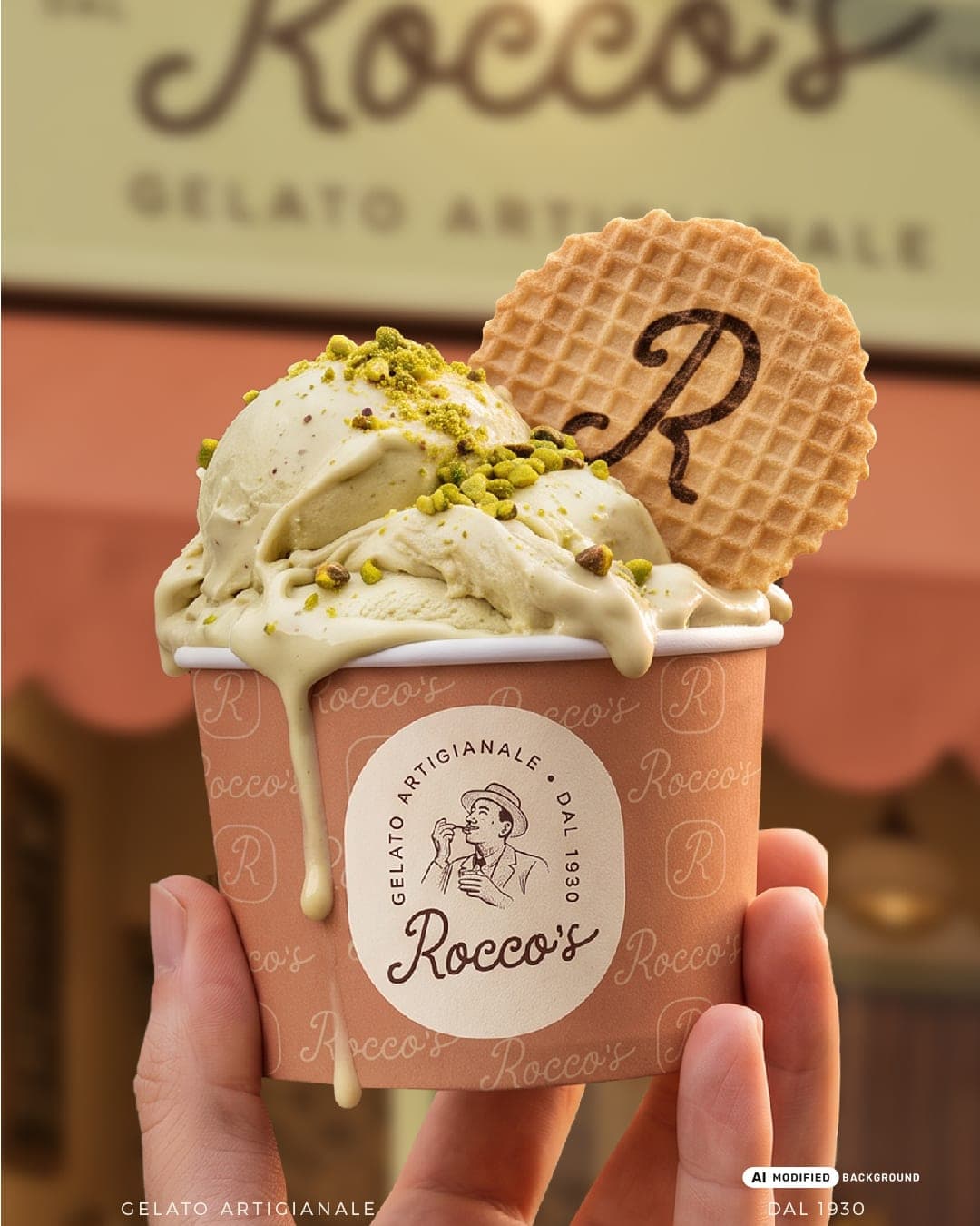
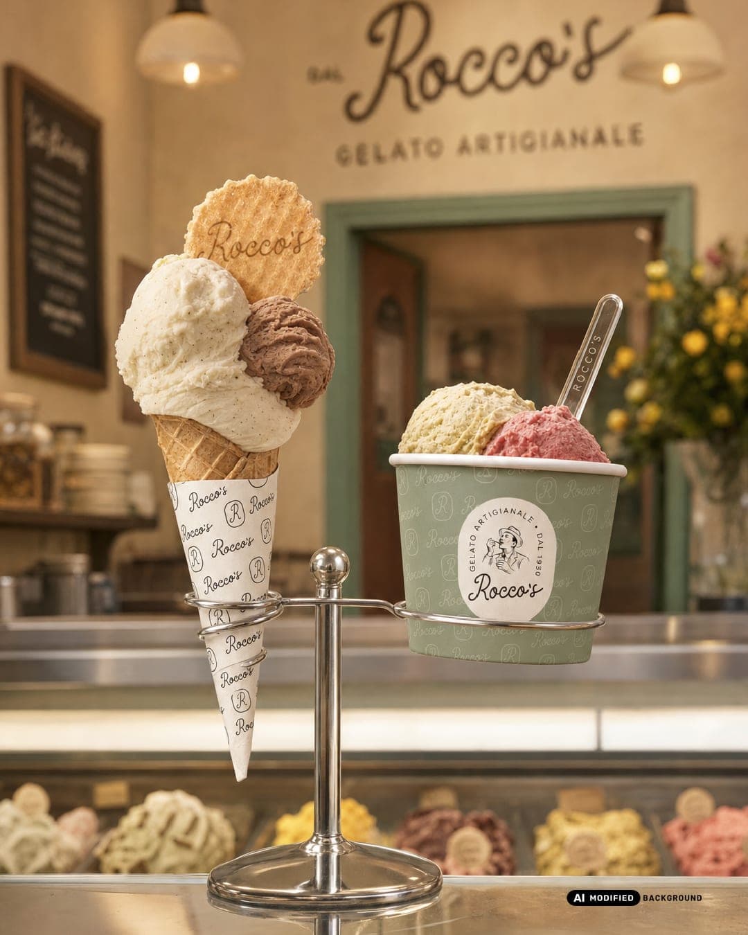
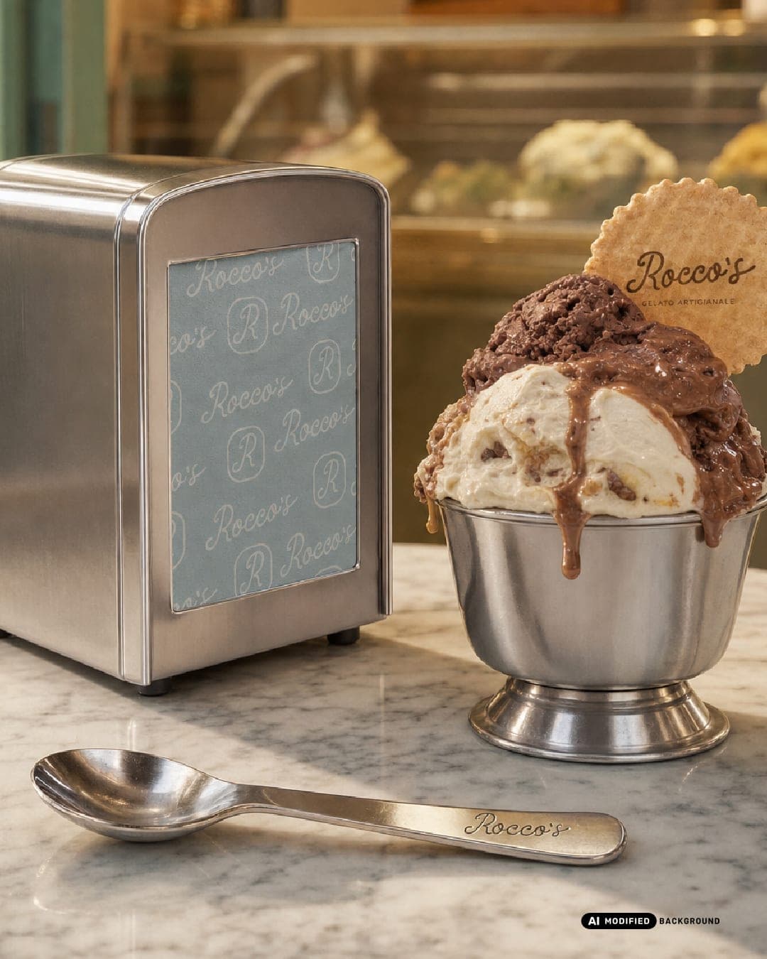
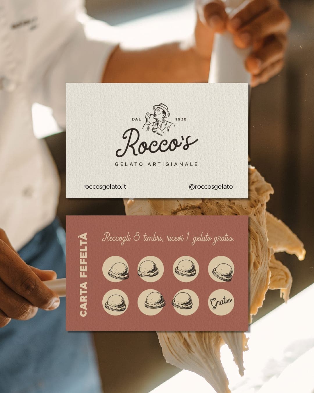
Rocco’s — Artisanal Gelateria Rocco’s brings the warmth and nostalgia of an Italian summer to the city street. Rooted in a family tradition of handcrafted gelato, the identity draws inspiration from old-world gelaterias, handwritten recipes and the simple pleasures of a summer spent in Italy. A characterful wordmark and illustrated portrait of Rocco anchor the visual identity, while a muted, flavour-inspired palette, recipe-led patterns and considered typography bring the story to life. From gelato cups and cone wraps to gift packaging, menus, loyalty cards and storefront signage, every touchpoint balances heritage with a contemporary sensibility. A brand built around timeless recipes, indulgent flavours and the memories made one scoop at a time.

Color Palette
This brand uses a color palette of 3 colors
Click a color to find brands with similar colors.
Tags
Live score
Scores stay hidden while voting is open, so early votes can't anchor the ones that follow. Check back once the countdown ends.
Votes (1)
| Voter | Design | Strategy | Originality | Story | Overall | |
|---|---|---|---|---|---|---|
 | Husain Studio from India linktr.ee/husain53?utm_source=linktree_profile_share<sid=30f62d2b-6269-481a-a5f9-7218f1a4fbd8 | 10 | 10 | 10 | 10 | 10.00 |