Food & Beverage · by Abubakr Design
SNAP
 Abubakr DesignPRO
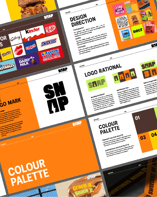
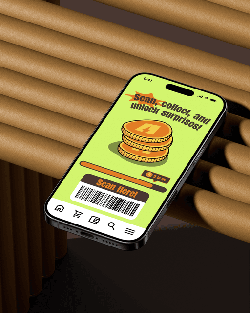
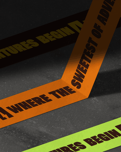
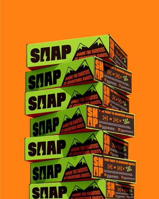
Snap is a new Swiss chocolate brand that offers delicious and playful chocolate treats for kids. Their goal is to create positive associations for chocolate with children, making it an adventure for the senses. They also want to build strong brand loyalty. For my design of the brand, I decided to create an identity tied around the word 'adventure' from the brief. I avoided using lots of chocolate brown colors and instead used more forest orange and green colors, linking towards the ideas of kids having fun adventures in the forest, kinda like when we used to go camping as kids. I created a logomark with a lightning shape formed in the logotype to symbolise the idea of 'creating a spark for adventure with chocolate. Finally, with areas such as the brand touchpoints, I not only focused on exploring consistency of the visual identity, but I also explored unique ways to build brand loyalty. Two ways I achieved this were through packaging and app design. For the packaging, I created a section that included a special offer for amusement parks like Chessington (like how Kellogg cereal boxes do it), as a fun way for kids to 'unlock their next adventure'. and finally for the app design, I create a playfully-styled rewards program where kids could scan every time they buy the product, and once they buy enough, they can win rewards such as free chocolate, special discounts and more!



Color Palette
Tags
Voting is closed for this nominee.