Food & Beverage · by Arpita
The Coffee Hatch
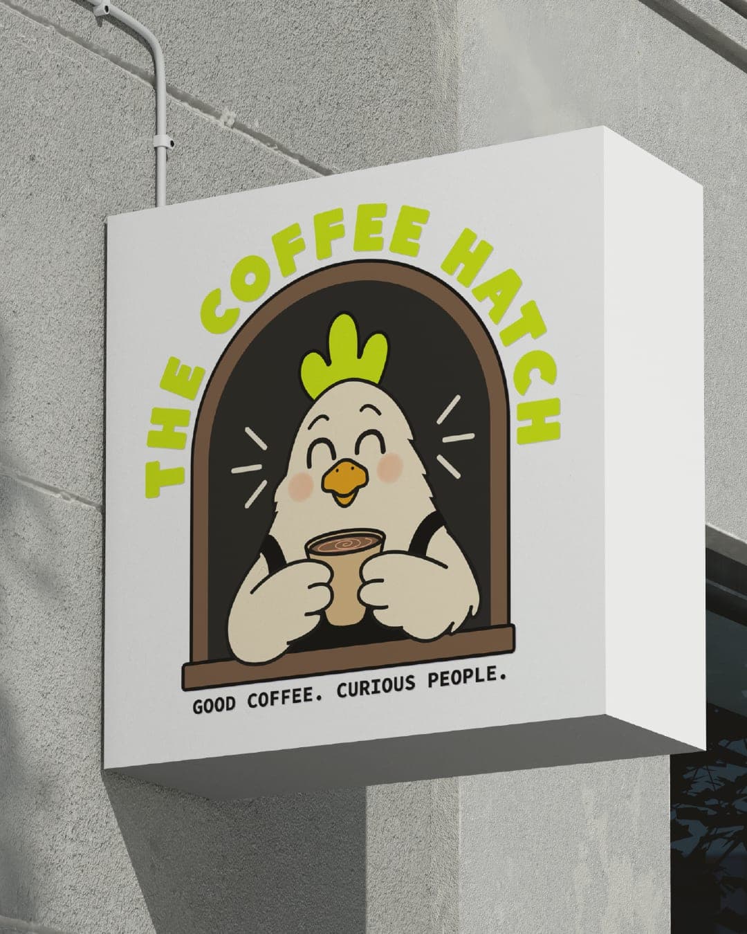
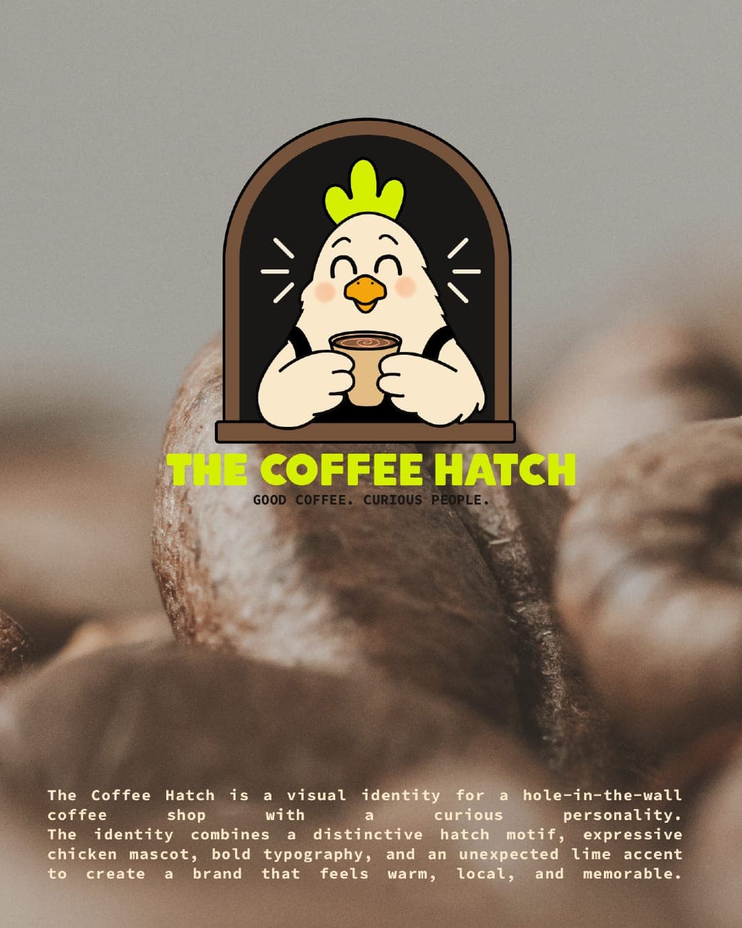
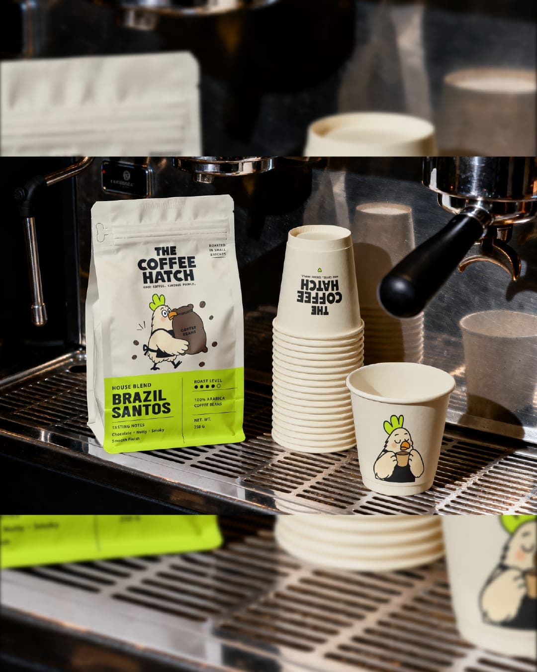
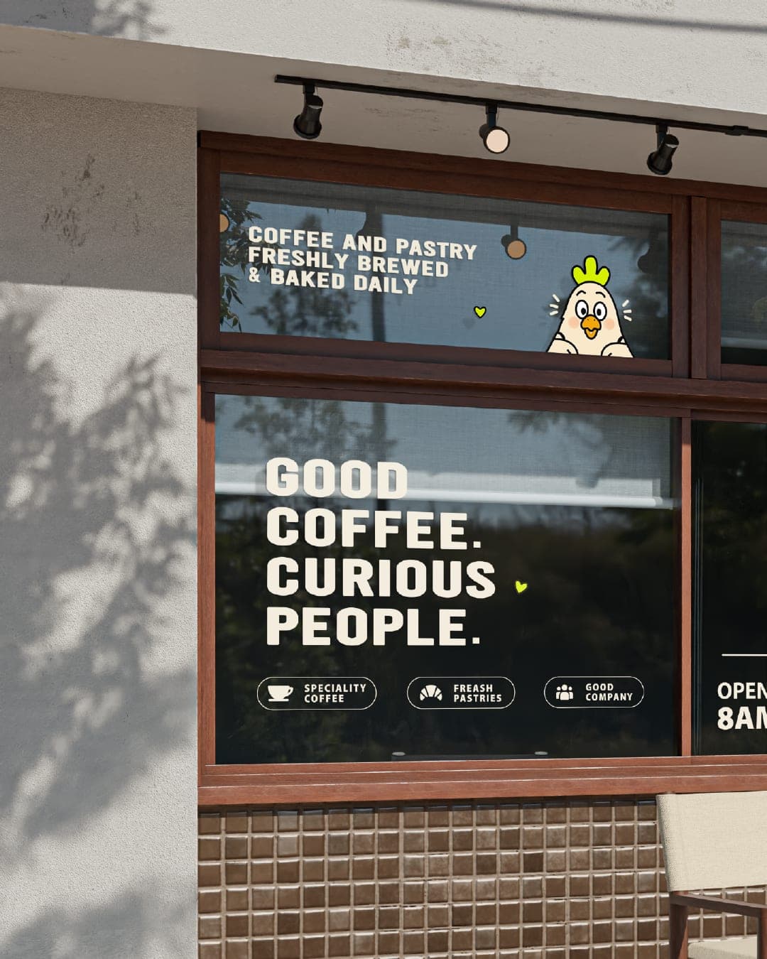
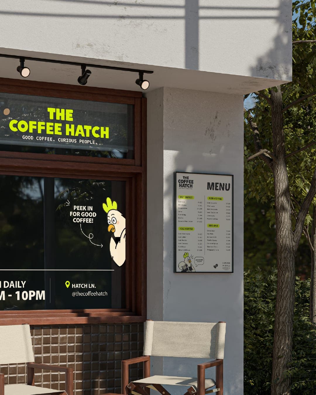
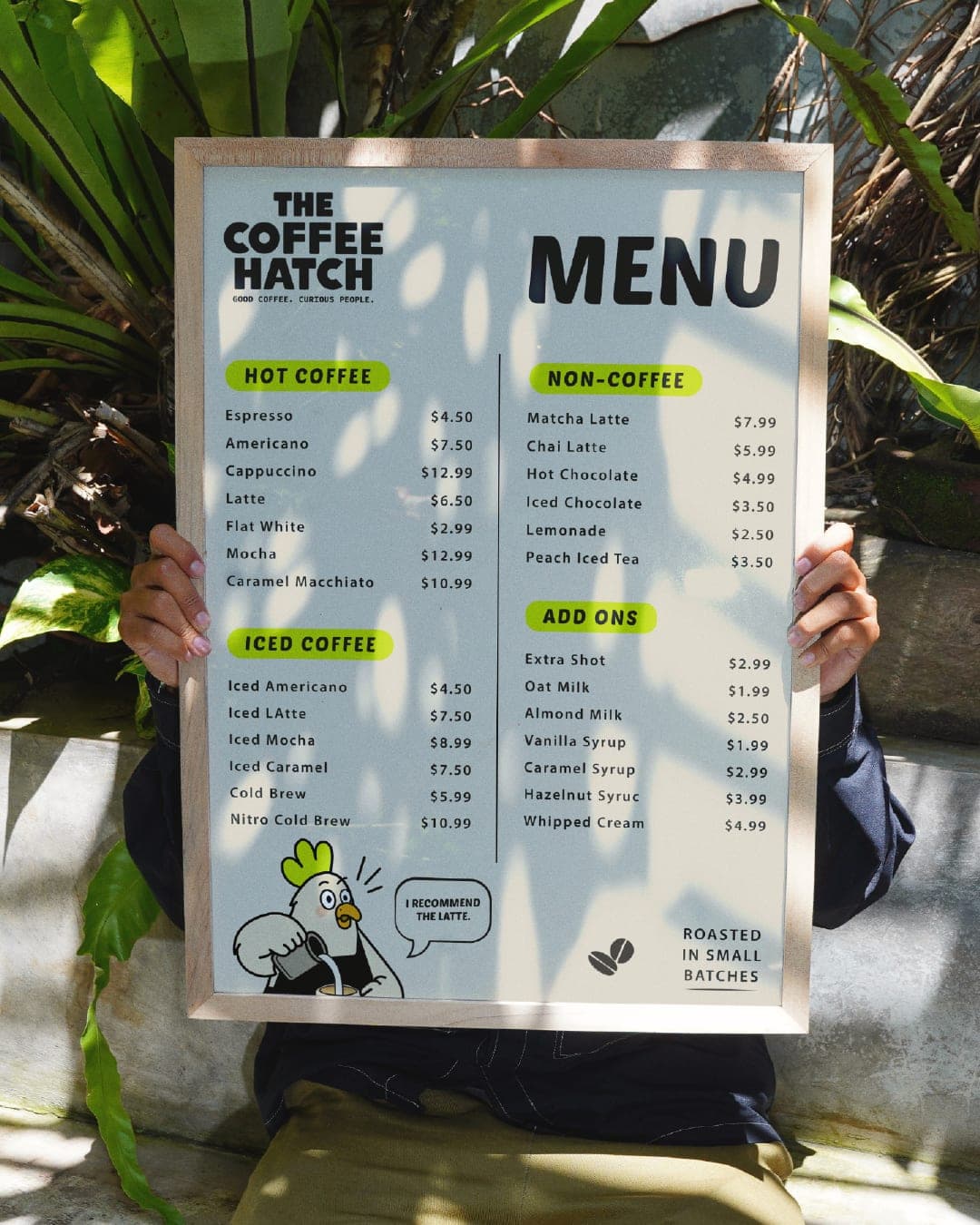
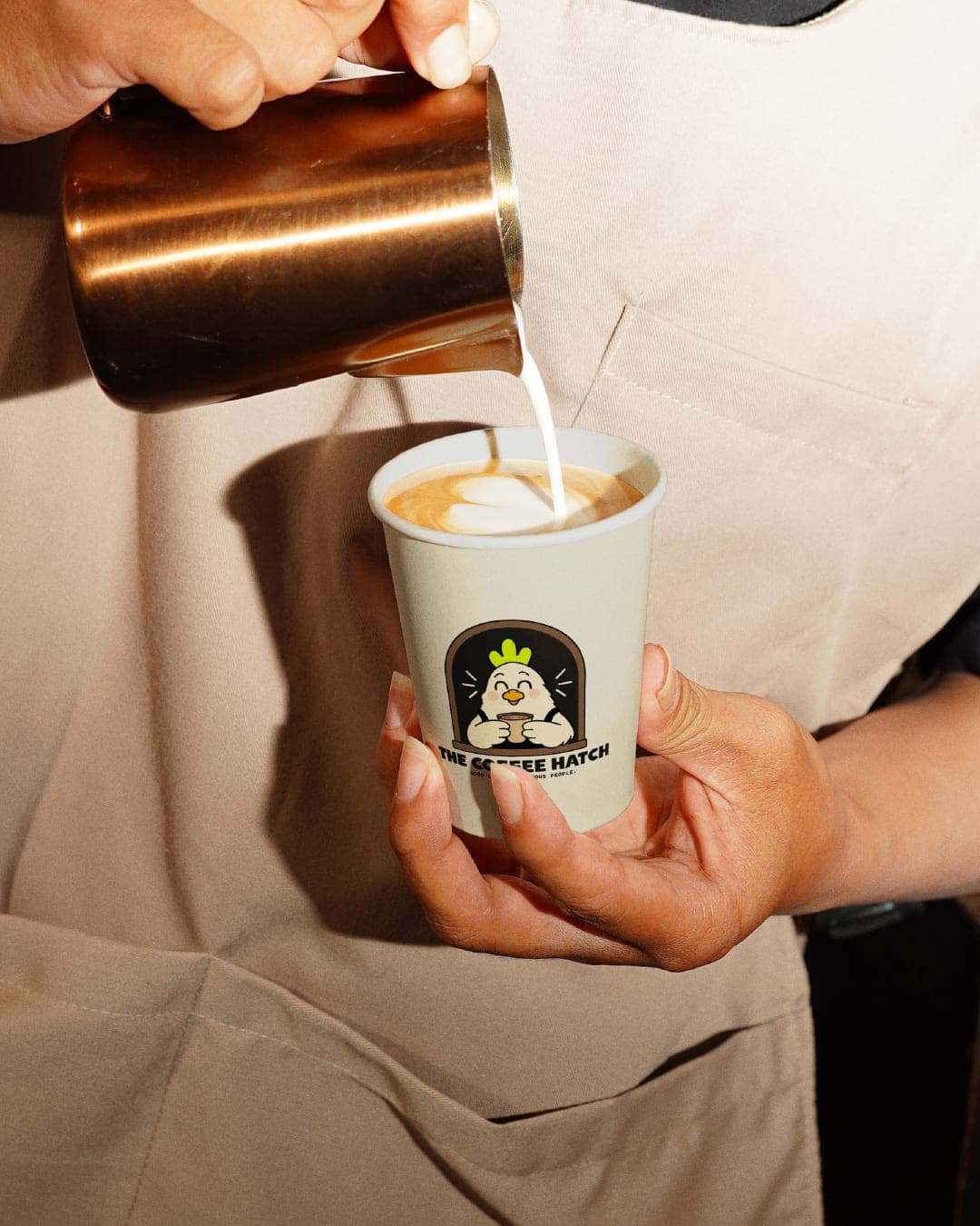
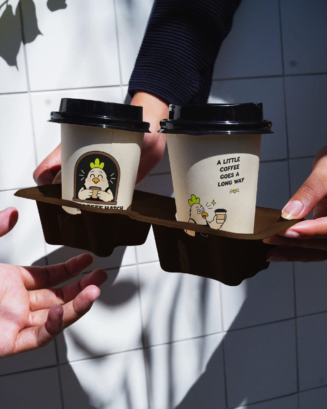
The Coffee Hatch is a playful coffee brand concept built around one simple idea: coffee that wakes you up. The identity is centered around a cheerful chicken mascot, inspired by the connection between chickens, mornings, and that first cup of coffee that gets you going. Instead of taking the usual overly-serious or sophisticated approach to coffee branding, I wanted The Coffee Hatch to feel warm, quirky, energetic, and instantly recognizable. The visual identity combines bold typography, a fresh lime-green and black palette, hand-drawn illustrations, and expressive character moments to create a personality-led brand system. The chicken mascot acts as the heart of the identity, allowing the brand to communicate through different expressions, poses, and playful situations. The result is a coffee brand that feels approachable and memorable while still having a strong visual presence across packaging, social media, and other touchpoints.


Color Palette
This brand uses a color palette of 3 colors
Click a color to find brands with similar colors.
Tags
Live score
Scores stay hidden while voting is open, so early votes can't anchor the ones that follow. Check back once the countdown ends.
Votes (1)
| Voter | Design | Strategy | Originality | Story | Overall | |
|---|---|---|---|---|---|---|
 | Laamari Designs from Tunisia | 8 | 7 | 6 | 9 | 7.40 |