Pet · by Morfa Brands
Weasy Food
 Morfa Brands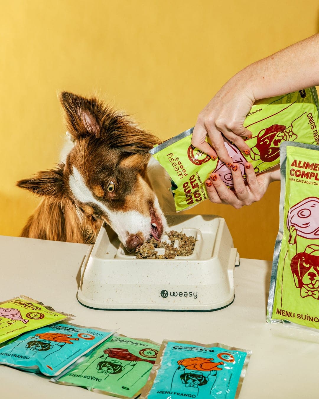
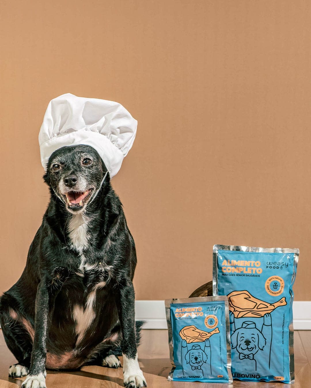
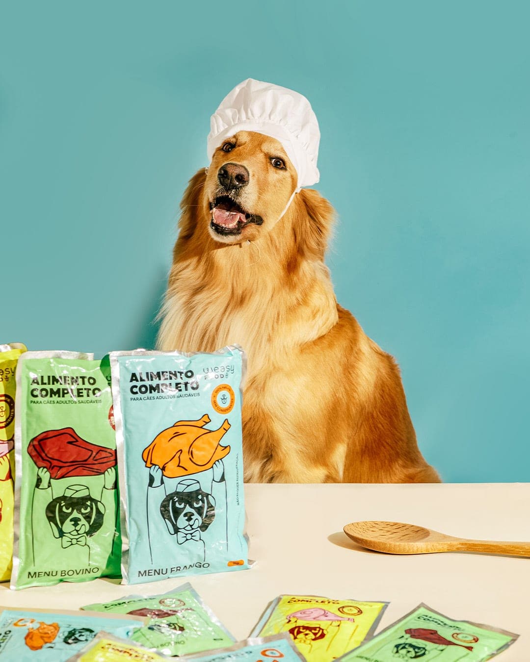
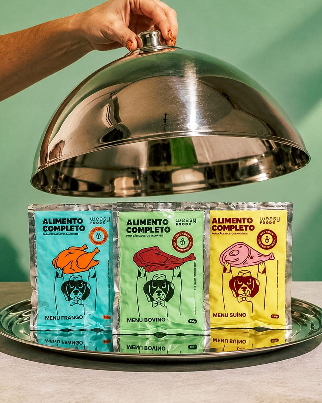
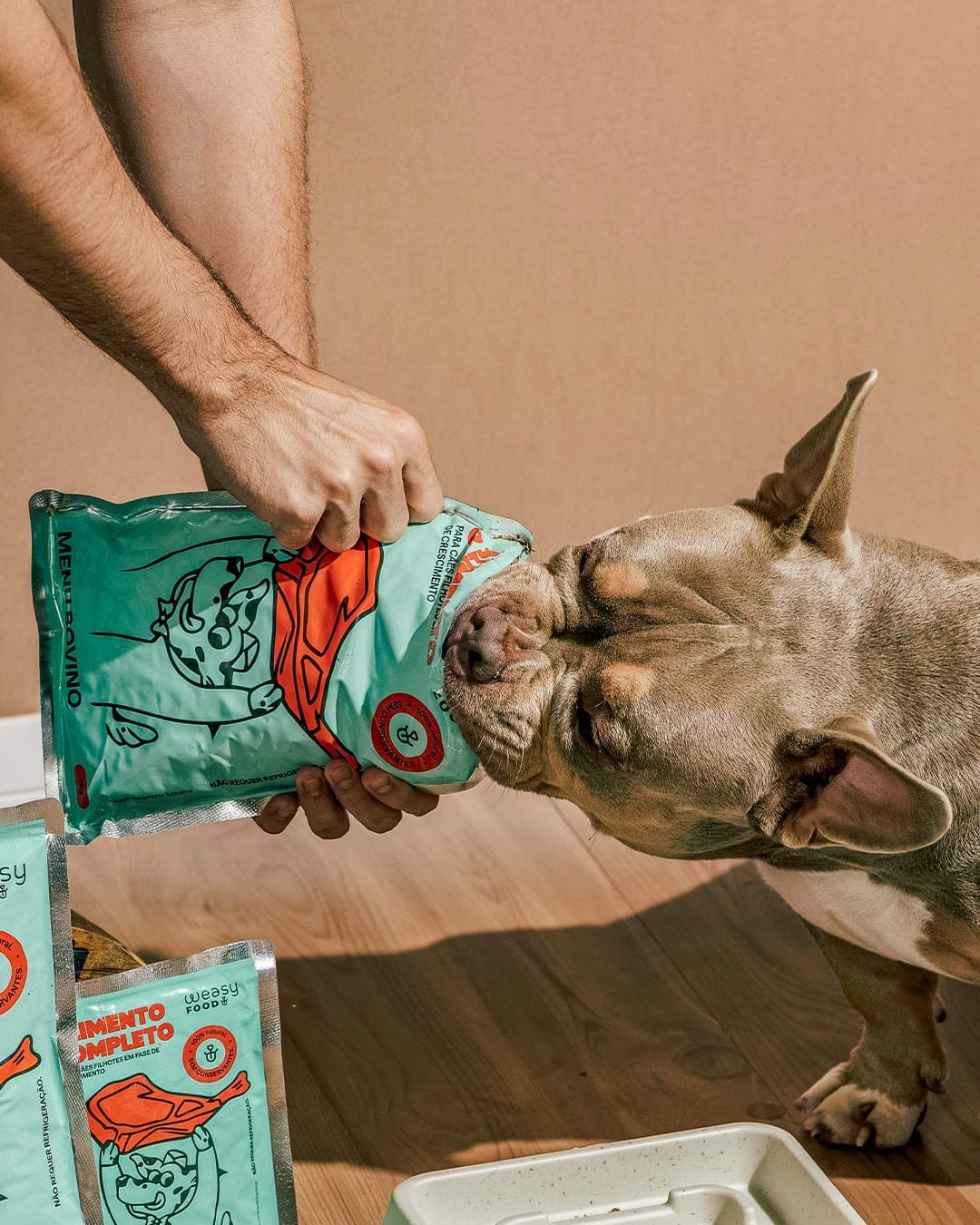
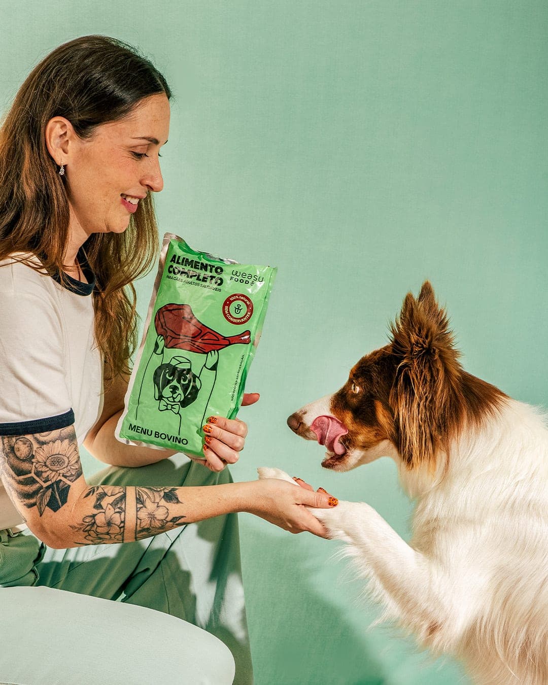
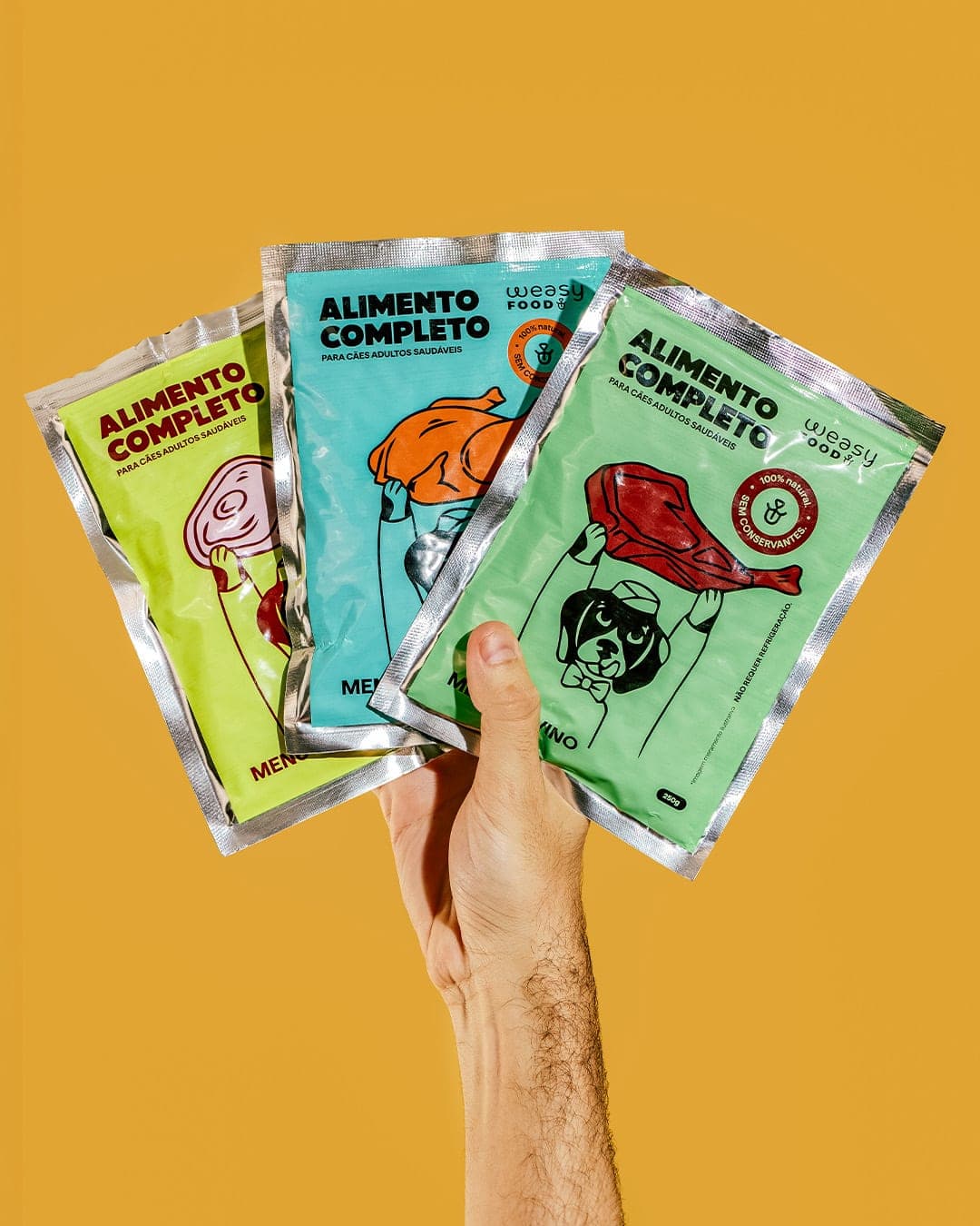
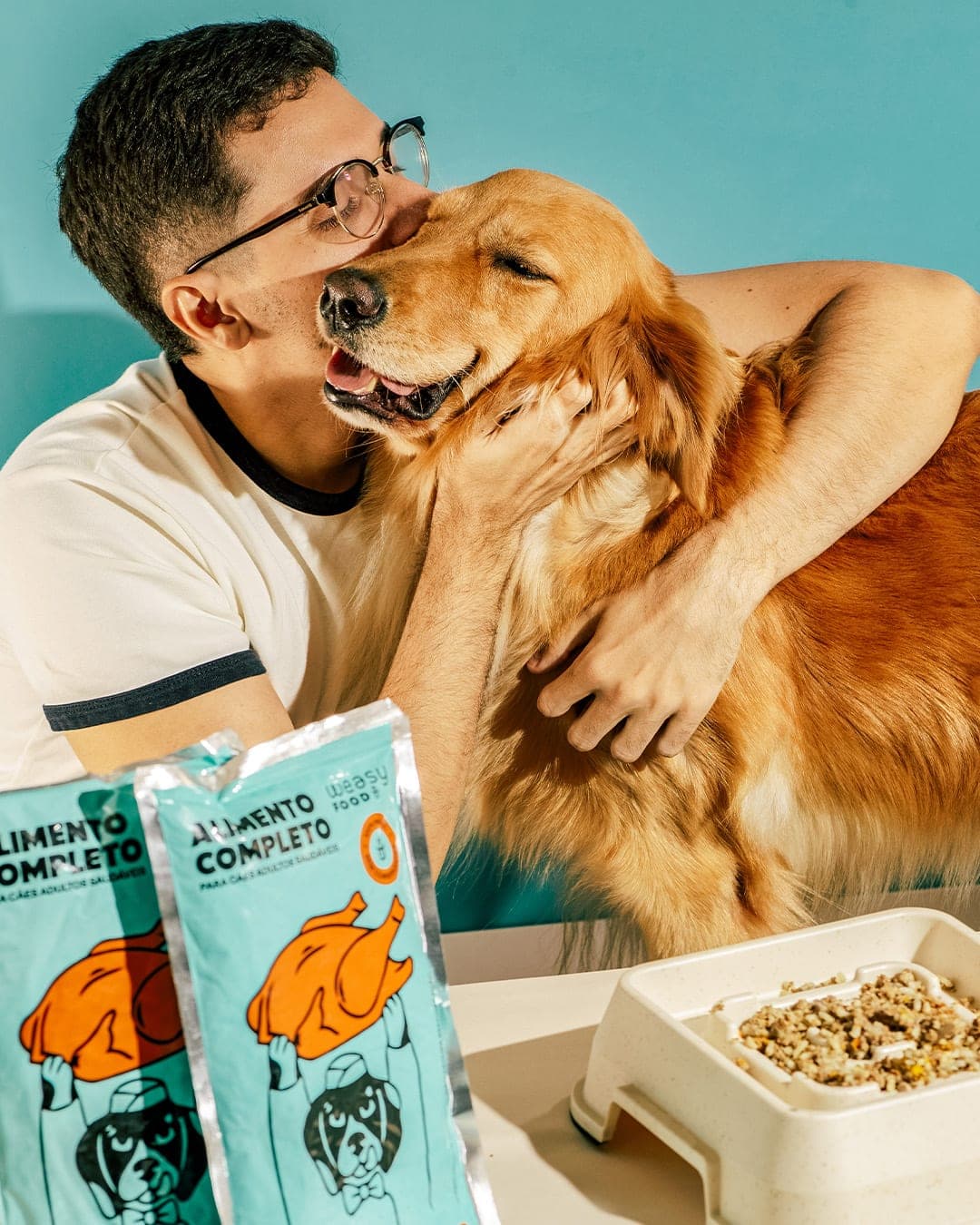
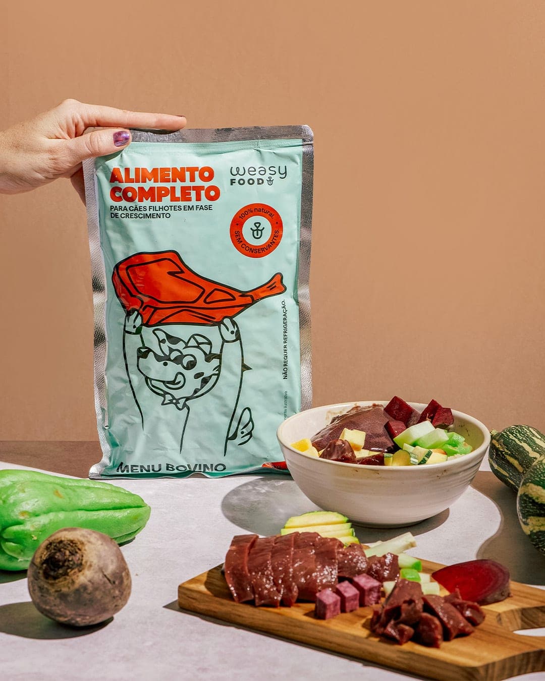
For Weasy Food, we developed a packaging and visual identity system built around a simple idea: make the food the protagonist. The concept transforms each protein into a trophy, with characters proudly lifting it above their heads. From there, color, illustration and typography create a clear system where each generation, flavor and species has its own personality while remaining part of one cohesive brand. The result is a bold and playful pet food identity designed to stand out on the shelf, communicate quickly and make the food itself impossible to overlook. A project by Morfa Brands.
Color Palette
This brand uses a color palette of 3 colors
Click a color to find brands with similar colors.
Tags
Live score
Scores stay hidden while voting is open, so early votes can't anchor the ones that follow. Check back once the countdown ends.
Votes (0)
No votes yet — be the first.