Food & Beverage · by breadfordesign
YOKO
 breadfordesign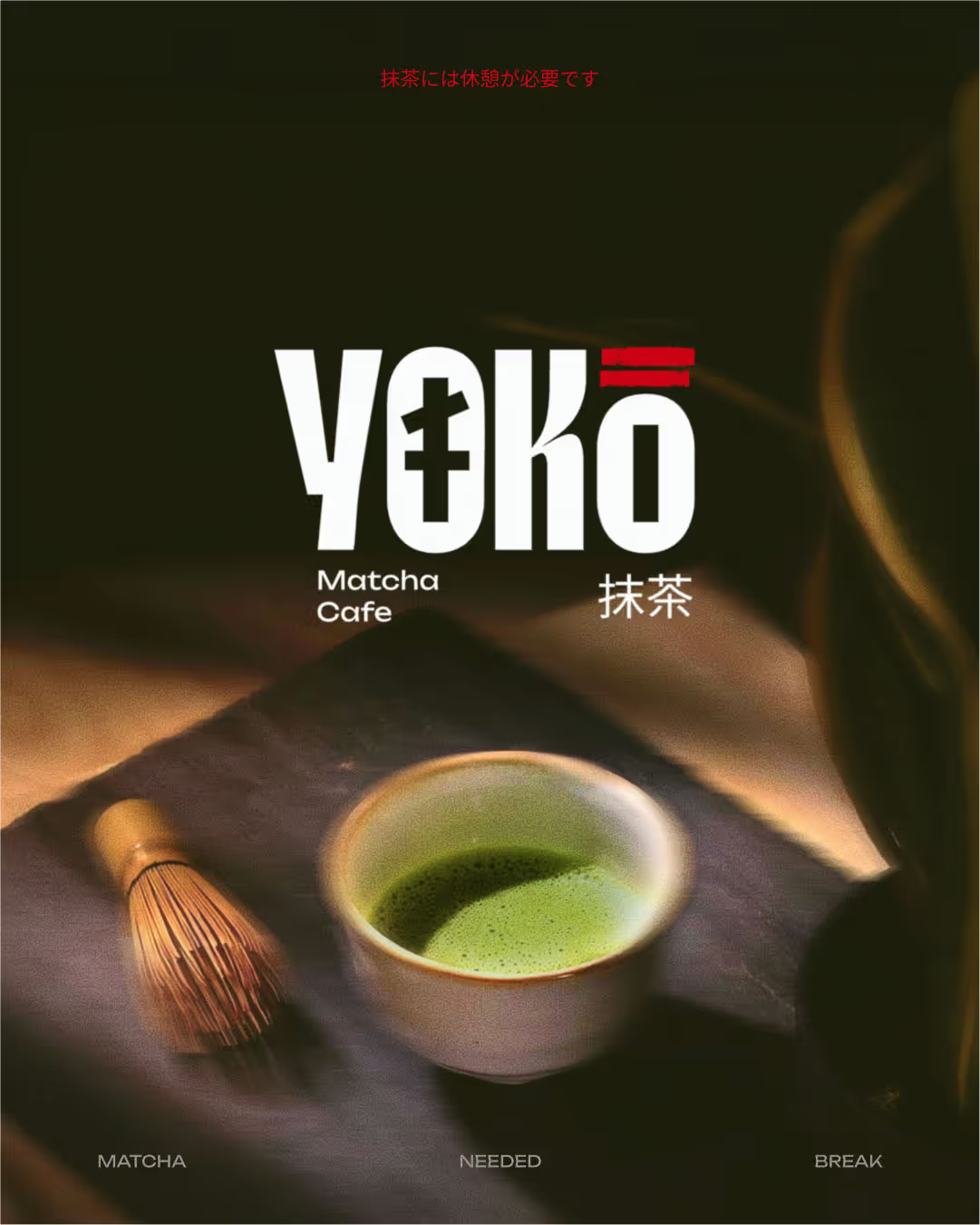
Yoko: A matcha needed break🍵 For Yoko, a modern matcha café, we set out to build more than just a brand. We crafted a pause button in the middle of a fast paced world. Rooted in the spiritual calm of Japanese culture, Yoko blends traditional design elements like the bold symbolism of torii gates ⛩️, the softness of sakura pinks, and the grounded calm of matcha greens. The result is a brand that feels equal parts ritual and refresh. The core idea is simple “A matcha needed break.” This became the narrative thread across the brand, from tone to textures, packaging to space design. Yoko is not just a café. It is a peace offering in a cup. Every touchpoint, from the menu to the merchandise, invites customers to slow down, sip up, and reconnect even if just for a moment. So tell us, do you want a matcha break?


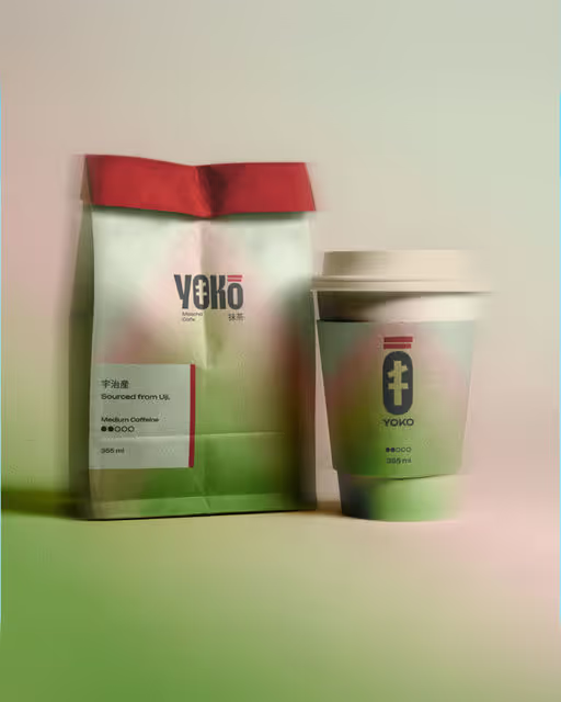

Color Palette
Tags
Voting is closed for this nominee.