
Key Details
Commercial use for one business is included. The brand may not be resold or redistributed.
You’ll receive the complete brand kit as editable source files, including a mini visual brand guideline (PDF).
This brand kit can be adapted within a defined scope. Up to 2 revision rounds are included after the initial setup.
Once the purchase is confirmed, delivery usually takes 7–14 business days, depending on the requested adjustments.

giulialeccadesign, Giulia Lecca
Graphic designer and illustrator from Verona ✏️ My work ranges from illustrations and mascot design to branding, logos and packaging always tailored to each client vision!
Profil on Braaands™Frequently Asked Questions
The core visual concept and structure of the brand remain unchanged.
These changes adapt the brand to your business without redesigning it from scratch.
If everything matches, you’ll receive a checkout link from Braaands™ to confirm the purchase.
The full amount is secured until the brand is finalized.
At checkout, you’ll also have the option to add additional packages such as business cards or packaging design.
Payment only happens once everything is confirmed.
Resale or redistribution is not permitted.
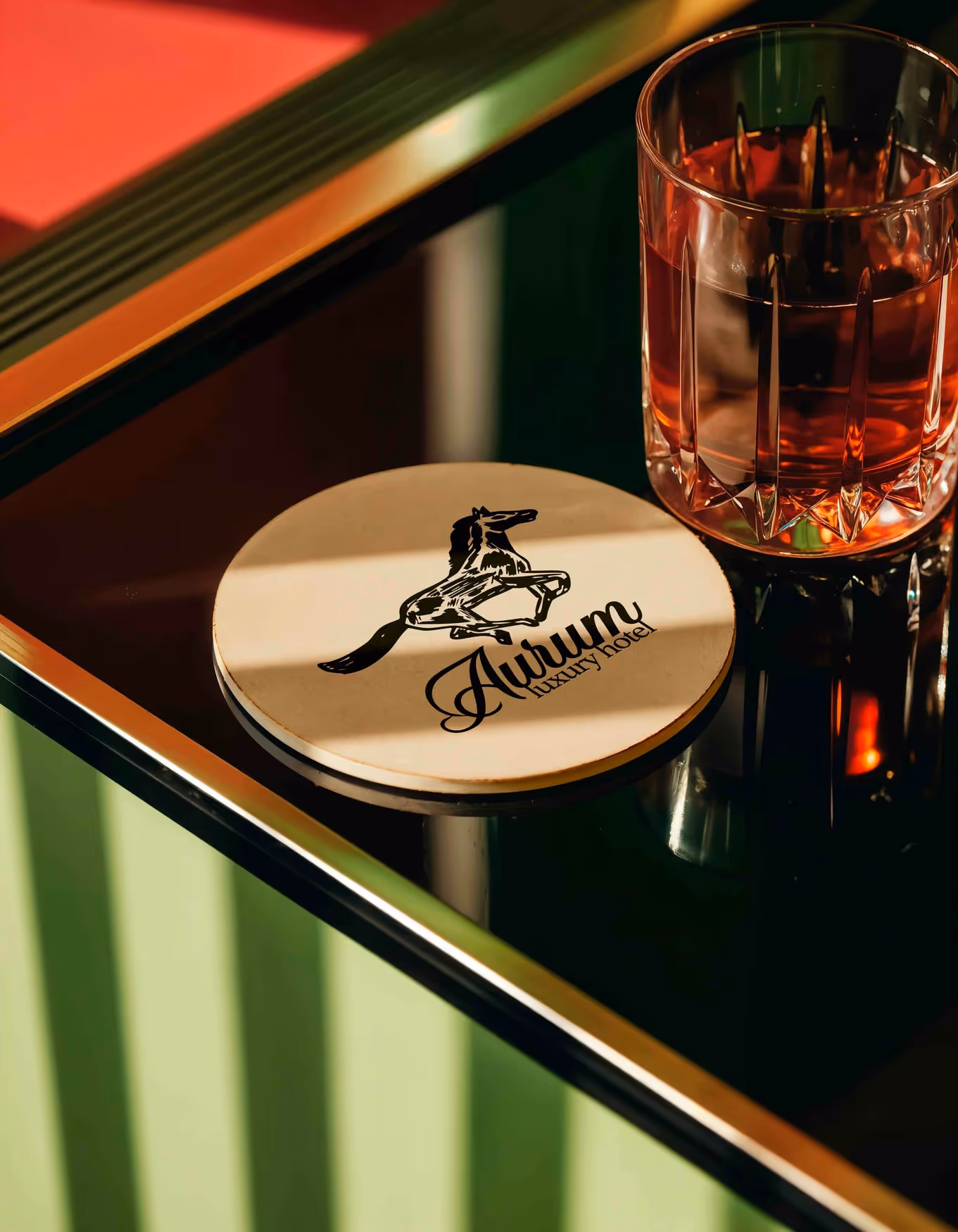
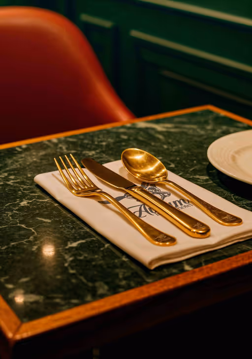
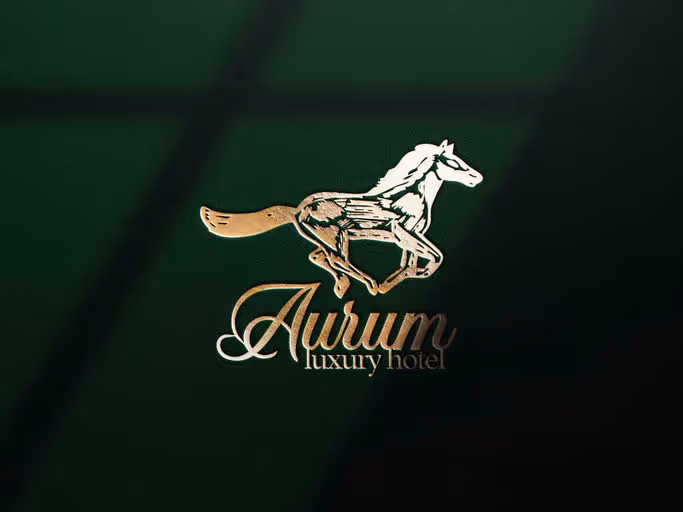
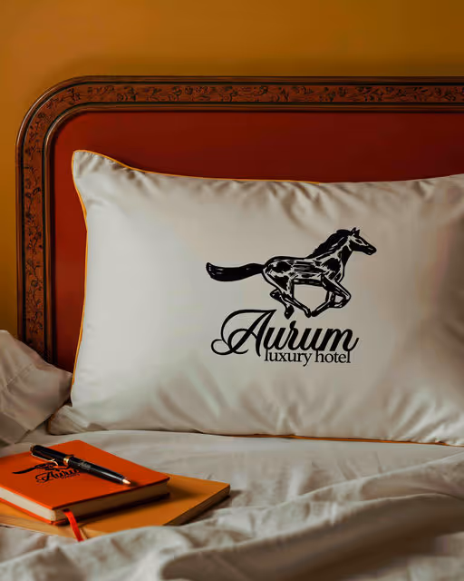
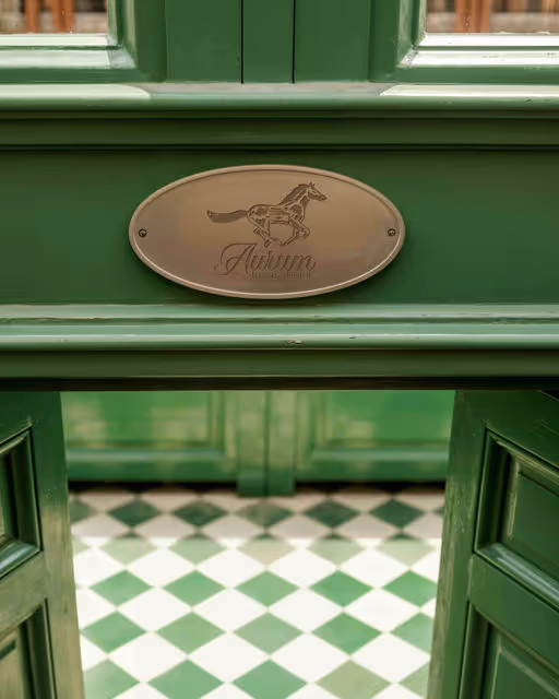
Hotel Branding
Aurum - luxury hotel
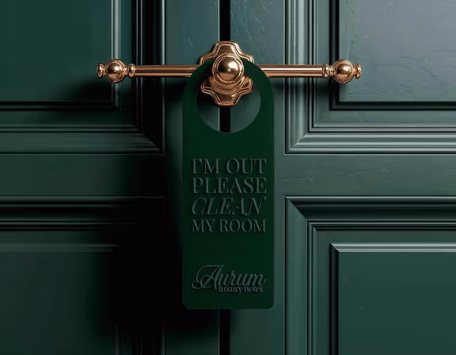
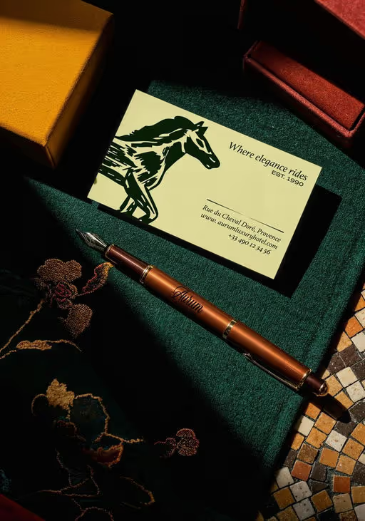
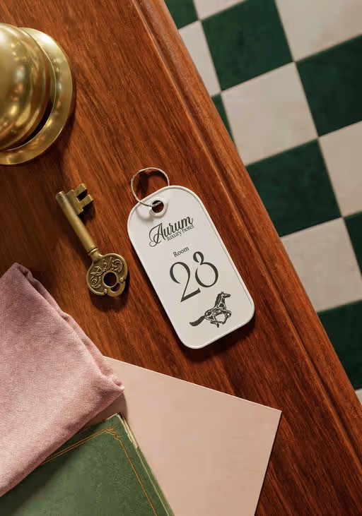
AURUM – Visual Identity for a Luxury Hotel in Provence🐎 A visual identity created for a luxury hotel in Provence where the horse becomes the distinctive symbol, a tribute to the region’s equestrian heritage and timeless elegance. The horse is illustrated with irregular, hand drawn strokes, expressing authenticity and movement while the cream and green palette evokes natural harmony and refined luxury. The logo, combining calligraphic and serif typography, is applied across the hotel’s visual system: stationery, menus, room keys and all branded materials. The name “Aurum”, meaning gold in Latin, embodies the sense of prestige and understated opulence that defines the spirit of this place. Design by Giulia Lecca