Brand Identity Showcase
Nominees
Thank you! Your submission has been received!
Oops! Something went wrong while submitting the form.
Showing you 0 of 0 Nominees


Brand for Sale
A portable gourmet nut spread designed for life on the move!!
With this concept, I wanted to explore how cool packaging can transform a familiar product. I got inspiration from beauty and lifestyle brands to turn Spread Co’s nut butters into something collectible, colorful, and worth carrying with you!
Healthy Food Branding
Packaging Design
Business Cards
Poster & Print
Label Design
Food & Beverage
Beauty & Skincare


Brand for Sale
Minimal coffee & brunch concept featuring a mischievous mascot, custom graffiti-inspired lettering and a soft lilac accent adding a subtle twist to the black and white identity.
Brunch & Coffee Branding
Business Cards
Label Design
Packaging Design
Poster & Print
Food & Beverage
Retail


Brand for Sale
A blend of Chinese heritage, playfulness, sustainability, and modernity - Introducing Good Nuts 🥜🧧
A nut butter brand, designed with intention of blending sustainability and culture with bold, modern, and playful designs.
The design itself was inspired by a mixture of packaging inspiration I've seen throughout the past months and the want to create something new on the shelf of grocery stores. The word in 'Hoa' in Mandarin Chinese means good and I wanted to introduce this into the brand with flavours identified in Chinese cooking that would be easily accessible within every day shopping. This inspired both the art style of the illustrations and the typographic creative direction.
The modernity is introduced in the bright, contrasting colours of the red and dark brown, and sans serif typography mixed with handwritten script.
From the ingredients to the jar, each aspect of the brand is conscious of it's impact on the world and looks for the balance in the product it creates and what it's presented in. Ethically sourced, organic ingredients, glass jars, and recycled paper/materials used for the labels are all apart of what makes this brand guilt free in it's enjoyment.
Healthy Food Branding
Packaging Design
Label Design
Poster & Print
Merchandise
Food & Beverage
Retail


FRIDAY is a modern fast food concept centered around fries as the main product - from classic portions to bold, over-the-top loaded combinations designed to be visually striking and highly shareable.
The brand targets a Gen Z audience looking for more than just food - a place driven by vibe, social moments, and experience.
The visual identity is feel bold, playful, and contemporary, built around strong color usage (with orange as a key tone), impactful typography, and a system that translates seamlessly across space, packaging, and digital.
The goal was to create a brand that is instantly recognizable, highly Instagrammable, and full of personality.
Fast Food Branding
Business Cards
Merchandise
Packaging Design
Poster & Print
Food & Beverage
Retail


Brand for Sale
Whisk is a matcha brand, wellness with personality. Calm but not boring. Energising but not intense. The kind of matcha you want on your kitchen bench and the café you're always just popping into.
Matcha Branding
Packaging Design
Label Design
Poster & Print
Merchandise
Food & Beverage
Wellness & Health


Brand for Sale
I wanted this to feel loud before you even read it
like the kind of jar that stares back at you on the shelf and dares you to pick it👀🩷
The bold colors pull you in fast the character adds attitude so it does not feel like just another jam and the playful copy keeps it fun and snackable just like the product itself! This was all about creating something messy in a good way something fruity chaotic and impossible to ignore🍽️
Jam Branding
Packaging Design
Merchandise
Label Design
Poster & Print
Food & Beverage
Retail

Brand for Sale
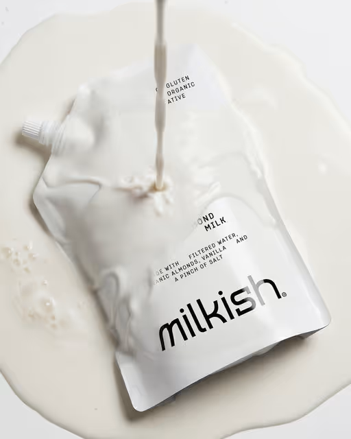
Milkish arrives as the antidote to the noisy, cluttered dairy aisle. Driven by the belief that the future of milk is lighter, cleaner, and calmer, the brand boldly ditches the conventional carton for a sleek, easy-pour sachet that feels decidedly premium. The lineup spans cashew, oat, and almond, and is packaged with intentional minimalism, utilizing a stark black-and-white palette to champion the honest craftsmanship of the ingredients. This isn't just emptiness; the generous white space serves as a 'visual exhale,' reflecting a mission to strip back the unnecessary and focus on the natural. By elevating the packaging from a commodity to a design object, Milkish transforms the routine of morning coffee or breakfast into a moment of quiet ritual.
Dairy Branding
Packaging Design
Label Design
Merchandise
Food & Beverage
Retail


Brand for Sale
Beki World is a playful collectible universe built around curiosity, surprise, and connection.
At its core, the brand transforms simple products into experiences where every interaction feels exciting and unexpected.d
Through bold visuals, soft organic shapes, and character-driven design, Beki World creates a system that feels alive, engaging, and instantly recognizable.le
More than just a brand, it is a growing world designed to be discovered, shared, and collected.
Collectibles Branding
Packaging Design
Merchandise
Poster & Print
Label Design
Entertainment
Retail

Brand for Sale
Bold but playful! Here is pet-friendly cafe
Pet Café Branding
Poster & Print
Social Media Kit
Merchandise
Label Design
Food & Beverage
Hospitality


Brand for Sale
BGL is a modern, everyday brand built on simplicity, speed, and individuality, allowing customers to quickly create something entirely their own.
Bagel Bar Branding
Packaging Design
Merchandise
Poster & Print
Label Design
Food & Beverage
Retail


Brand for Sale
Developing illustrations for a paper and packaging store. The illustrations depict a little girl's life with the store's merchandise: gift boxes, toys, and their bestseller and customer favorite: a craft paper house.
Paper & Packaging Store Branding
Packaging Design
Merchandise
Poster & Print
Business Cards
Retail
Home & Lifestyle


Brand for Sale
Conceptual identity for Casa Coco, a beachside bar for chill afternoons and warm nights by the sea.
Bar Branding
Poster & Print
Packaging Design
Label Design
Merchandise
Food & Beverage
Hospitality


Little Dimple is a dumpling house rooted in the energy of Hong Kong street culture. It's a dumpling house that balances a cheeky dumpling house mascot with Hong Kong dai pai dong (大牌檔) dining culture.
Food & Beverage Branding
Packaging Design
Poster & Print
Label Design
Merchandise
Food & Beverage
Hospitality

Brand for Sale
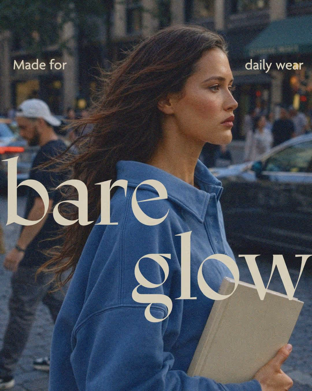
bare glow is makeup for daily wear — but really, for every wear.
It's built on the idea that makeup shouldn’t fight your skin.
It should sit comfortably, layer intuitively, and support a healthy-looking base throughout the day.
Buildable. Breathable.
Designed to be worn wherever life takes you.
Make-up Branding
No items found.
Beauty & Skincare

Brand for Sale
SHARED GROUND part 1/2 operates without elevation targets or competitive metrics.
It does not calculate achievement, does not rank participation, and does not translate movement into numbers. Designed for collective presence across urban landscapes, it removes the pressure of pace, distance, and outcome tracking. There is no optimization layer, no algorithmic reward, no invisible scoreboard. What remains is simple: bodies in motion, space unfolding, proximity forming.
Built for open routes, slow progression, and conversation-based movement, it adapts to sidewalks, parks, intersections, staircases, bridges, vacant lots, waterfront edges, and in-between spaces that rarely receive attention. It occupies the ordinary. It respects the overlooked. It allows the route to be shaped by mood, weather, light, and shared intuition rather than predefined endpoints.
There are no finish lines, no countdowns, no performance demands. No pace enforcement. No mandatory distance. No corrective feedback. The act of walking is not reduced to output. It is restored to presence.
Experience Branding
Poster & Print
Label Design
Merchandise
Packaging Design
Wellness & Health
Events & Festivals


Brand for Sale
Loaffa is a premium sleepwear and bedding brand designed for comfort, calm, and effortless luxury. From soft, breathable nightwear to cozy, high-quality bedding, every product is crafted to make your nights peaceful and your mornings refreshed. With relaxed fits, gentle fabrics, and elegant designs, Loaffa turns your bedroom into a sanctuary of comfort and style. Sleep well. Live better. 🌙
Homewear Branding
Poster & Print
Packaging Design
Merchandise
Label Design
Fashion & Apparel
Home & Lifestyle

Brand for Sale
Oaten is a modern oats brand designed around clarity, functionality, and honest nutrition. The brand focuses on simple ingredients and purposeful benefits, creating a breakfast option that fits naturally into the routines of working professionals who care about their health. The visual identity is built to feel warm, structured, and trustworthy, reflecting the idea of everyday fuel done right.
The product range is organized into three clear variants — Daily Fuel, Protein Boost, and Fibre Support — each addressing different nutritional needs while maintaining a cohesive brand system. Through thoughtful color coding, clean typography, and minimal yet confident packaging, Oaten aims to bring clarity and intention to the breakfast aisle while presenting oats as a modern, functional staple.
Oaten Branding
Packaging Design
Poster & Print
Label Design
Merchandise
Food & Beverage
Wellness & Health

Brand for Sale
Boccia is a fictional Italian sandwich concept centered around generous focaccia and bold Mediterranean flavors. The visual identity combines playful illustration with strong, rounded typography to create a brand that feels both expressive and approachable.
At the heart of the identity is a cheerful mascot inspired by Italian food culture, bringing personality and warmth to the brand. Paired with vibrant photography, soft pastel accents and dynamic layouts, the system extends across packaging, posters, signage and environmental applications.
The result is a lively and contemporary brand universe designed to celebrate indulgence, authenticity and the joy of Italian street food.
Sandwich Branding
Poster & Print
Packaging Design
Business Cards
Label Design
Food & Beverage
Retail

Brand for Sale
riot rosé - made for rooftop sunsets, long dinners, pre-dinner soundtracks and that inevitable “one more glass?” moment. Wine designed to be shared, photographed and remembered
Beverage Branding
Packaging Design
Poster & Print
Merchandise
Label Design
Food & Beverage
Hospitality


Brand for Sale
Every brand is born from a point of restlessness an impulse that moves an idea into the world. Drauvn was born from this movement: the fusion between the urban and the symbolic, between the concrete of the streets and the invisible realm of ideas.
A streetwear brand that speaks not only of clothing, but of expression, identity, and presence.
The challenge of this project was to build a visual identity that balanced strategy and expression. From the brand’s essence and its audience, I developed a visual system that reflects its core pillars: attitude, purpose, and authenticity. Every choice, from shapes to colors, carries Drauvn’s raw and symbolic aesthetic, inspired by the underground and narratives that intertwine art, resistance, and meaning.
The result is a visual signature for those who dress with awareness and intention. A universe where art, introspection, and rebellion converge and where dressing becomes an act of expression.
Fashion Branding
Merchandise
Label Design
Business Cards
Poster & Print
Fashion & Apparel
Retail

Brand for Sale
Ninety One is a new pub based on the historic Truman Brewery site in London. The identity is based around an inclusive "Your Local" concept that uses rich traditional colours and heritage typography to appeal to the diverse Brick Lane community through its extensive physical touchpoints.
Pub Branding
Poster & Print
Label Design
Merchandise
Packaging Design
Hospitality
Events & Festivals

Brand for Sale
A brand shaped by nature, not trends.
My take focused on restraint, earthy tones, botanical forms, and tactile details that feel grounded and honest. Nothing loud, nothing forced. Just calm, modern design that lets nature lead and materials speak for themselves.
Skincare Branding
Packaging Design
Label Design
Merchandise
Poster & Print
Home & Lifestyle
Beauty & Skincare


Bake'N is a modern breakfast bakery known for their signature donuts, fresh cookies, and quality coffee. They needed packaging that captures the brand's energetic, grab-and-go vibe while staying true to honest ingredients and approachable design. The challenge was creating a cohesive system across donut boxes, cookie bags, and coffee cups that feels modern, warm, and instantly recognizable—whether you're rushing to work or enjoying a slow morning.
Swipe to see the full brand identity ✨🫶
Bakery Branding
Packaging Design
Label Design
Poster & Print
Merchandise
Food & Beverage
Retail


Brand for Sale
LUNE is an approach to intimate care designed for real life.
A brand that puts gentleness, simplicity, and respect back at the heart of every cycle.
No taboos. No complicated language.
Just products designed to support every body with precision and care.
From soft shades to deeper hues, every visual detail reflects a need, everyday comfort, or special attention during more sensitive moments.
An identity conceived with intention.
A design that serves natural balance.
Because your body isn't uniform,
your care shouldn't be either.
Intimate Care Branding
Packaging Design
Poster & Print
Merchandise
Label Design
Beauty & Skincare
Wellness & Health


Brand for Sale
Allura is more than a cosmetics brand, it is a visual poem dedicated to timeless femininity and the serenity of nature.
Every detail, from the flowing monogram to the soft botanical illustrations, was created to whisper rather than shout, reminding that beauty is most powerful when it feels effortless.
Inspired by the grace of French aesthetics and the calm rhythm of nature, Allura blends artistry and purity into one elegant identity.
The monogram “aa” symbolizes duality the meeting of two sides: the natural and the refined, the modern and the timeless.
Its typography, color palette, and packaging come together to tell one story — of beauty that feels effortless, personal, and pure.
Allura speaks softly, moves slowly, and leaves an impression that lingers like a scent, like a memory, like a feeling.
Cosmetic Branding
Packaging Design
Label Design
Poster & Print
Merchandise
Beauty & Skincare
Fashion & Apparel
Brand for Sale
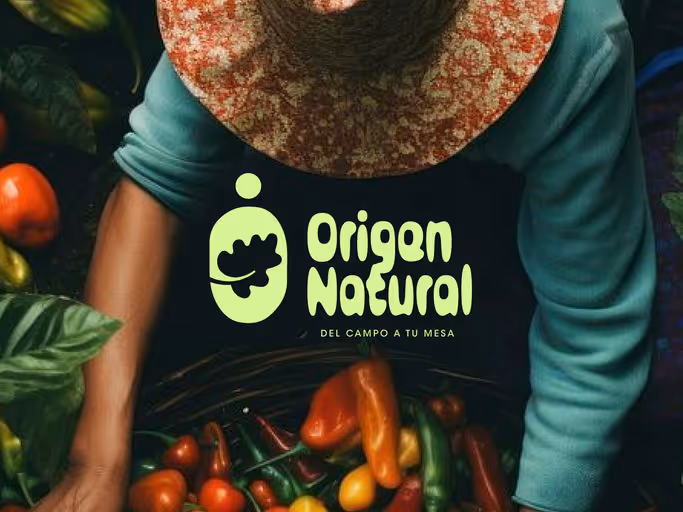
Origen Natural isn’t just a new brand. It’s a different way of understanding what ends up on your table.
Behind every piece of fruit and every vegetable lies a story we don’t usually see: hands that plant, processes that take time, and an origin that often goes unnoticed.
This project was created to bring to light what has always been there. To connect the product with the person who grows it, and to transform an everyday purchase into a meaningful choice.
Farm-to-Table Experience Branding
Poster & Print
Packaging Design
Label Design
Business Cards
Food & Beverage
Home & Lifestyle


Brand for Sale
Cozy Bun is a bakery café centered around comfort, warmth, and everyday indulgence.
The brand identity was designed to capture the feeling of a cozy pause — fresh bread, the smell of coffee, and simple moments of enjoyment.
Bakery Branding
Business Cards
Poster & Print
Label Design
Packaging Design
Food & Beverage
Hospitality

Brand for Sale
Shakey's 🍨🥤 A conceptual 80’s inspired milkshake bar.
Everything from the brand identity to the interior design had to be bold, retro, and super colourful. A place to hang out with your friends and talk for hours over your favourite milkshake.
I absolutely love the classic retro brand look, so I wanted to stay true to it but also give this concept a more modern feel. I did that by using a fresh, slightly whimsical colour palette and keeping the illustrations cute and simple to add a playful charm ✨
Milkshake Bar Branding
Poster & Print
Packaging Design
Label Design
Merchandise
Food & Beverage
Hospitality

Brand for Sale
After Brew is a cafe made for the creators, where presence matters more than productivity 🌸
Not built around hustle culture or loud aesthetics. It’s built around the in-between.
The visual identity leans into clean typography, bold yet warm tones, and thoughtful layouts to capture that quiet creative energy.
Café Branding
Poster & Print
Packaging Design
Merchandise
Business Cards
Food & Beverage
Home & Lifestyle


Brand for Sale
A playful and bold fruit jam branding design that brings the fun back into the pantry!
Jam Branding
Packaging Design
Label Design
Merchandise
Poster & Print
Food & Beverage
Retail


Brand for Sale
M!NDSHOT is a functional focus drink inspired by Japanese botanical ingredients and the clarity traditions of the East.
The name was the starting point. The goal was something immediate, almost clinical, urgent without the aggressive tone of traditional energy drinks. The exclamation mark replacing the "I" turns the name itself into a visual emergency signal.
The identity is built around a core tension between the clinical and the cultural. Japanese kanji, emergency graphic elements, and a palette of electric blue and coral create a system where every element has a narrative function. The packaging hero copy "In case of mental fog, M!NDSHOT. " merges logo and tagline into a single typographic statement, making the brand name the answer to its own problem.
Art direction extends the identity across a full offline campaign: subway posters, branded merchandise, and product photography built around a recurring blue latex glove as the brand's visual signature... straniante, memorable, unmistakably M!NDSHOT.
Focus Drink Branding
Packaging Design
Label Design
Poster & Print
Business Cards
Food & Beverage
Wellness & Health

Brand for Sale
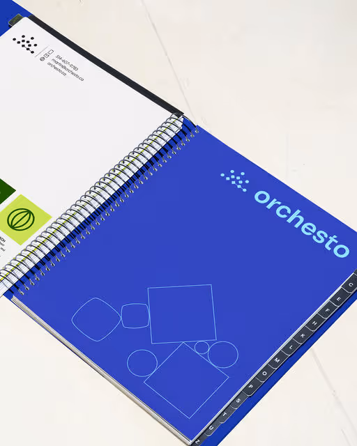
Orchesto is an all-in-one agency redefining retail by integrating product development, marketing operations, and retail strategy into one cohesive system. At Leyma, we developed a brand identity built around the idea of an orchestra: coordination, precision, and collaboration across disciplines. This translates into a flexible and structured visual language that balances a professional yet approachable aesthetic with more dynamic and expressive elements. More than just a visual layer, the identity works as a tool that reflects how Orchesto operates: connecting teams, simplifying processes, and turning ideas into consistent and scalable retail experiences.
Agency Branding
Business Cards
Stationery
Poster & Print
Social Media Kit
Retail
Tech & AI

Brand for Sale
ROULÉ CRÊPES
Crêperie Branding
© March 2026
The visual direction is built around a playful squirrel mascot and warm, minimal aesthetic. ROULÉ blends bold simplicity with an artisanal feel. From cups to wraps, every detail is designed to turn everyday moments into something a little more delightful. ROULÉ is your "daily muse".
Instagram : @ru.crea.studio
Crêperie Branding
Business Cards
Label Design
Packaging Design
Merchandise
Food & Beverage
Retail

Brand for Sale
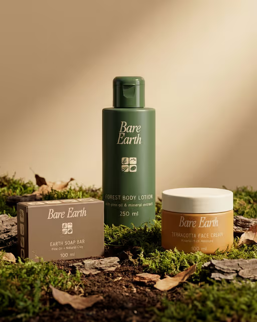
Bare Earth is a natural skincare brand concept built around the idea of skin care that feels truly connected to nature. The goal was to create a brand that reflects earth-derived ingredients without relying on the typical leaf-heavy or overly organic visuals most natural brands use. Instead, the direction focused on building a calm but distinctive identity using earthy colors, refined serif typography, and a simple icon system inspired by nature. The four icons fern, mountain, river, and stone represent the natural sources behind the formulations and help connect the brand visually with the packaging. The packaging system keeps things clean and structured while using color variations inspired by natural materials like forest greens, terracotta clay, and mineral stone. This allows each product to feel different while still belonging to the same visual family. The result is a grounded skincare identity that blends natural inspiration with a modern, minimal design
Skincare Branding
Packaging Design
Label Design
Merchandise
Poster & Print
Beauty & Skincare
Home & Lifestyle

Brand for Sale
Oaten is a modern oat porridge brand created to simplify everyday breakfasts while maintaining a strong visual identity. The goal of this project was to design a packaging system that feels clean, approachable, and retail-ready, while clearly communicating nutrition and flavor at first glance. The brand focuses on honest ingredients, warm mornings, and a balanced lifestyle, avoiding overly complex or cluttered design approaches.
The packaging is built around a consistent layout system that ensures clarity across all variants. A bold logo, centered hierarchy, and structured information flow make the product easy to read on shelf. Each flavor is distinguished through a strong color palette—Berry Blend uses vibrant pink tones for freshness, Cocoa Crunch uses deep brown for indulgence, and Honey Crunch uses warm golden hues to represent comfort and natural sweetness. This creates a visually balanced lineup that stands out while maintaining brand consistency.
Food imagery plays a key role in the design. Each pack features a top-view bowl of oat porridge with real ingredients, enhancing appetite appeal and reinforcing authenticity. The use of simple typography and minimal yet effective claims such as “No Added Sugar” and “High in Fiber” ensures the packaging remains informative without feeling overwhelming.
Overall, Oaten is designed as a modern FMCG brand that blends functionality with visual appeal. The result is a cohesive packaging system that feels fresh, contemporary, and ready for real retail environments.
Porridge Branding
Packaging Design
Label Design
Food & Beverage
Retail

Brand for Sale
Fable&Co partnered with TQA, a global leader in Agentic AI, on a comprehensive brand transformation, with an ambition to reposition TQA as a defining voice in the agentic AI era.
Agentic AI Branding
Poster & Print
Website Design
Interface Design
Business Cards
Tech & AI
Next
1 / 22