
Key Details
Commercial use for one business is included. The brand may not be resold or redistributed.
You’ll receive the complete brand kit as editable source files, including a mini visual brand guideline (PDF).
This brand kit can be adapted within a defined scope. Up to 2 revision rounds are included after the initial setup.
Once the purchase is confirmed, delivery usually takes 7–14 business days, depending on the requested adjustments.

Designbyvaleriya
A Graphic Designer with a true eye for well-curated design. After a lifelong interest in all digital artistic forms, I choose Graphic Design as my main focus. Along with my freelan
Profil on Braaands™Frequently Asked Questions
The core visual concept and structure of the brand remain unchanged.
These changes adapt the brand to your business without redesigning it from scratch.
If everything matches, you’ll receive a checkout link from Braaands™ to confirm the purchase.
The full amount is secured until the brand is finalized.
At checkout, you’ll also have the option to add additional packages such as business cards or packaging design.
Payment only happens once everything is confirmed.
Resale or redistribution is not permitted.
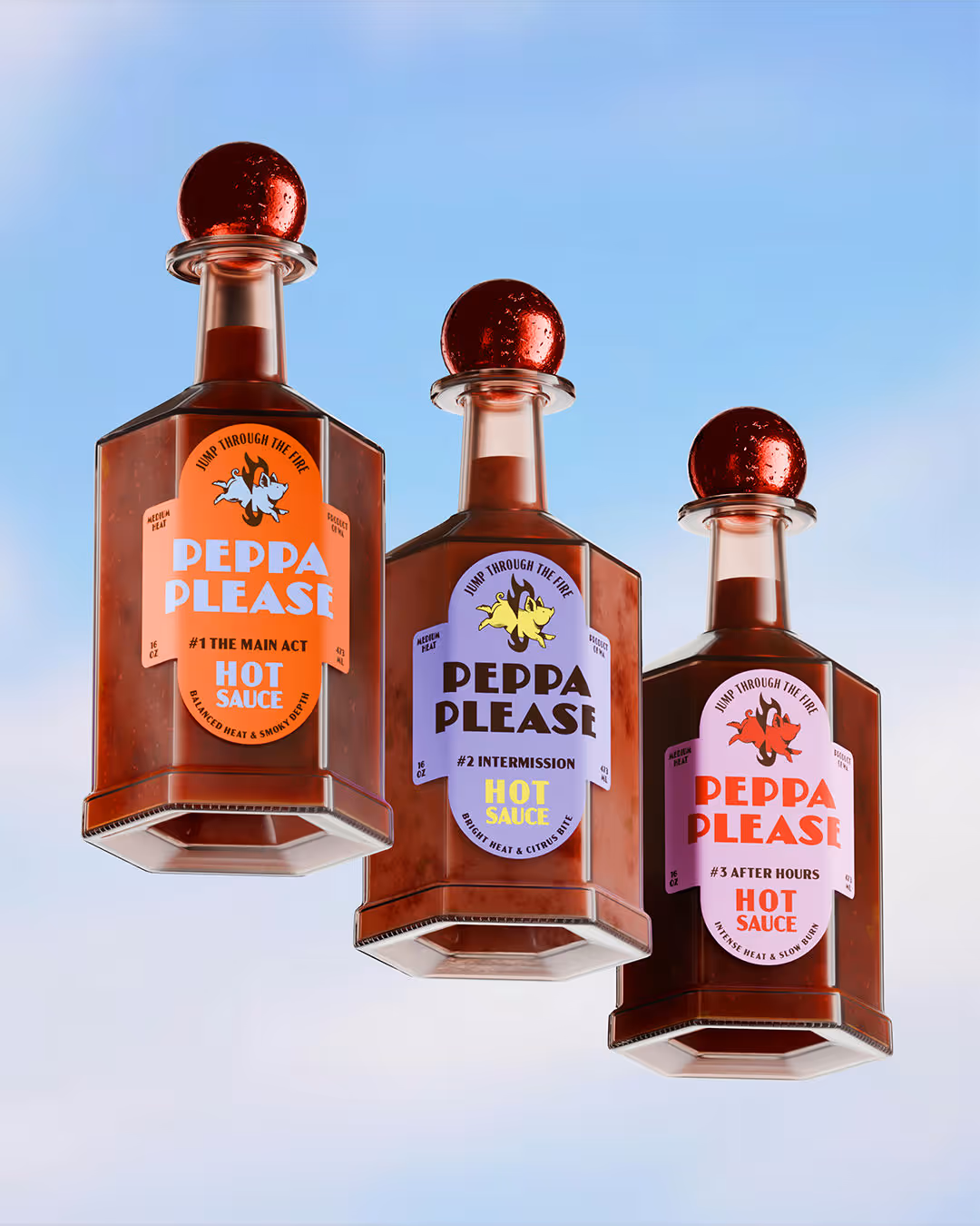
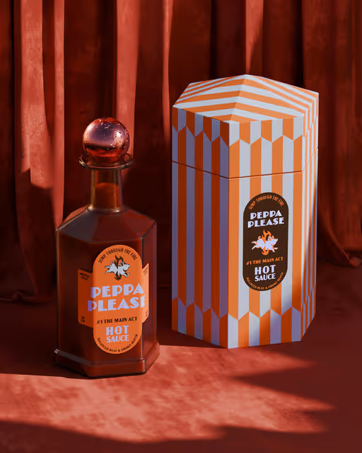
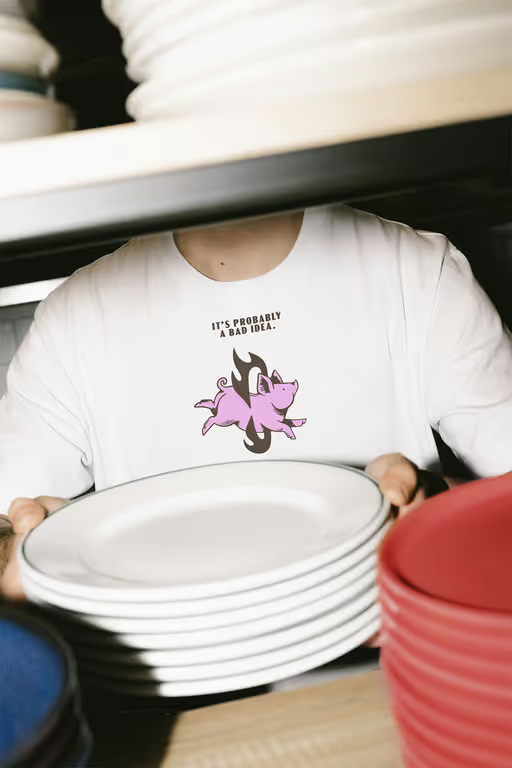
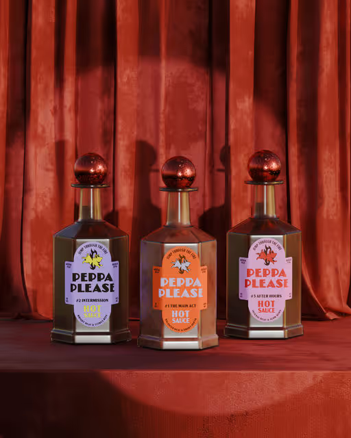
Sauce Branding
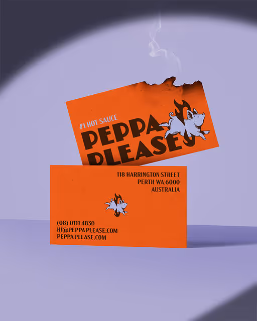
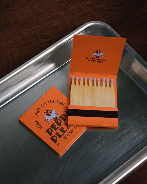
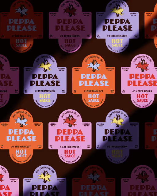
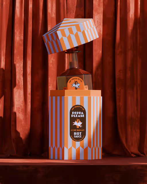
Peppa Please - Hot Sauce
We collaborated with @by.skojie to bring this conceptual project to life for @designerbriefs 🎪 Peppa Please is a pure art-direction experiment, built around storytelling, humour, and controlled chaos. At the centre of the concept is Peppa: a lazy, slightly delusional pig convinced they’re ready to leap through a flaming circus hoop. The result is a brand that doesn’t take itself too seriously, but is executed with intention and restraint. The circus became our narrative framework. Acts, pauses, and after-hours moments informed the flavour hierarchy, while the hexagon-shaped bottle and box reference the geometry of a circus chapiteau. Bold colour contrasts, gritty textures, and tattoo-inspired illustration styles were used to push the brand away from polished perfection and toward something more raw, tactile, and human. The label design balances structure with distortion, combining strong typographic hierarchy with displaced details and print-like imperfections. The result is packaging that feels worn, energetic, and slightly unhinged, like a travelling street circus that’s been on the road a little too long. This project wasn’t about creating a market-ready hot sauce. It was about exploring visual tension, narrative branding, and how far a concept can be pushed while still feeling cohesive. It’s loud. It’s chaotic. It’s probably a bad idea. 🔥🐷