Key Details
Commercial use for one business is included. The brand may not be resold or redistributed.
You’ll receive the complete brand kit as editable source files, including a mini visual brand guideline (PDF).
This brand kit can be adapted within a defined scope. Up to 2 revision rounds are included after the initial setup.
Once the purchase is confirmed, delivery usually takes 7–14 business days, depending on the requested adjustments.

Gevorg
Frequently Asked Questions
The core visual concept and structure of the brand remain unchanged.
These changes adapt the brand to your business without redesigning it from scratch.
If everything matches, you’ll receive a checkout link from Braaands™ to confirm the purchase.
The full amount is secured until the brand is finalized.
At checkout, you’ll also have the option to add additional packages such as business cards or packaging design.
Payment only happens once everything is confirmed.
Resale or redistribution is not permitted.
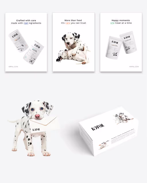
Dog Food Branding
K9pal — Pet Food
K9pal is a conceptual pet food branding and packaging project focused on minimalism, balance, and a quiet, modern visual identity. The pet food aisle is rarely quiet. Bright colors, dense claims, and competing mascots often fight for attention, leaving little room for clarity. K9pal takes a different approach. Designed as a premium nutrition brand for modern, conscious dog owners, this conceptual identity leans into restraint, using design to signal trust, transparency, and quality. At the core of the brand is the idea of Fresh Balance. The system pairs scientific precision with a calm, modern visual language, intentionally stepping away from the visual noise typical of commercial pet food. Inspiration comes from the Dalmatian coat. Its natural contrast and graphic simplicity become a subtle metaphor for balance, purity, and confidence. The result is a brand that feels considered and contemporary. Rather than relying on excess, K9pal creates shelf presence through contrast, spacing, and a strong point of view, proving that clarity can be just as compelling as color. Design Approach The packaging is built on a dominant white canvas, chosen to evoke cleanliness, safety, and transparency. This sense of “radical whiteness” creates breathing room on shelf, allowing the product to stand apart through calm rather than chaos. Bold black typography anchors the system, while playful Dalmatian imagery adds warmth and character without overwhelming the design. A unified design system was developed across multiple SKUs, ensuring consistency while allowing the range to scale seamlessly. Key elements include: Line Art Illustrations Custom minimalist outlines introduce a light, friendly personality, referencing the active and joyful lives of dogs while keeping the overall look refined and uncluttered. Clear Hierarchy Modern sans-serif typography establishes strong readability and structure across all packaging formats and digital applications, reinforcing the brand’s emphasis on clarity and trust. Together, these elements create a visual identity that feels confident, intentional, and refreshingly quiet. It is an approach that lets design do the talking. https://www.behance.net/gallery/240959817/K9pal-Pet-Food-Branding-Packaging