Key Details
Commercial use for one business is included. The brand may not be resold or redistributed.
You’ll receive the complete brand kit as editable source files, including a mini visual brand guideline (PDF).
This brand kit can be adapted within a defined scope. Up to 2 revision rounds are included after the initial setup.
Once the purchase is confirmed, delivery usually takes 7–14 business days, depending on the requested adjustments.

Design by Sukaina
Hey! I’m Sukaina, a graphic designer who helps skincare and café brands build strong identities through branding and packaging design. I love creating visuals that tell a story, f
Profil on Braaands™Frequently Asked Questions
The core visual concept and structure of the brand remain unchanged.
These changes adapt the brand to your business without redesigning it from scratch.
If everything matches, you’ll receive a checkout link from Braaands™ to confirm the purchase.
The full amount is secured until the brand is finalized.
At checkout, you’ll also have the option to add additional packages such as business cards or packaging design.
Payment only happens once everything is confirmed.
Resale or redistribution is not permitted.
Food & Beverage Brand Identity
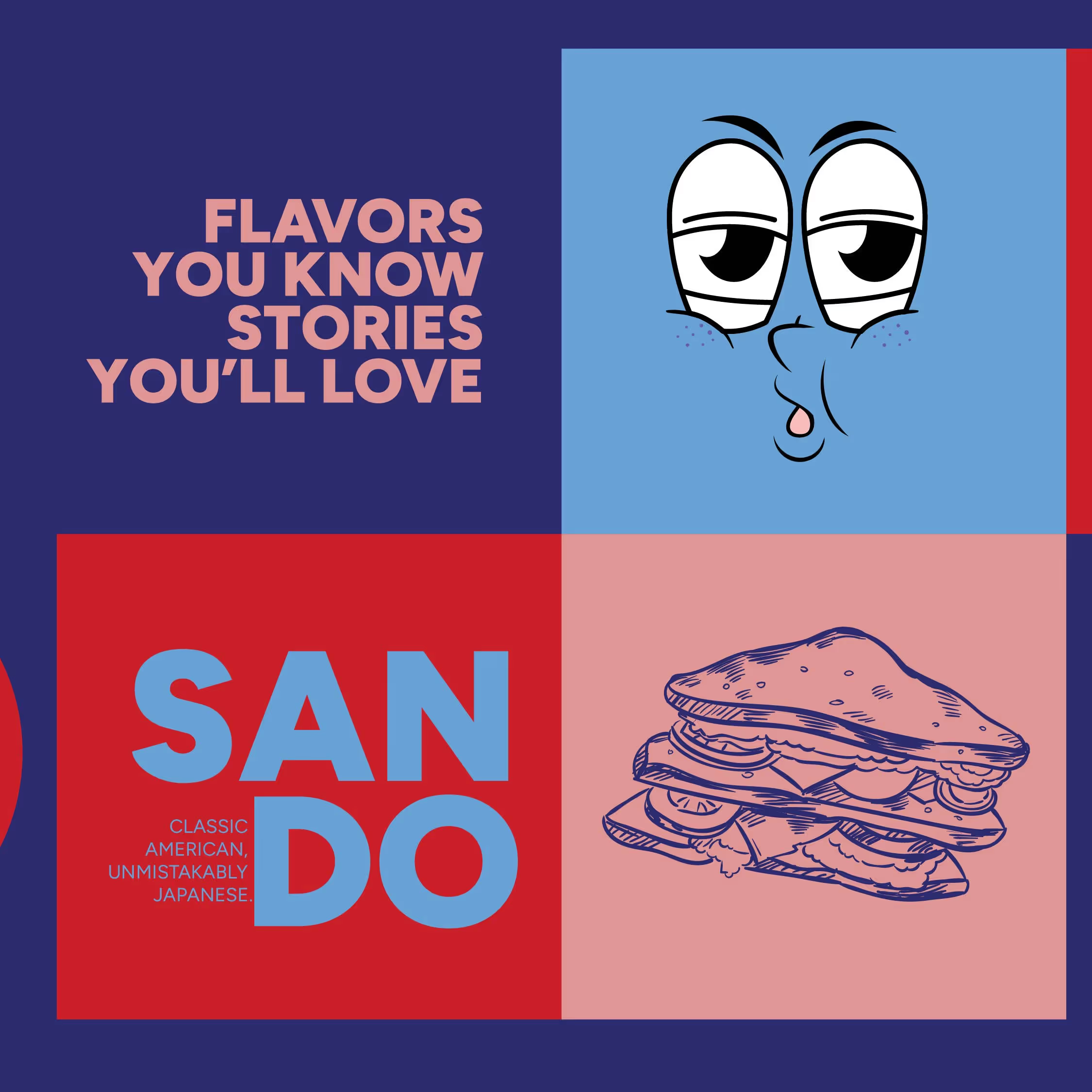
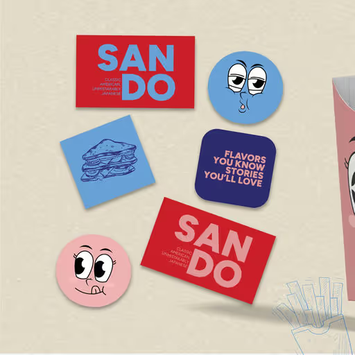
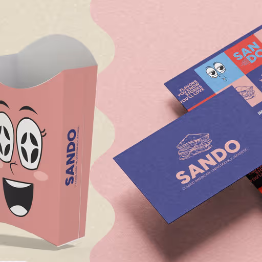
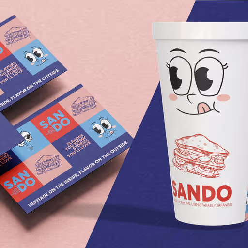
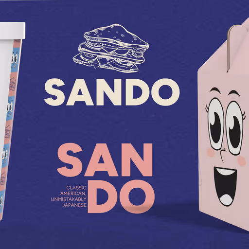
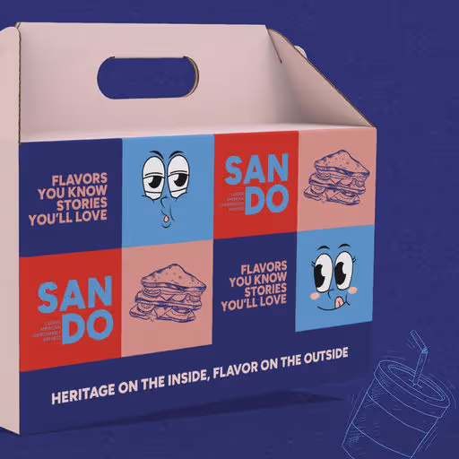
Sando | Japanese Sandwich Shop Branding
Sando is a fresh and playful Japanese-American sandwich shop that blends Tokyo street-style minimalism with bold, modern branding. The visual identity is built around clean layouts, a vibrant color palette, and type choices that reflect the quirky, compact nature of Japanese “sando” culture. The logotype is simple and geometric, capturing both cuteness and confidence. At the same time, the packaging and in-store materials bring the brand to life through a mix of grid-based balance and fun, icon-driven design. From sandwich wraps to takeaway bags and stickers, every piece is designed to create a memorable, photogenic experience for food lovers. Bold. Fresh. Easy to crave. A visual identity that makes every bite feel like a brand moment.