Brand Identity Showcase
Nominees
Thank you! Your submission has been received!
Oops! Something went wrong while submitting the form.
Showing you 0 of 0 Nominees


Brand for Sale
MNCH isn’t a sandwich brand. It’s a lifestyle. A bold, veggie-stacked, bread-snoozing lifestyle.
Sandwich Branding
Packaging Design
Label Design
Merchandise
Business Cards
Food & Beverage
Home & Lifestyle


Brand for Sale
The visual identity of Don Fuego is inspired by fire as both a cooking method and a social experience.
The handcrafted logo features irregular, organic shapes to reflect the raw, unpredictable nature of flame and to create a more authentic and approachable feel.
The hand-drawn illustrations reinforce this idea using simple and imperfect lines to evoke heat, movement and the cooking process, while adding a playful and human touch.
The red color palette is directly inspired by fire, embers and warmth creating a bold and energetic visual impact that immediately communicates the concept.
The tapas format supports a shared and convivial dining experience, aligning perfectly with the idea of food prepared over an open flame and enjoyed together.
Overall, the brand is designed to feel warm, social, bold and contemporary centered around the idea of bringing people together through fire
Restaurant Branding
Poster & Print
Business Cards
Label Design
Merchandise
Food & Beverage
Hospitality

Brand for Sale
Pasta di Nonna is a heritage pasta brand that draws from traditional milling and slow drying techniques.
I wanted the packaging to feel simple, confident, and honest. The clear window lets the product speak for itself, the typography creates a strong and easy reading flow, and the colors help it stand out on shelf without trying too hard.
Good pasta begins with method. Good packaging begins with intention.
Pasta Branding
Packaging Design
Poster & Print
Label Design
Business Cards
Food & Beverage
Retail

Brand for Sale
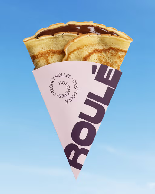
Roulé is a modern crêpe concept combining French street food with bold Scandinavian design. Strong typography and a repeating spiral shape the identity across packaging and print.
Crêpe Branding
Packaging Design
Poster & Print
Label Design
Stationery
Food & Beverage
Fashion & Apparel

Brand for Sale
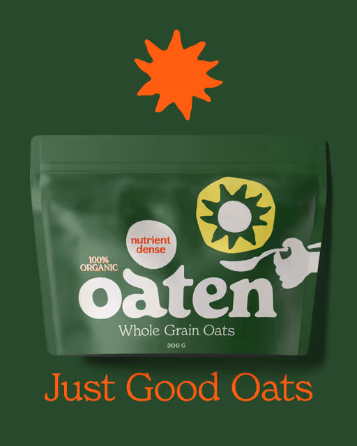
Oaten is a modern porridge brand focused on nutritious everyday breakfasts.
Porridge Branding
Packaging Design
Poster & Print
Label Design
Merchandise
Food & Beverage


Inspired by traditional cocina a la brasa, Don Fuego celebrates the art of open-fire cooking. A Spanish restaurant celebrates the bold flavor created through flame, smoke, and glowing embers. A place where the heat of the grill, the richness of Mediterranean ingredients, and the spirit of gathering around the table define every moment.
Restaurant Branding
Business Cards
Label Design
Packaging Design
Poster & Print
Food & Beverage
Hospitality


Brand for Sale
Coffee Shop Branding
© March 2026
The visual direction is built around a fresh, fun, and bold attitude. Strong typography, expressive shapes, and a vibrant color palette bring the brand to life across every cup. Whether it’s the cool charcoal for a modern, minimal vibe or the soft lavender for a lighter and playful mood, each variation is designed to stand out at the coffee bar while staying cohesive with the brand universe.
Coffee Shop Branding
No items found.
Food & Beverage
Retail


Brand for Sale
Don Fuego is a character-driven brand concept for an open fire restaurant. Focusing on heat, shared dining, and the theatrical energy of cooking over flames, it conveys warmth, social vibes, and a cheeky sense of fun.
Restaurant Branding
Label Design
Packaging Design
Poster & Print
Merchandise
Food & Beverage
Hospitality

Brand for Sale
Where botany meets fire.
I wanted this brand to feel like something you’d find in an old herbal book — delicate lines, ornamental frames, carefully composed typography.
But inside? Pure heat.
Small batch chili sauce inspired by nature, crafted with bold contrasts:
mango & habanero, serrano & lime.
Sauce Branding
Packaging Design
Label Design
Poster & Print
Merchandise
Food & Beverage
Retail

Brand for Sale
Don Fuego is a modern restaurant concept built around open-fire cooking and shared dining.
The idea was to capture the warmth and social atmosphere of long tables, good wine and food prepared over flame.
The identity combines expressive typography with a dynamic bull illustration — a symbol of strength, fire and Spanish culinary culture.
Supporting graphics were inspired by hand-ink textures to echo the raw energy of flame-grilled cuisine.
🔥 Grill • Wine • Fire
Restaurant Branding
Business Cards
Label Design
Merchandise
Packaging Design
Food & Beverage
Hospitality


Brand for Sale
Maneridge is a winter horseback riding destination offering guided rides and equestrian experiences in snow-covered, high-elevation landscapes, shaped by cold weather and the connection between rider and horse.
The branding for Maneridge is designed to feel modern, clean, premium, and professional, while still remaining warm and welcoming. The visual direction leans women-centric, reflected through the overall aesthetic and imagery choices. The typography and color palette were carefully selected to communicate the club’s refined professionalism and approachable spirit. The icon combines a shield and horseshoe silhouette, featuring an illustration of a joyful jumping horse to represent confidence, movement, and the thrill of riding.
Equestrian Club Branding
Business Cards
Label Design
Merchandise
Stationery
Sports
Hospitality


Brand for Sale
For Studio Moroso, a historic studio based in Soave, I developed a new visual identity designed to enhance the studio’s heritage while clearly communicating its core values.
The logo is built on an essential yet meaningful construction:
• the client at the center, represented by the central dot;
• care and professional support, expressed through the curved line that embraces it;
• focus and direction, suggested by the directional sign that guides the viewer’s eye;
• history and strong ties to the territory, evoked by a shape inspired by the battlements of the Castle of Soave.
The color palette revolves around Pantone Space Cherry red (#990011), chosen to convey solidity, authority, and a strong sense of identity.
The visual system is complemented by the Quasimoda typeface, characterized by clean and elegant lines that provide balance, readability, and a contemporary aesthetic.
The result is a visual identity that blends tradition and modernity, designed to present the studio in a coherent, recognizable, and professional way.
Project by Giulia Lecca
Studio Branding
Business Cards
Stationery
Label Design
Packaging Design
Home & Lifestyle
Retail

Brand for Sale
CouCou is a quiet, everyday kind of patisserie—made for slow mornings, warm streets, and that first bite you take before the day really starts. Crafted with real butter, simple ingredients, and careful hands, each pastry is baked to feel familiar yet special. Flaky layers, soft centers, and balanced sweetness come together without trying too hard. It’s the kind of place that reminds you of neighborhood bakeries, paper bags still warm, pastel storefronts, and small rituals you return to again and again—because some comforts are better when they stay simple.
Patisserie Branding
Packaging Design
Label Design
Poster & Print
Merchandise
Food & Beverage
Retail


Brand for Sale
There’s a specific kind of magic in European "leisure culture" that we’ve drifted away from in the digital age and that’s exactly what I wanted to reclaim with the identity for Casa Coco.
When I sat down to draft this brand, I wasn't just looking for a logo; I was looking for a temperature. I wanted the visual language to feel like 3:00 PM on a Tuesday in 1976.... that hazy, salt-crusted, mid-August heat where the only thing that matters is the condensation on your glass.
Bar Branding
Poster & Print
Merchandise
Label Design
Business Cards
Hospitality
Home & Lifestyle


Brand for Sale
CRUA was born out of a refusal to soften what is real. A branding project for a body care brand that embraces matter, use, and imperfection as its language. The product is not idealized. It is shown in action. Foam, excess, gesture, and wear are part of its identity.
Body Care Branding
Packaging Design
Label Design
Merchandise
Beauty & Skincare
Wellness & Health

Brand for Sale
Inner Matter is more than just a typical day spa; it’s a sanctuary designed to bridge the gap between physical recovery and emotional stillness. Rooted in the philosophy that "what happens within matters most," the space emphasizes holistic integration, treating the nervous system as much as the muscular system. The atmosphere is intentionally minimalist, utilizing soft earth tones, ambient soundscapes, and natural textures to immediately lower cortisol levels upon entry.
Spa Branding
Packaging Design
Poster & Print
Label Design
Business Cards
Wellness & Health
Home & Lifestyle

Brand for Sale
Nutty by Nature is an organic peanut butter brand inspired by nostalgia and stirred with bold new flavours. Creamy, crunchy, and a little adventurous, it’s here to give your breakfast (and your spoon) a refresh!
The brand focuses on simple, organic ingredients grown sustainably with no artificial flavours. This reflects authenticity and transparency at its core.
Peanut Butter Branding
Packaging Design
Label Design
Poster & Print
Merchandise
Food & Beverage
Retail


Brand for Sale
Nouveau branding pour Athletica Union - Agence de communication spécialisée dans le sport.
New branding for Athletica Union – Communication agency specialising in sport.
Athletic Branding
Poster & Print
Merchandise
Packaging Design
Label Design
Sports
Tech & AI

Brand for Sale
New branding for Casa Nonna - Italian restaurant
Italian Restaurant Branding
Poster & Print
Label Design
Business Cards
Packaging Design
Food & Beverage
Hospitality

Brand for Sale
Shakey’s is an 80s-inspired milkshake bar designed by @unpeel.design. Its built around bold flavors, loud music, and an over-the-top party atmosphere. Inspired by the energy of 80s disco culture, the space combines pastel tones, metallic finishes, and neon accents to create a playful, nostalgic environment.
Milkshakes are served in cocktail glasses, transforming a familiar comfort drink into a celebratory experience. Each shake is named after a year, turning the menu into a nostalgic timeline that celebrates indulgence and fun.
The visual identity draws directly from 80s party aesthetics. Soft pastel colors paired with metallic textures balance sweetness and excess, while bold, retro-inspired typography references disco-era signage and reinforces the confident, expressive nature of the brand.
Shakey’s is a place where milkshakes aren’t just drinks, but moments.
Extra thick since the 80s.
Milkshake Bar Branding
Poster & Print
Packaging Design
Label Design
Merchandise
Food & Beverage
Events & Festivals

Brand for Sale
Toss Bar is a modern salad concept with a playful, fashion-forward point of view. Designed to feel just as chic as it is fresh. The goal was to move away from the typical “green and wholesome” visual language and build an identity that balances clean eating with confident, cool girl energy.
The logo takes inspiration from the classic cocktail garnish (an olive on a pick) and reimagines it in a bright, healthy context ~ cherry tomatoes on a skewer. An elegant script wordmark delivers the elevated feminine tone while the bold “Bar” anchors the system with clarity and trust creating a look that feels both stylish and dependable.
Salad Bar Branding
Label Design
Packaging Design
Poster & Print
Business Cards
Food & Beverage
Fashion & Apparel
Brand for Sale
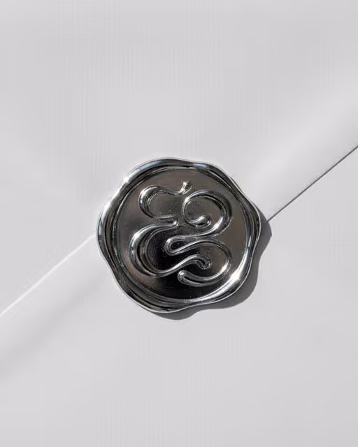
Eg. Creative - a branding project
Visual identity for a copywriter
The core symbol merges an E and a g, forming a fluid monogram.
Chrome represents the present: It reflects culture, trends and reality as they are now. Just like her writing, it is responsive, aware and sharp.
Black symbolises ink: permanence, clarity and confidence. Once words are written, they remain. It speaks to conviction and authority in voice.
White represents paper arcs: space, structure and possibility. The blank page is both discipline and freedom. It holds the narrative before it unfolds.
Copywriter Branding
Packaging Design
Business Cards
Label Design
Poster & Print
Home & Lifestyle
Retail


Brand for Sale
🧖🏻♀️Inner Matter is a premium spa focused on deep rest and inner balance.
Inspired by the traditions of Japanese onsen culture and elevated through contemporary spa design, Inner Matter creates experiences that restore balance from the inside out.
Spa Branding
Business Cards
Stationery
Poster & Print
Packaging Design
Beauty & Skincare
Wellness & Health

Brand for Sale
The Bunch is a vegetarian burger concept built around three cheeky mascots: a patty, fries and sauce. The project challenges the typical meat heavy burger aesthetic with bold pink tones and a messy, fun attitude.
Vegetarian Burger Branding
Packaging Design
Poster & Print
Merchandise
Label Design
Food & Beverage
Retail


Brand for Sale
Peppa Please is a hot sauce brand designed for those who want their meals with a serious kick and a side of humor. Moving away from traditional glass bottles, the identity utilizes industrial-style metal tins to house "crushingly hot" flavors—a choice that visually reinforces the brand’s belief that "mild is a social construct."
The branding features a bold, vintage-inspired script and a provocative personality meant to dominate any table. By blending high-energy visuals and clean ingredients with a "cheeky" attitude, Peppa Please delivers an uncompromising heat experience that refuses to take food—or life—too seriously.
Real heat. Raw aesthetics. No sympathy.
Sauce Branding
No items found.
Food & Beverage
Retail


Brand for Sale
Lazuli House is a bold brand identity for a boutique communications agency, blending sharp strategy, cultural fluency, and editorial storytelling. Built around confidence, mood, and intention — designed to feel human, expressive, and impossible to ignore.
Agency Branding
Business Cards
Poster & Print
Stationery
Merchandise
Tech & AI

Brand for Sale
Playful packaging design for a modern probiotic sparkling soda. Each flavor is represented through bold, minimal illustrations that blend fruit elements with character-driven visuals, creating a fresh, memorable identity focused on gut health without sacrificing fun.
Soda Branding
Packaging Design
Label Design
Poster & Print
Merchandise
Food & Beverage
Wellness & Health

Käse Coffee House is a specialty coffee destination defined by the marriage of precision brewing and traditional craftsmanship. Moving away from the "grab-and-go" culture, the brand emphasizes the ritual of drinking coffee, grounding the high-grade specialty product in the warmth and weight of heritage vessels.
The Core: uncompromising specialty coffee, featuring rotating single-origin beans and expert extraction methods (V60, Aeropress, Espresso).
The Signature: The service vessels. Instead of standard ceramic or paper, every beverage is served in unique, traditional cups from central Asia "KÄSE". These cups serve as a tangible connection to history and tradition, turning every sip into an aesthetic experience.
The Vibe: Authentic, grounded, and sensory-focused. It is a place to slow down and appreciate the details of the roast and the texture of the cup.
Café Branding
Merchandise
Packaging Design
Poster & Print
Business Cards
Food & Beverage
Hospitality

Brand for Sale
A study in matter and material. Bare Earth draws from botanical sheets, patent aesthetics, and forest elements to build a restrained, textural identity rooted in resin, clay, and moss.
Skincare Branding
Packaging Design
Poster & Print
Label Design
Merchandise
Home & Lifestyle
Fashion & Apparel

Brand for Sale
Shakey’s is a conceptual milkshake brand inspired by late-night diners, soft neon lights, and the familiar comfort of something cold and sweet. Rooted in ’80s American diner culture, the brand celebrates indulgence, nostalgia, and everyday rituals — moments that feel familiar, comforting, and quietly special. (collab with @tanjeena.design)
Milkshake Branding
Poster & Print
Merchandise
Label Design
Packaging Design
Food & Beverage
Retail

Brand for Sale
Parley is a high-class biscuit salon. In a world full of bakeries, patisseries, and dessert cafés, Parley makes biscuits the star of the show, treating them like works of art - inviting people to slow down and appreciate life’s smaller pleasures.
Biscuit Salon Branding
Label Design
Packaging Design
Poster & Print
Merchandise
Food & Beverage
Retail

Brand for Sale
Branding for L*Espirit Belle.
We combined the brand’s strengths and values into a minimalist symbol: a flower, or an asterisk. The symbol references naturalness, the reeds in home fragrances, and the flame of a candle. We developed a premium identity that is easy to reproduce — both on a single product and across more than 100 product types.
L’Esprit Belle began expanding into new markets, including China. This stage required careful consideration of cultural context, particularly colour symbolism and visual perception.
Home Fragrances Branding
Packaging Design
Label Design
Business Cards
Stationery
Beauty & Skincare
Retail

Brand for Sale
The Callisto is a concept brand envisioned as a private art club built around openness and expression. Inspired by museums, architecture, stone, and oceanic blues, the identity explores weight, permanence, and spatial composition through a material-led visual language.
Private Art Club Branding
Poster & Print
Packaging Design
Label Design
Merchandise
Home & Lifestyle
Entertainment


Oh Belly is a playful, gut-friendly soda brand built with a strong focus on packaging as the hero. The goal was to create a system that feels fresh, fun, and shelf-ready without leaning into boring or clinical health cues. A clean warm-white base keeps the brand consistent, while bold fruit colors and mascots bring instant flavor recognition. The layout stays fixed across all variants, allowing the range to feel unified, scalable, and easy to spot both on shelves and on screen. This project explores how a mascot-led, color-driven packaging system can balance personality with clarity in a modern
Soda Branding
Packaging Design
Label Design
Merchandise
Food & Beverage
Retail


Brand for Sale
Échappée Belle is a travel agency conceived as a series of immersive stopovers.
Each destination becomes a chapter, shaped by the rhythm of the seasons, culture, and place.
The experience goes beyond travel itself, envisioned as a complete immersion-sensory, thoughtful, and deeply rooted in the destination.
For this first stopover, the focus turns to Japan, between Mount Fuji, the tea routes of Uji, the temples of Kamakura, and the bamboo forests of Arashiyama.
A natural and editorial visual universe supports this vision, with a palette inspired by landscapes, airy compositions, and an embossed logo evoking the idea of a chapter.
More than a journey, Échappée Belle offers another way to explore the world slow, immersive, and attentive to detail.
Travel Agency Branding
Business Cards
Label Design
Packaging Design
Stationery
Hospitality
Events & Festivals

Brand for Sale
La Musé is a heritage atelier based in France, founded on the belief that fashion is both memory and muse. Rooted in artisanal craftsmanship and poetic femininity, the brand blends old-world refinement with modern restraint. Each piece is thoughtfully constructed, honoring traditional techniques while embracing a contemporary silhouette.
The logo reflects this philosophy. The hand-drawn portrait at its center evokes a timeless muse. Its imperfect, expressive lines give the mark an intimate, workshop-made quality, reinforcing the brand's commitment to artistry and authenticity.
The fully custom logotype, fluid and organic, contrasts the delicacy of the illustration with confident movement.
Together, the logo mark and wordmark create a signature that feels personal, archival, and distinctly crafted — much like the garments themselves.
Atelier Branding
Label Design
Packaging Design
Business Cards
Merchandise
Fashion & Apparel