

Key Details
Commercial use for one business is included. The brand may not be resold or redistributed.
You’ll receive the complete brand kit as editable source files, including a mini visual brand guideline (PDF).
This brand kit can be adapted within a defined scope. Up to 2 revision rounds are included after the initial setup.
Once the purchase is confirmed, delivery usually takes 7–14 business days, depending on the requested adjustments.

giulialeccadesign, Giulia Lecca
Graphic designer and illustrator from Verona ✏️ My work ranges from illustrations and mascot design to branding, logos and packaging always tailored to each client vision!
Profil on Braaands™Frequently Asked Questions
The core visual concept and structure of the brand remain unchanged.
These changes adapt the brand to your business without redesigning it from scratch.
If everything matches, you’ll receive a checkout link from Braaands™ to confirm the purchase.
The full amount is secured until the brand is finalized.
At checkout, you’ll also have the option to add additional packages such as business cards or packaging design.
Payment only happens once everything is confirmed.
Resale or redistribution is not permitted.
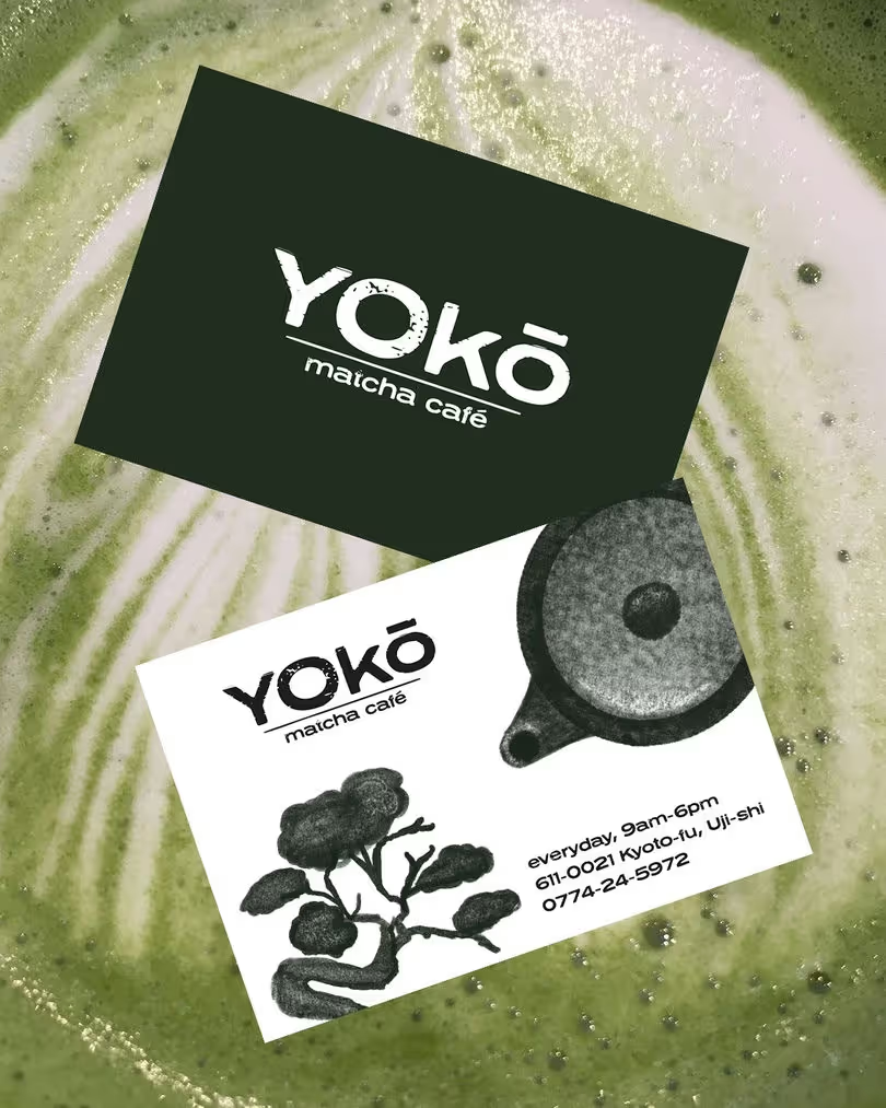
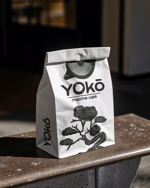
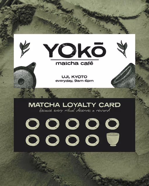
Matcha Branding
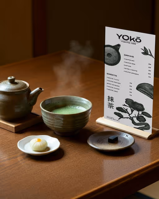
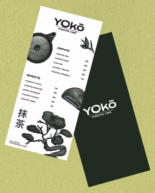
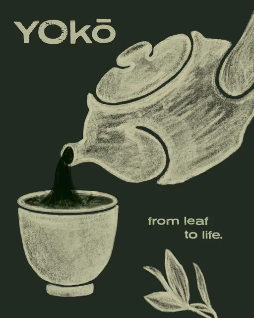
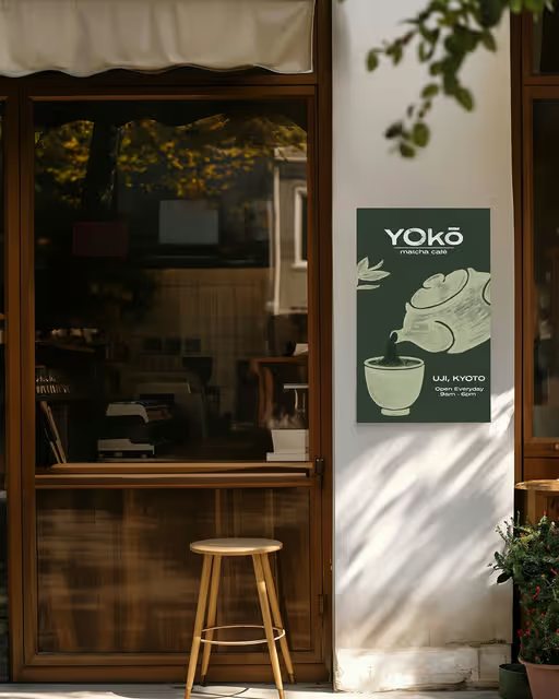
Yokō Matcha Café🍵
A visual identity created for a Japanese matcha bar that invites slowness and quiet reflection. Yokō was born from the tension between fast city rhythms and the need to pause. The concept is expressed through a design language that embraces calm, ritual, and the beauty of imperfection. The illustrations are hand-drawn, inspired by traditional sumi-e ink painting (墨絵 ) and the minimal, poetic forms of Japanese nature. Textured strokes and organic lines bring a sense of authenticity. Embracing imperfection, the logo reveals a quiet elegance in its roughness, where every line holds meaning. Like a matcha prepared slowly, the design invites a quiet moment in a busy world. Project by Giulia Lecca