Brand Identity Showcase
Nominees
Thank you! Your submission has been received!
Oops! Something went wrong while submitting the form.
Showing you 0 of 0 Nominees


Brand for Sale
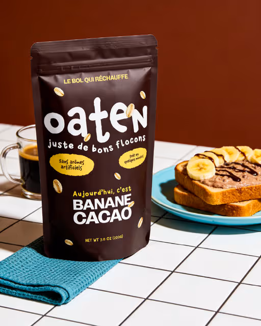
Oaten brings back the joy of simple mornings. Represented by our cowboy-hatted farmer, Mr. Oaten, we believe eating well should feel easy and fun. With three varieties and no added sugars or flavors, it’s just honest oats.🌾🥣
Porridge Branding
Packaging Design
Label Design
Poster & Print
Merchandise
Food & Beverage
Wellness & Health


Brand for Sale
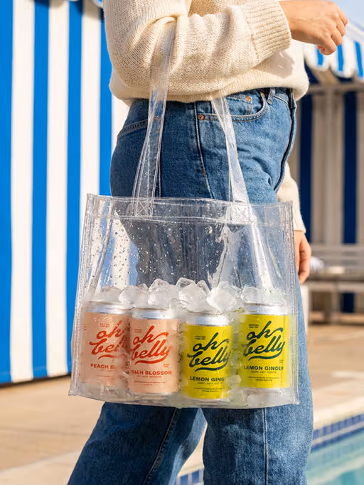
Oh Belly is a fun soda brand that supports gut health with prebiotics.
Soda Branding
Packaging Design
Poster & Print
Merchandise
Label Design
Food & Beverage
Wellness & Health

Brand for Sale
Oaten is a modern porridge brand focused on nutritious everyday breakfasts.
Porridge Branding
Packaging Design
Merchandise
Label Design
Poster & Print
Food & Beverage

Brand for Sale
This packaging is designed to feel like a quiet morning wrapped in warmth. The rich orange tones and soft illustration evoke comfort, memory, and the gentle rhythm of home. The small girl beside the oversized bowl becomes a symbol of care, simplicity, and the joy found in everyday rituals. Clean, minimal information allows the emotion to breathe without distraction. Altogether, it doesn’t just present a product — it tells a story of warmth in every spoonful.
Porridge Branding
Packaging Design
Poster & Print
Label Design
Merchandise
Food & Beverage
Home & Lifestyle

Brand for Sale
Bare Earth is a nature led body care concept inspired by forest ingredients like pine oils and mineral clays. I focused on creating a calm, honest visual language that feels grounded and premium without overcomplication. Following the brief’s keywords around nature and authenticity, I explored editorial still life photography using pine butterflies as a symbol of renewal and connection to the ecosystem behind the formula. Soft lighting, minimal styling and natural textures help the product feel like it exists inside the forest, not just inspired by it. The goal was to create a contemporary editorial skincare aesthetic that feels real, tactile and emotionally connected to nature, ideal for modern botanical and sustainable beauty brands.
Body Care Branding
Packaging Design
Label Design
Beauty & Skincare
Home & Lifestyle


Brand for Sale
Ljóma is a sunscreen brand inspired by Icelandic beaches, featuring a pebble-shaped bottle made from recycled ocean plastic and refillable inner pouches designed to reduce waste.
Sun Screen Branding
Packaging Design
Business Cards
Label Design
Poster & Print
Beauty & Skincare
Wellness & Health

Brand for Sale
Inspired by the resilient women who shaped this culture, La Mãma invites the world to experience authentic Mexican flavors with a modern twist.
Born in Australia, the brand captures the strength and essence of the Mexican woman. She is the warrior mother who unites people around the table, embodying the vibrant spirit and deep-rooted traditions of Mexico.
Fast Food Branding
Packaging Design
Poster & Print
Label Design
Merchandise
Food & Beverage
Hospitality


Brand for Sale
TERRE is an artisanal ceramics studio based in Provence, celebrating the raw beauty and poetry of the earth.
Its authentic and warm universe is expressed through mineral colors, organic shapes, and nature-inspired patterns, inviting the gentle spirit of the South and the art of craftsmanship into everyday life.
A natural and sensitive visual identity accompanies this world, with a logo inspired by the layers of the earth, a typeface that evokes the handmade gesture, and a warm color palette with terracotta and ivory accents.
Ceramic Studio Branding
Packaging Design
Label Design
Poster & Print
Business Cards
Home & Lifestyle
Retail

Brand for Sale
Oaten; A modern porridge brand made for slow mornings and busy ones alike.
Soft tones, confident typography, and a playful mascot come together to create a visual language that feels modern yet grounded.
—
Designed in collaboration with @designedbymitte
Porridge Branding
Business Cards
Packaging Design
Label Design
Merchandise
Food & Beverage
Retail


Brand for Sale
Nonna Beve is an Italian restaurant concept inspired by the client’s grandmother and the feeling of growing up around her table. The identity translates warmth, generosity, and togetherness into a playful yet elegant visual world. Inspired by old Italian illustrations and aperitivo culture, the brand is centered around the grandmother as both the name and the mascot — a symbol of joy, hosting, and unapologetic living. Designed to feel welcoming, lively, and familiar, Nonna Beve invites people to eat well, drink well, and stay a little longer.
Italian Restaurant Branding
Business Cards
Label Design
Packaging Design
Poster & Print
Food & Beverage
Hospitality


Brand for Sale
The concept was designed to feel vibrant and bold. To support this energy, the custom typography was carefully built by hand in Illustrator, giving the brand a distinct and confident presence.
Alongside this bold foundation, the concept introduces a softer layer through vintage tones. While the brand is energetic at its core, these elements add a sense of timelessness and organic character. They help ground the identity and subtly communicate quality and authenticity, making the brand feel more thoughtful, and rooted in story other than just bold expression.
Matcha Branding
Business Cards
Label Design
Packaging Design
Poster & Print
Fashion & Apparel
Brand for Sale
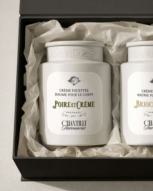
A body care collection inspired by the rituals of the French kitchen.
Whipped creams, warm brioche, ripe pear, soft almond, familiar notes reimagined as something to be savoured slowly, on the skin.
Soins du corps, inspirés de la pâtisserie française.
Body Care Branding
Packaging Design
Label Design
Poster & Print
Stationery
Beauty & Skincare
Food & Beverage


Brand for Sale
Identity | Packaging design
Lumea
The name Lumea draws from the idea of light and glow, without being literal. Soft and balanced, it sets the tone for a brand that feels warm, modern, and composed. The logo is intentionally minimal. Set in lowercase typography with generous spacing, it communicates confidence without excess. There are no decorative elements - only clean forms designed to feel contemporary yet enduring.
The brand identity is built around repetition, rhythm, and structure. Linear patterns and stripe variations form a visual system inspired by the steady burn of candlelight. These elements create consistency while allowing variation across products. Color is used with restraint - muted reds, violets, and teals provide distinction without breaking the brand’s quiet tone.
The packaging design reflects the same philosophy. Tall, slim boxes echo the proportions of the dinner candles inside. The layout prioritizes white space, allowing the product to feel light and refined. Fine line illustrations suggest the form and pattern of the candles without relying on photography, reinforcing a sense of calm and intentional design.
Candles Branding
Packaging Design
Label Design
Poster & Print
Merchandise
Home & Lifestyle
Retail
Brand for Sale
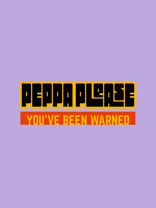
Peppa Please is a contemporary hot sauce brand built around the idea of anticipation and impact - the moment right before experiencing intense heat. The pose of the character bracing over the TNT plunger represents the physical and emotional response to spice: you know it's going to hit, yet you still lean into it.
Rather than softening the idea of heat, Peppa Please embraces it as a promise: a sauce that is confident, unapologetic, and honest about the experience it delivers.
Sauce Branding
Poster & Print
Merchandise
Label Design
Packaging Design
Food & Beverage

Brand for Sale
Crumb & Brew is a modern coffee spot centered on warm drinks, soft cookies, and the joy of slowing down. The bold, flowing logomark reflects community and rising steam, while bubbly visuals echo fresh coffee foam to create a cozy feel.
Café Branding
Packaging Design
Merchandise
Poster & Print
Business Cards
Food & Beverage
Hospitality

Brand for Sale
Mixing 70's outdoor vibes with a clean, modern edge. Every element was designed to celebrate that feeling of heading off the grid.
Lifestyle & Outdoor Branding
Label Design
Merchandise
Packaging Design
Poster & Print
Fashion & Apparel
Home & Lifestyle

Brand for Sale
Bella is a transformative Australian brand redefining the pasta sauce category by merging authentic Italian traditions with contemporary culinary trends. It’s designed for the modern-day gourmet who values quality, sustainability, and convenience. In a market dominated by uninspired options, Bella rises as the choice for those craving authenticity, vibrant flavors, and eco-conscious packaging.
Sauce Branding
Packaging Design
Label Design
Merchandise
Poster & Print
Food & Beverage
Retail

Brand for Sale
This is a bakery concept that takes a modern, lighthearted approach that stands apart from traditional bakeries, by using bold colors, and a witty mascot. The result is an identity that feels approachable and contemporary, without losing the warmth and authenticity of handmade goods.
Bakery Branding
No items found.
No items found.

Brand for Sale
An experimental branding project exploring restaurant identity through the lens of 90s underground print culture. The BANG Ramen system uses limited high contrast color, aggressive typography, and layered graphic composition to create a fictional but fully realized brand world. Designed to exist across physical objects, signage, and printed ephemera, the work emphasizes tactile detail, macro graphic texture, and cohesive visual storytelling.
Restaurant Branding
No items found.
No items found.
Brand for Sale
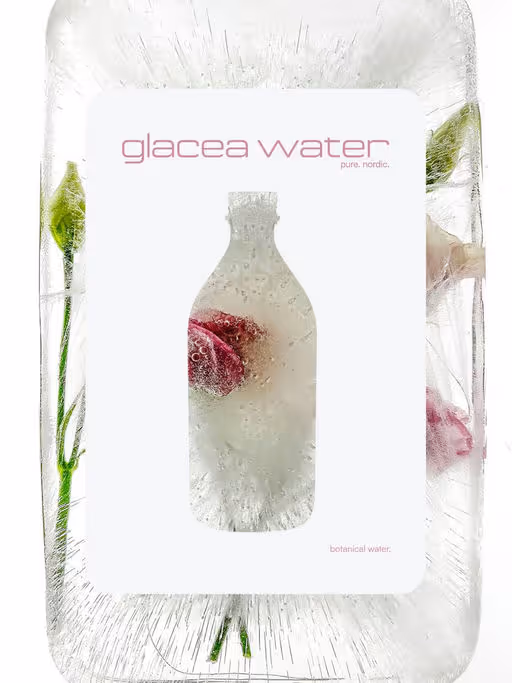
Glacea Water is a contemporary botanical water brand inspired by Nordic environments.
Rooted in cold climates and natural restraint, the project explores purity through mineral water gently infused with botanical extracts. Subtle florals, northern herbs, and glacial influences come together in a calm, balanced approach to water.
Beverage Branding
No items found.
No items found.

Brand for Sale
Reserved is a conceptual motel imagined between nostalgia and modern ease.
Inspired by retro Californian motels and fashion editorial aesthetics, the project blends warm rosé tones with soft sun-faded oranges, creating an atmosphere that feels both familiar and contemporary.
Designed as a place to slow down, Reserved focuses on mood before function, where color, texture, and typography work together to shape an experience rather than just a space.
Every detail is intentional, from the visual identity to the printed pieces, reflecting a sense of comfort, calm, and warmth.
Reserved exists somewhere between past and present, between travel and pause a destination defined defined by light and unhurried time.
No rush. No schedule. Just time.
Motel Branding
No items found.
No items found.


Brand for Sale
GyoGyo brings the sizzle of Japan to your kitchen with flavour-packed gyoza and DIY hot pot kits. Rooted in tradition with a playful anime twist, it’s made for sharing, slurping, and seriously good umami moments.
Japanese Food Branding
No items found.
No items found.


Brand for Sale
Nayma is a warm and friendly cake brand that focuses on homemade flavors and simple joy. Its visual style uses soft colors, clean shapes, and a gentle look that reflects comfort and sweetness. The brand aims to feel welcoming, kind, full of love—just like the cakes it creates. Nayma brings a small moment of happiness to anyone who enjoys something sweet and made with care.
Cake Branding
Packaging Design
Merchandise
Poster & Print
Label Design
Food & Beverage
Retail

Brand for Sale
Nayma is a warm and friendly cake brand that focuses on homemade flavors and simple joy. Its visual style uses soft colors, clean shapes, and a gentle look that reflects comfort and sweetness. The brand aims to feel welcoming, kind, full of love—just like the cakes it creates. Nayma brings a small moment of happiness to anyone who enjoys something sweet and made with care.
Cake Branding
Packaging Design
Merchandise
Label Design
Poster & Print
Food & Beverage
Retail

Brand for Sale
Scope of work: Branding & Packaging
A Mineral water brand made of plant extract shaped by cold climate and pristine landscapes
Mineral Water Branding
Packaging Design
Label Design
Merchandise
Food & Beverage
Retail

Bare Earth is a fictional natural body care brand inspired by forest extracts and raw materials.
This project explores minimalist branding and packaging through a calm, earthy and modern visual identity.
Body Care Branding
Packaging Design
Label Design
Merchandise
Poster & Print
Beauty & Skincare
Home & Lifestyle

Brand for Sale
A Fun & Bold Bakery Brand!
We designed this brand and packaging for a bakery that wanted to stand out and feel fun, modern, and full of flavor!
We used bright colors like orange, pink, and black, used a bold and modern typeface, and added a fun illustration to give the brand a unique and happy look. It’s made to grab attention and feel fresh — just like the bakery items inside.
Bakery Branding
Packaging Design
Merchandise
Business Cards
Poster & Print
Food & Beverage
Retail

Brand for Sale
We designed a matcha brand that is all about refreshing energy and vibrant taste. We blended fresh green vibes with a touch of purple to give it that premium yet playful look you’ll love.
Matcha Branding
Packaging Design
Merchandise
Poster & Print
Label Design
Food & Beverage
Retail


Brand for Sale
For Kiln ceramic studio, a grounded yet premium feel was essential, so I specifically chose a soft serif font to capture the premium and calm feel. The color palette dark oranges and soft tints make you feel slower and relaxed.
In today's world, full of stress and the vibrancy of screens, ceramic products make you connect to nature and your inner self.
Ceramic Studio Branding
Packaging Design
Label Design
Business Cards
Stationery
Home & Lifestyle
Wellness & Health


Brand for Sale
Founded in 2025 in Tokyo’s Harajuku district, YOKŌ is a matcha café where fast‑paced city life meets moments of mindful stillness.
Every drink is slow‑crafted to help you pause, breathe and find calm in the city rush.
Matcha Branding
Packaging Design
Merchandise
Label Design
Business Cards
Food & Beverage
Hospitality
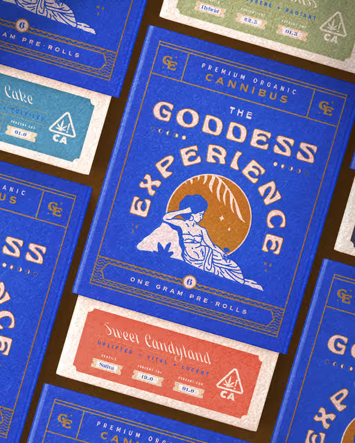
A cannabis identity and packaging system for The Goddess Experience. Built around mood, ritual, and creating an experience before the first hit.
Cannabis Branding
Packaging Design
Label Design
Poster & Print
Merchandise
Wellness & Health
Retail
Brand for Sale
Modern porridge brand concept focused on warmth, simplicity and everyday rituals. Identity design, packaging system and AI-directed visuals created to explore a soft, honest and contemporary food branding universe.
Porridge Branding
Packaging Design
Label Design
Poster & Print
Merchandise
Food & Beverage
Retail

Brand for Sale
MooHaus is a handmade gelateria based in São Paulo. Our goal was to create a fun, fluid and cool brand! We adopted a totally organic identity, representing Moo's artisanal side, from the conception of its ice creams made carefully with natural ingredients, to the establishment of emotional connection and experience that we want to transmit through all the visual and verbal part.
Gelateria Branding
Packaging Design
Merchandise
Poster & Print
Business Cards
Food & Beverage
Retail


Brand for Sale
Valperdine, a wine house where each cuvée holds its own world, a feeling told before the first sip even happens. 🍇🦌
To bring this universe to life, I designed a series of labels as narrative collages, blending analog textures, surreal landscapes, and a gradient trichromy that became the brand’s visual signature. All guided by the emblematic woman and stag, the silent narrators of this journey.
From Velvet Night to Ruby Bloom, Golden Harvest and Burning Dawn, every bottle is a small odyssey, meant to be tasted, but also read and imagined.
Wine Branding
Packaging Design
Label Design
Merchandise
Poster & Print
Food & Beverage
Fashion & Apparel

Brand for Sale
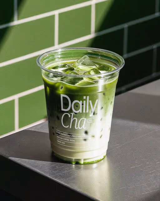
I recently dove into Brief 222 by @Brief Club, tasking me to develop a brand identity for Daily Cha, a modern matcha cafe. The goal was to move beyond the traditional "tea house" aesthetic and create something that resonates with a fast paced, design conscious urban audience.
My approach focused on the concept of "Balanced Energy." I paired raw, organic textures with a bold, high contrast visual language. By mixing a sophisticated serif representing the heritage of the tea with a minimalist layout, the identity feels both premium and accessible. The design isn't just about a logo; it’s about the tactile experience of a morning ritual.
The project includes a comprehensive logo system, a custom takeaway cup design, and a digital first color palette. Exploring how a brand can feel "calm" yet "electric" at the same time was a rewarding challenge. Even though the official giveaway with @Marlo Studios has ended, the brief served as the perfect catalyst to push my packaging and identity skills to the next level.
Matcha Branding
Packaging Design
Label Design
Merchandise
Poster & Print
Food & Beverage
Retail

Brand for Sale
When design aligns with purpose, brands connect faster.
For Oh Belly Probiotic Soda, I developed a visual direction that reflects lightness, care, and modern wellness. The design system combines refreshing colors, intentional spacing, and clean typography to create a calm yet energetic presence.
Every decision was made with the user in mind from visual clarity to emotional appeal. This project is a reminder that great branding doesn’t shout; it communicates clearly, feels human, and builds trust at first glance.
Strategic design. Thoughtful execution. Real impact.
Prebiotic Soda Branding
Packaging Design
Merchandise
Label Design
Poster & Print
Food & Beverage
Wellness & Health