
Key Details
Commercial use for one business is included. The brand may not be resold or redistributed.
You’ll receive the complete brand kit as editable source files, including a mini visual brand guideline (PDF).
This brand kit can be adapted within a defined scope. Up to 2 revision rounds are included after the initial setup.
Once the purchase is confirmed, delivery usually takes 7–14 business days, depending on the requested adjustments.

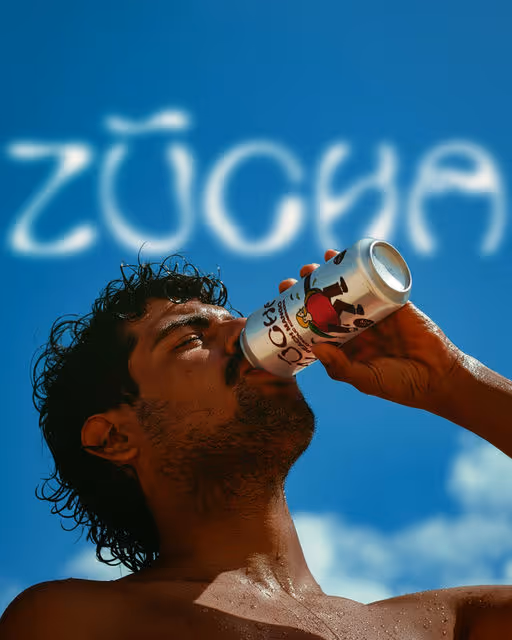
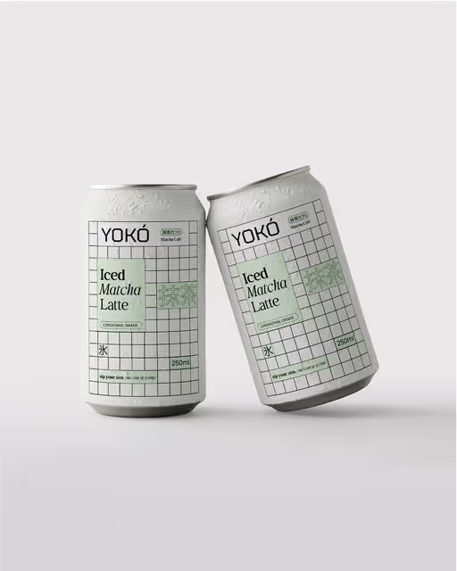
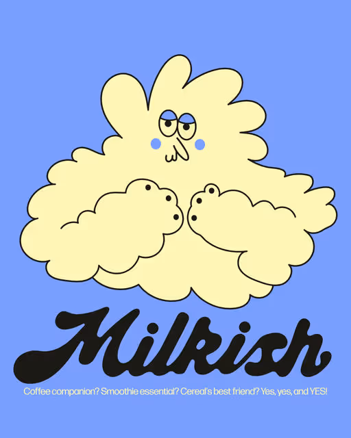
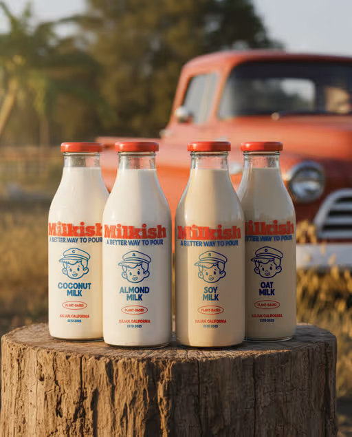
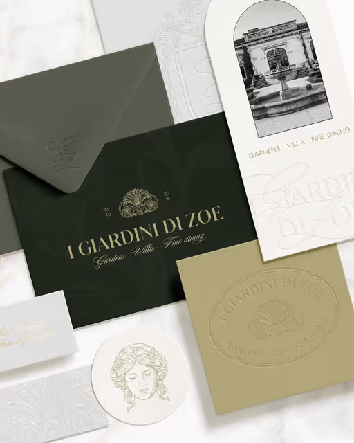
Kurka
Frequently Asked Questions
The core visual concept and structure of the brand remain unchanged.
These changes adapt the brand to your business without redesigning it from scratch.
If everything matches, you’ll receive a checkout link from Braaands™ to confirm the purchase.
The full amount is secured until the brand is finalized.
At checkout, you’ll also have the option to add additional packages such as business cards or packaging design.
Payment only happens once everything is confirmed.
Resale or redistribution is not permitted.
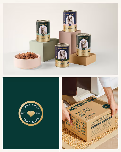
Pet Food Branding
Nutrivida
The branding was inspired by classic typographic forms. Serif typefaces, a golden Pantone accent, and a hand-drawn pen illustration gave the design an elegant, timeless character. The pet’s portrait was emphasized with a semi-circular color field, while the label layout followed a traditional, centered composition. To evoke warmth and a sense of closeness, the color palette was softened - warm ecru backgrounds and emotional photography showcasing the bond between humans and their pets. Combined with the tagline “Pure Love, True Care,” it all formed a coherent and harmonious brand identity.