


Key Details
Commercial use for one business is included. The brand may not be resold or redistributed.
You’ll receive the complete brand kit as editable source files, including a mini visual brand guideline (PDF).
This brand kit can be adapted within a defined scope. Up to 2 revision rounds are included after the initial setup.
Once the purchase is confirmed, delivery usually takes 7–14 business days, depending on the requested adjustments.

Estúdio Marciano
transformar e fortalecer marcas através de soluções criativas de design, sempre buscando inovar e trazer perspectivas diversas para os projetos.
Profil on Braaands™Frequently Asked Questions
The core visual concept and structure of the brand remain unchanged.
These changes adapt the brand to your business without redesigning it from scratch.
If everything matches, you’ll receive a checkout link from Braaands™ to confirm the purchase.
The full amount is secured until the brand is finalized.
At checkout, you’ll also have the option to add additional packages such as business cards or packaging design.
Payment only happens once everything is confirmed.
Resale or redistribution is not permitted.
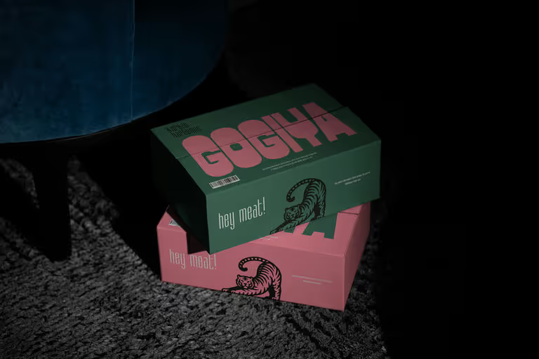
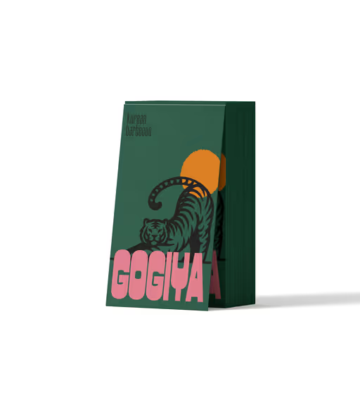
Restaurant
Gogiya
Gogiya is a Korean barbecue restaurant where friends and family gather around sizzling grills. The name Gogiya means “Hey meat!” in Korean, matching the restaurant´s fun feel. every meal here is authentic, social and delicious. "GOGIYA", in all caps and a bold (PC Merchis) font that’s rounded and kind of “puffed up,” really gives off a strong vibe and tons of personality. It almost plays with the space around it, like it’s saying, “hey, look at me!” Then there’s “Korean Barbecue” (Kirgina), a narrow sans serif font sitting above it — super minimal, sleek, and elegant. It balances out the whole look and lets “GOGIYA” steal the spotlight. The tiger has a strong symbolism in Korean culture: it’s a guardian, a protector, and also a symbol of strength. The tiger’s pose (with its body curved) feels dynamic and full of movement, like it’s about to leap into action — which ties in perfectly with the ideas of fire, grilling, and energy.