
Key Details
Commercial use for one business is included. The brand may not be resold or redistributed.
You’ll receive the complete brand kit as editable source files, including a mini visual brand guideline (PDF).
This brand kit can be adapted within a defined scope. Up to 2 revision rounds are included after the initial setup.
Once the purchase is confirmed, delivery usually takes 7–14 business days, depending on the requested adjustments.

Creavora Studio
We will shape the faces of your business. Our digital studio crafts the eye-catching theme and mood of your brand and business with modern, clean, and minimalistic style
Profil on Braaands™Frequently Asked Questions
The core visual concept and structure of the brand remain unchanged.
These changes adapt the brand to your business without redesigning it from scratch.
If everything matches, you’ll receive a checkout link from Braaands™ to confirm the purchase.
The full amount is secured until the brand is finalized.
At checkout, you’ll also have the option to add additional packages such as business cards or packaging design.
Payment only happens once everything is confirmed.
Resale or redistribution is not permitted.
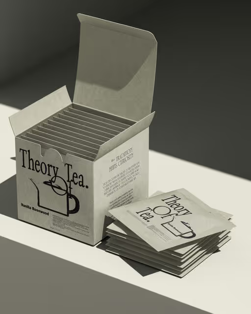
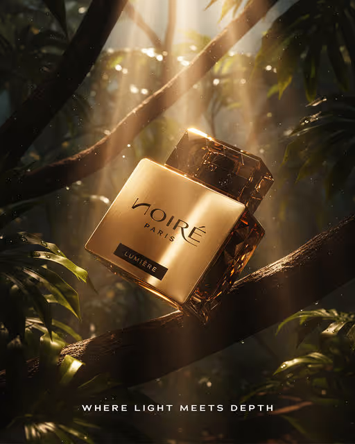
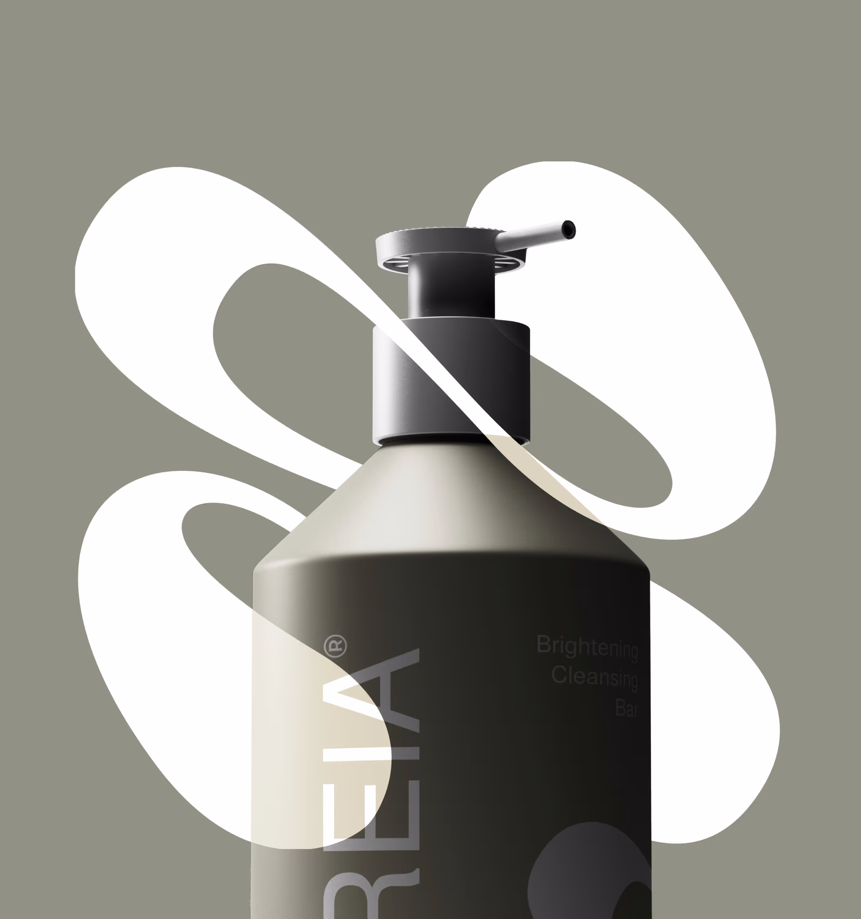
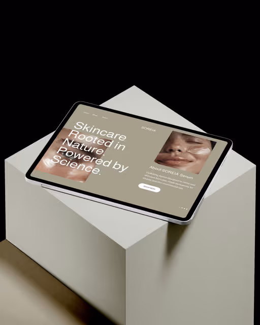
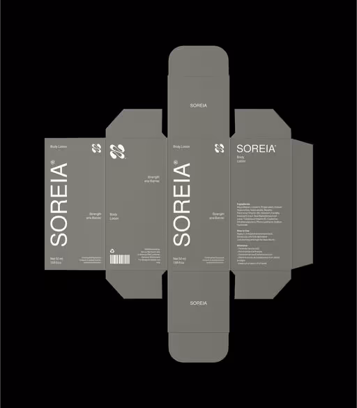
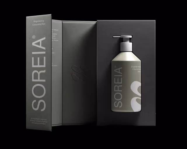
Beauty & Health Brand Identity
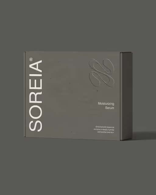
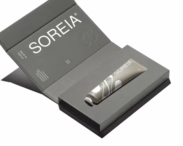
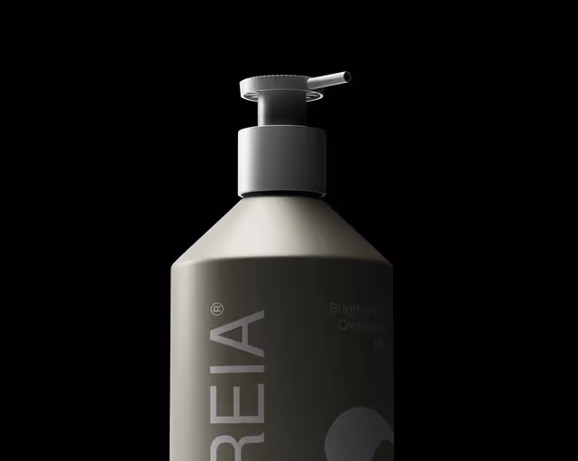
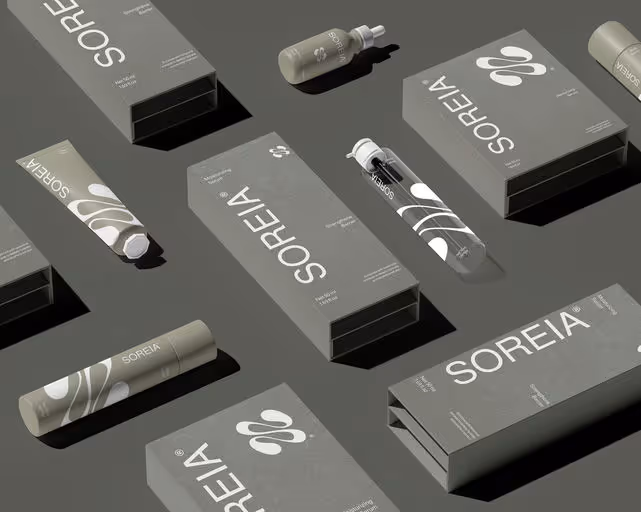
SOREIA® Branding & Packaging
SOREIA is a skincare brand rooted in nature’s calm, offering gentle, plant-based formulations that nourish and restore. We developed a visual identity and packaging system that reflects SOREIA’s natural essence, combining organic forms, earthtone palettes, and minimal design to create a soft yet elevated brand presence. The logomark draws inspiration from the letter “S” and the shape of a water droplet, symbolizing hydration, balance, and nature’s quiet strength. The overall brand direction embraces simplicity, modern elegance, and a mindful connection between product and self-care ritual. From concept to visual language, SOREIA is designed to feel honest, healing, and beautifully grounded