Key Details
Commercial use for one business is included. The brand may not be resold or redistributed.
You’ll receive the complete brand kit as editable source files, including a mini visual brand guideline (PDF).
This brand kit can be adapted within a defined scope. Up to 2 revision rounds are included after the initial setup.
Once the purchase is confirmed, delivery usually takes 7–14 business days, depending on the requested adjustments.

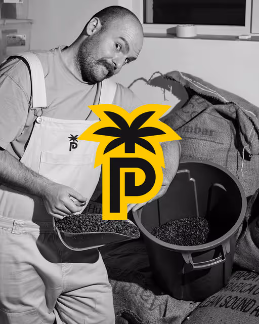
_.pixelprincess._
Frequently Asked Questions
The core visual concept and structure of the brand remain unchanged.
These changes adapt the brand to your business without redesigning it from scratch.
If everything matches, you’ll receive a checkout link from Braaands™ to confirm the purchase.
The full amount is secured until the brand is finalized.
At checkout, you’ll also have the option to add additional packages such as business cards or packaging design.
Payment only happens once everything is confirmed.
Resale or redistribution is not permitted.
Bakery
Twisted Bites
I developed a memorable and striking visual style for a pretzel bakery. The main design element is a black and white checkered pattern, which I applied on the package and envisioned for the window display. This pattern creates a strong visual identity for the brand. I also created a friendly cartoon character holding pretzels. This mascot is placed on the package and in the window display design, making the brand more appealing and memorable. The Twisted Bites logo is in stylish italics, giving it a personalized look. The packaging also features the founding year, "EST. 2025".