

Key Details
Commercial use for one business is included. The brand may not be resold or redistributed.
You’ll receive the complete brand kit as editable source files, including a mini visual brand guideline (PDF).
This brand kit can be adapted within a defined scope. Up to 2 revision rounds are included after the initial setup.
Once the purchase is confirmed, delivery usually takes 7–14 business days, depending on the requested adjustments.

@design_elva, Elva
Empowering brands through striking visual design. Logo, Branding, Packaging, Graphics. Work globally, based in Ukraine. IG @design_elva
Profil on Braaands™Frequently Asked Questions
The core visual concept and structure of the brand remain unchanged.
These changes adapt the brand to your business without redesigning it from scratch.
If everything matches, you’ll receive a checkout link from Braaands™ to confirm the purchase.
The full amount is secured until the brand is finalized.
At checkout, you’ll also have the option to add additional packages such as business cards or packaging design.
Payment only happens once everything is confirmed.
Resale or redistribution is not permitted.
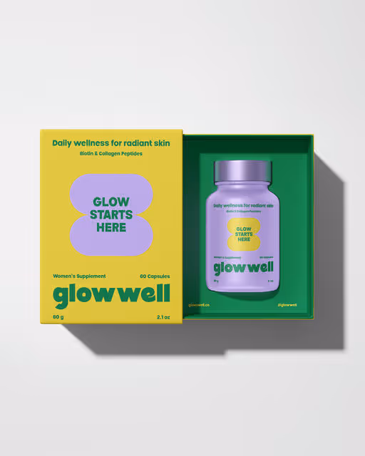
Beauty & Health Branding
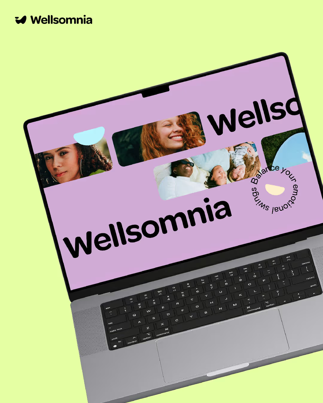
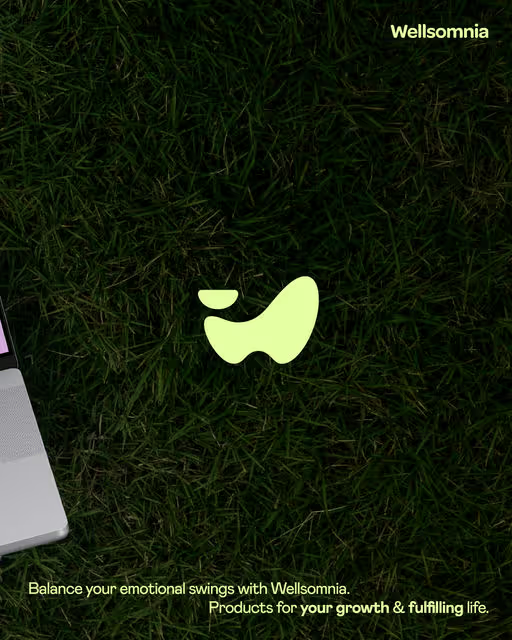
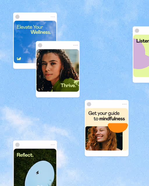
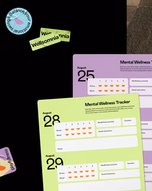
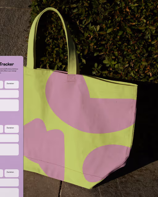
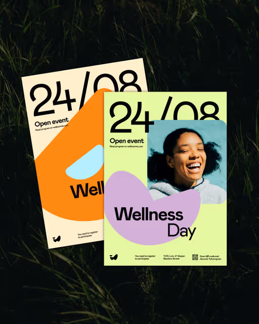
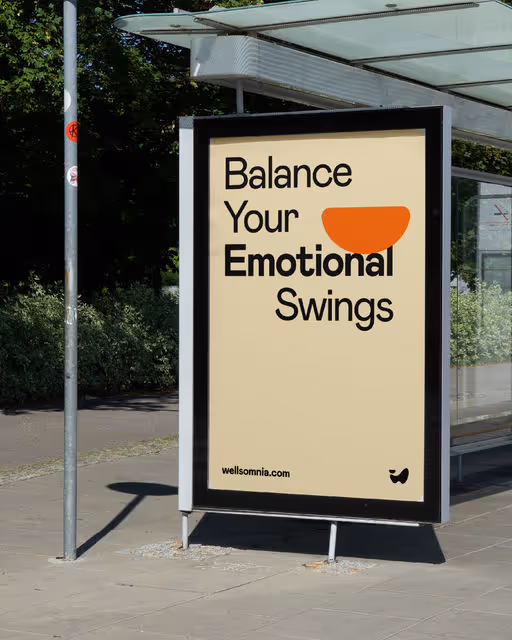
Wellsomnia
The Wellsomnia project is a startup aiming to support mental wellness and growth of young women. The brand offers journals, workbooks and trackers that help them become more self-aware, find a way to regulate emotions and energy levels. The concept of identity is based on the idea of finding an internal balance. The variety of forms of the visual concept symbolize the uniqueness of each person and resemble the letters of the brand name. The semicircle highlights the search for balance of emotions and sensations, which is common to all seekers of wellness. The logomark is an abstract embodiment of the first letter of the brand name "W" and reflects the very essence of its mission — to help a person in their self-discovery and achieving internal balance. The lower part of the sign balances and supports the semicircle, which symbolizes the swings of emotions and inner energy. The softness of the graphics creates a feeling of friendliness and comfort, that helps to be open to self-discovery. In their turn, bright contrasts and playfulness of identity awaken curiosity. The Wellsomnia brand gives energy and comfort to take small steps towards inner balance every day. Elevate your wellness with Wellsomnia.