Food & Beverage · by Studio Moara
Aroma Nusa
 Studio MoaraPRO
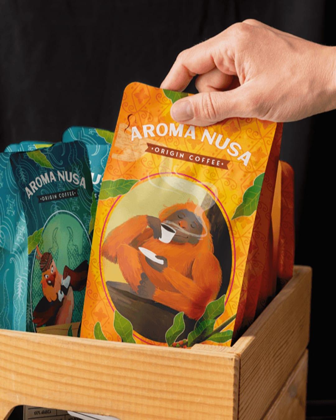
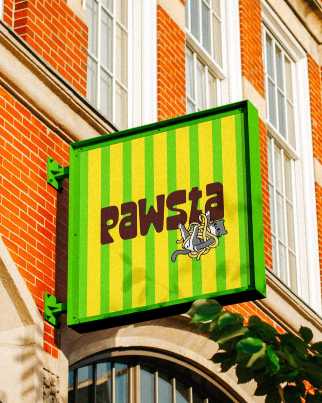
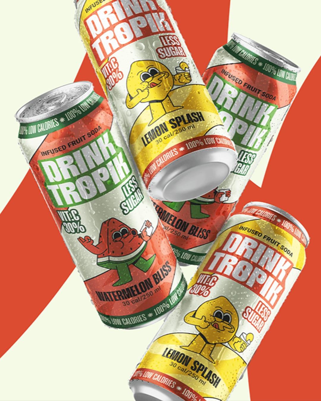
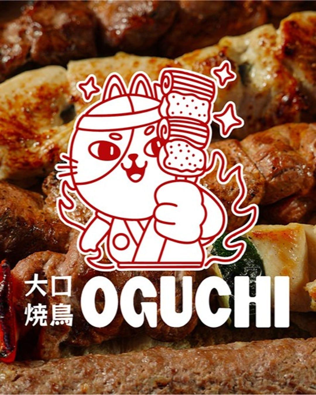
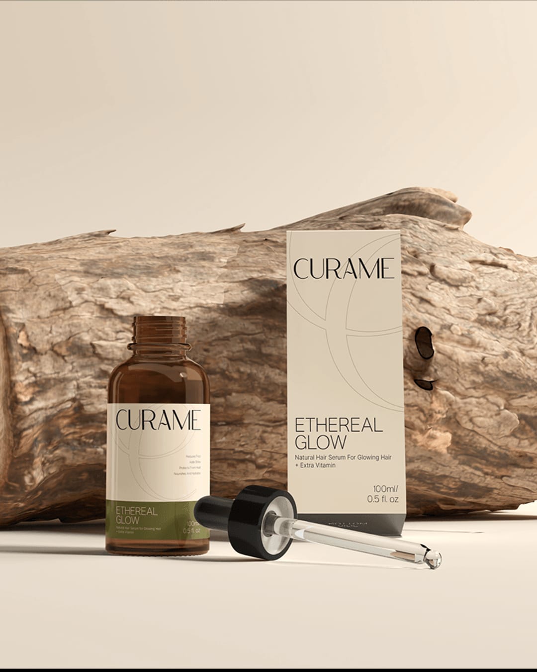
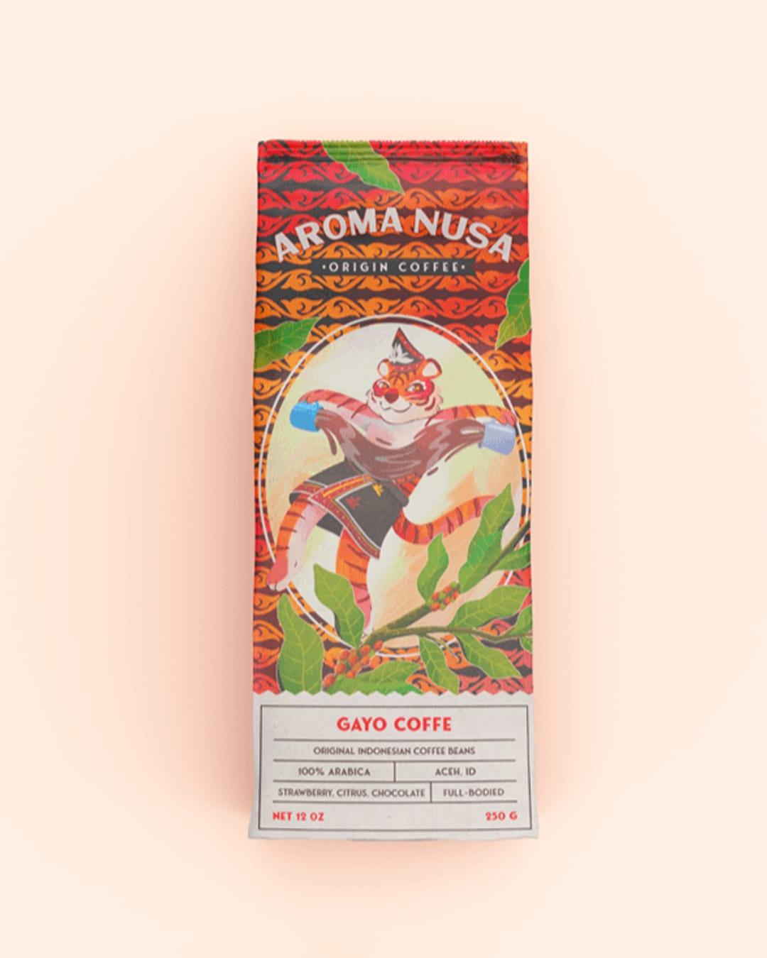
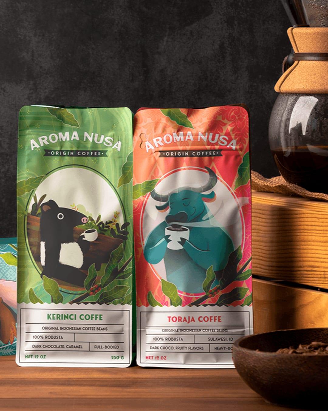
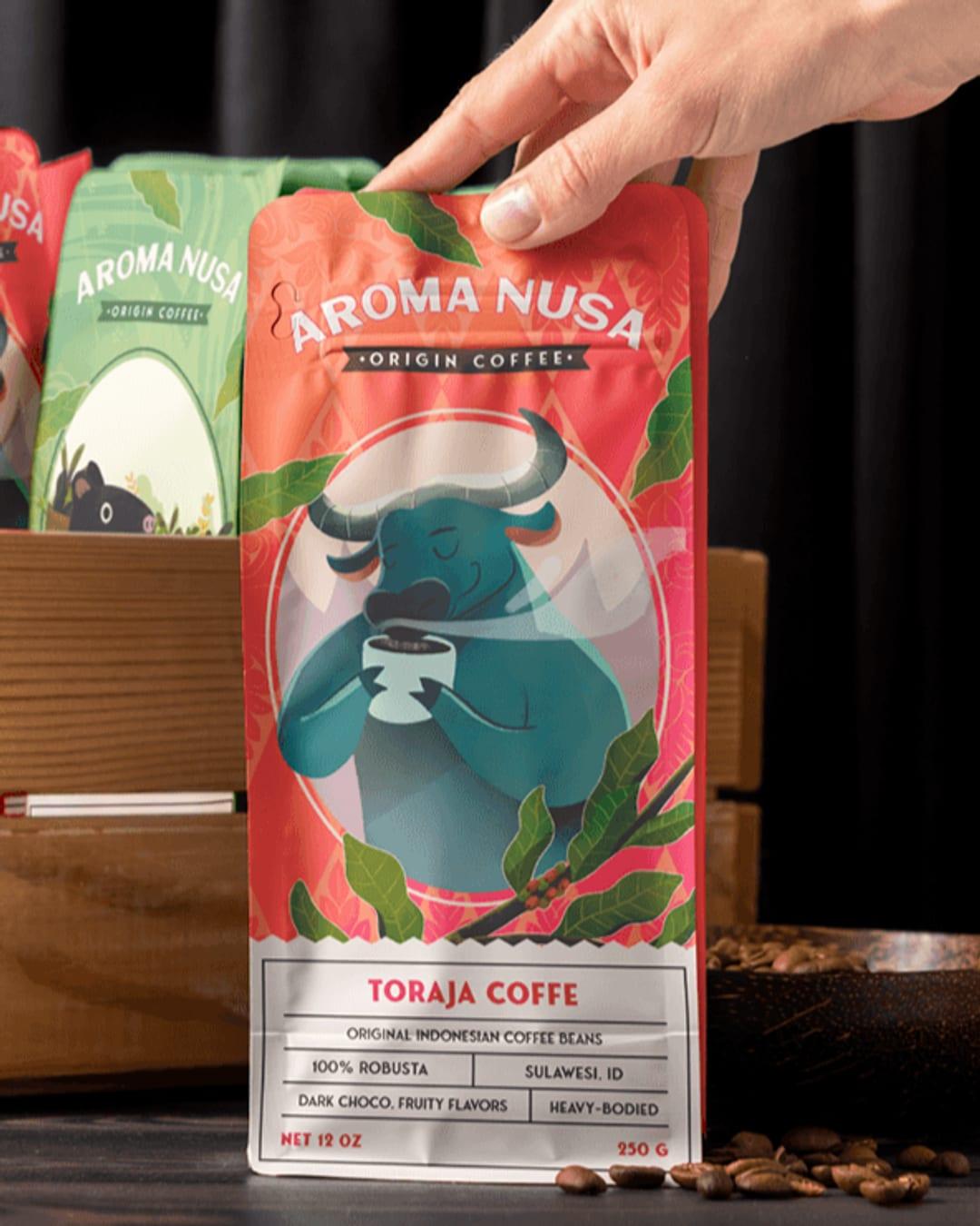
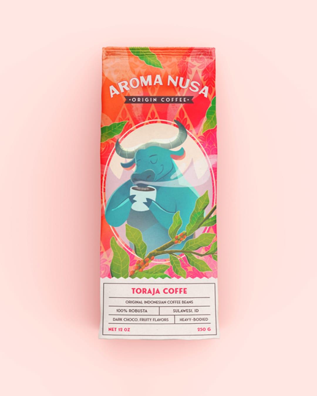
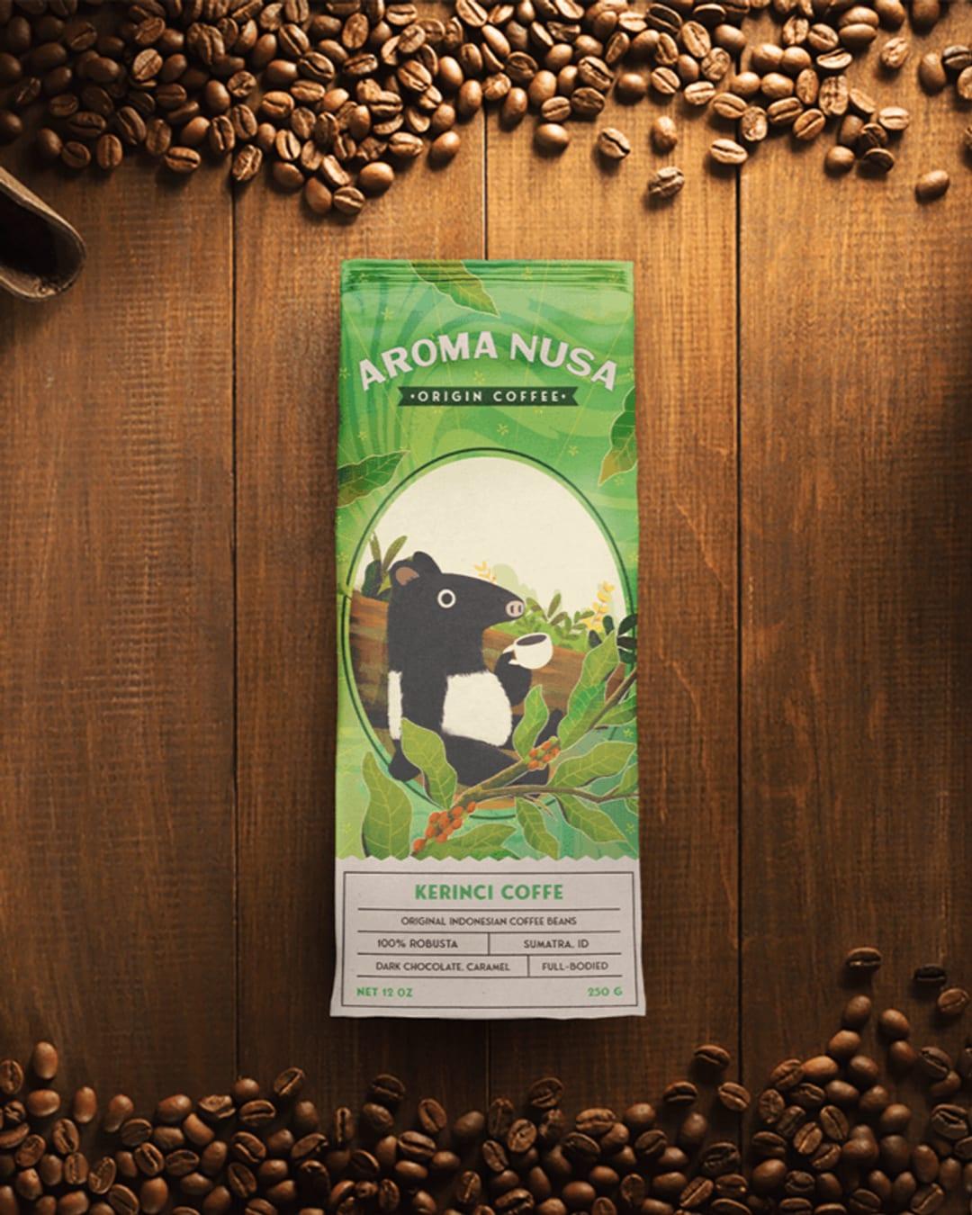
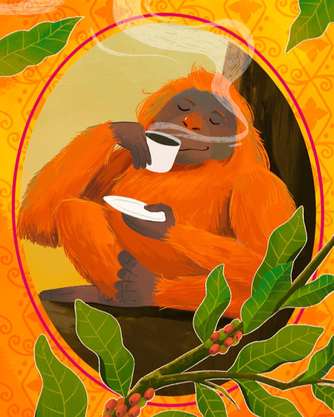
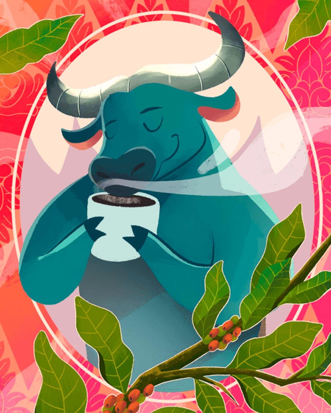
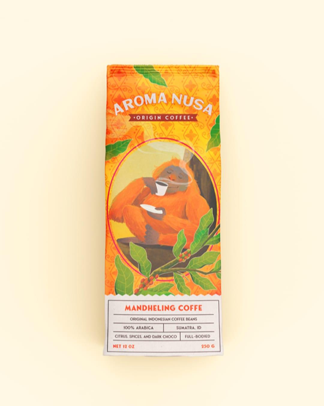
This project explores the design of coffee packaging and branding for an artisan product line. The goal was to create packaging that merges function with aesthetics strong brand identity, visual appeal, and commercial value. Illustration played a key role, with each coffee variant featuring a unique character reflecting its flavor, aroma, and mood. The illustration style is clean, modern, and slightly playful, adding warmth while maintaining a premium feel. A custom color system was created to distinguish blends and boost shelf presence. Typography was kept minimal for clarity and consistency. The packaging system was made to adapt across pouch, tin, and digital formats. Scope of work included label layout, color coding, variant illustrations, and product mockups. The result shows how branding, illustration, and packaging can work together to deliver a distinctive visual identity.
Color Palette
This brand uses a color palette of 3 colors
Click a color to find brands with similar colors.
Tags
Live score
Scores stay hidden while voting is open, so early votes can't anchor the ones that follow. Check back once the countdown ends.
Votes (0)
No votes yet — be the first.