Food & Beverage · by By siddika
Big ban
 By siddika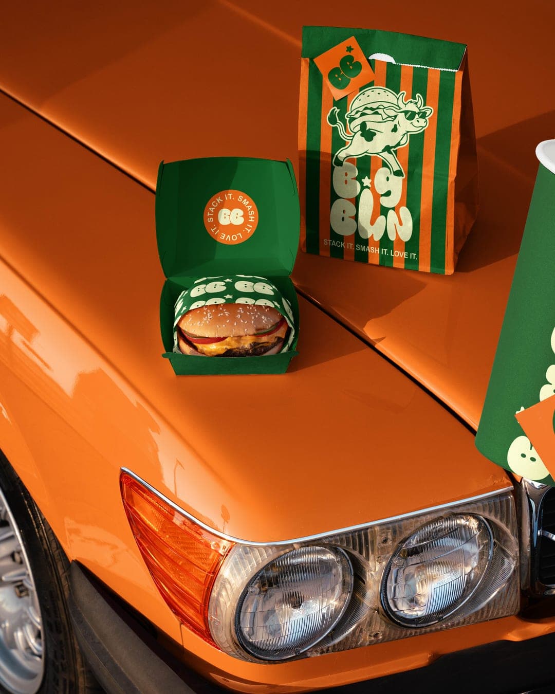
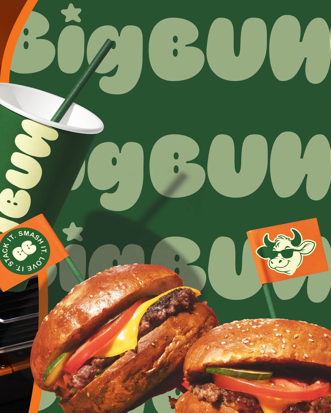
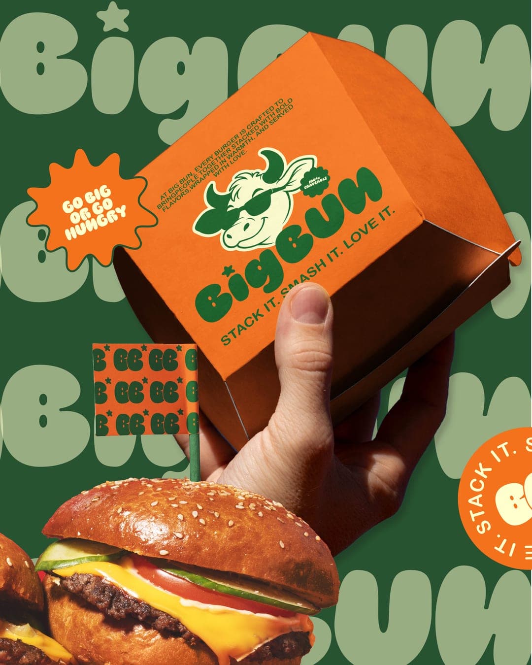
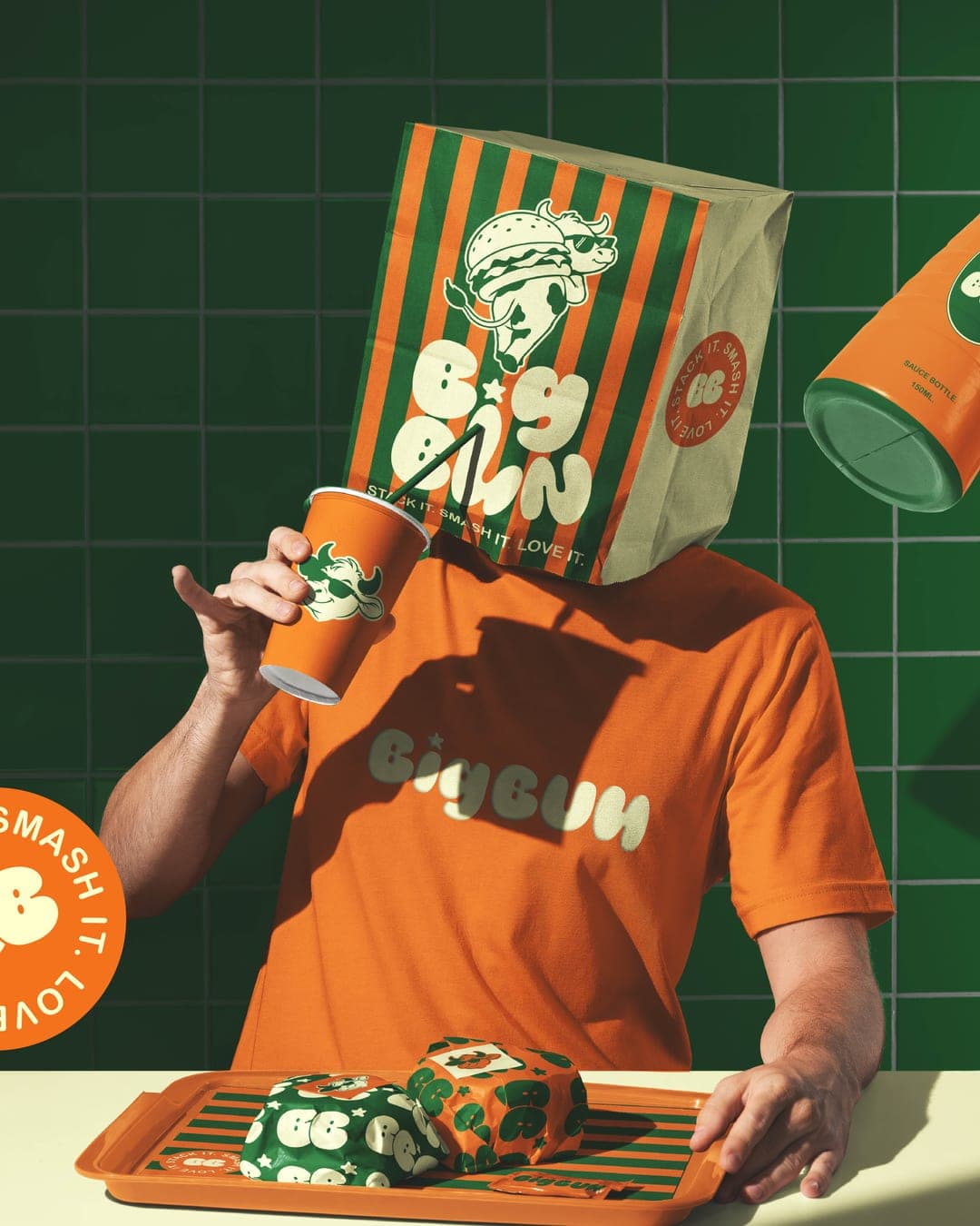
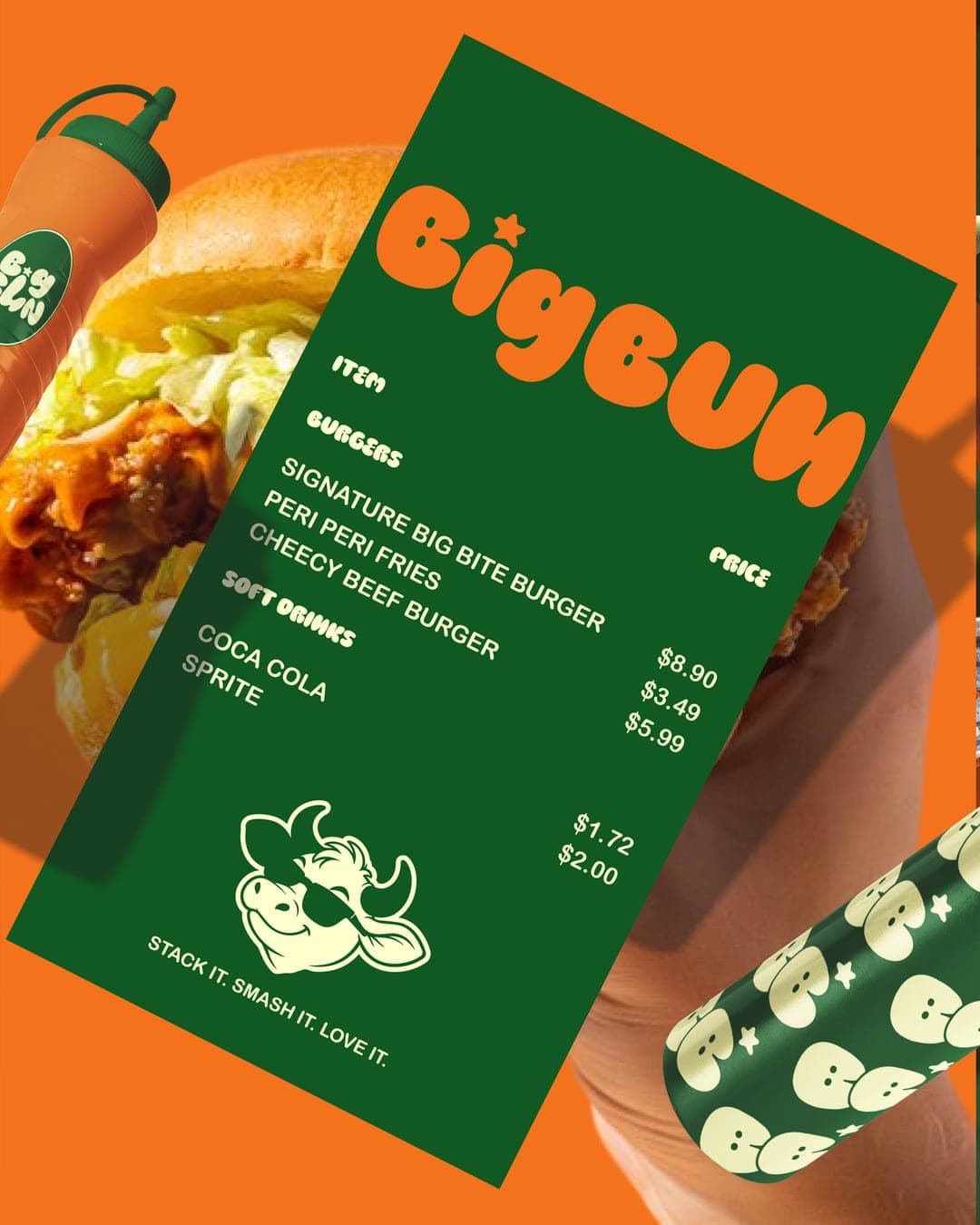
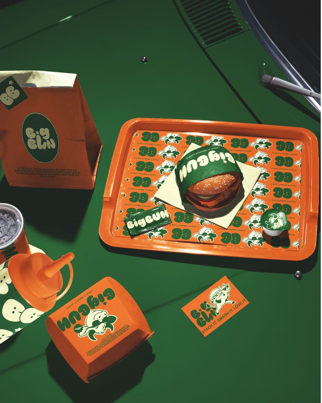
BIG BUN - carousel post - Concept Behind the Identity 🍔 Not every logo tells its story at first glance. The Big Bun wordmark is intentionally split into two levels - BIG on top and BUN below. A single letterform is designed to do double duty: the upper portion reads as I, while the lower curve completes the U, allowing one shape to connect both words seamlessly. The mascot carries the story even further. Instead of holding a burger, the cow is walking with the beef burger resting across its back, then looking over its shoulder mid-step. That playful pose adds movement, humour, and personality while subtly celebrating the brand's signature ingredient. A bold identity built to be remembered beyond just the logo.
Color Palette
This brand uses a color palette of 3 colors
Click a color to find brands with similar colors.
Tags
Live score
Scores stay hidden while voting is open, so early votes can't anchor the ones that follow. Check back once the countdown ends.
Votes (1)
| Voter | Design | Strategy | Originality | Story | Overall | |
|---|---|---|---|---|---|---|
 | Panos Kyriopoulos from Greece panos.framer.website | 9 | 9 | 9 | 9 | 9.00 |