Beauty & Personal Care · by By siddika
The white rose
 By siddika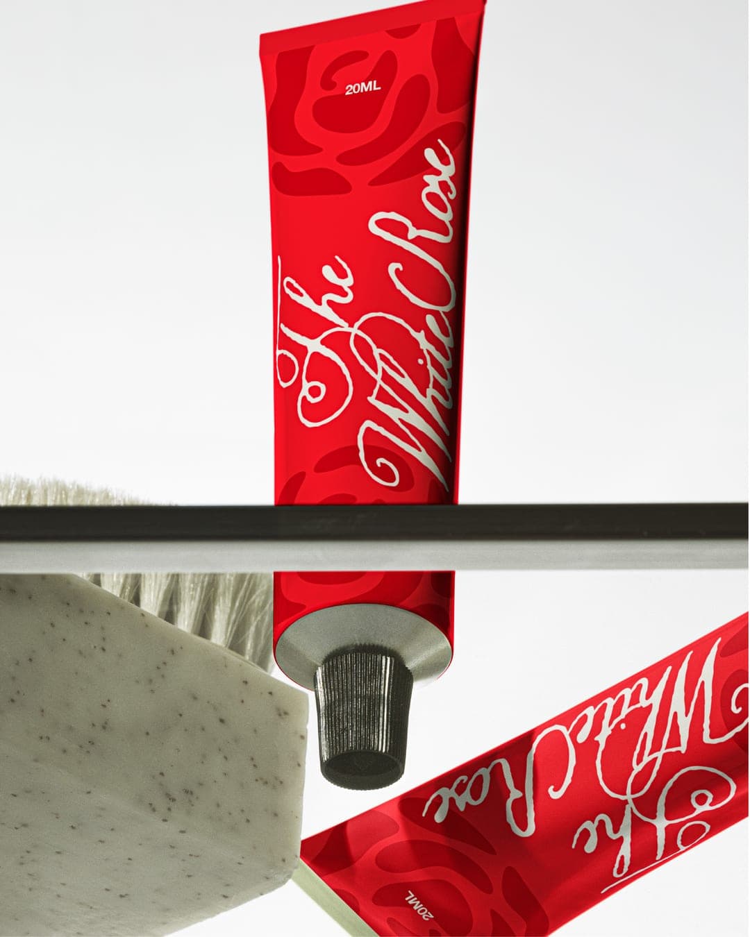
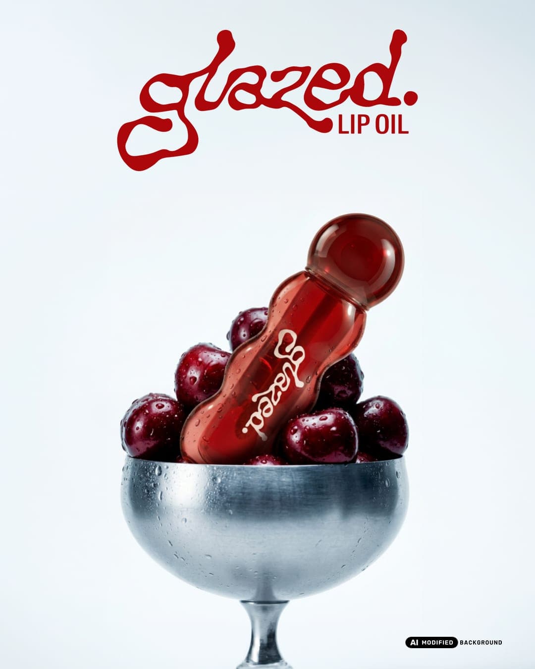
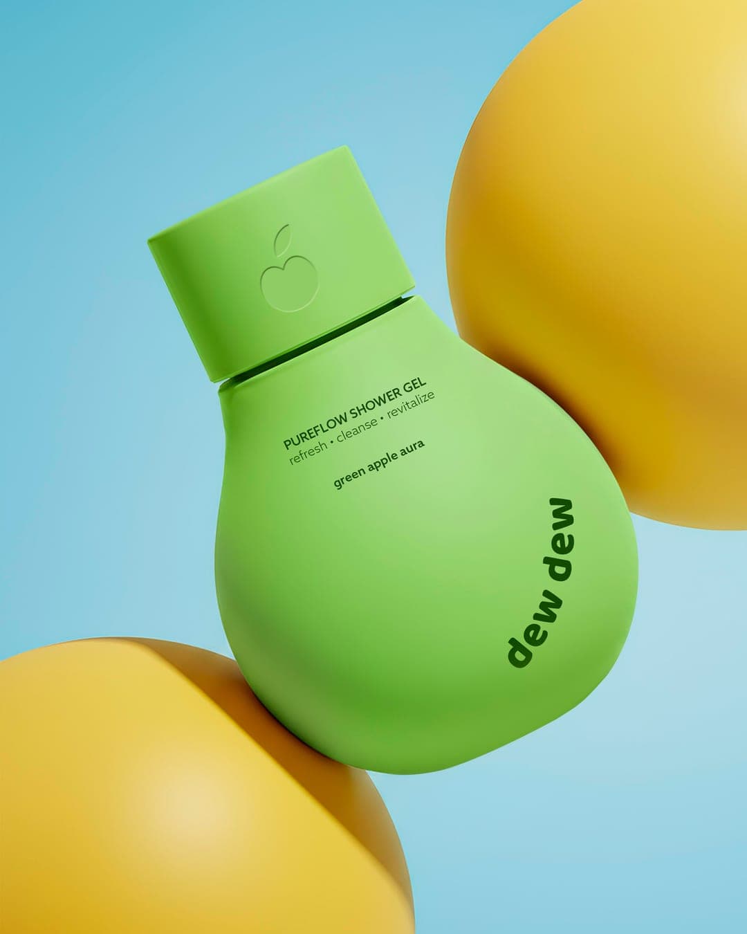
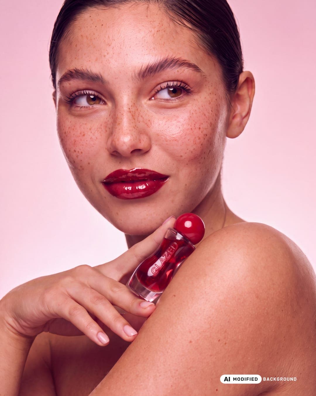
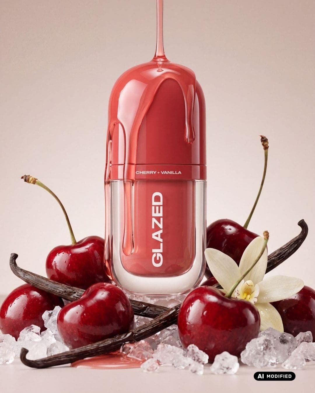
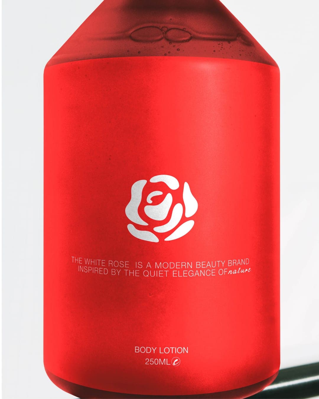
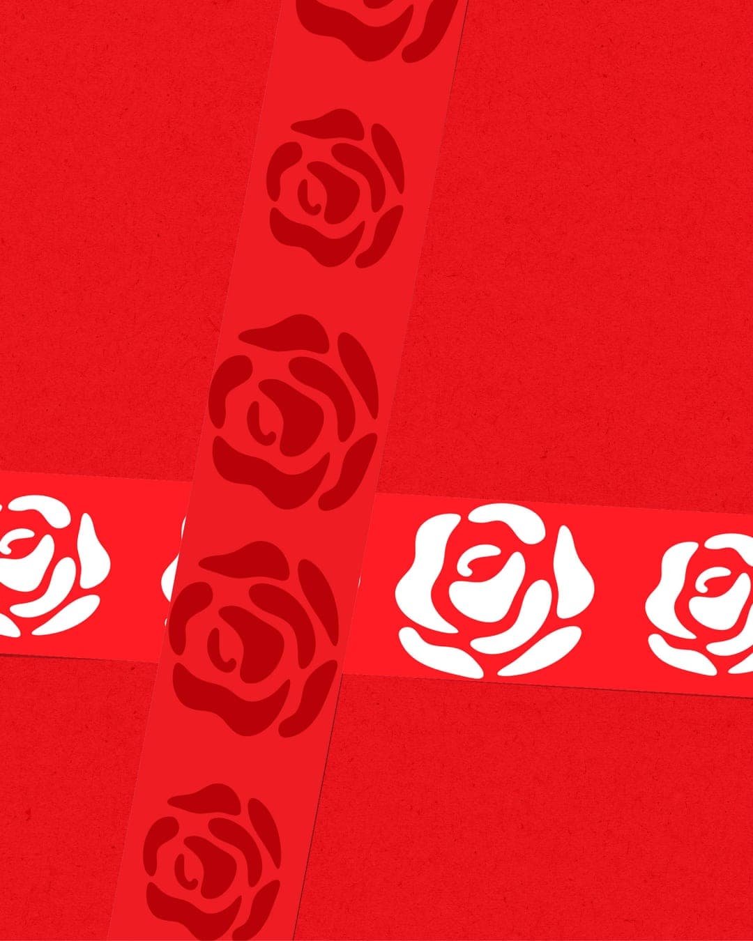
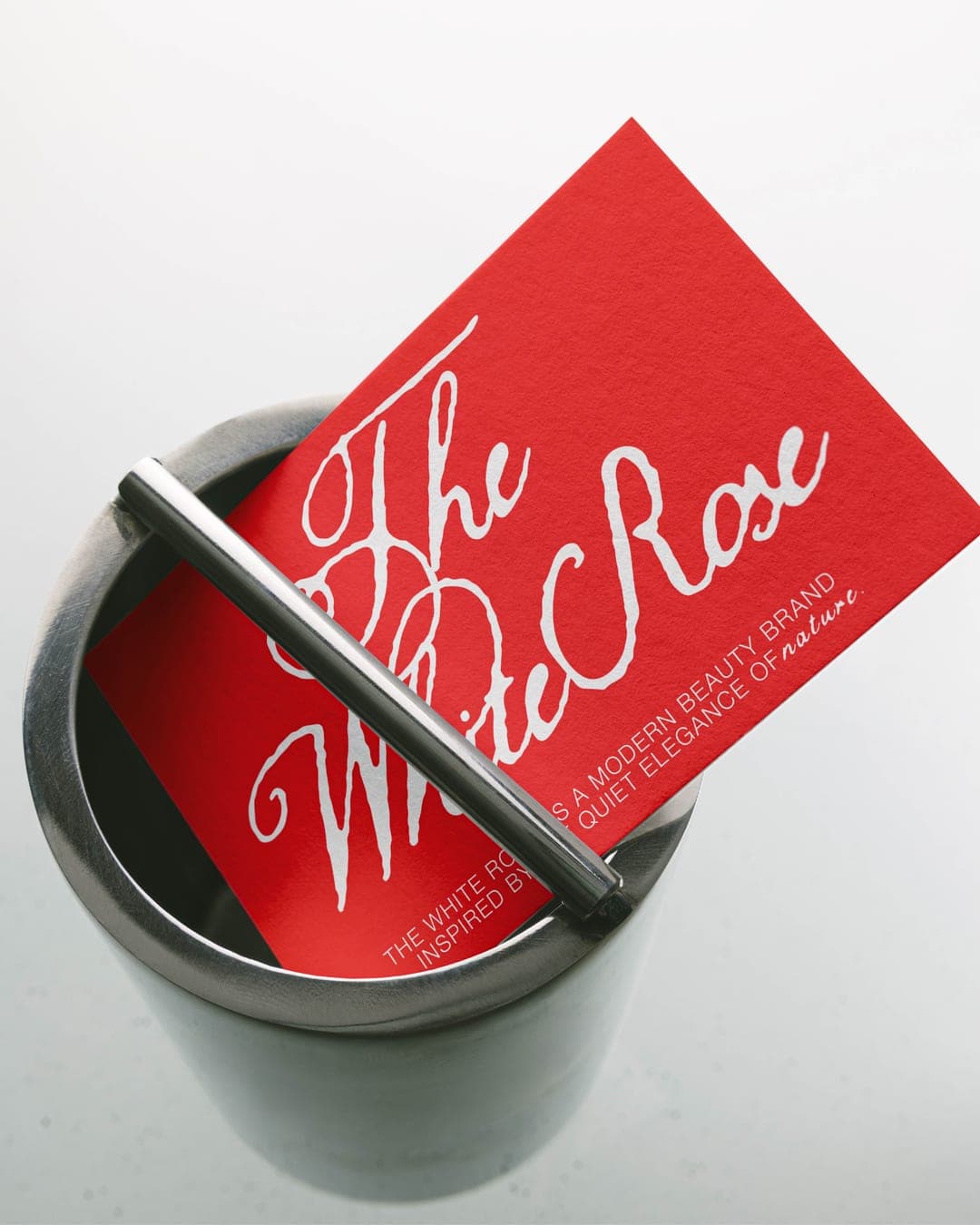
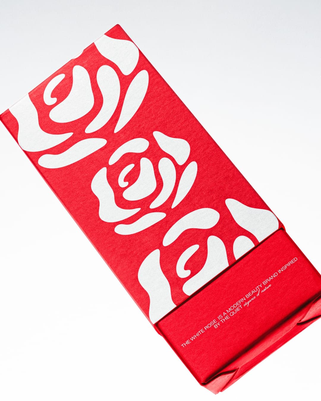
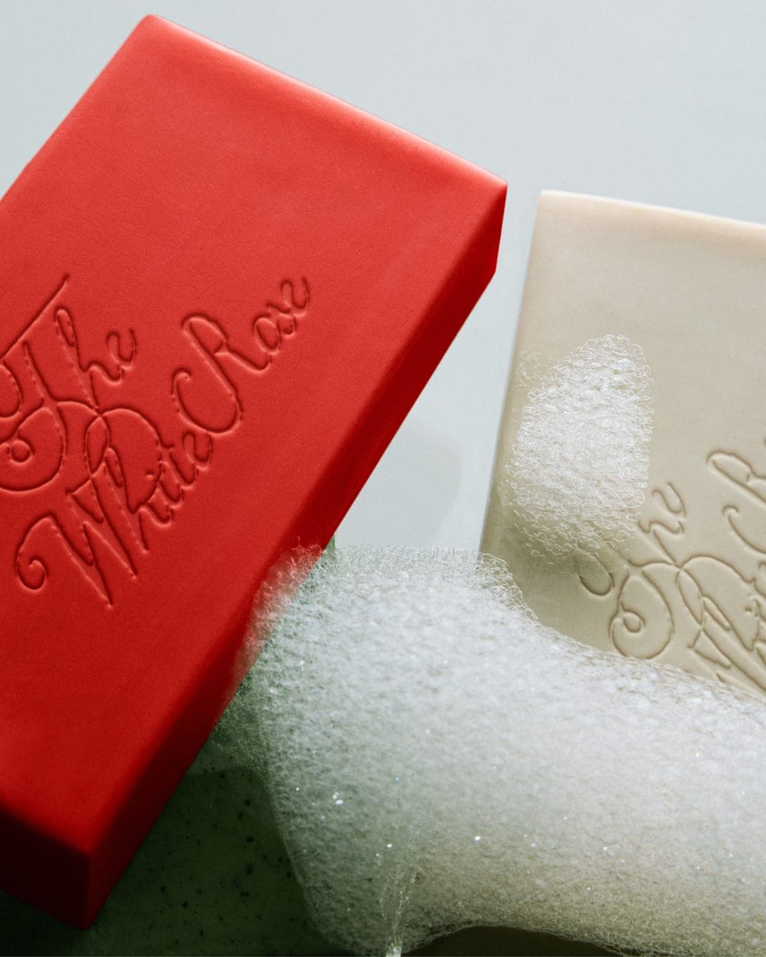
A brand identity is more than a beautiful package — it’s how the story continues across every touchpoint. ❤️ For The White Rose, I extended the visual language into bottles, patterns, labels, and supporting brand elements — keeping the bold red palette and expressive rose motif consistent while giving each piece its own presence. From subtle embossing to repeat patterns and statement packaging, every detail works together to build a beauty brand that feels recognisable, cohesive, and full of personality. Because when the identity is strong, even the smallest detail feels like the brand.
Color Palette
This brand uses a color palette of 2 colors
Click a color to find brands with similar colors.
Tags
Live score
Scores stay hidden while voting is open, so early votes can't anchor the ones that follow. Check back once the countdown ends.
Votes (3)
| Voter | Design | Strategy | Originality | Story | Overall | |
|---|---|---|---|---|---|---|
 | Design By Sukaina from Pakistan | 10 | 10 | 10 | 10 | 10.00 |
| l | lilyzdesigns from London | 10 | 10 | 10 | 10 | 10.00 |
 | Husain Studio from India linktr.ee/husain53?utm_source=linktree_profile_share<sid=30f62d2b-6269-481a-a5f9-7218f1a4fbd8 | 10 | 10 | 10 | 10 | 10.00 |