Beauty & Personal Care · by Viktoria Stanevich
Briletoj De Roso
 Viktoria Stanevich
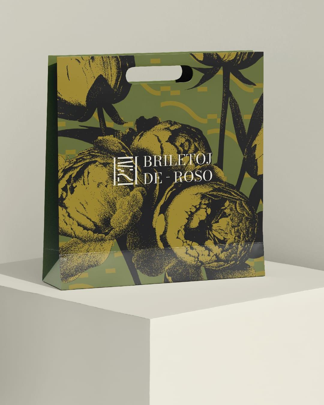
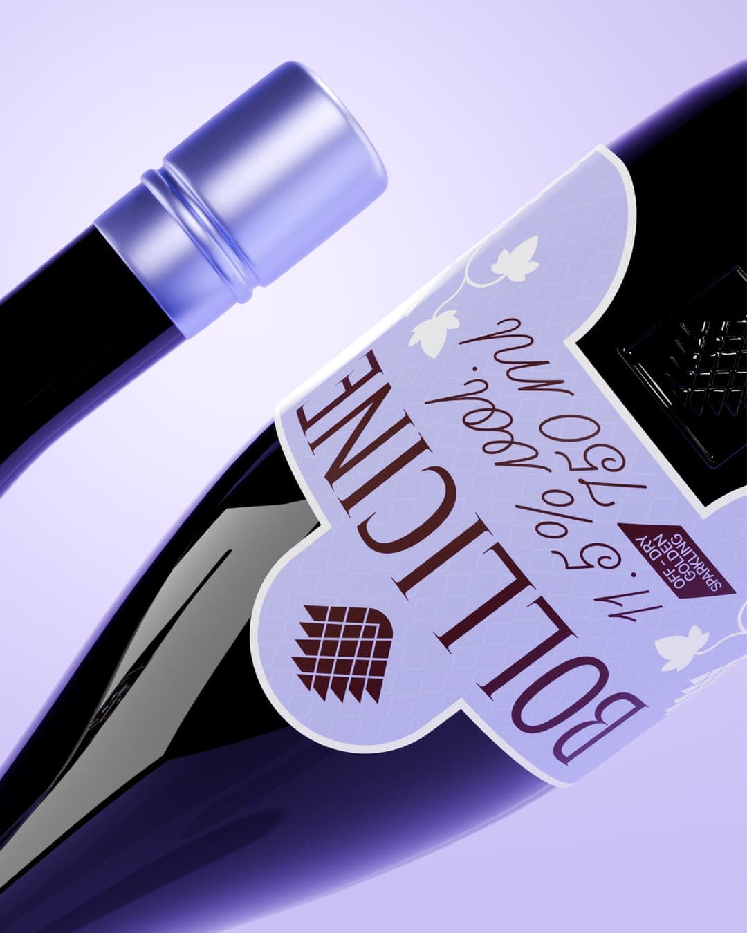
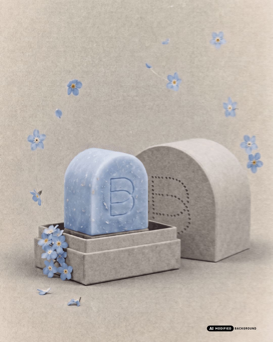
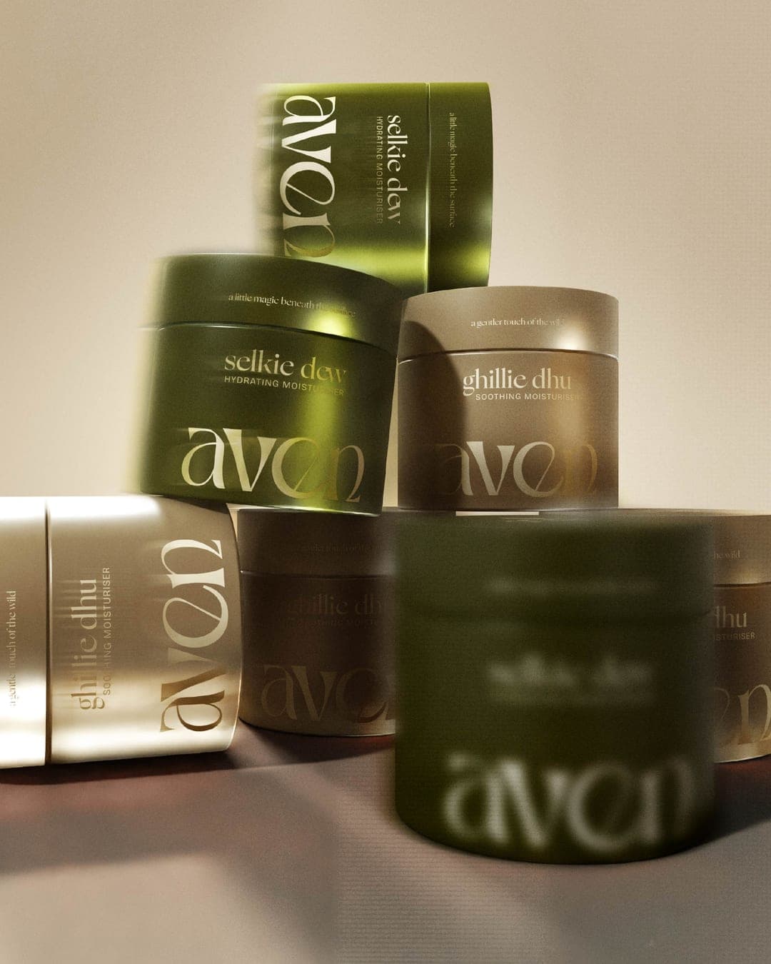
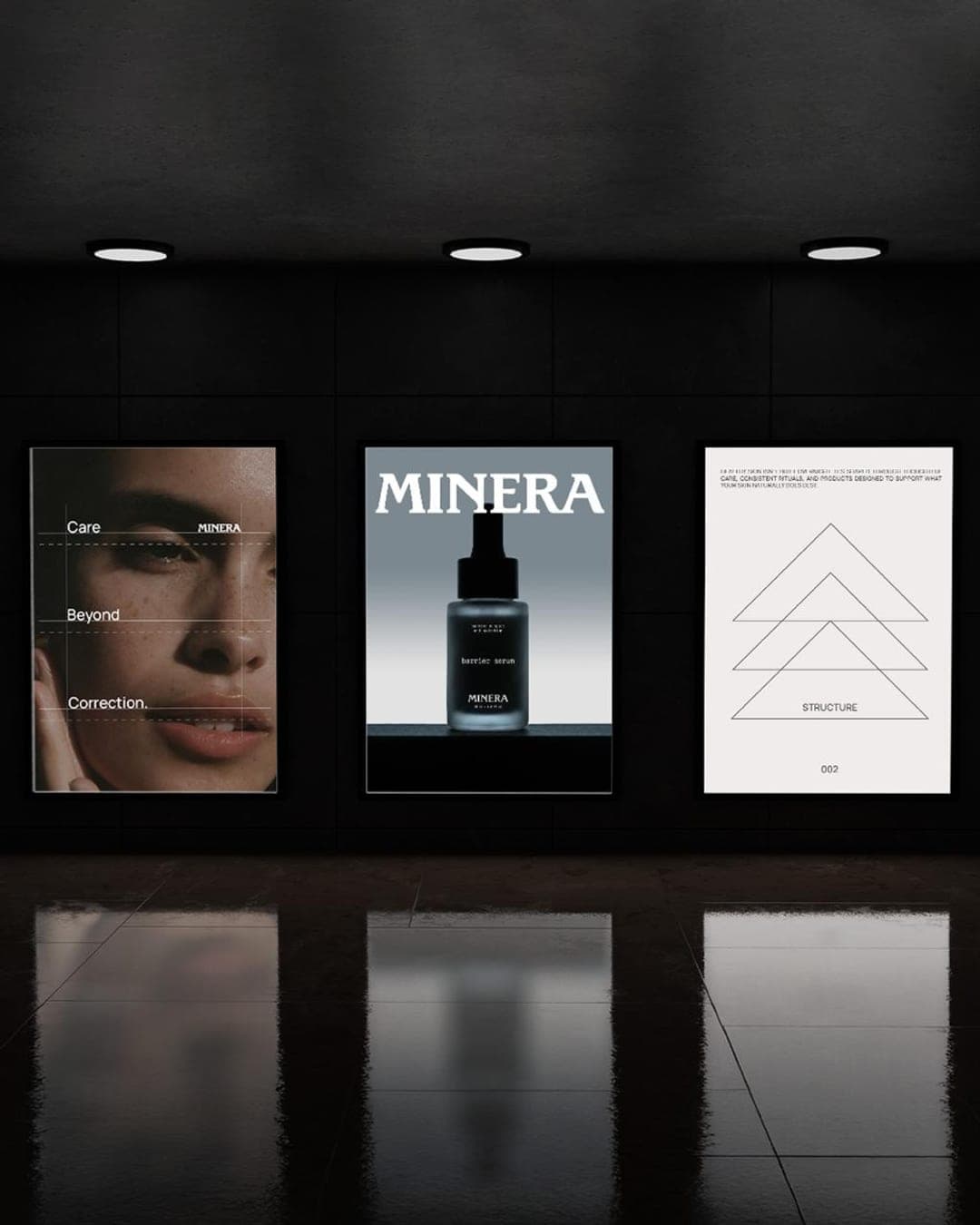
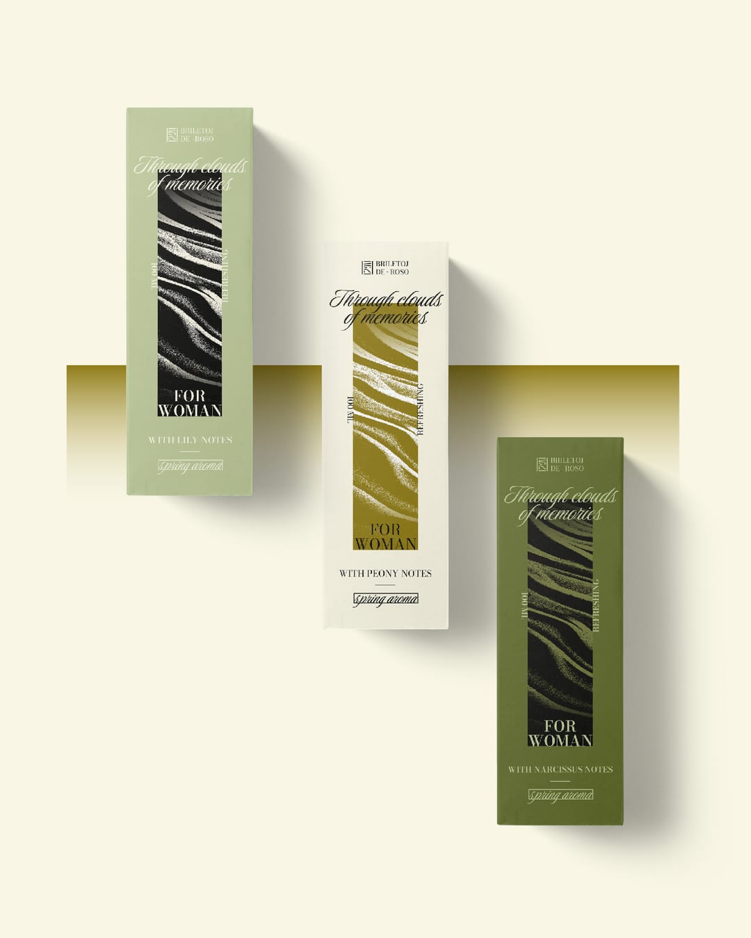
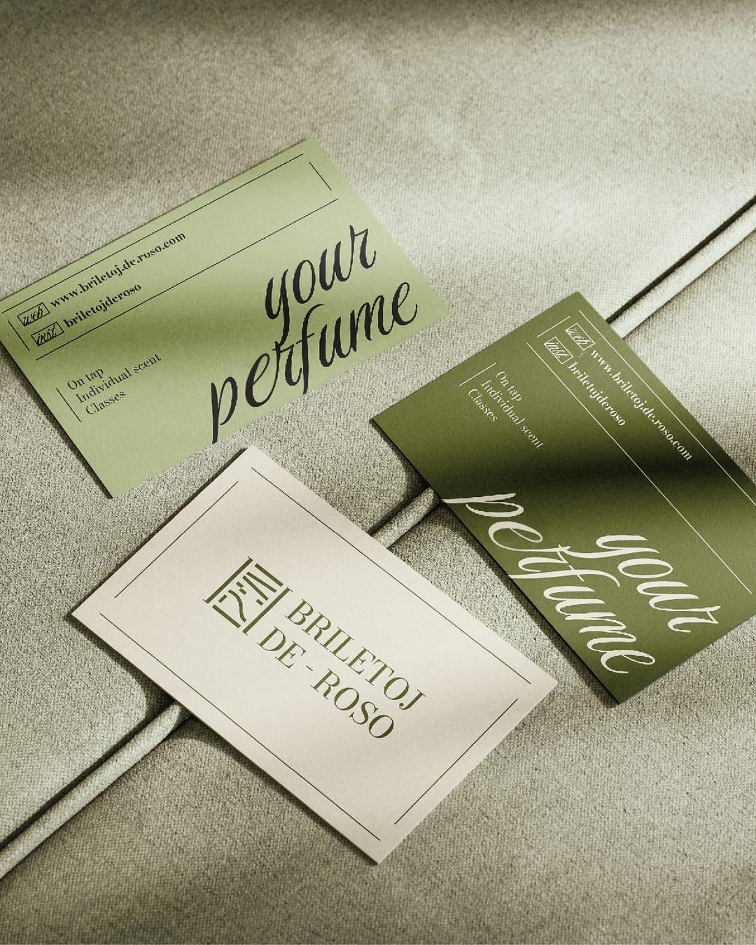
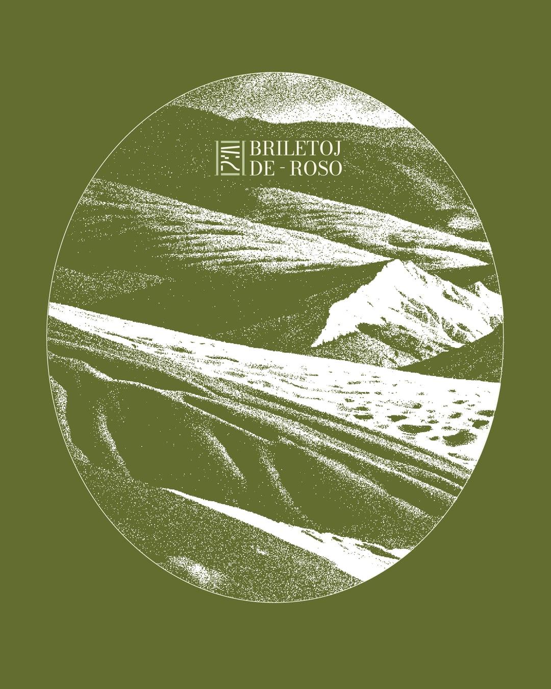
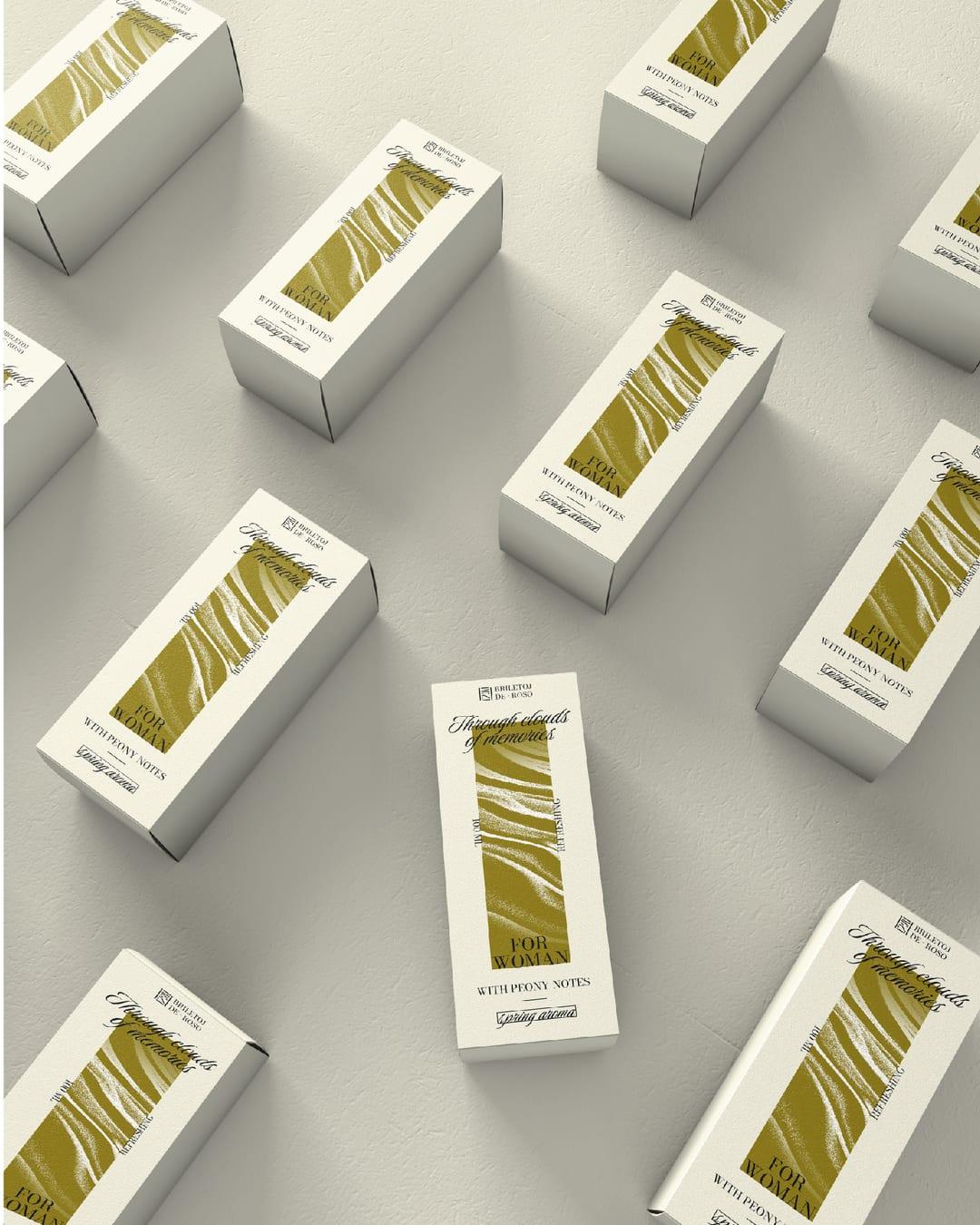
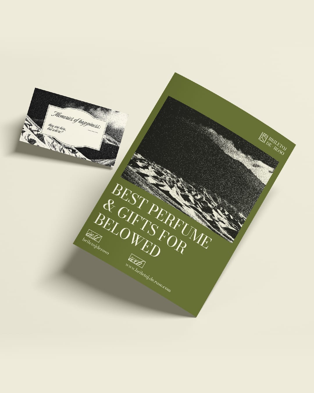
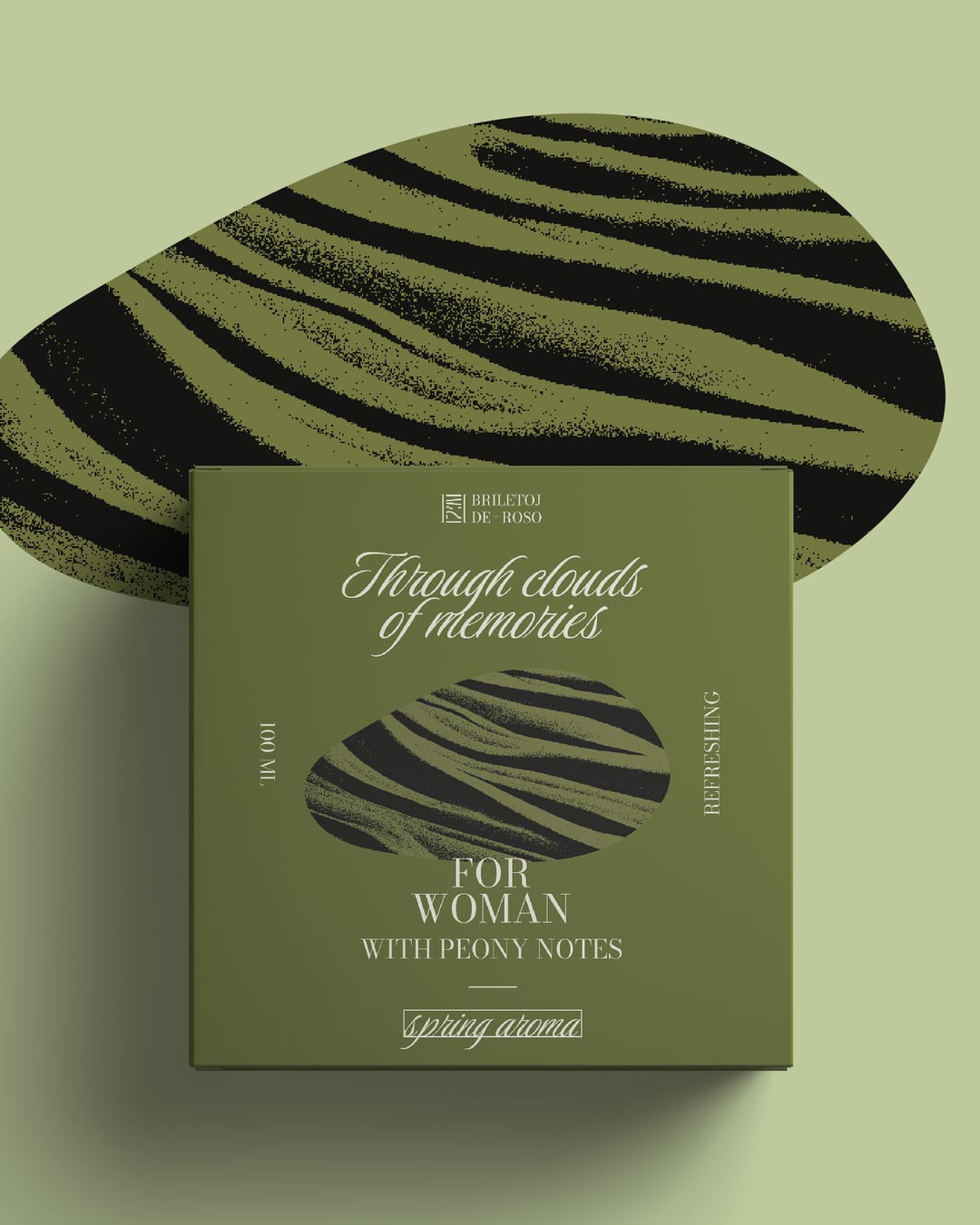
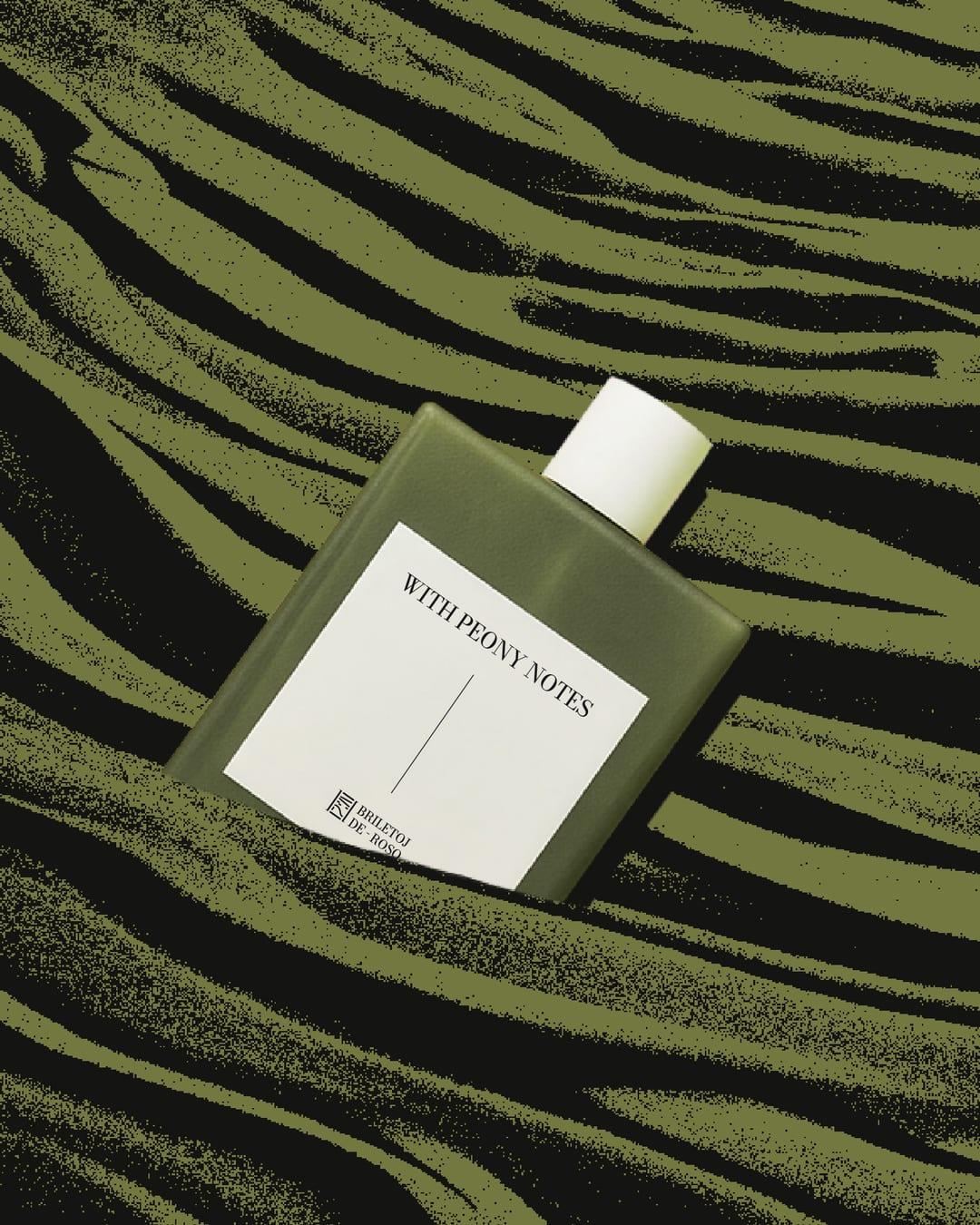
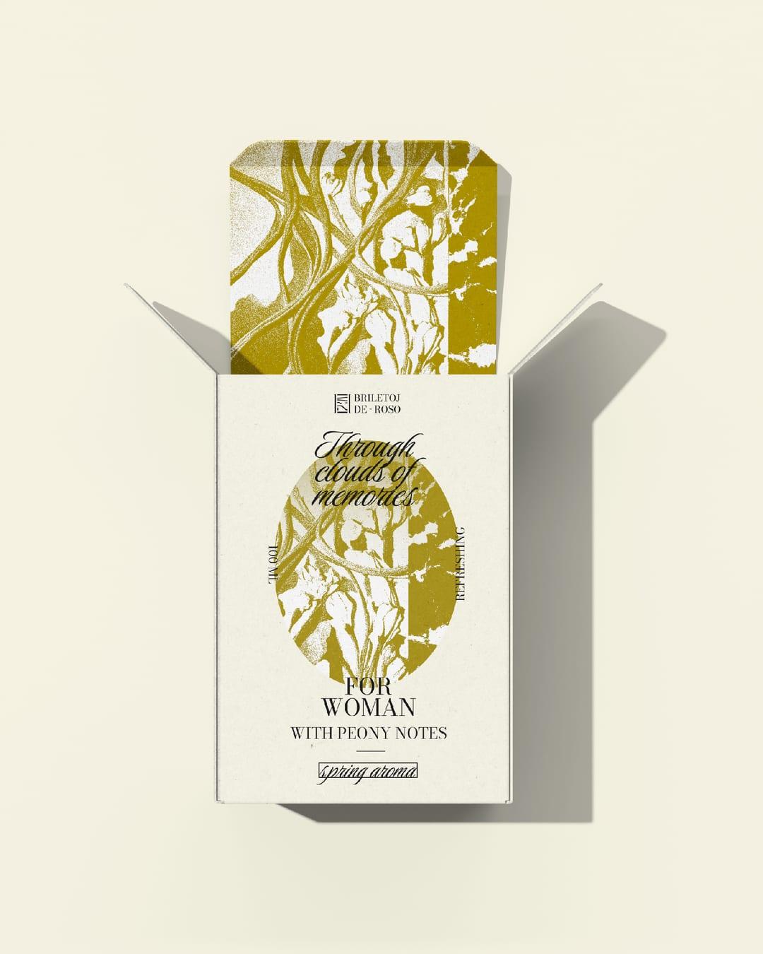
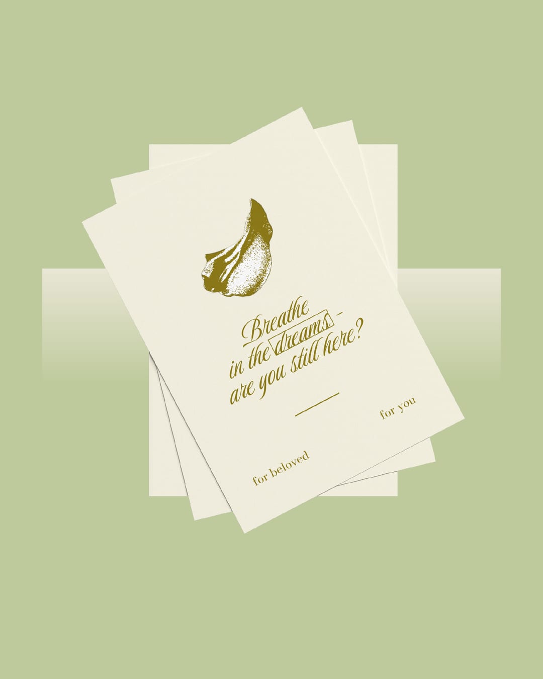
This perfume brand focuses on fragrances with herbal and floral notes, drawing inspiration from nature, landscapes, and a subtle vintage atmosphere. To translate this into a visual concept, I used the metaphor of a window opening onto a new world: perfume becomes a way to discover new scents, places, and possibilities. This idea became the foundation of the logo, combining a window shape with a simplified landscape. I also introduced a dithering effect to visually suggest the dispersion of perfume when sprayed. At the same time, it gives floral and landscape imagery a softer, more dreamlike quality. Textures inspired by grass and flowers further connect the visual language to the character of the fragrances. The system was designed to be flexible across different packaging formats, working equally well on classic rectangular bottles, tall narrow boxes, and square formats. This allowed the same visual idea to remain recognizable while adapting naturally to different products.
Color Palette
This brand uses a color palette of 3 colors
Click a color to find brands with similar colors.
Tags
Live score
Scores stay hidden while voting is open, so early votes can't anchor the ones that follow. Check back once the countdown ends.
Votes (0)
No votes yet — be the first.