Link copied
Beauty & Personal Care · by Yesha Joshi
MINERA
 Yesha Joshi
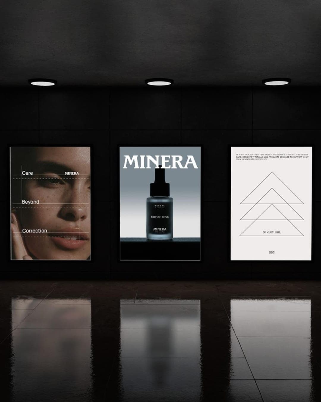
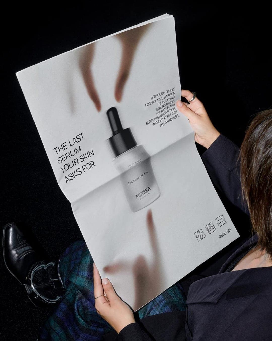
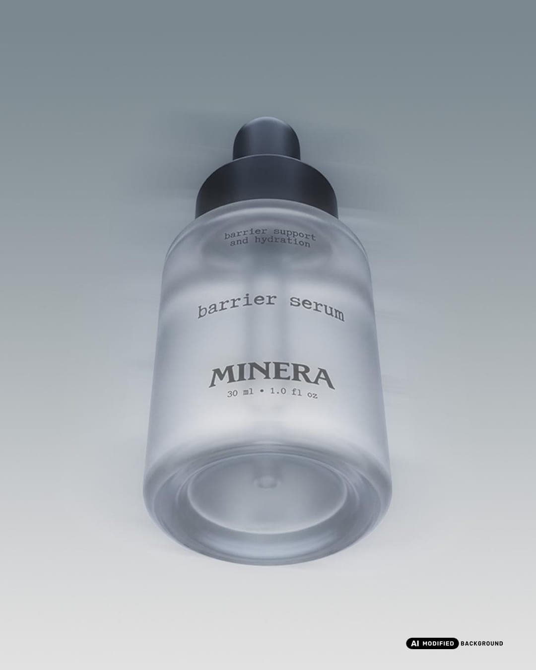
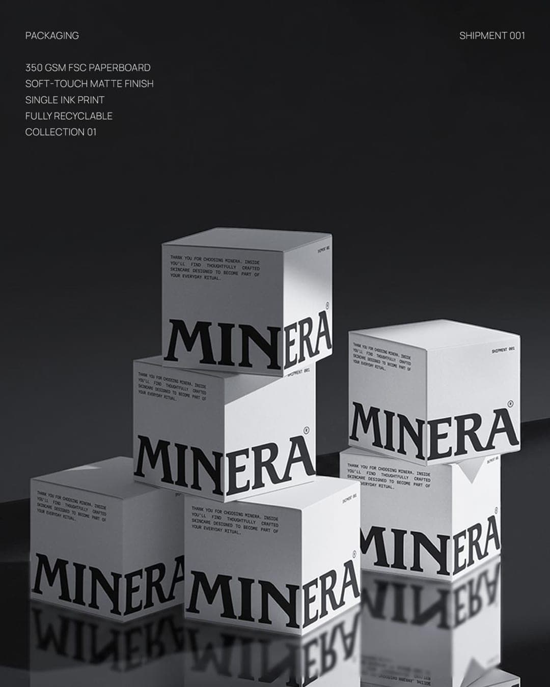
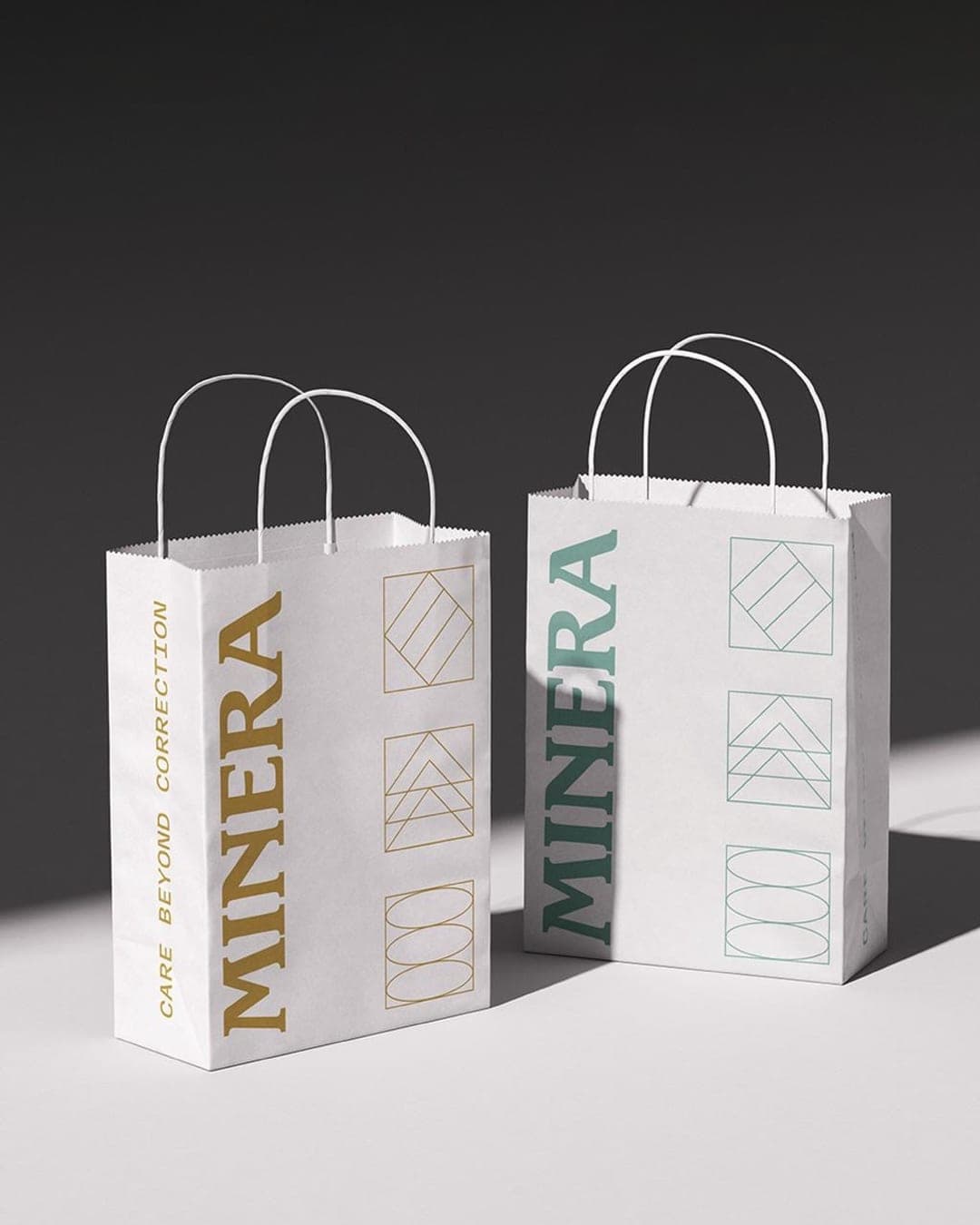
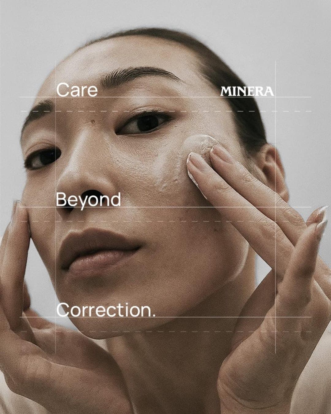
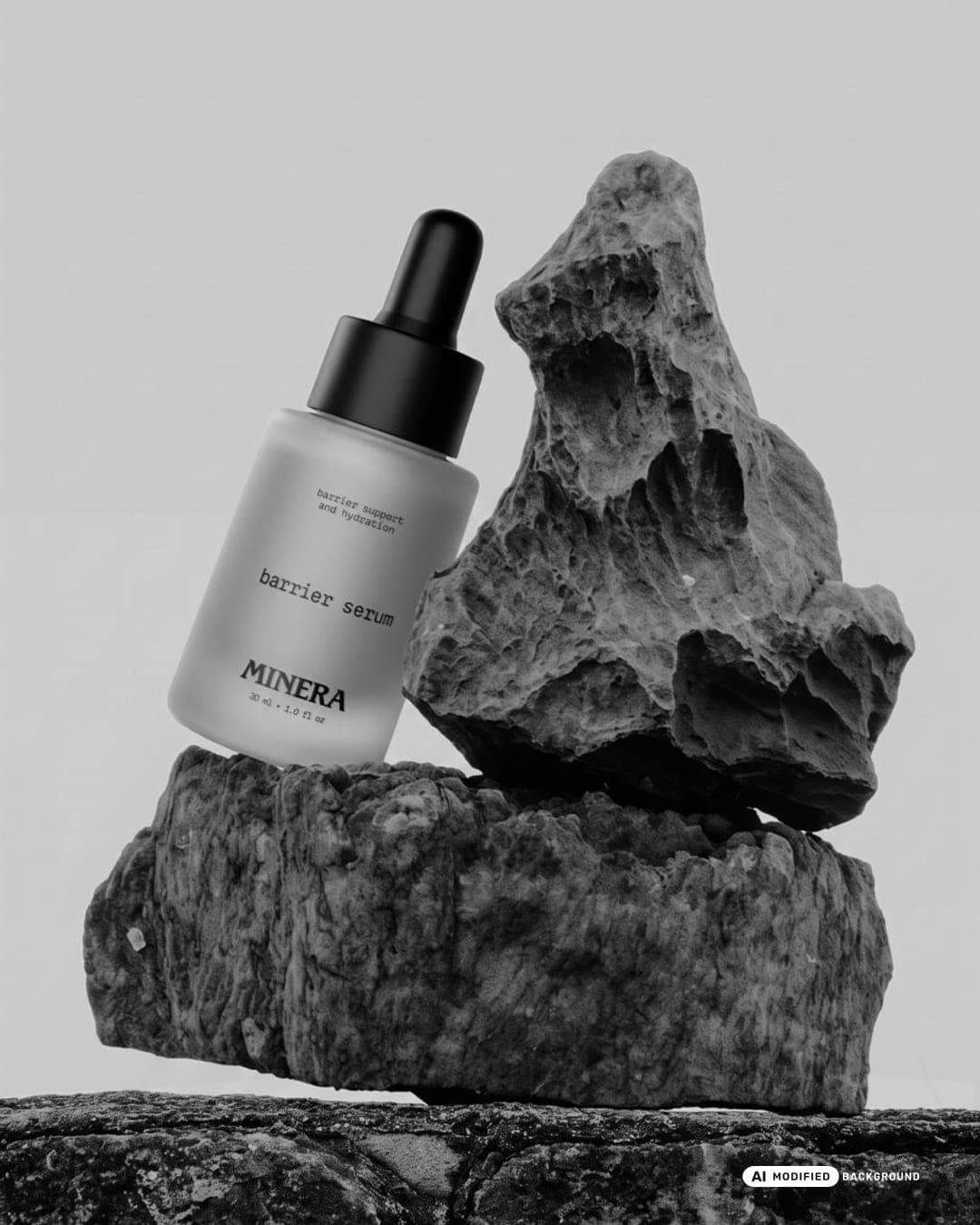
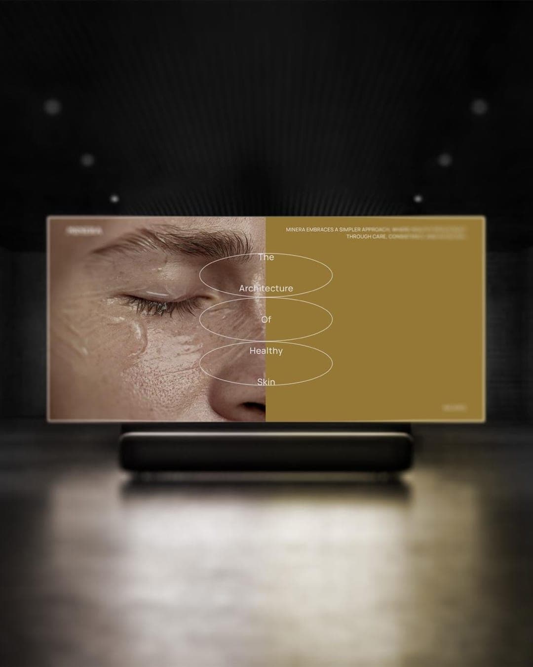
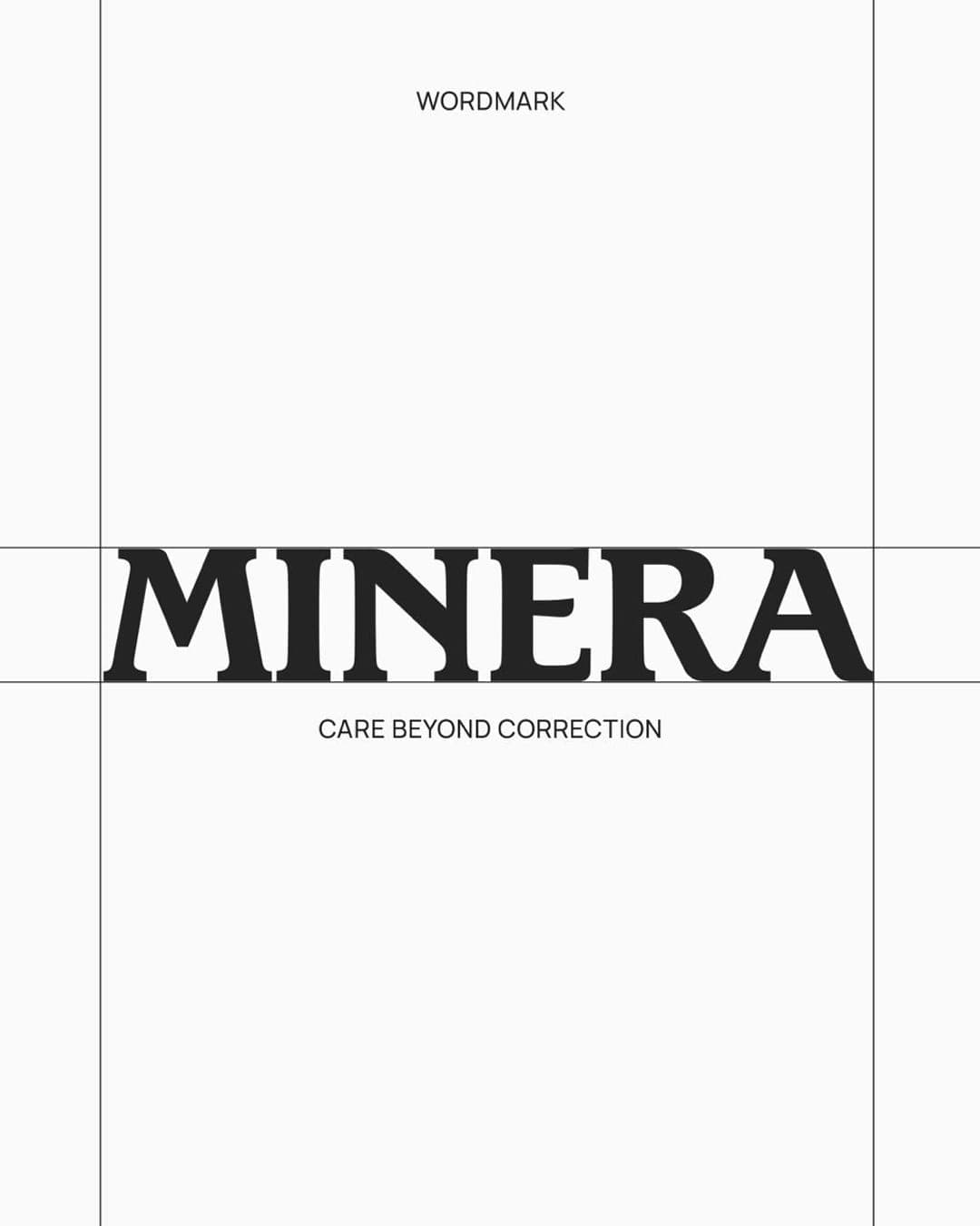
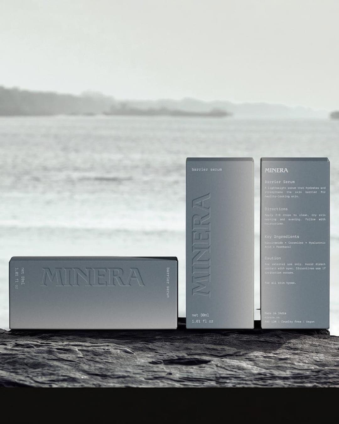
For MINERA, I built a visual identity around structure, geometry, and the idea of supporting healthy skin rather than constantly correcting it. The identity takes inspiration from the structure of skin, geometric forms, and minerals, which shaped the visual language across the branding, packaging, and art direction.
Color Palette
This brand uses a color palette of 3 colors
Click a color to find brands with similar colors.
Tags
Live score
Scores stay hidden while voting is open, so early votes can't anchor the ones that follow. Check back once the countdown ends.
Votes (0)
No votes yet — be the first.