Voting closed
Link copied
Agency & Studio · by Tanayadesigns
Kind Joinery
 Tanayadesigns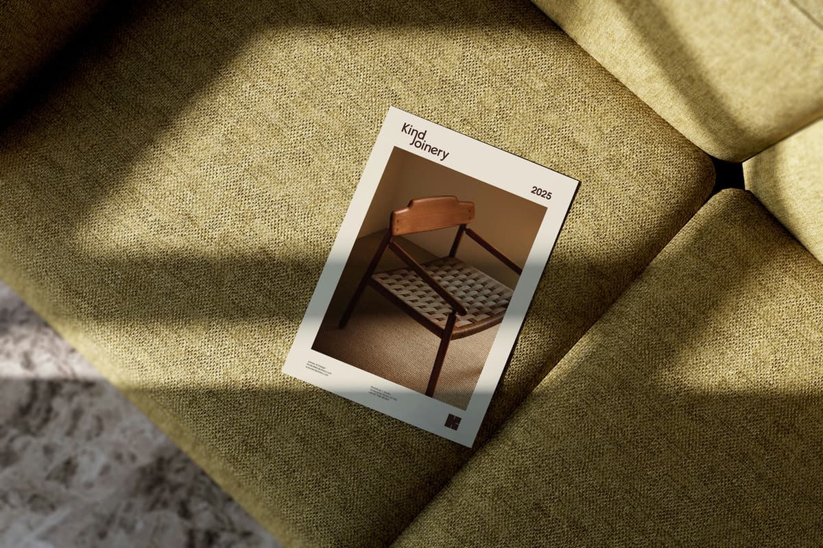
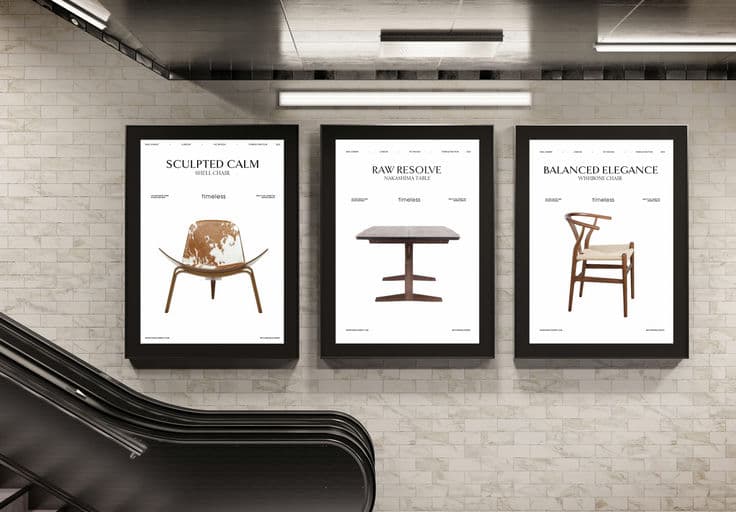
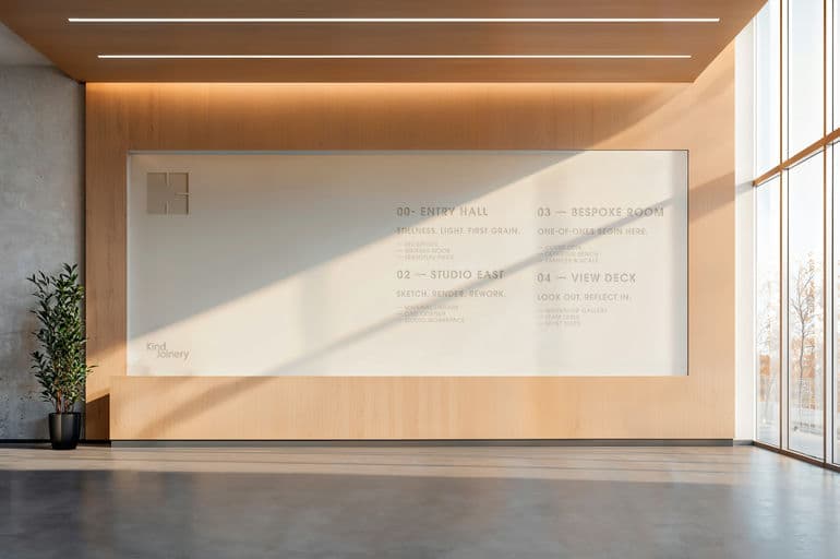
It’s more than a mark — it’s a joint. Inspired by traditional woodworking slots, this logo for Kind Joinery hides a quiet ‘K’ within its form — a subtle nod to precision, balance, and timeless craft. Just like every dovetail or mortise-and-tenon, the logo embodies the harmony of strength and elegance, where nothing is accidental and every detail serves a purpose. It’s a celebration of craftsmanship passed down through generations, reimagined for today — a symbol that’s as enduring as the work it represents.



Color Palette
Tags
Voting is closed for this nominee.