Agency & Studio · by bynillo.studio
by DAISY BOULTON
 bynillo.studio
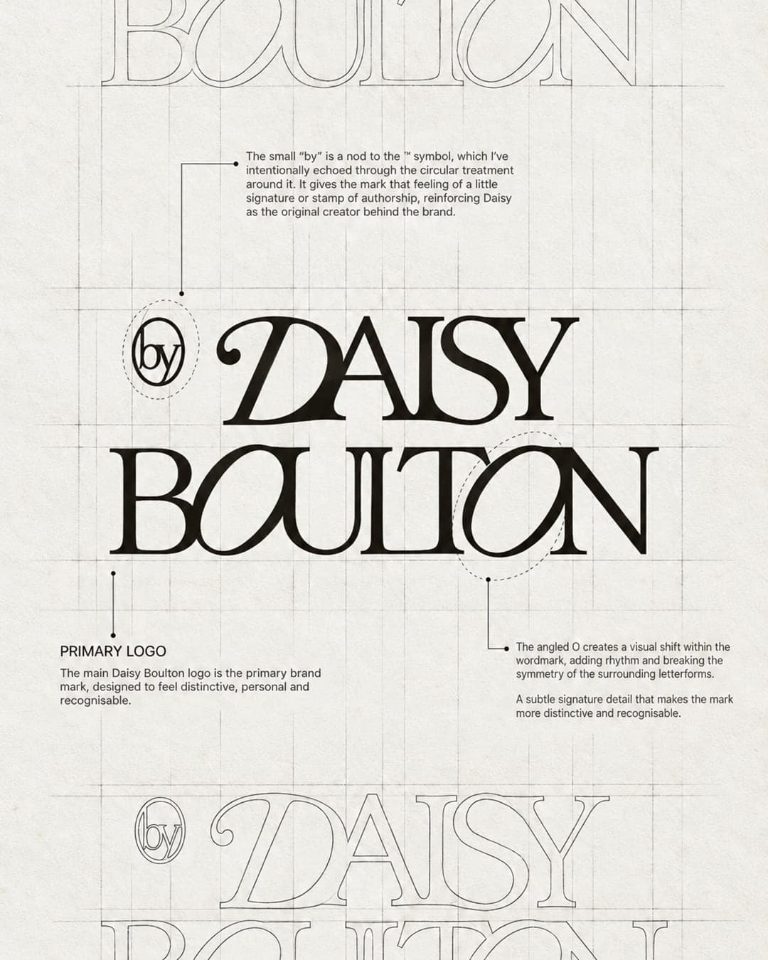
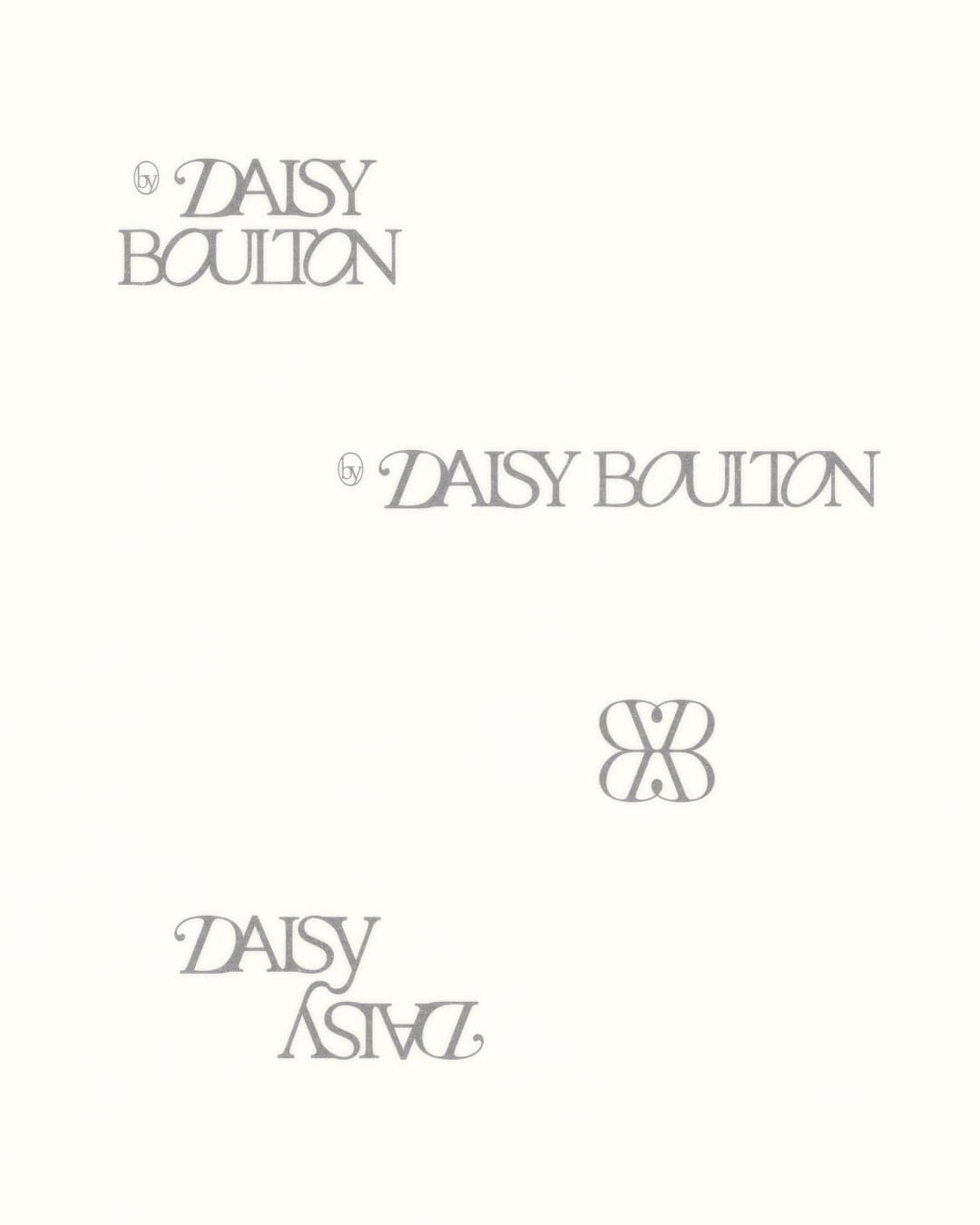
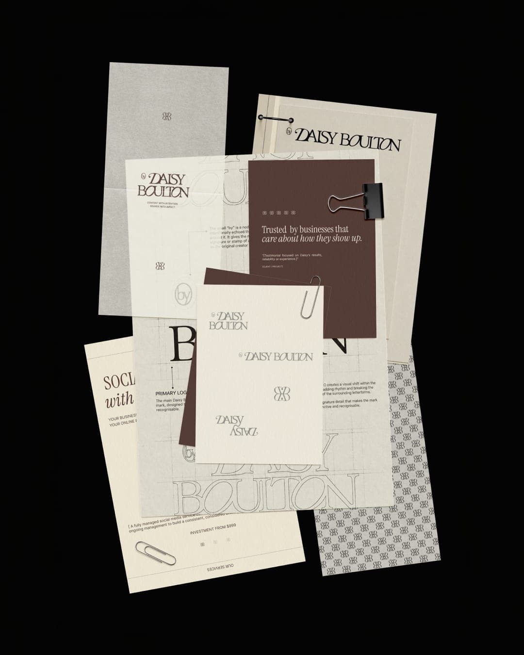
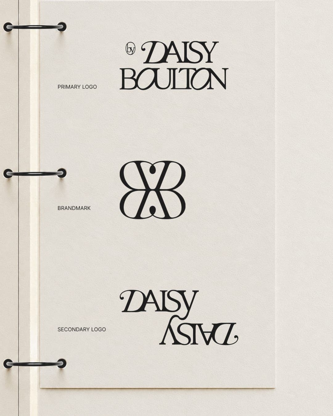
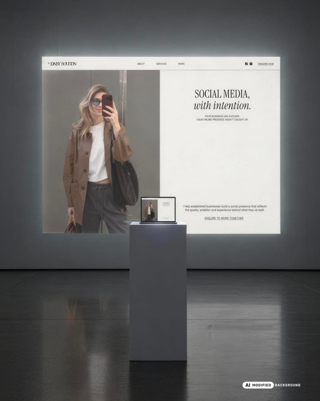
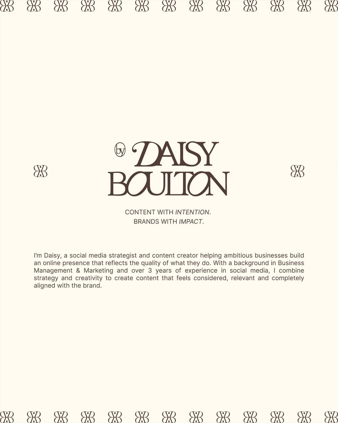
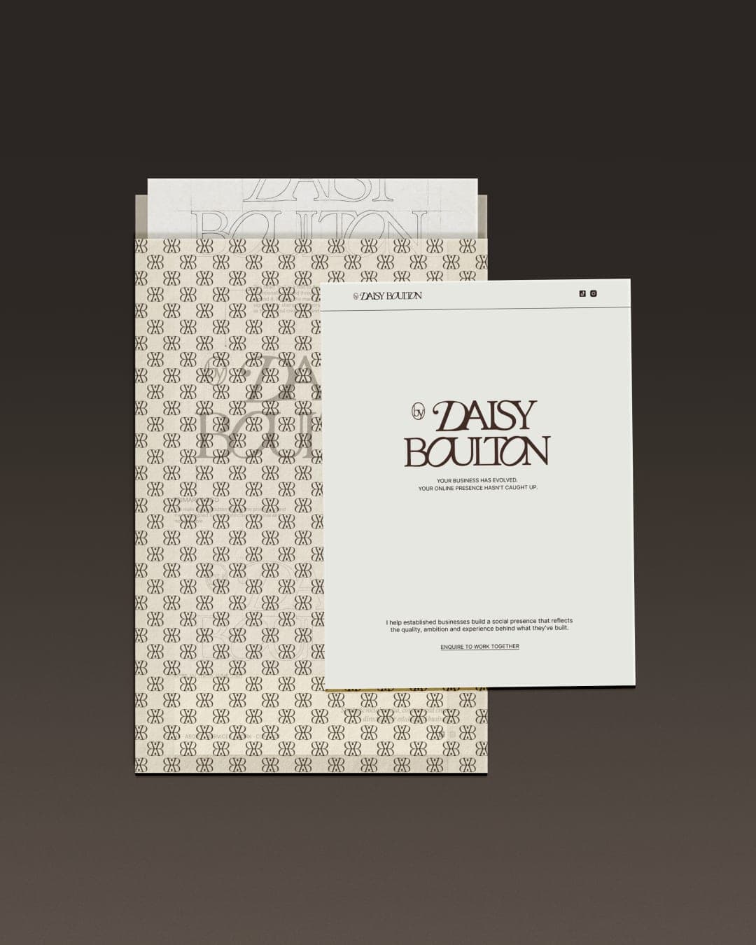
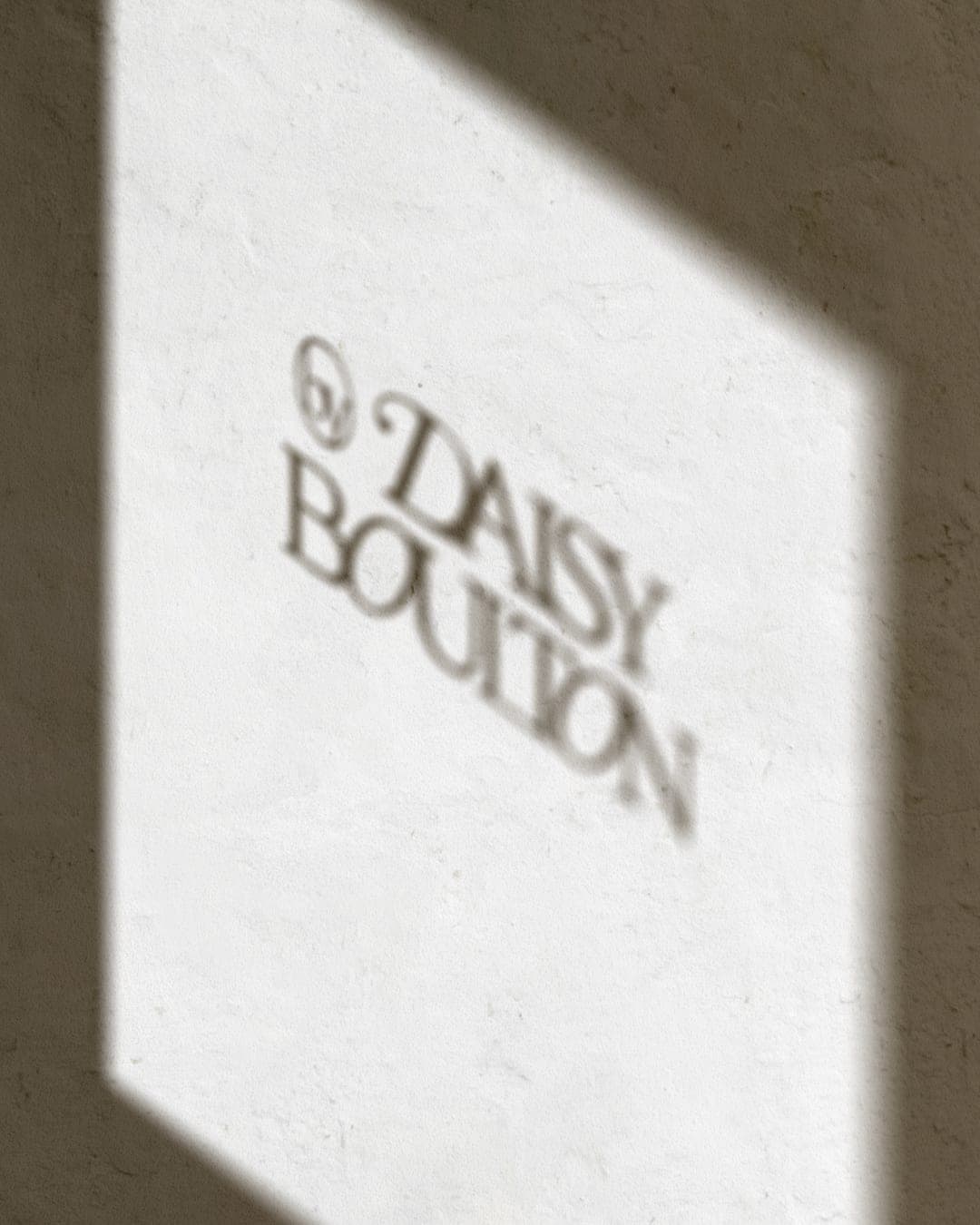
A considered visual identity carried through to the digital experience, bringing every detail together to create a brand that feels cohesive, distinctive and personal. The primary wordmark features a subtle “by” detail, inspired by the trademark symbol, a small nod to the person behind the work and a sense of authorship and ownership. This thinking carries through the wider identity and into the website, creating a consistent experience across every touchpoint.


Color Palette
This brand uses a color palette of 2 colors
Click a color to find brands with similar colors.
Tags
Live score
Scores stay hidden while voting is open, so early votes can't anchor the ones that follow. Check back once the countdown ends.
Votes (0)
No votes yet — be the first.