Link copied
Food & Beverage · by eliisign
KURU
 eliisign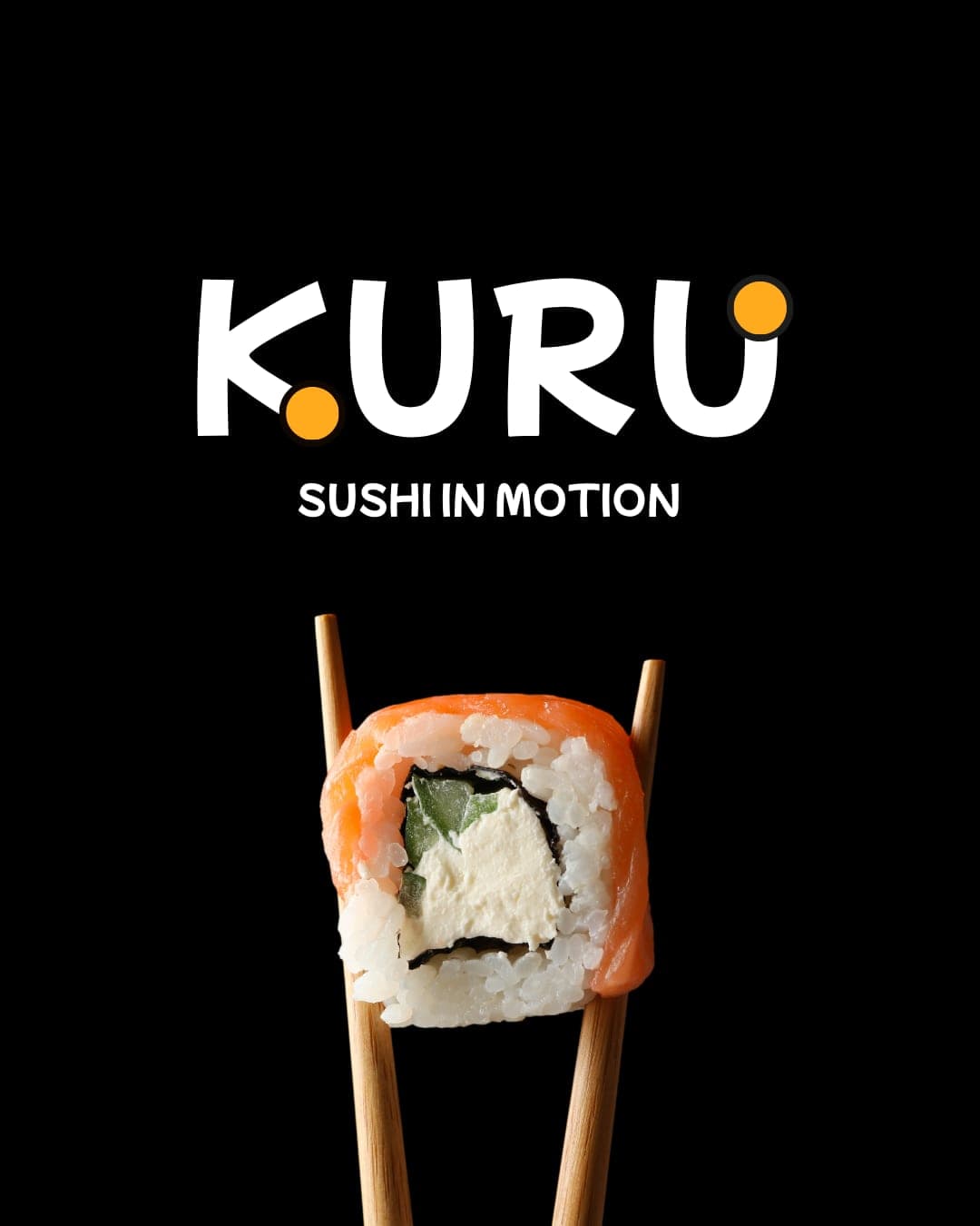
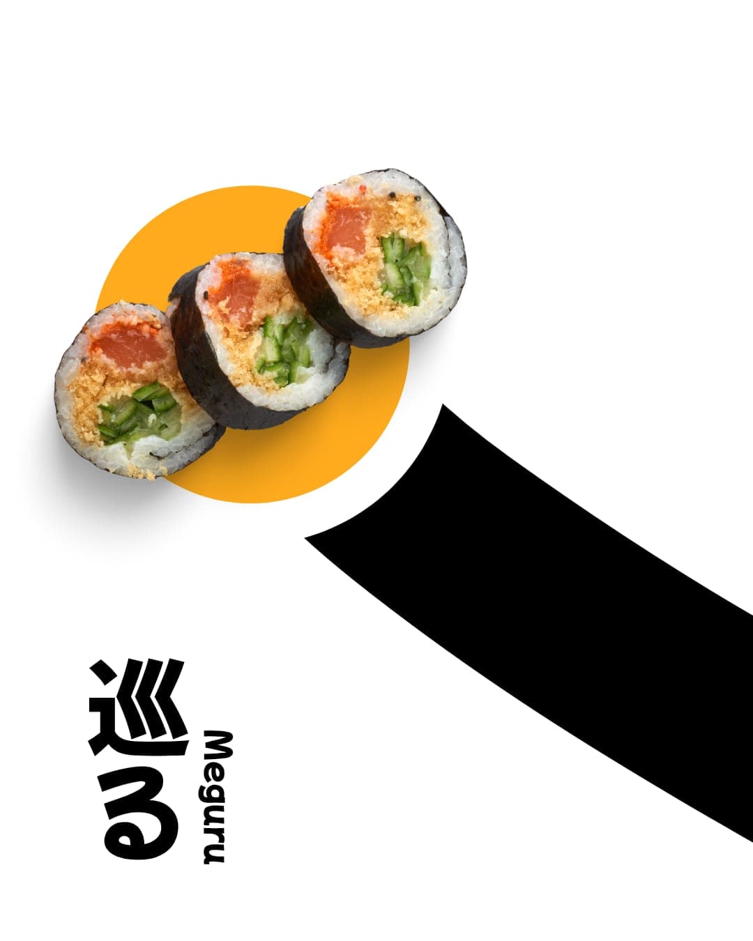
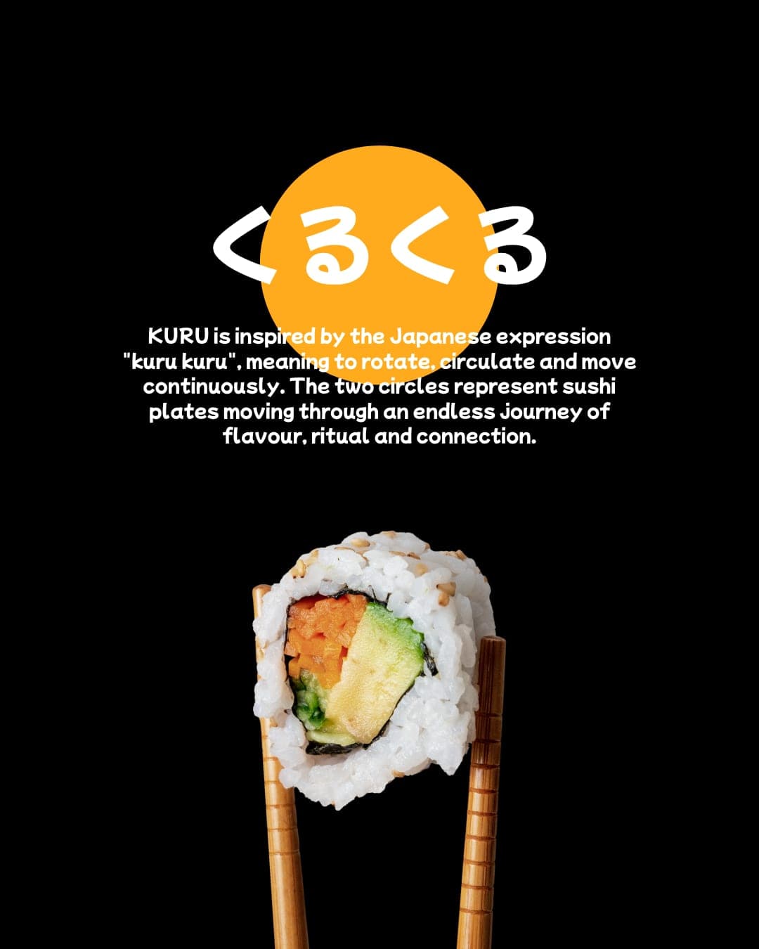
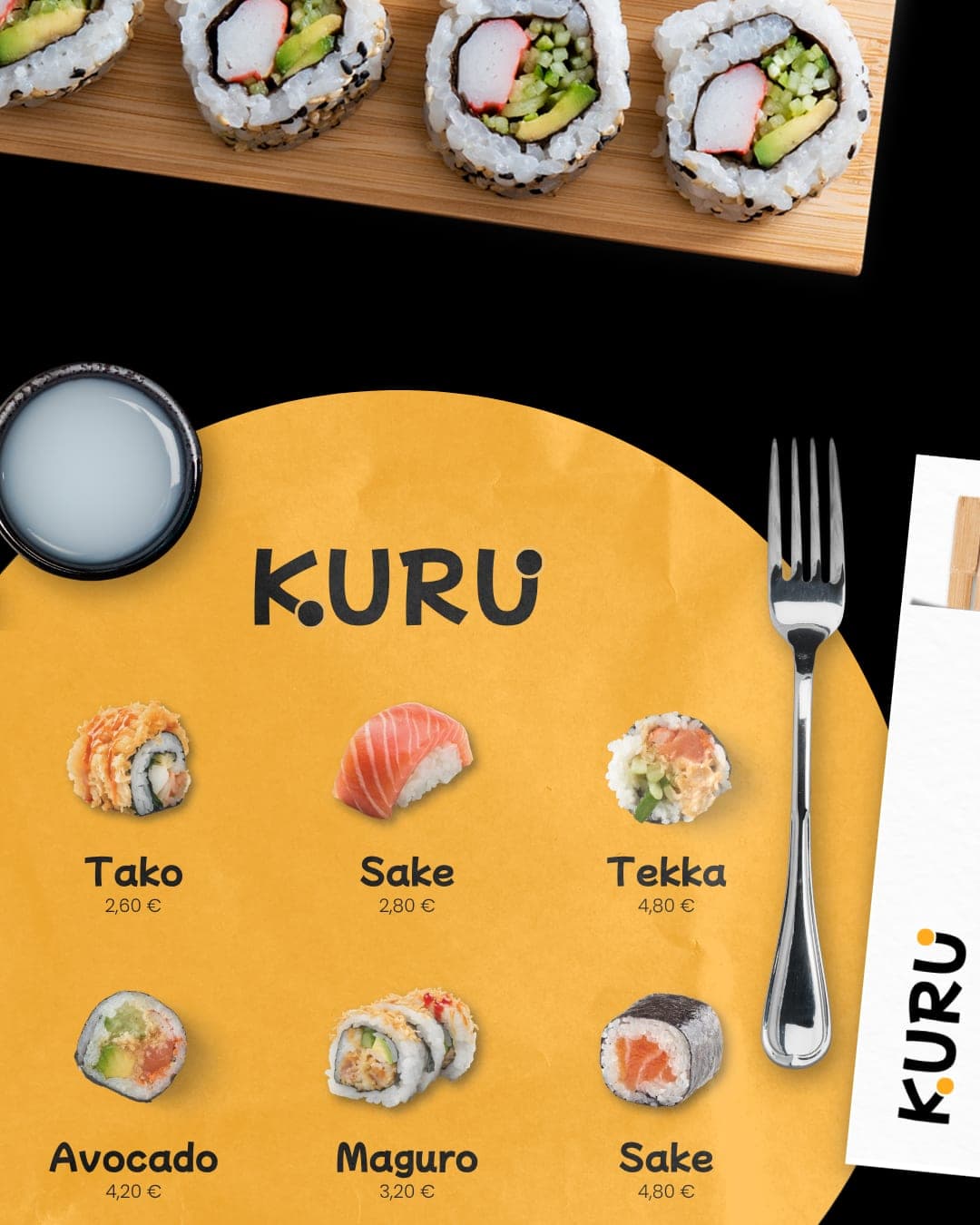
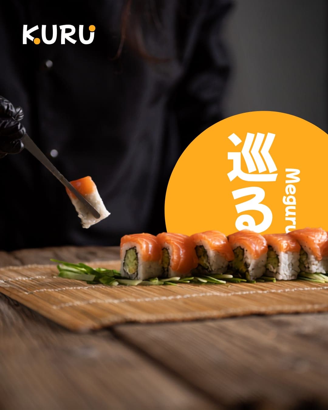
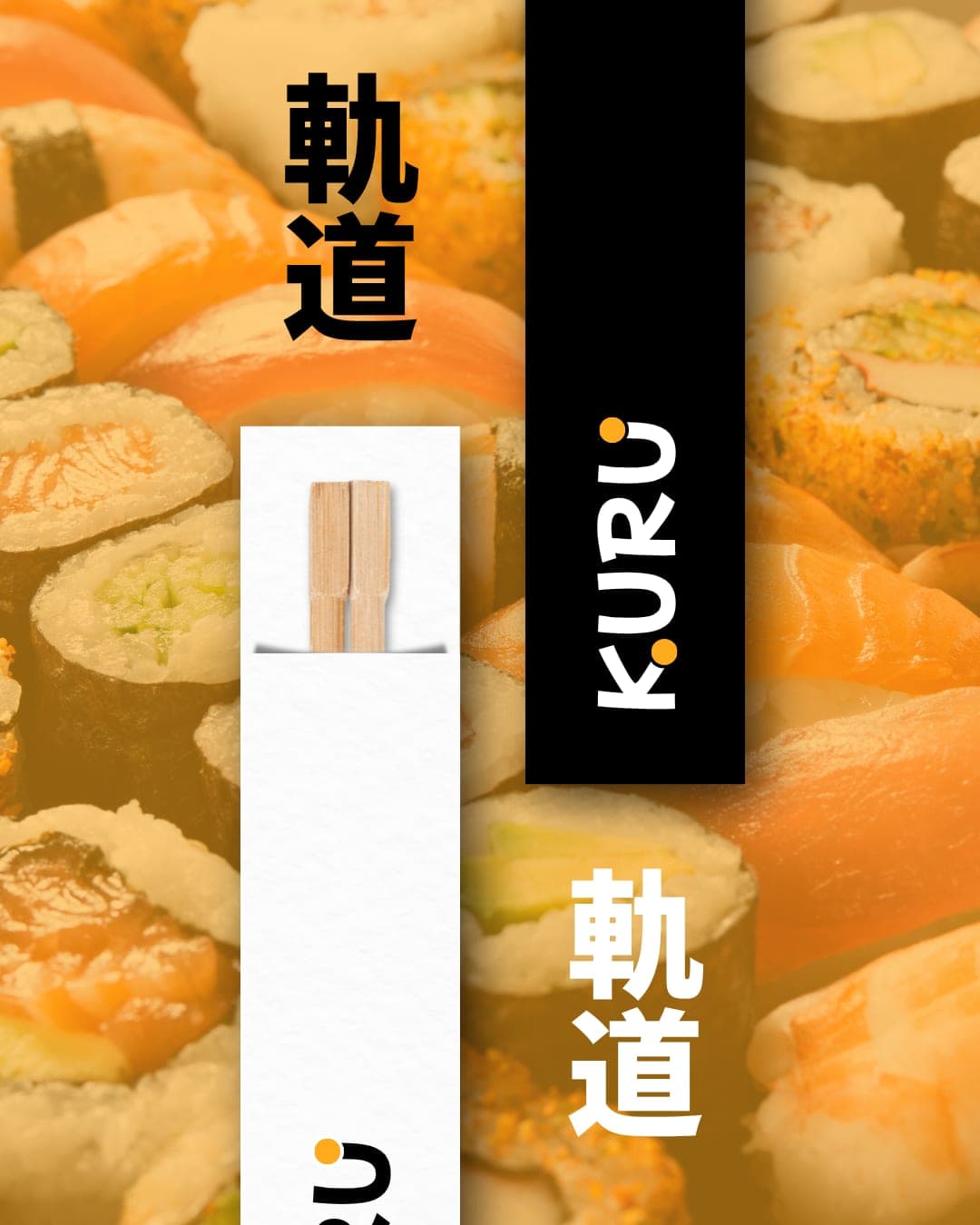
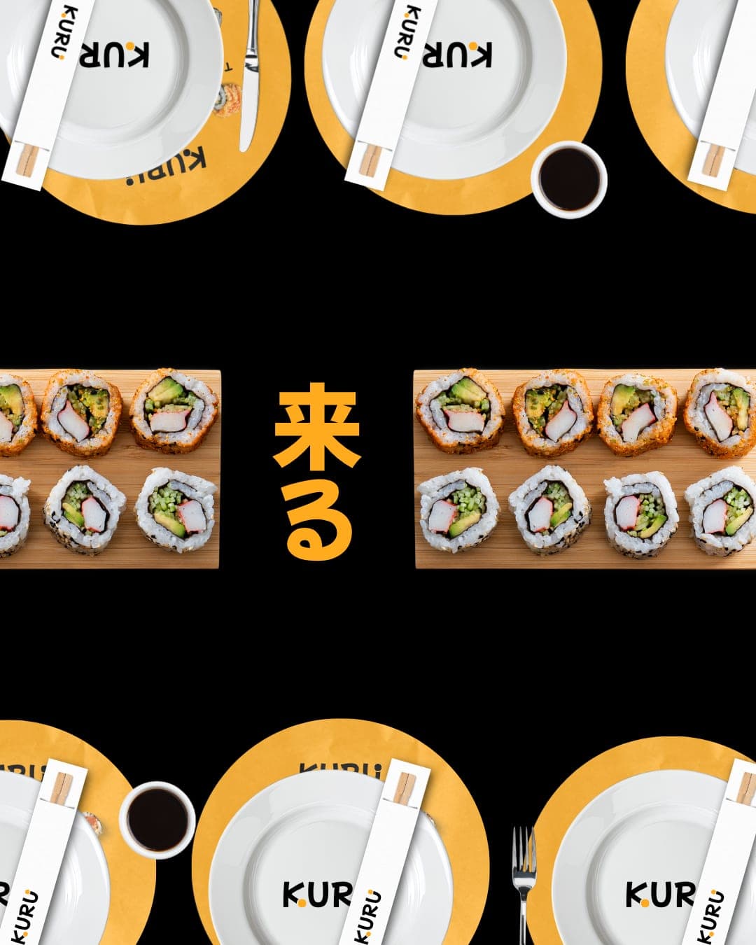
KURU is inspired by the Japanese expression “kuru kuru”, meaning to rotate, circulate and move continuously. The two circles reflect the movement of sushi plates as they travel directly to each guest, symbolizing an endless journey of flavour, ritual and connection.
Color Palette
This brand uses a color palette of 3 colors
Click a color to find brands with similar colors.
Tags
Live score
Scores stay hidden while voting is open, so early votes can't anchor the ones that follow. Check back once the countdown ends.
Votes (0)
No votes yet — be the first.