Link copied
Food & Beverage · by Atipus
Manel
 Atipus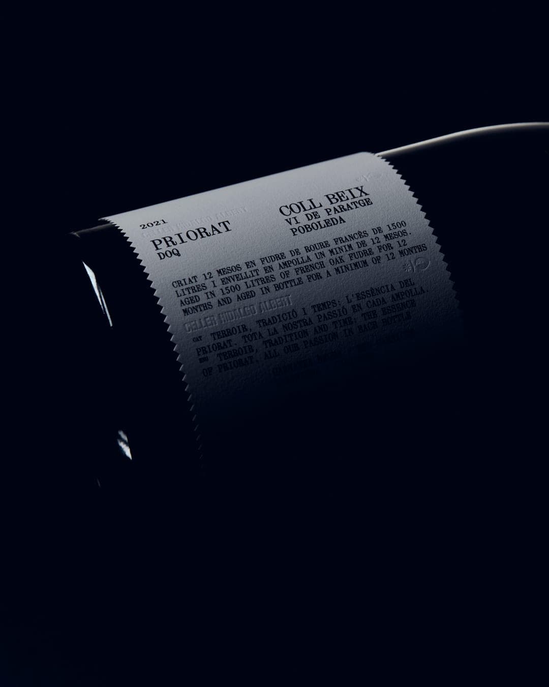
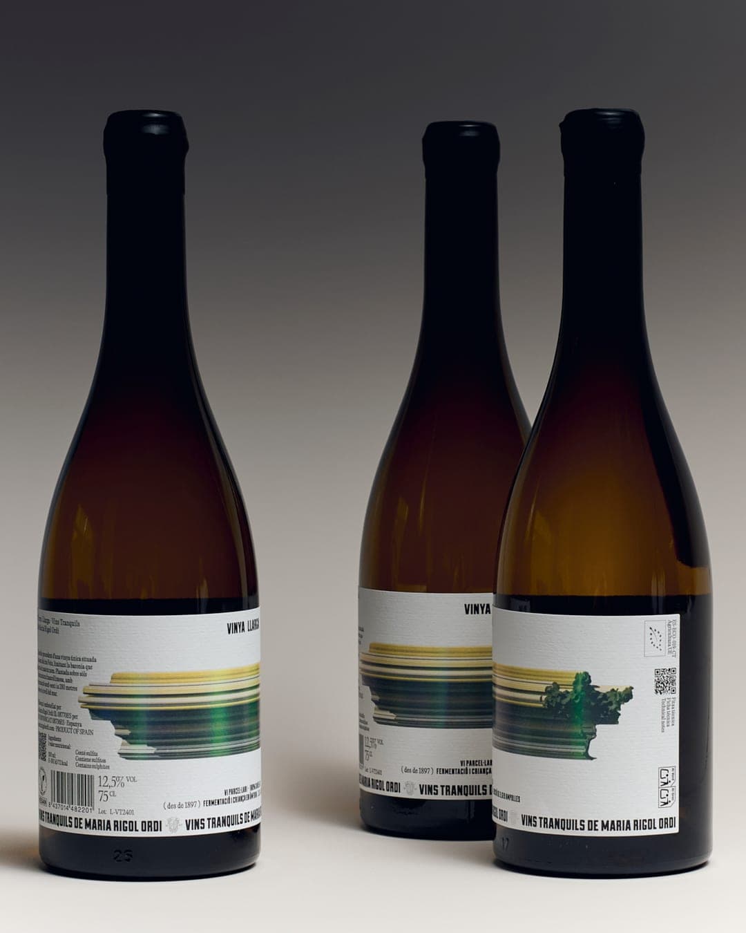
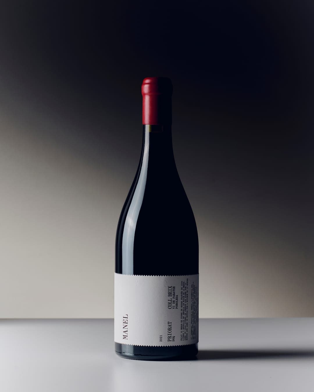
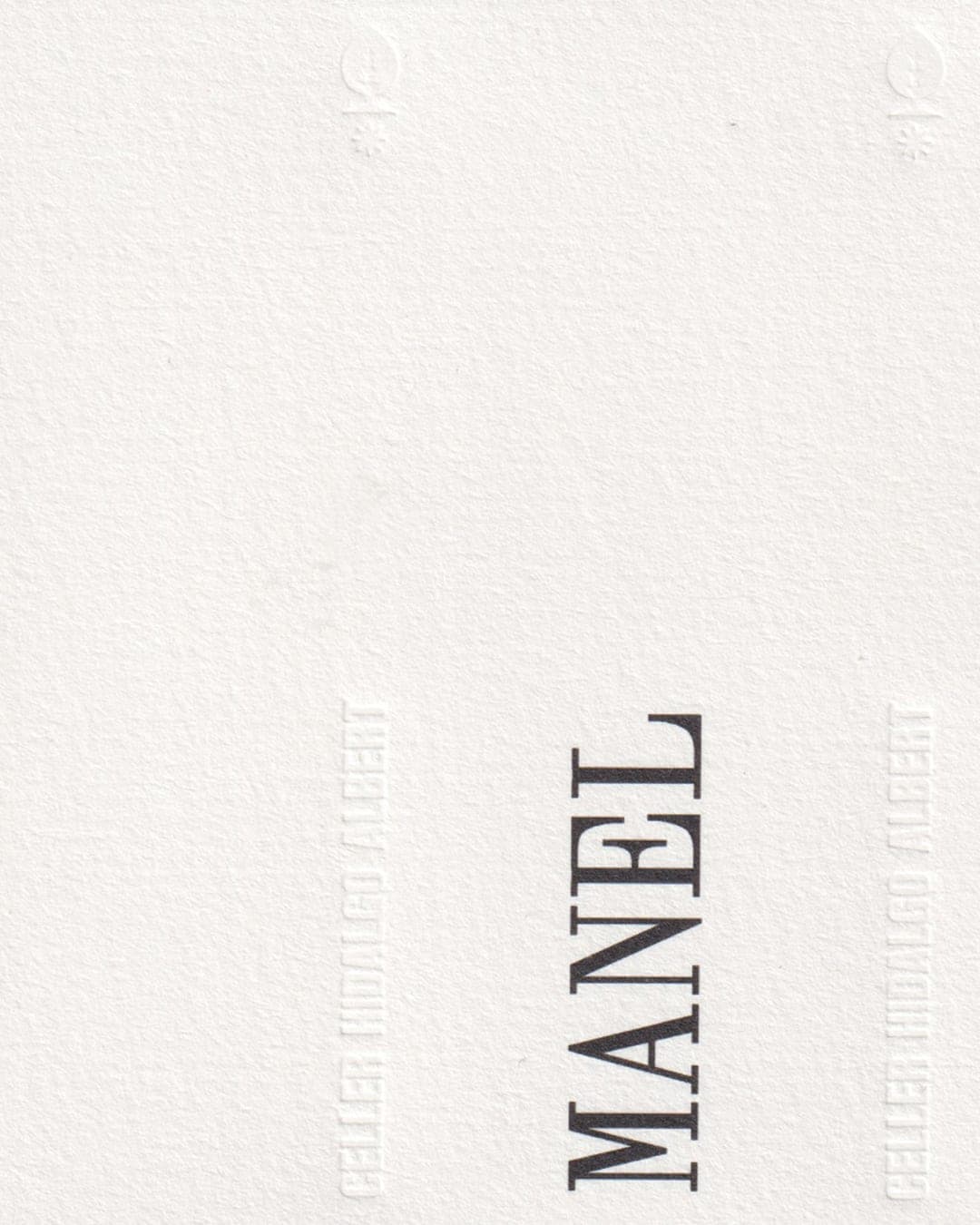
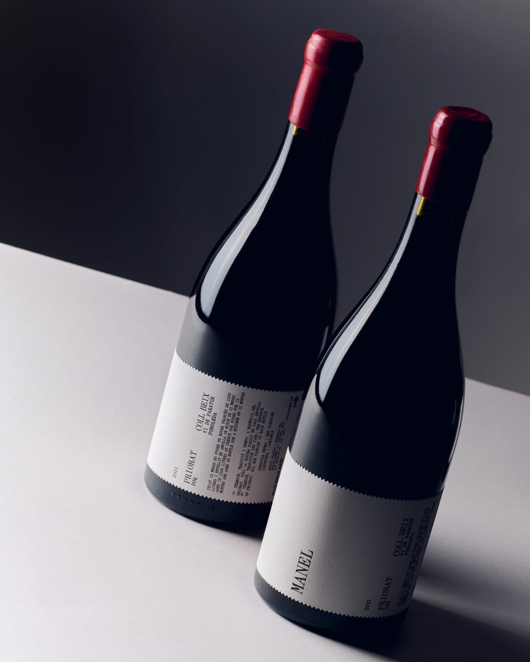
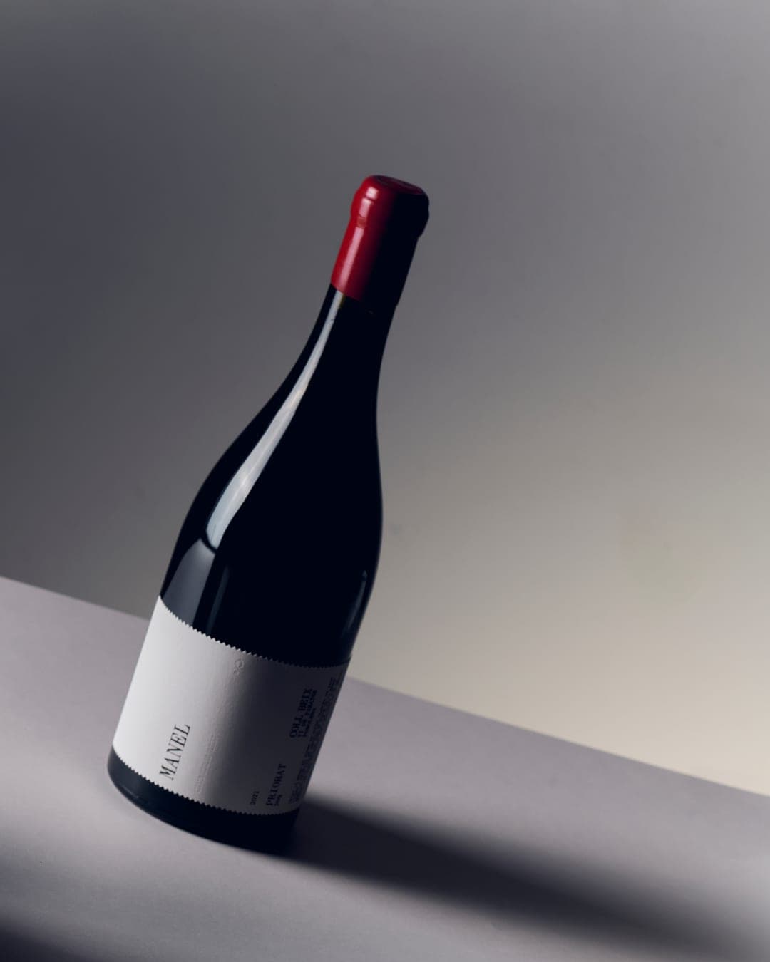
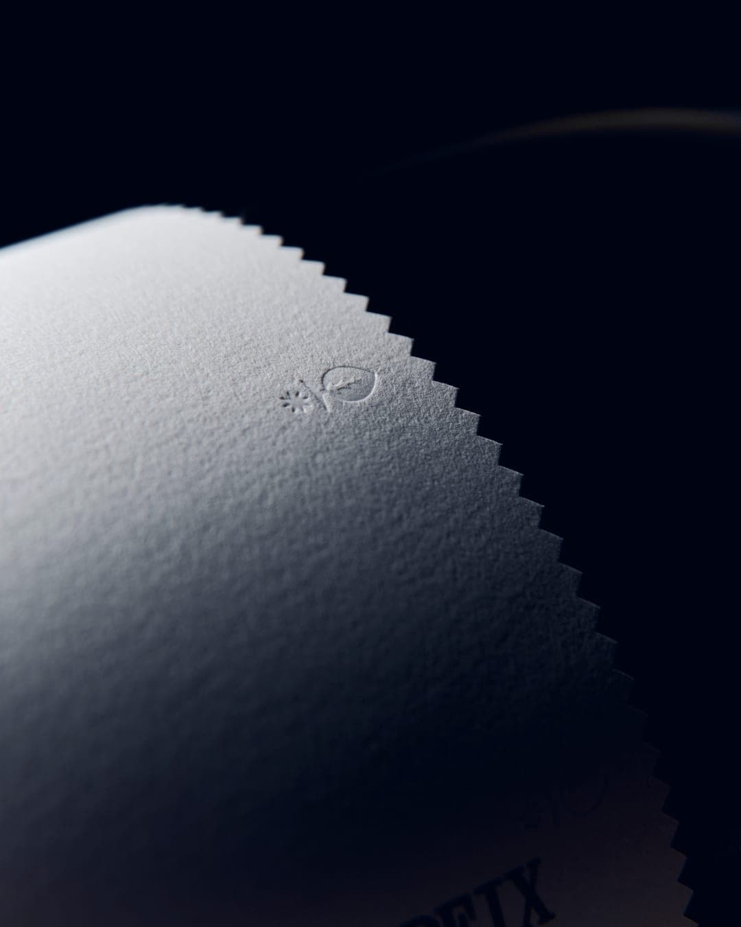
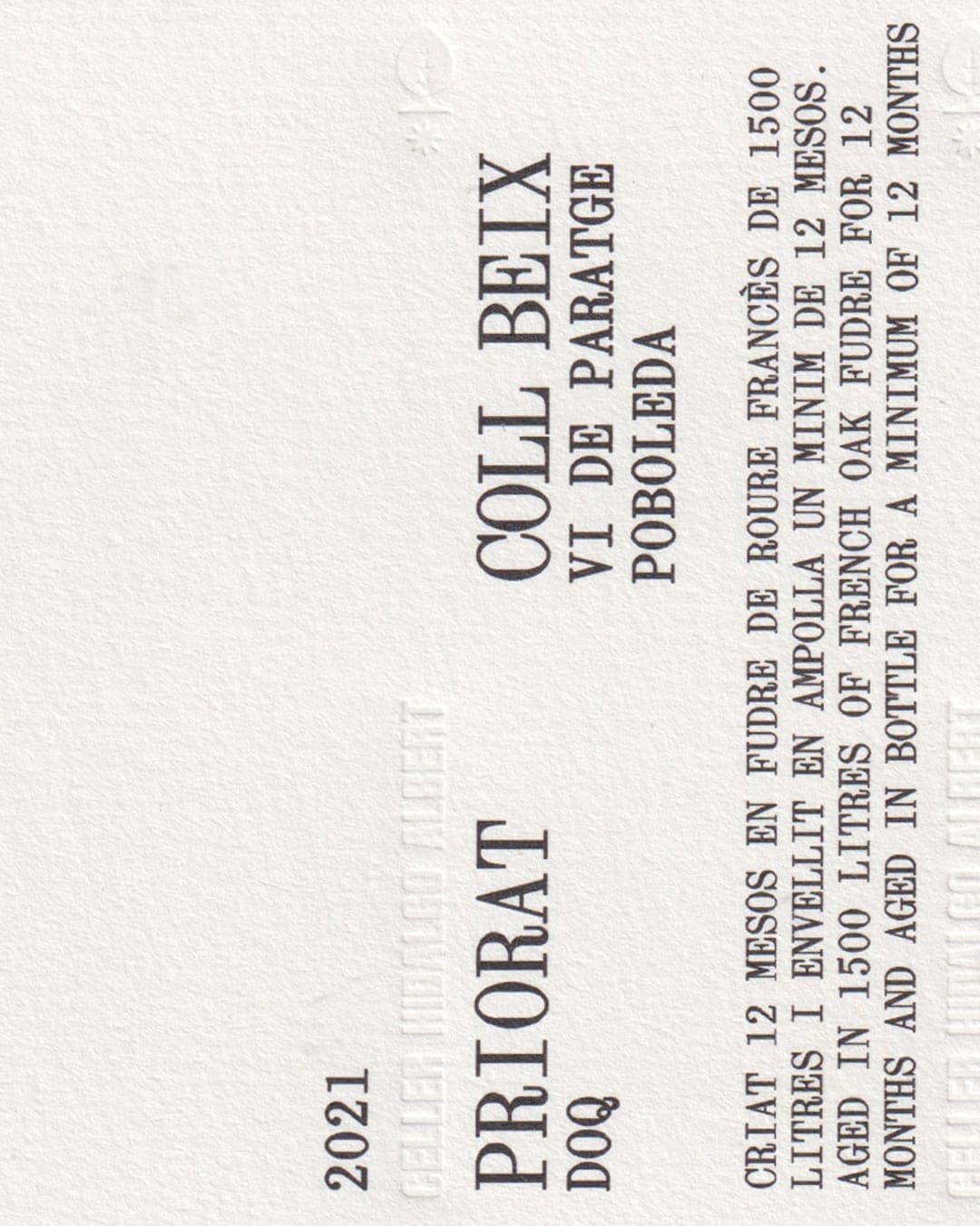
A new label for Manel, building on the graphic foundations that have defined Celler Hidalgo Albert from the beginning. 🍷 We took their original visual language as our starting point, keeping its essence while giving it a more contemporary expression. The winery’s symbol acts as a link to its origins, while typography, nomenclature and a stripped-back composition give the wine a distinctive presence. Photography: Marc G. Camps
Color Palette
This brand uses a color palette of 1 color
Click a color to find brands with similar colors.
Tags
Live score
Scores stay hidden while voting is open, so early votes can't anchor the ones that follow. Check back once the countdown ends.
Votes (1)
No votes yet — be the first.