Food & Beverage · by Studio Moara
Motti
 Studio MoaraPRO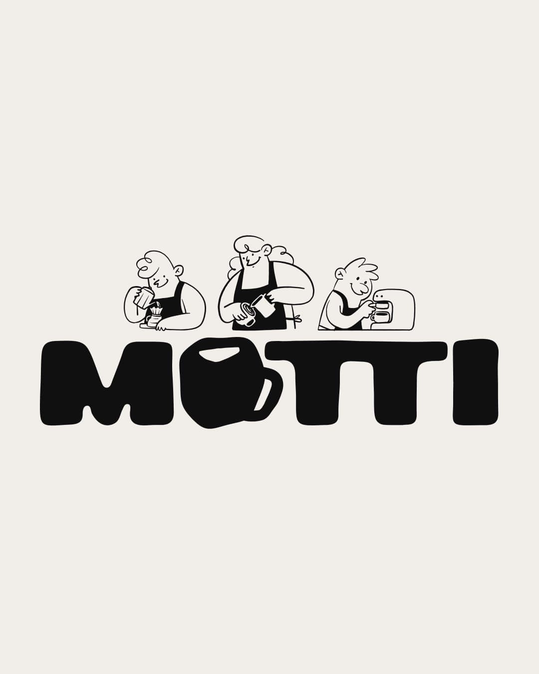
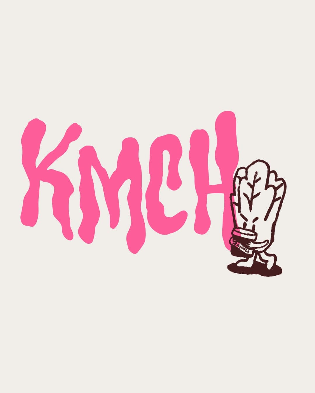
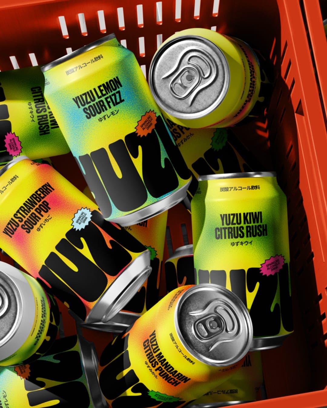
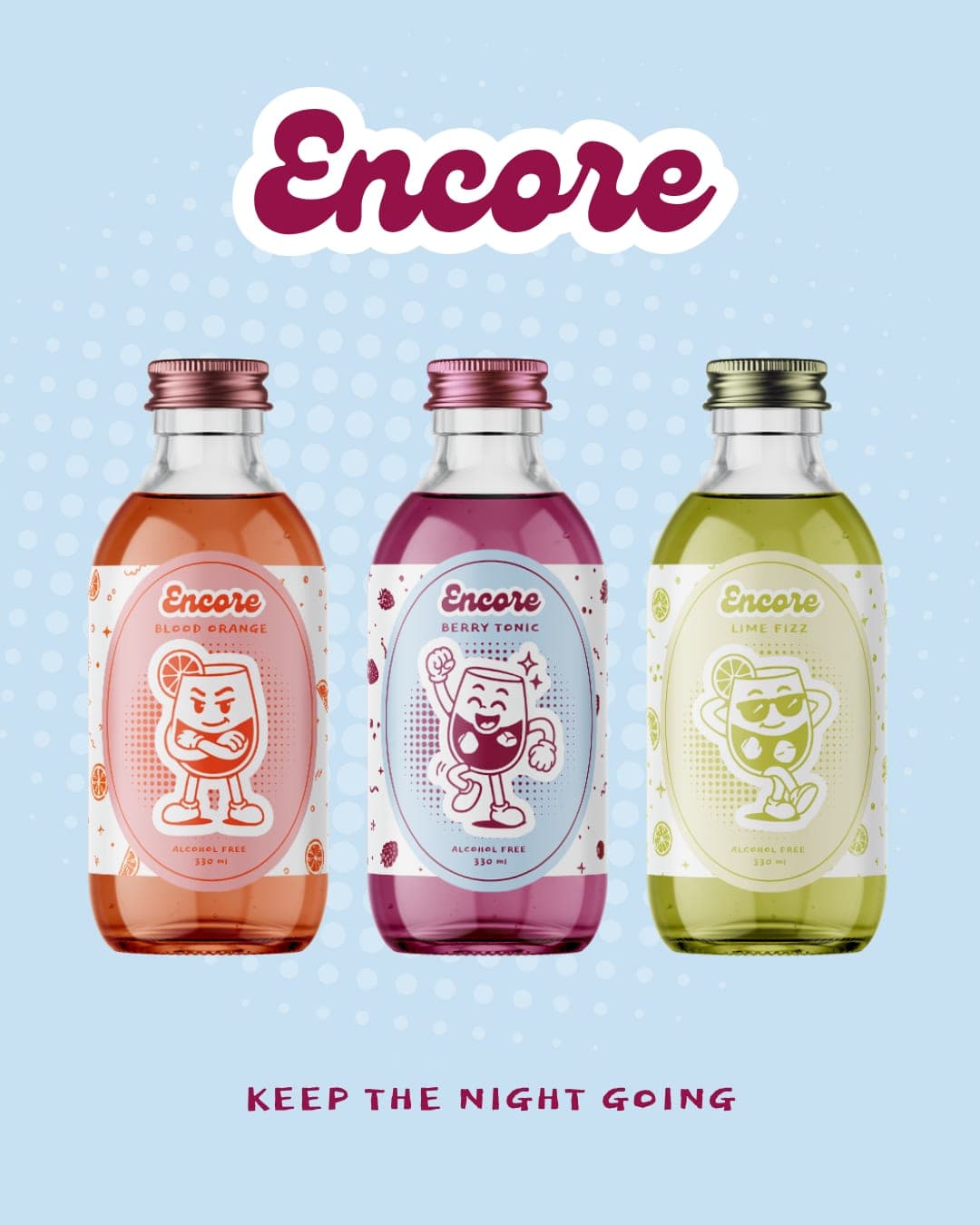
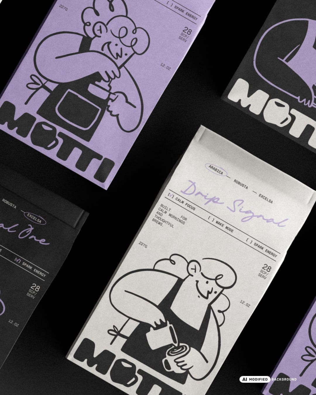
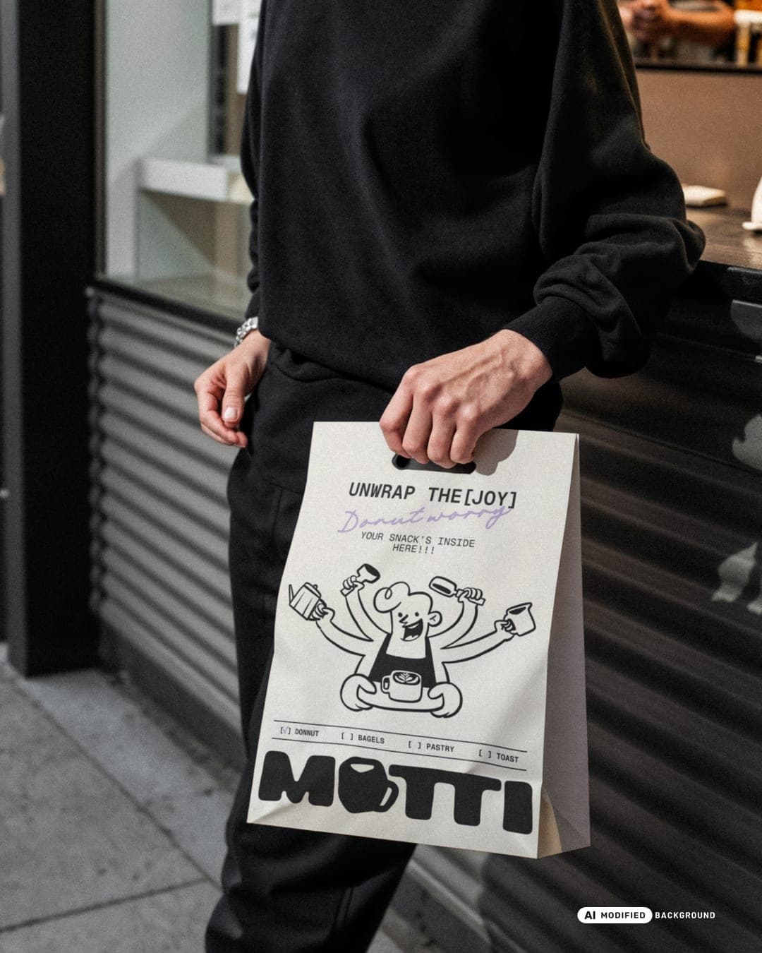
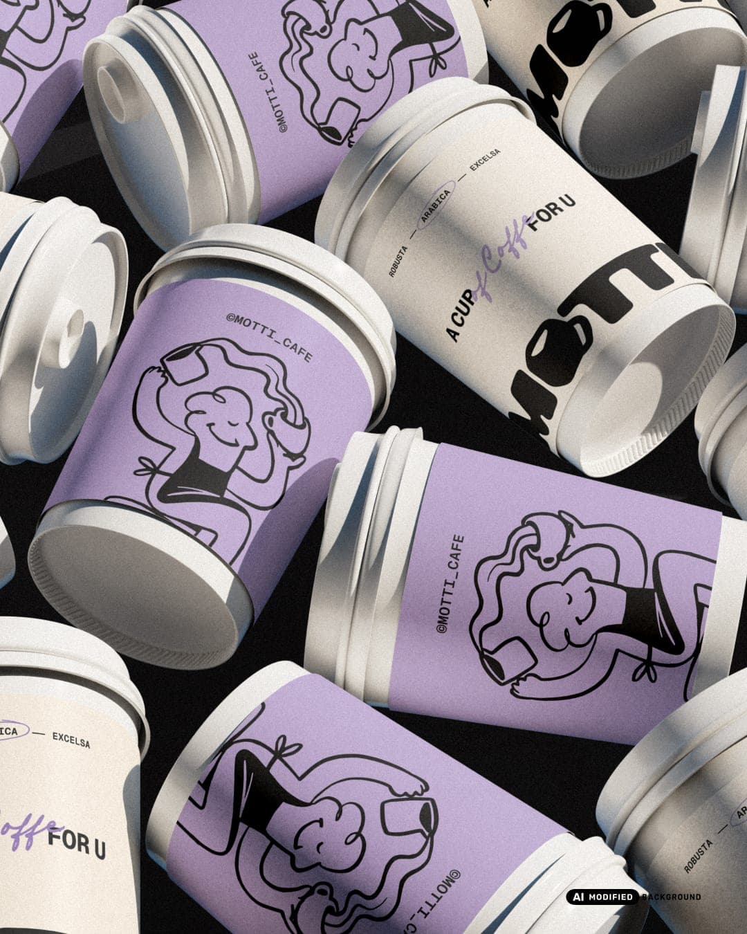
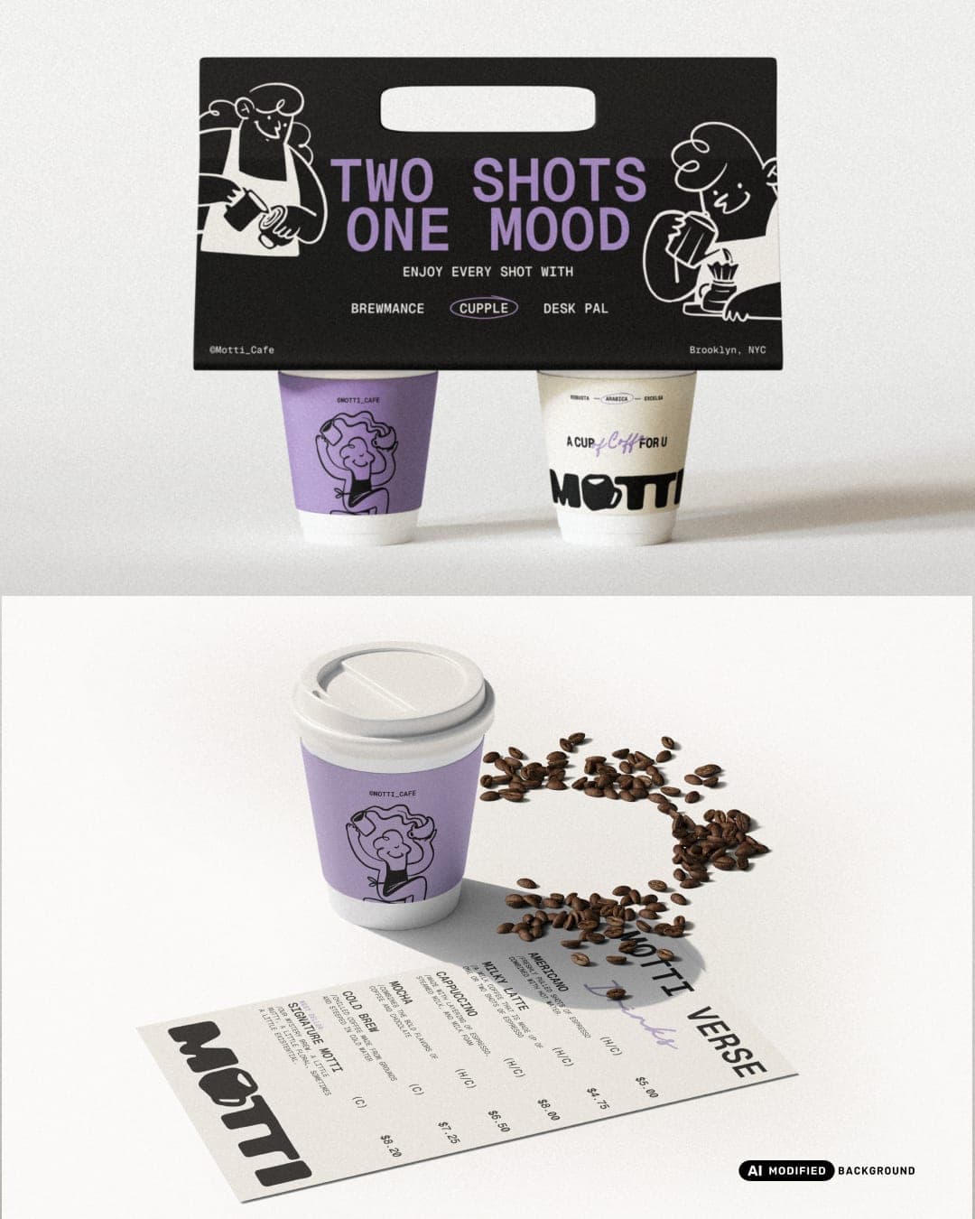
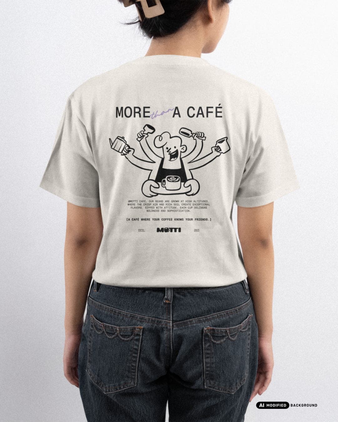
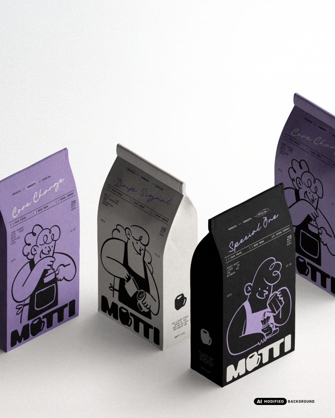
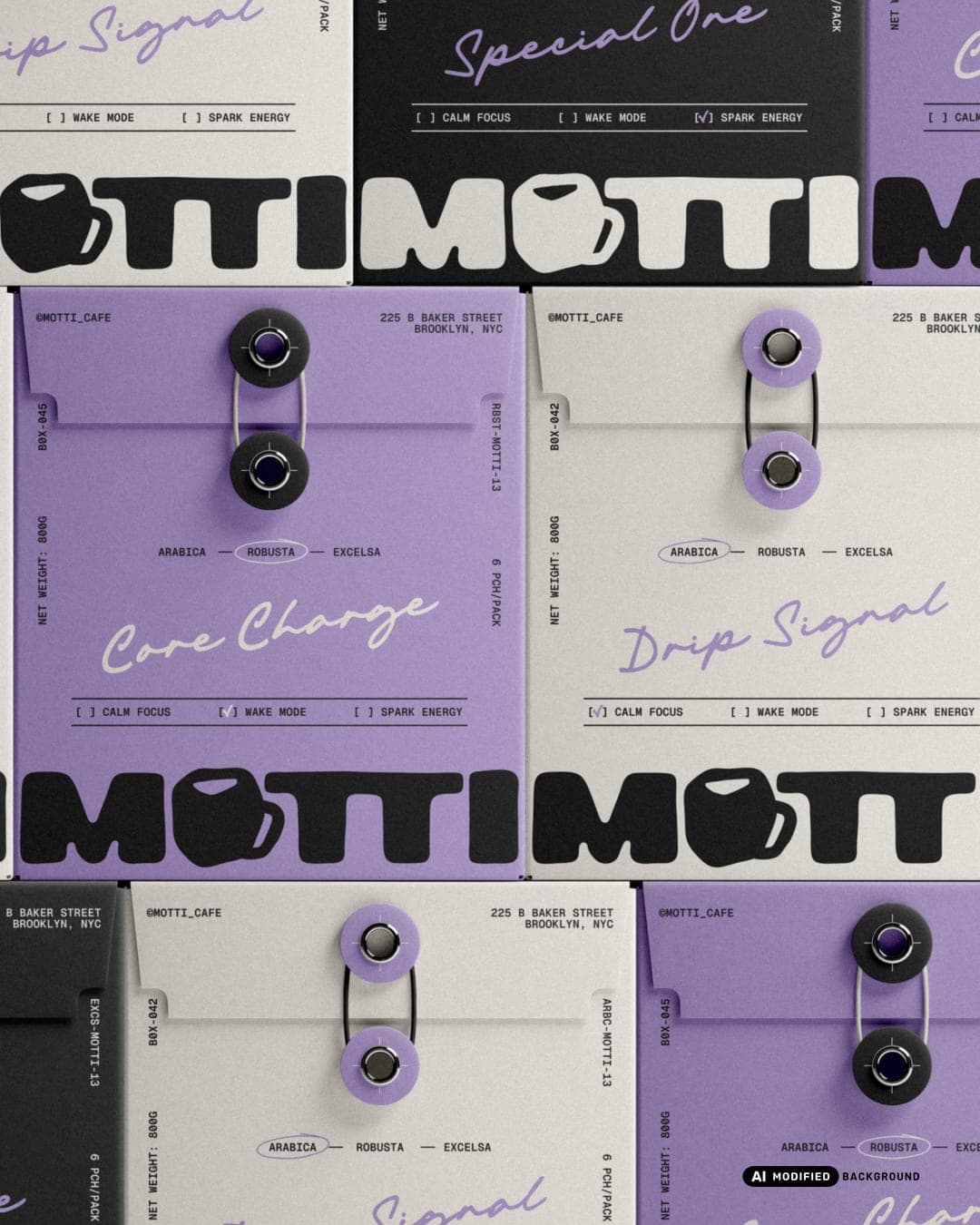
We developed the complete brand identity—from logo design, character illustration, and packaging dielines, to a cohesive visual system ready for both print and digital use. The logo was crafted in two styles: a minimalist logotype and a friendly mascot version to enhance brand personality. The character design plays a key role across the brand touchpoints, bringing warmth and memorability to the customer experience. For packaging design, we focused on clean layouts, modern color palettes, and flexible formats that can adapt across various café products, ensuring visual consistency and production-ready application. This project highlights our approach to café branding: thoughtful, modern, and strategic. It’s not just about looking good, it’s about building a visual identity that resonates, performs, and stands out.
Color Palette
This brand uses a color palette of 3 colors
Click a color to find brands with similar colors.
Tags
Live score
Scores stay hidden while voting is open, so early votes can't anchor the ones that follow. Check back once the countdown ends.
Votes (0)
No votes yet — be the first.