Food & Beverage · by Studio Moara
Mushi Matcha
 Studio MoaraPRO
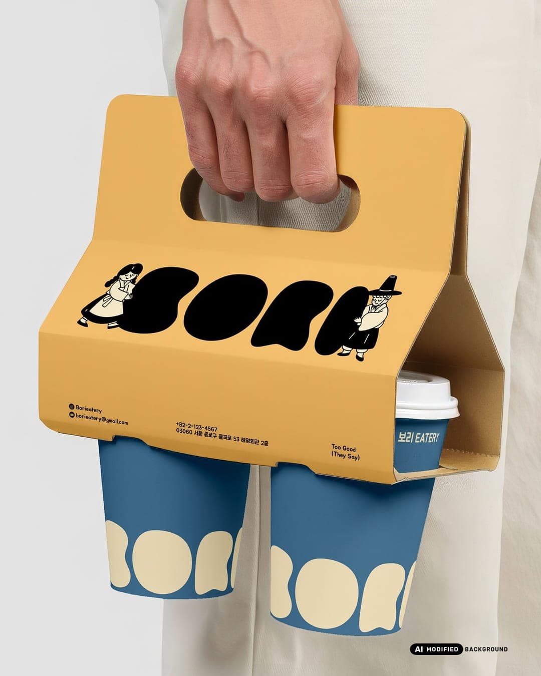
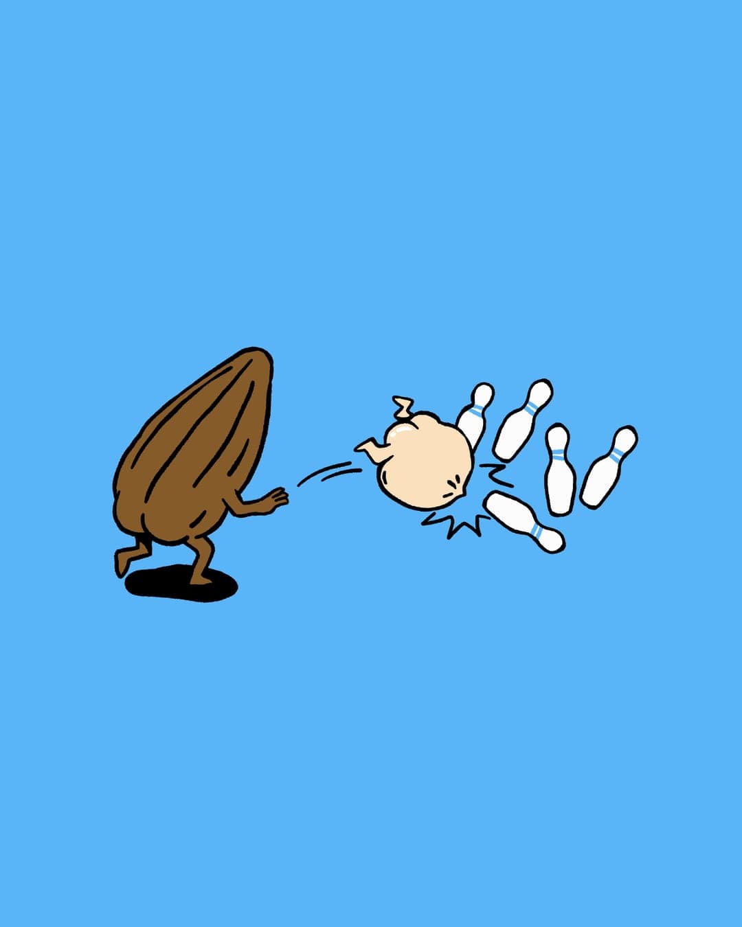
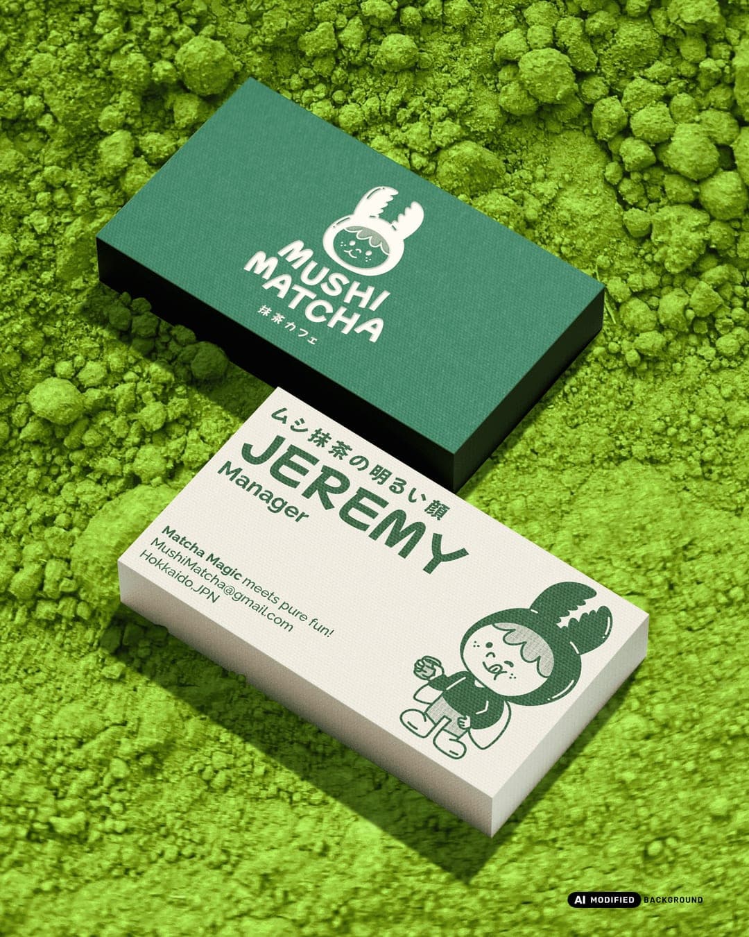
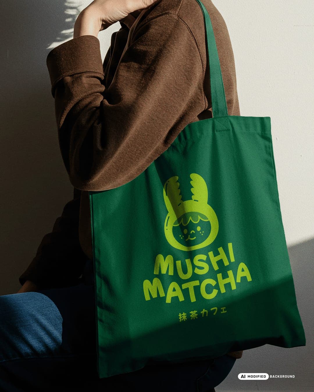
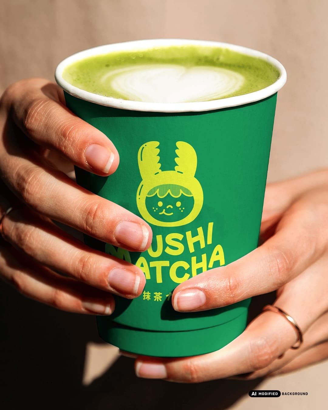
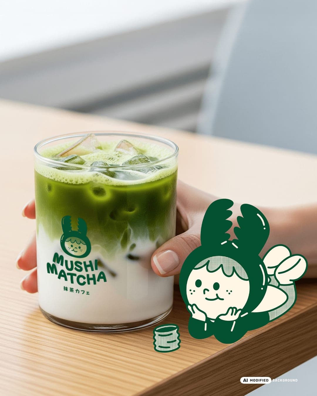
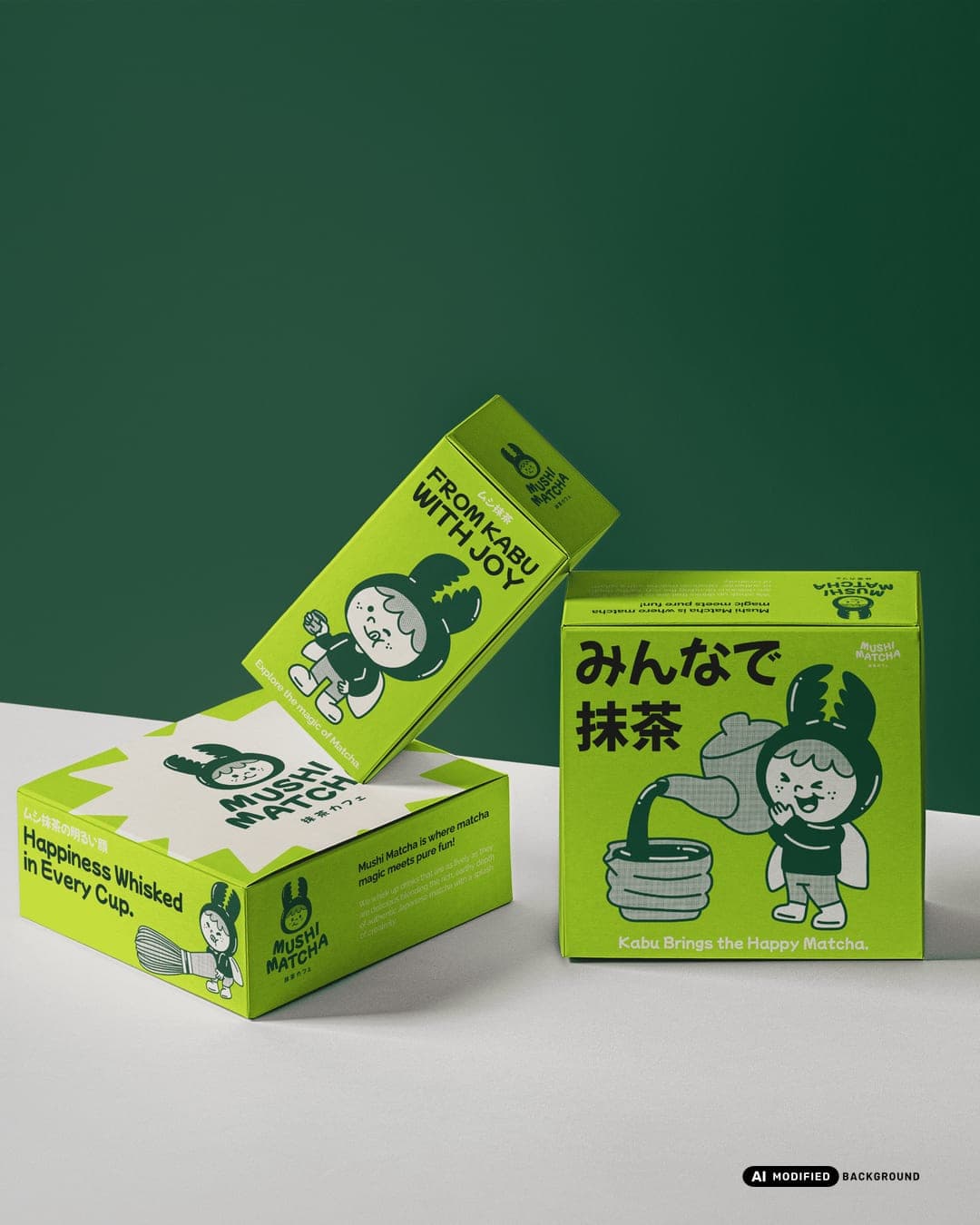
Mushi Matcha is a branding project created to capture the gentle spirit of Japanese tea culture in a way that feels charming, cute, and calm. At the heart of the identity is a simple matcha logo and the adorable mascot Kabu, who brings warmth and friendliness to every detail. With soft shapes and playful expressions, Kabu makes the brand approachable and easy to love, turning a simple cup of matcha into a little companion for everyday moments. The palette blends fresh greens with deeper tones and light neutrals, echoing the calm of tea fields and the soothing feeling of a warm drink. The mascot appears in sweet poses across packaging, cups, tote bags, and interiors, creating consistency and joy that gently draws people closer. This project shows how a thoughtful mix of logo, colors, and mascot can transform matcha branding into a cozy world where customers feel welcome and inspired to sip slowly.
Color Palette
This brand uses a color palette of 3 colors
Click a color to find brands with similar colors.
Tags
Live score
Scores stay hidden while voting is open, so early votes can't anchor the ones that follow. Check back once the countdown ends.
Votes (1)
| Voter | Design | Strategy | Originality | Story | Overall | |
|---|---|---|---|---|---|---|
 | Design By Sukaina from Pakistan | 9 | 9 | 10 | 9 | 9.20 |