Link copied
Food & Beverage · by Besart Lutfiu
NØMA
 Besart LutfiuPRO
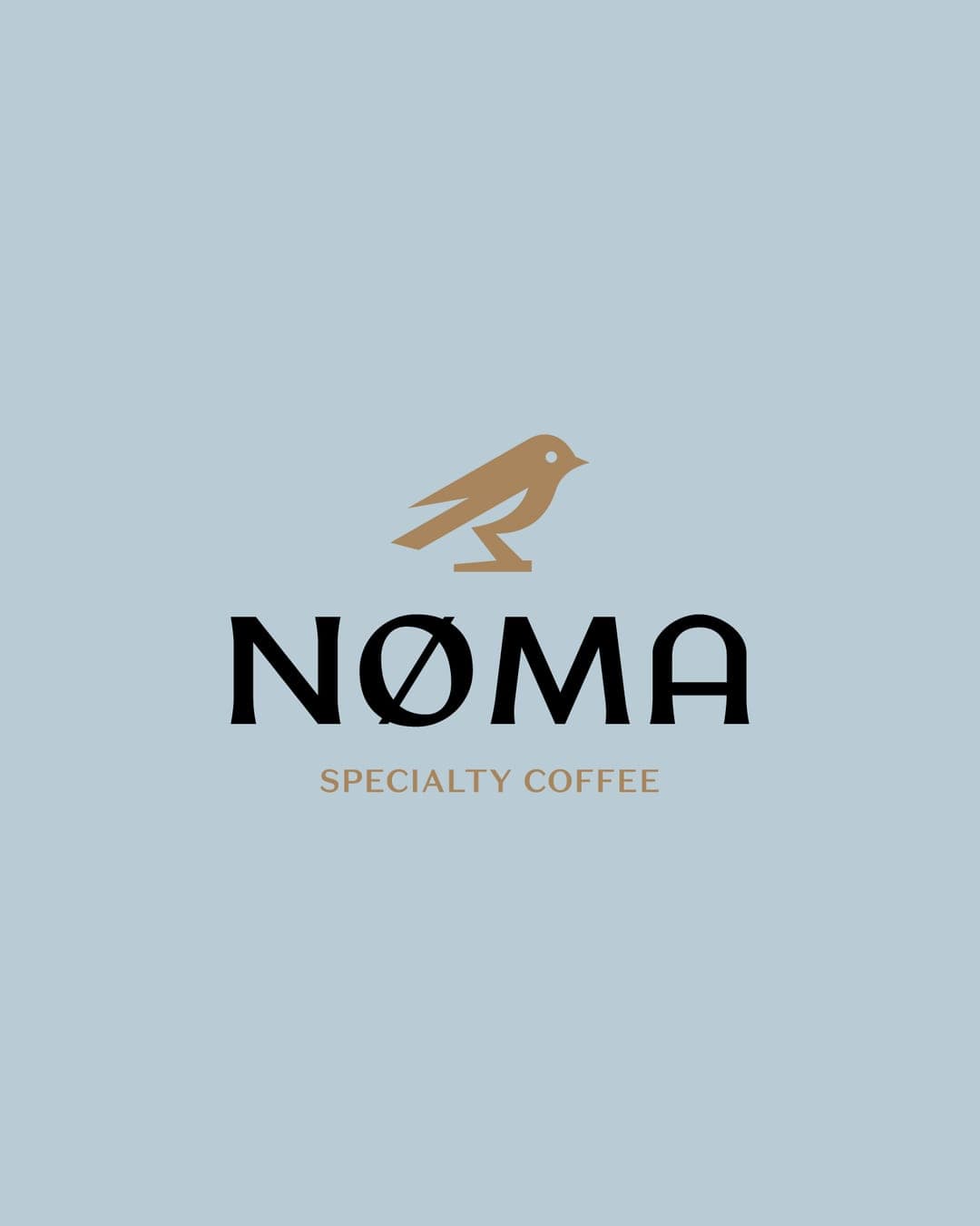
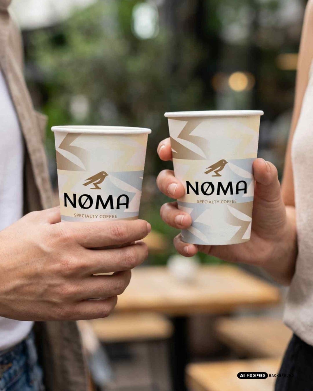
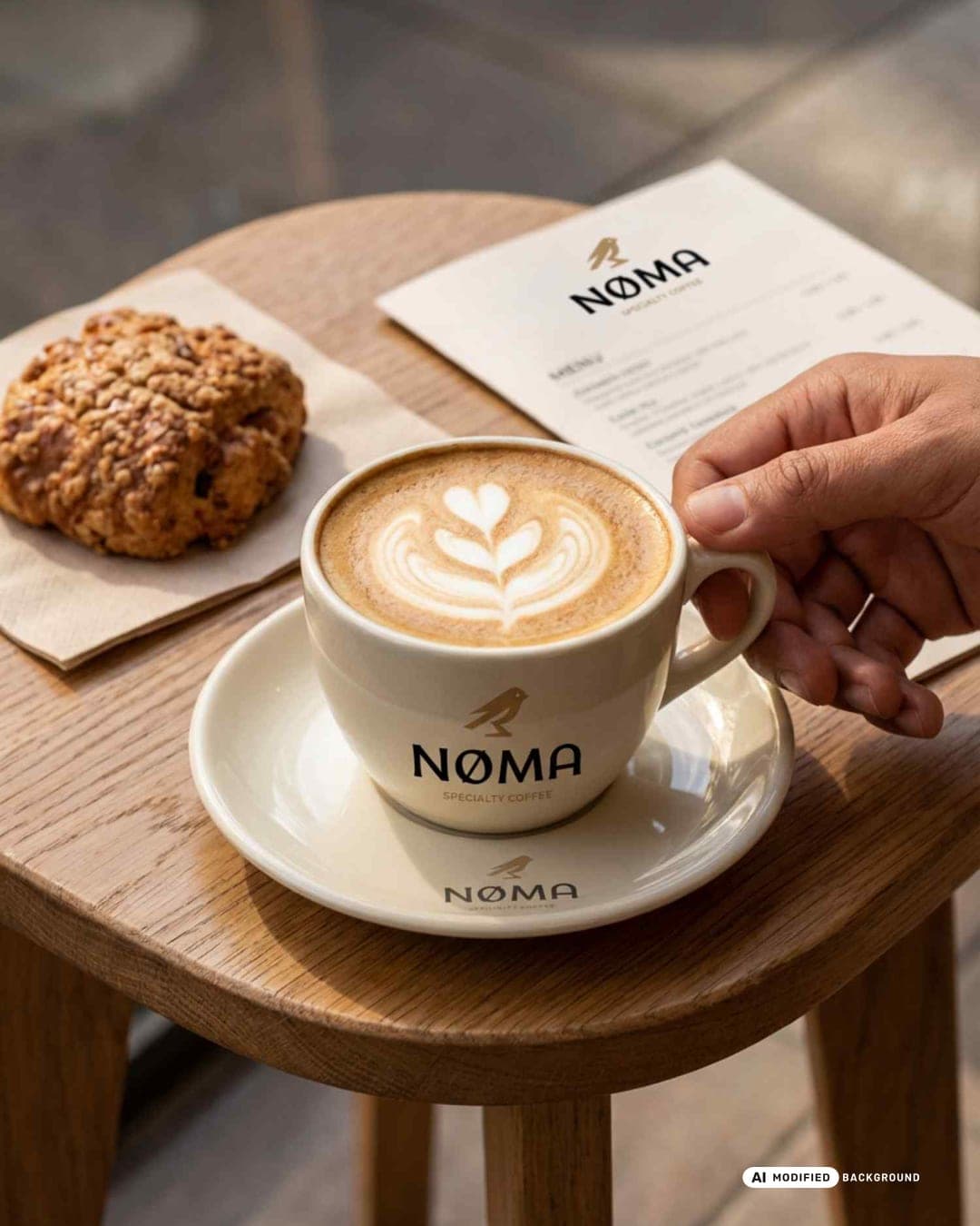
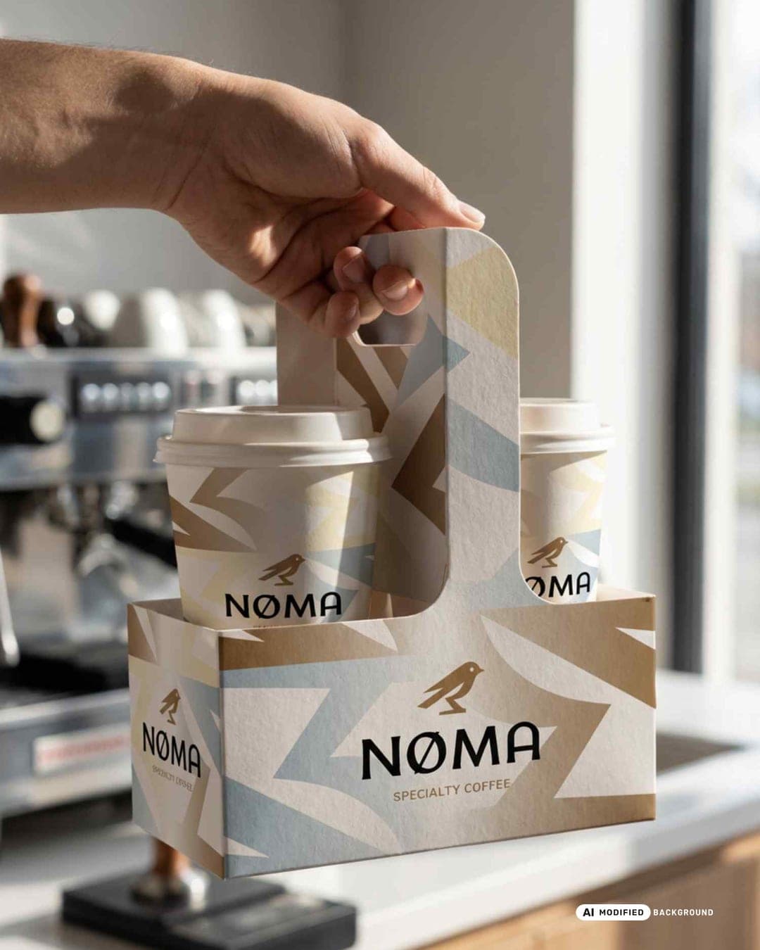
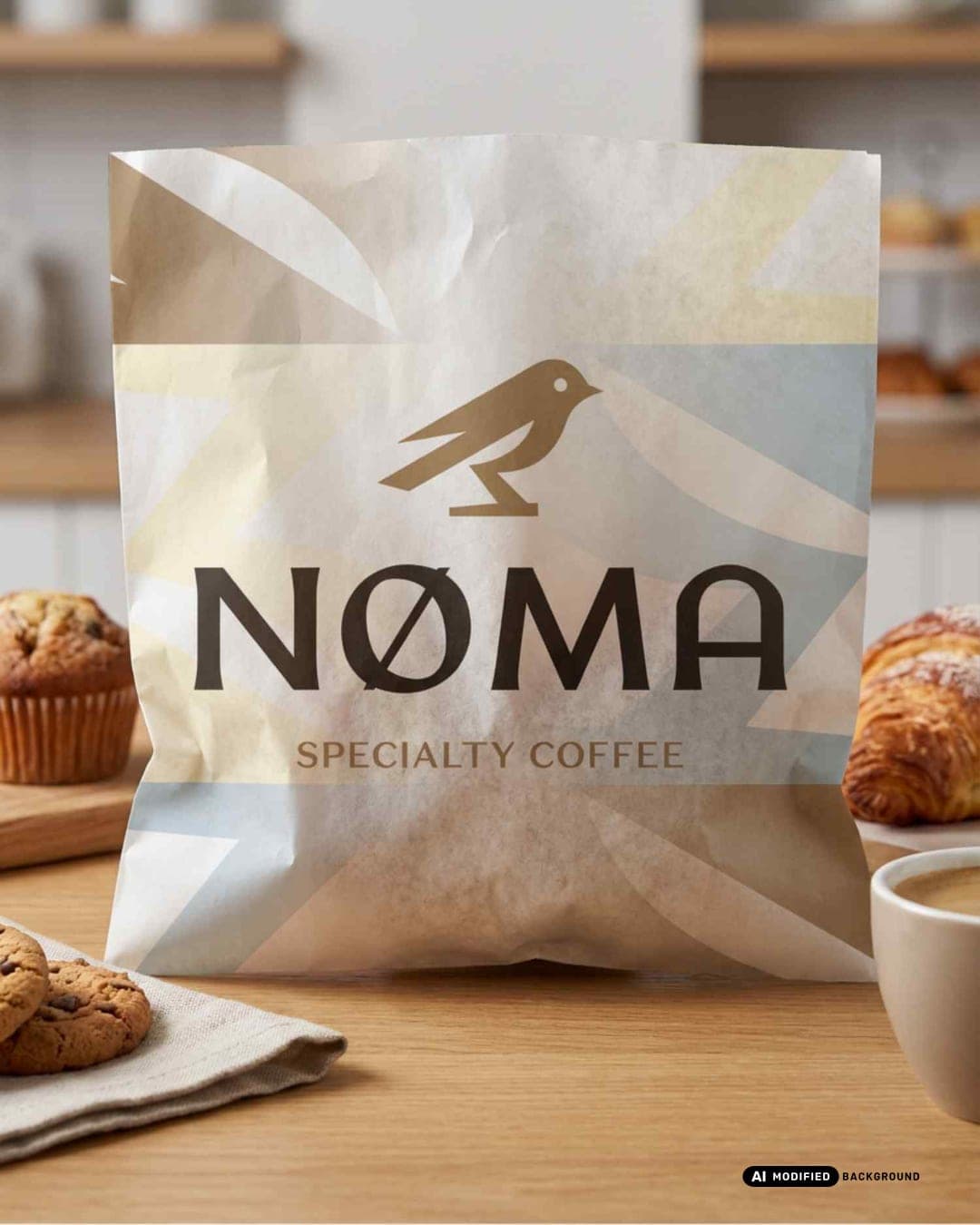
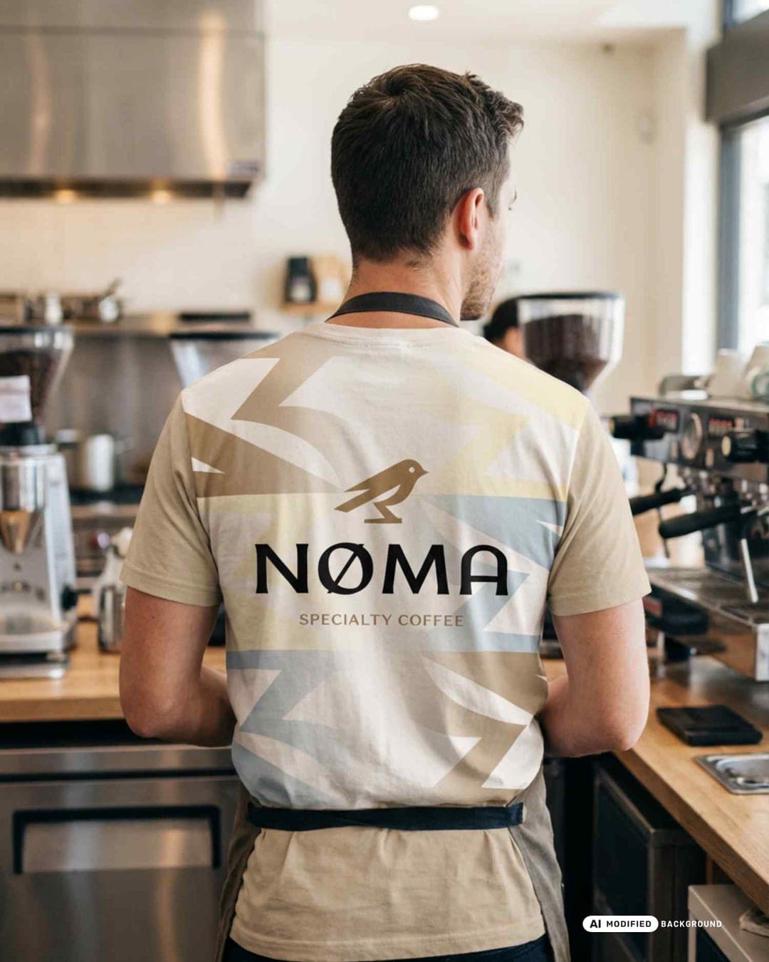
This brand identity explores a quieter approach to specialty coffee where simplicity, clarity, and consistency define the experience. The visual system is built around a minimal bird symbol that becomes the core of the brand language. From this mark, a series of geometric patterns, restrained typography, and warm neutral tones create a cohesive identity across packaging, takeaway cups, and café materials.
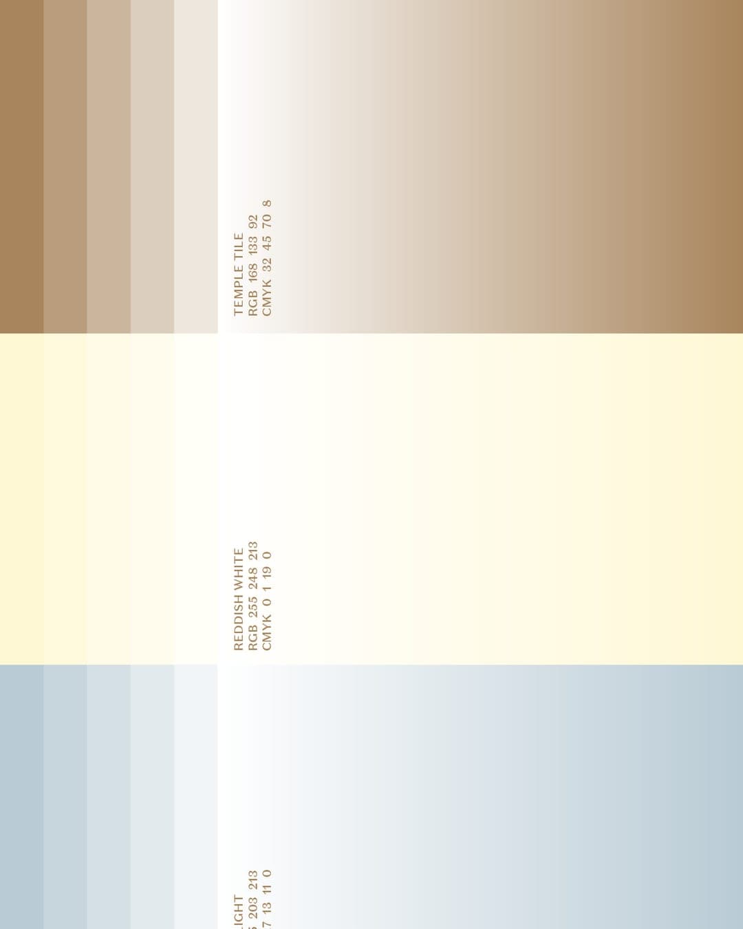
Color Palette
This brand uses a color palette of 3 colors
Click a color to find brands with similar colors.
Tags
Live score
Scores stay hidden while voting is open, so early votes can't anchor the ones that follow. Check back once the countdown ends.
Votes (0)
No votes yet — be the first.