Technology · by SURYA DZN
Nurovia
 SURYA DZN
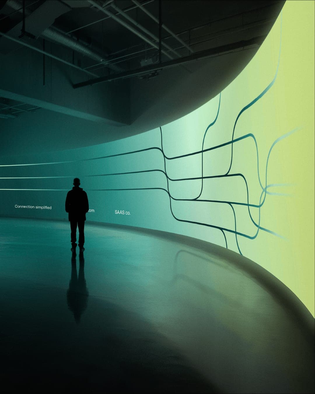
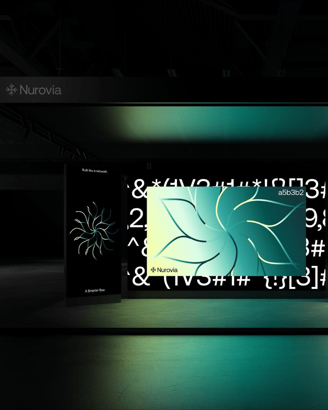
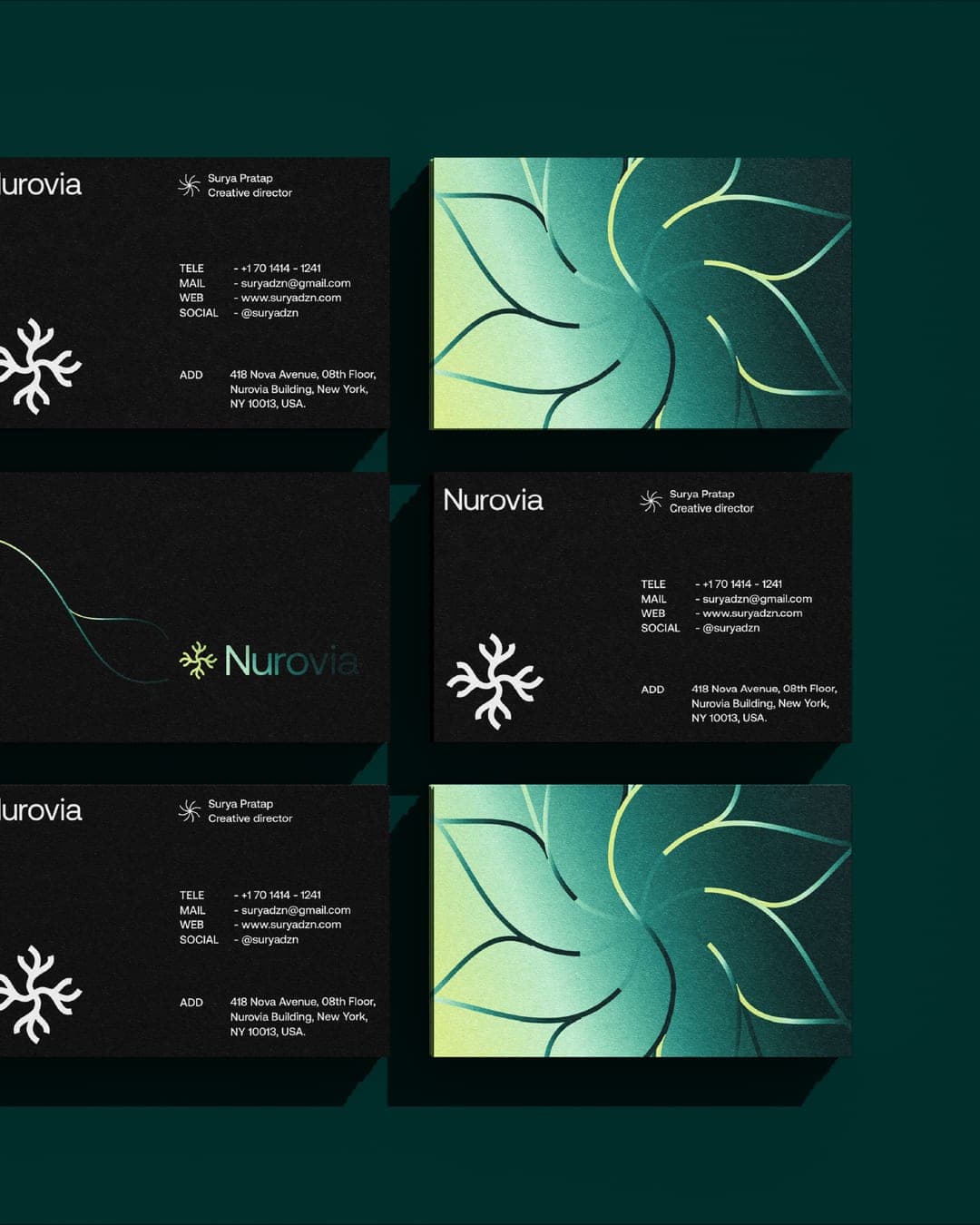
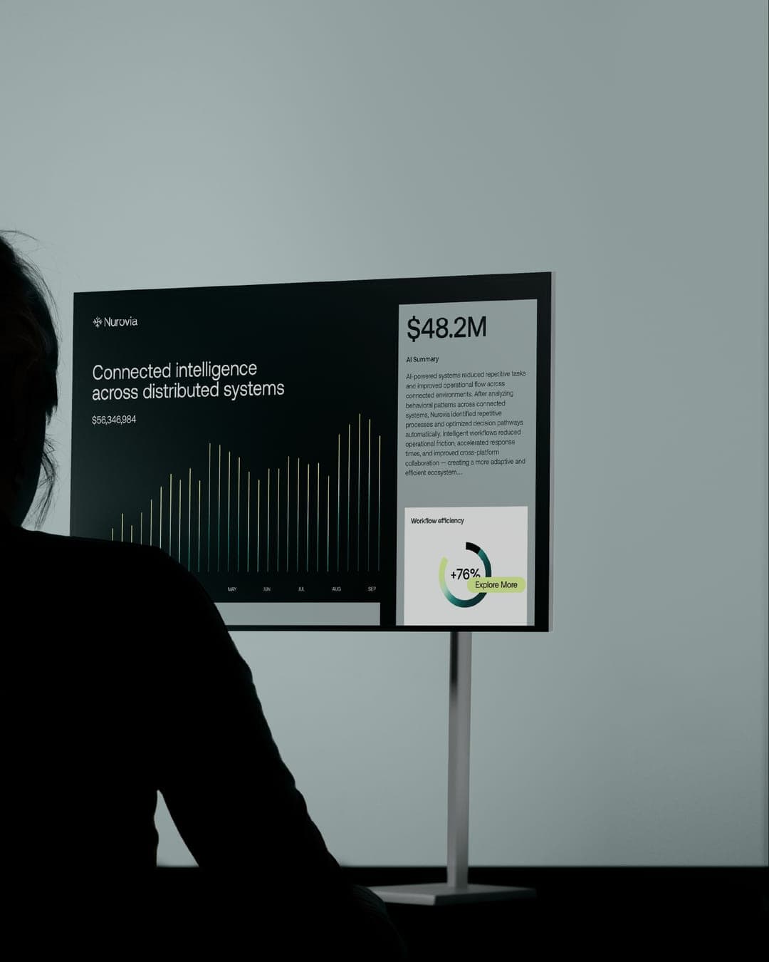
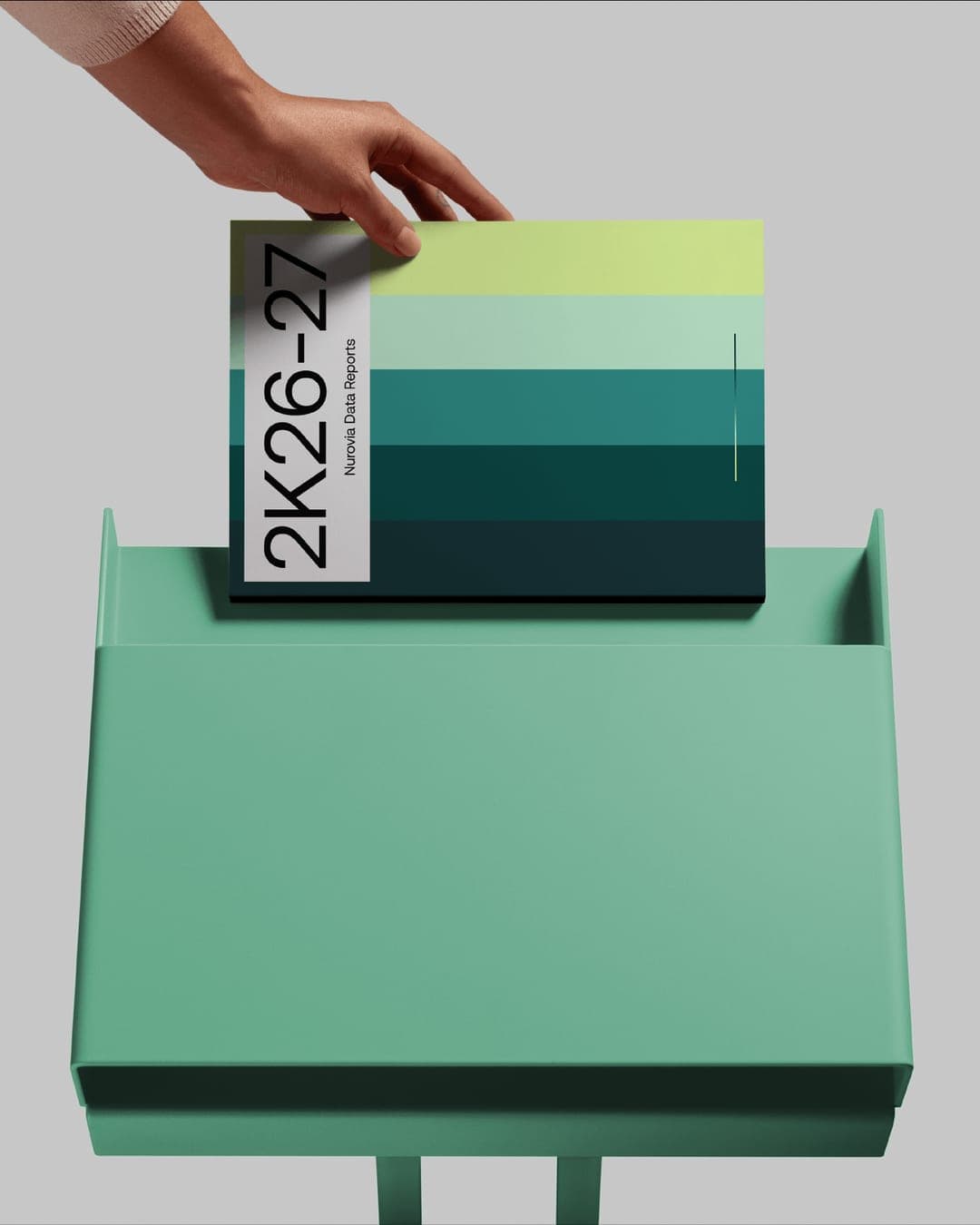
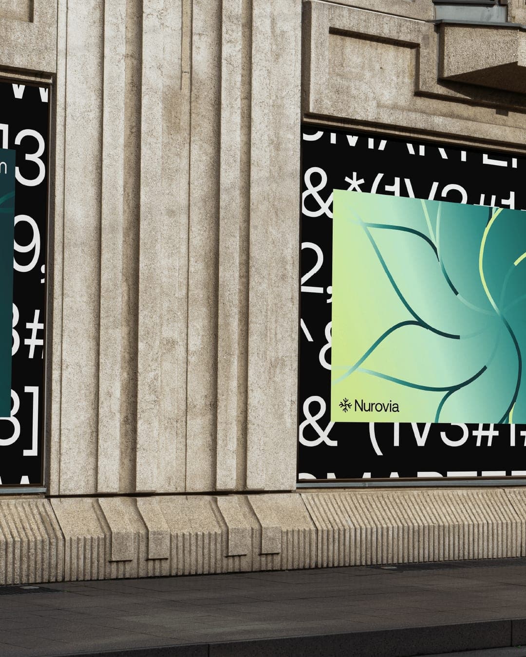
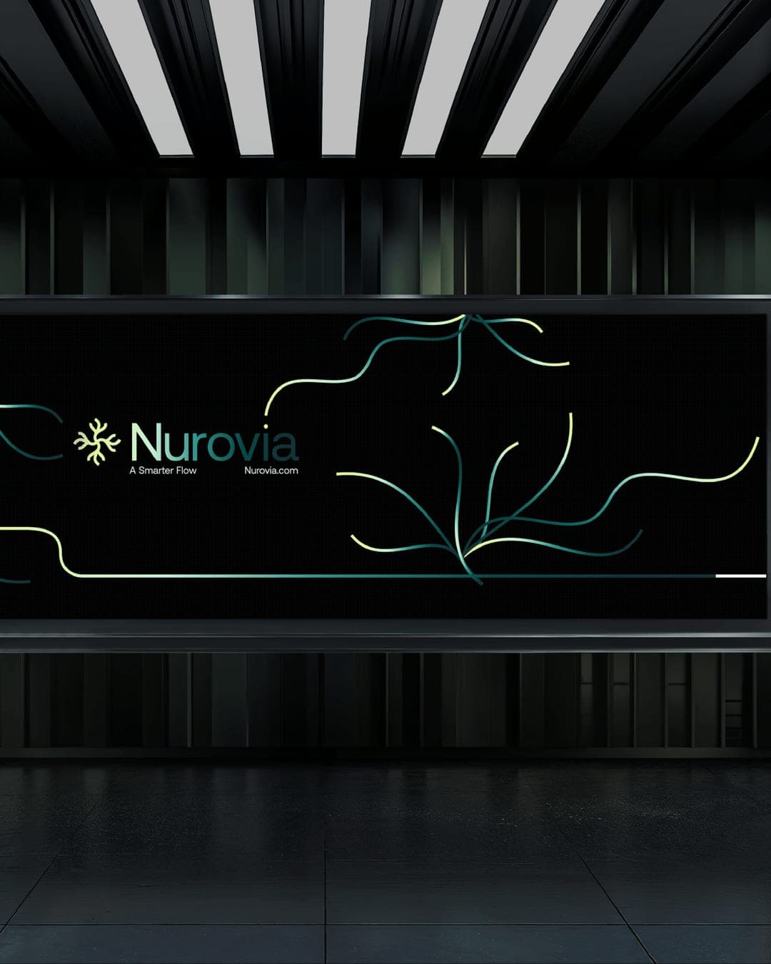
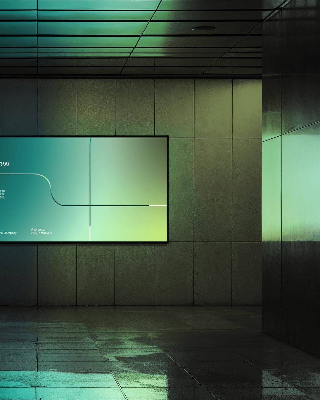
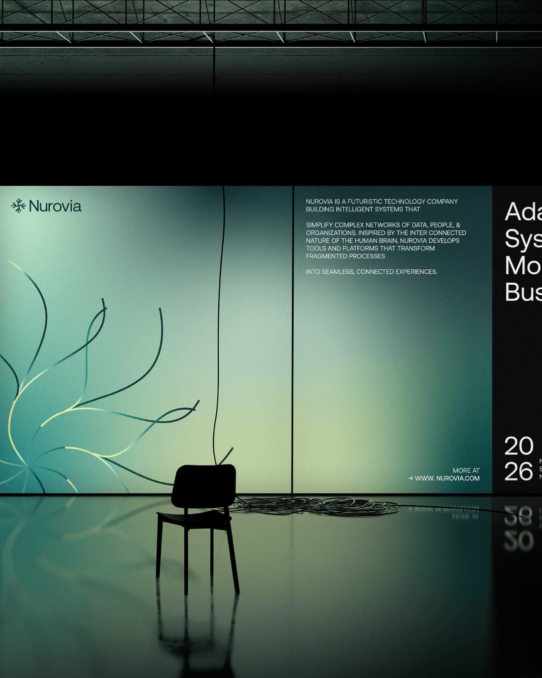
NUROVIA is an intelligent systems company built to simplify how information moves, connects, and creates value. At the heart of the design is a symbol inspired by neuron structures and crafted using precise grids and controlled geometry. The branching form represents signals, systems, and connected pathways. Each extension can be interpreted as ideas, products, users, or data points interacting with one another. The symbol was intentionally designed to feel structured yet organic. This balance helps express both technology and adaptability. The color palette moves away from common technology blues and purples, introducing cooler green and teal tones that feel fresh, premium, and approachable. Dynamic gradients and flowing patterns extend the identity system further by expressing movement, intelligence, and continuous interaction. Together, these elements create a visual language that feels modern, distinctive, and scalable across digital environments.
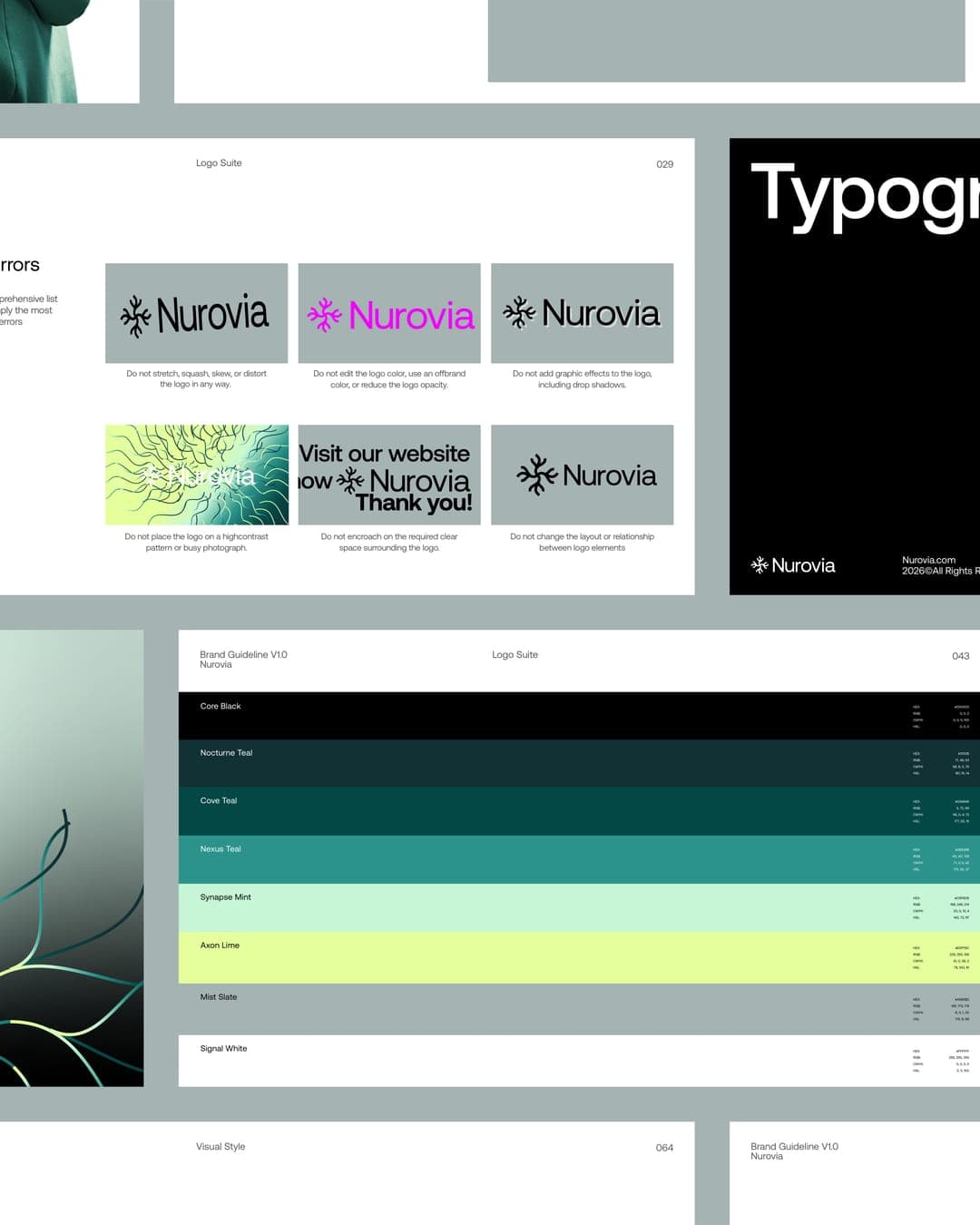
Color Palette
This brand uses a color palette of 3 colors
Click a color to find brands with similar colors.
Tags
Live score
Scores stay hidden while voting is open, so early votes can't anchor the ones that follow. Check back once the countdown ends.
Votes (1)
| Voter | Design | Strategy | Originality | Story | Overall | |
|---|---|---|---|---|---|---|
 | Panos Kyriopoulos from Greece panos.framer.website | 9 | 10 | 9 | 10 | 9.40 |