Technology · by Estúdio Reven
Setenet
 Estúdio Reven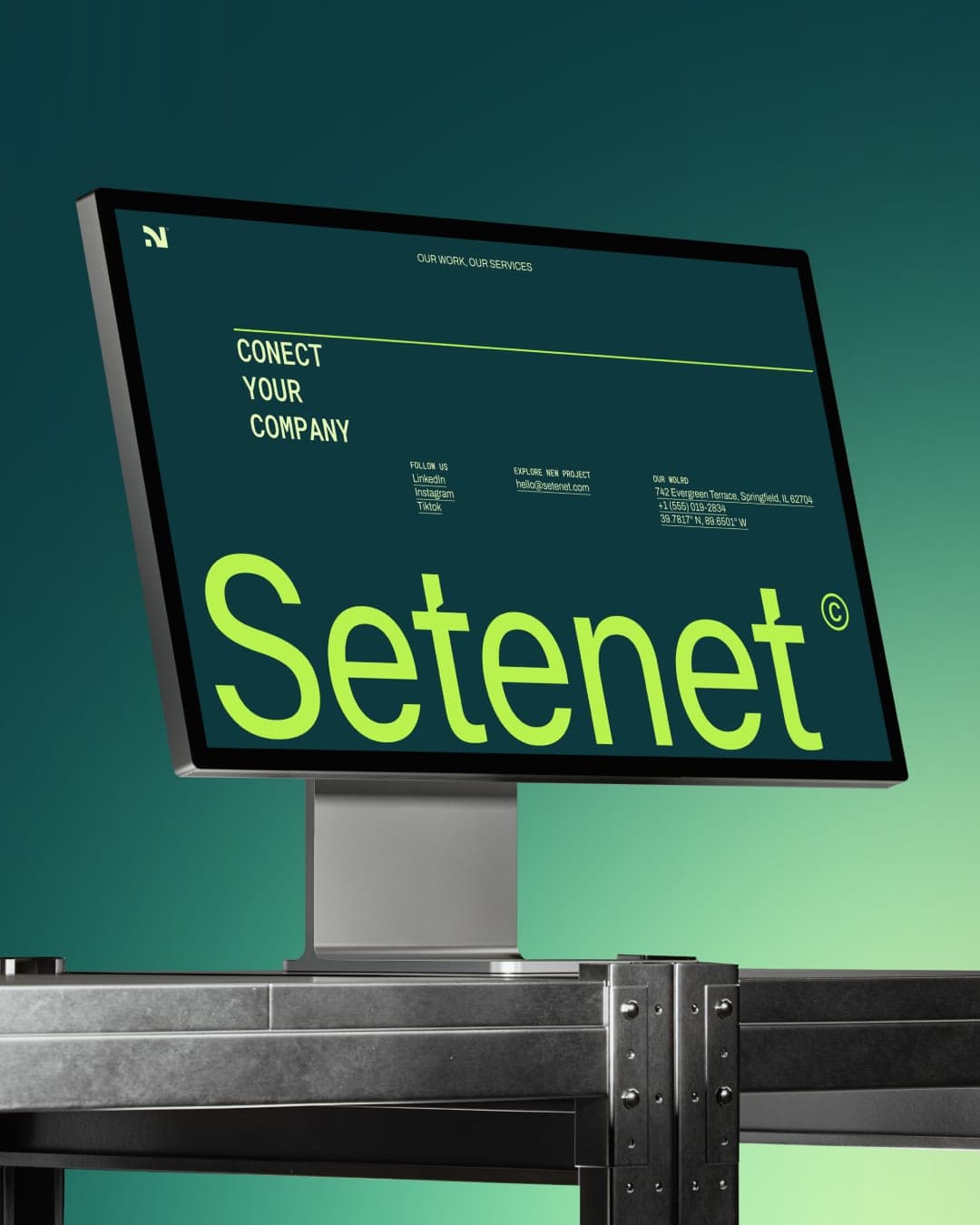
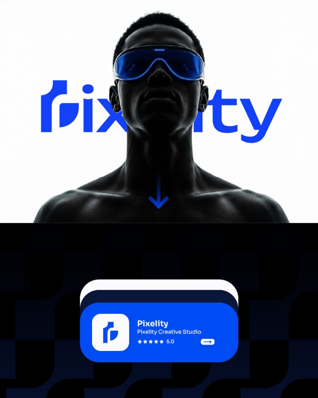
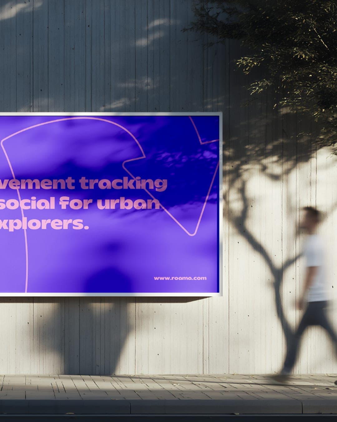
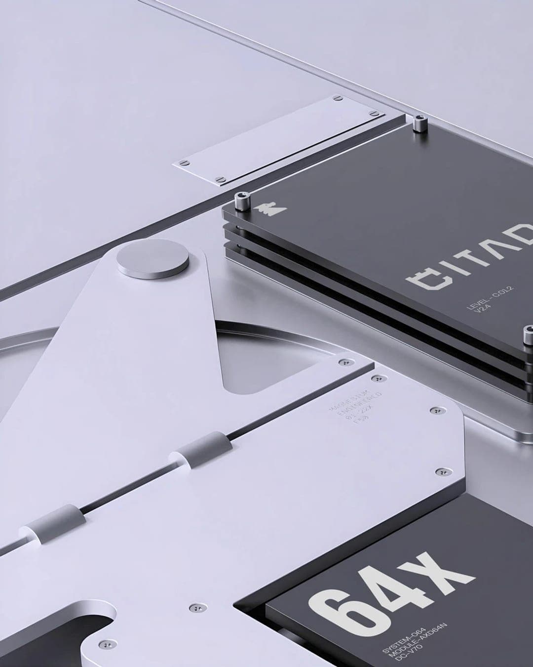
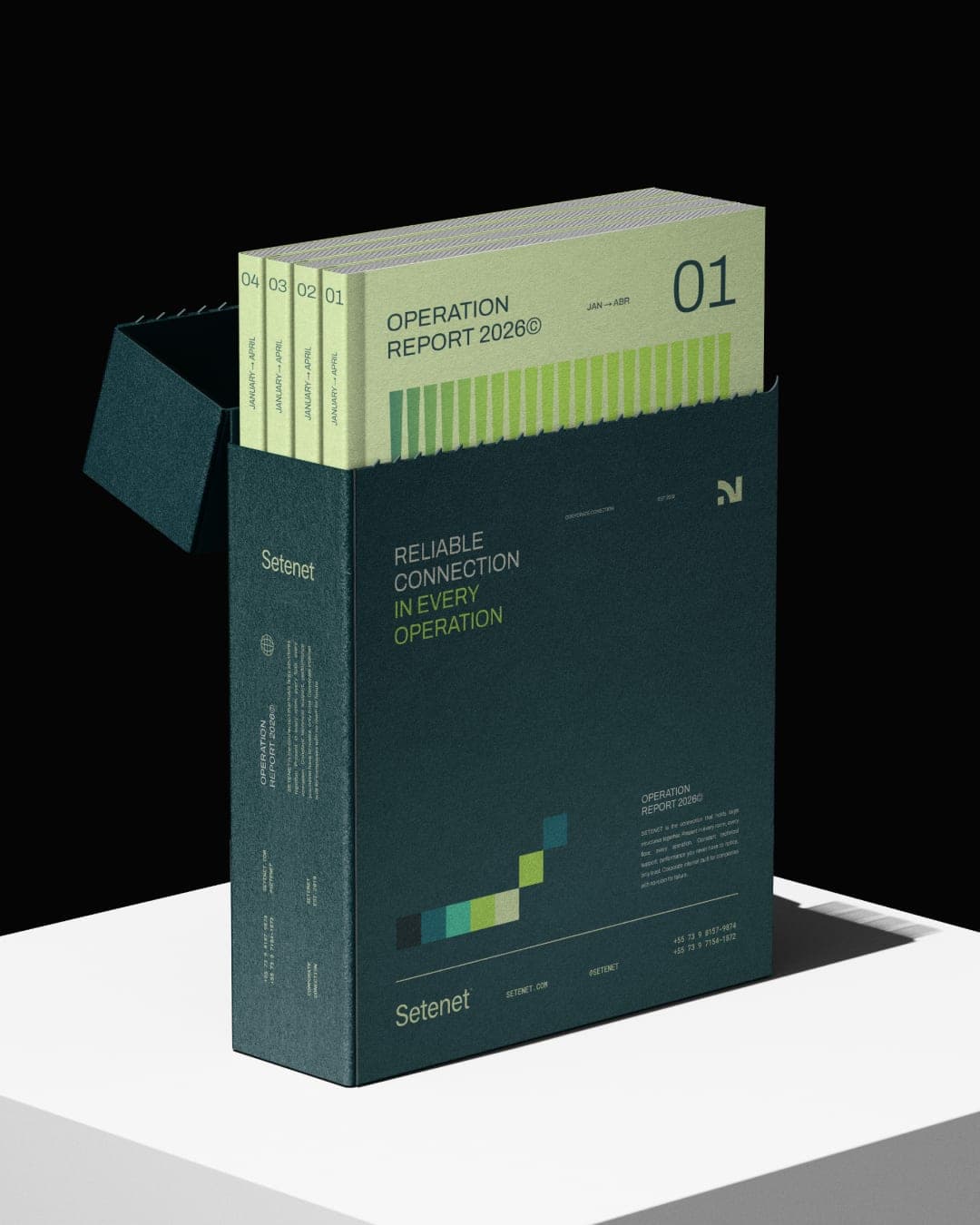
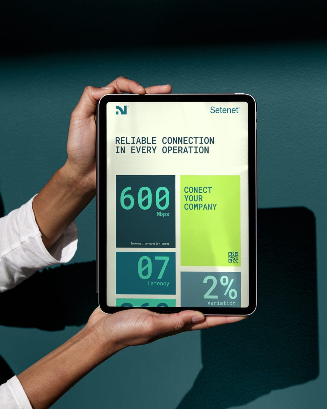
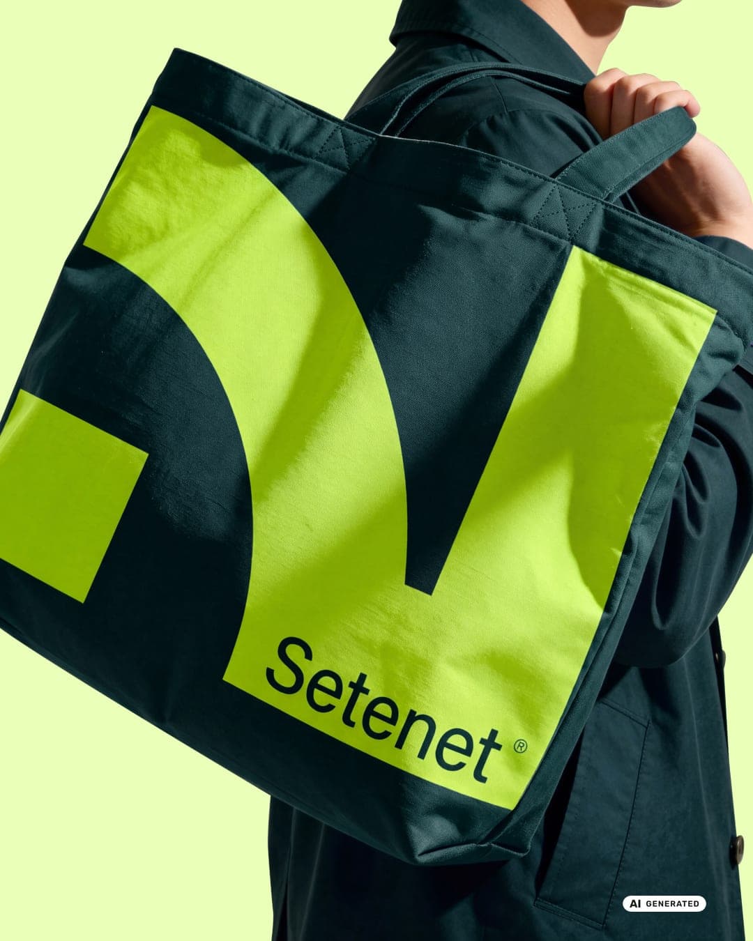
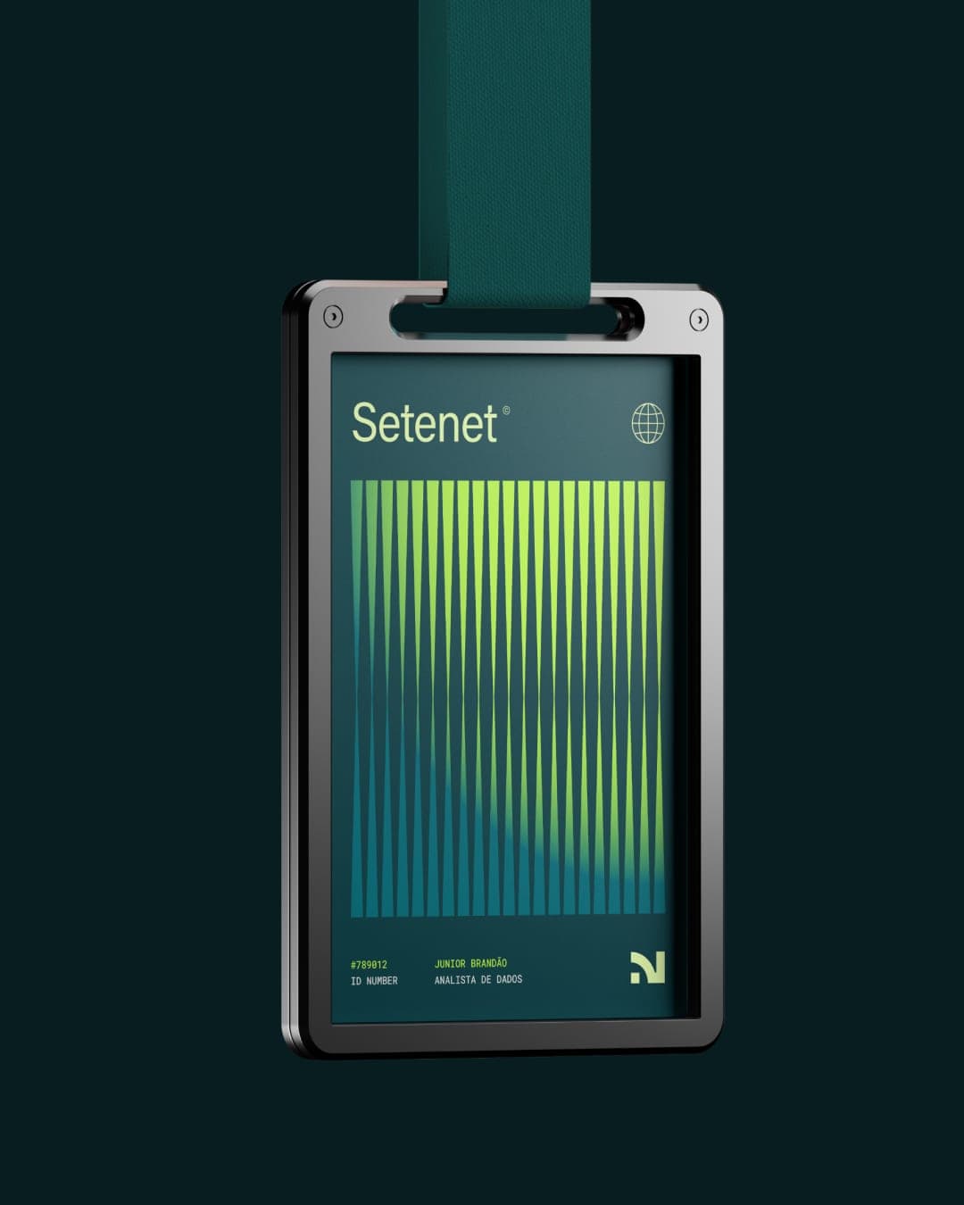
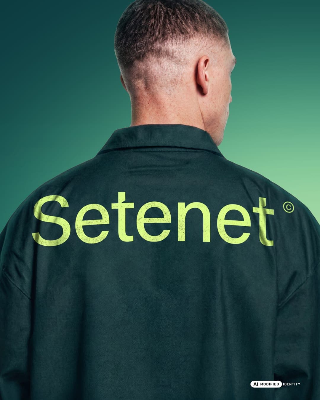
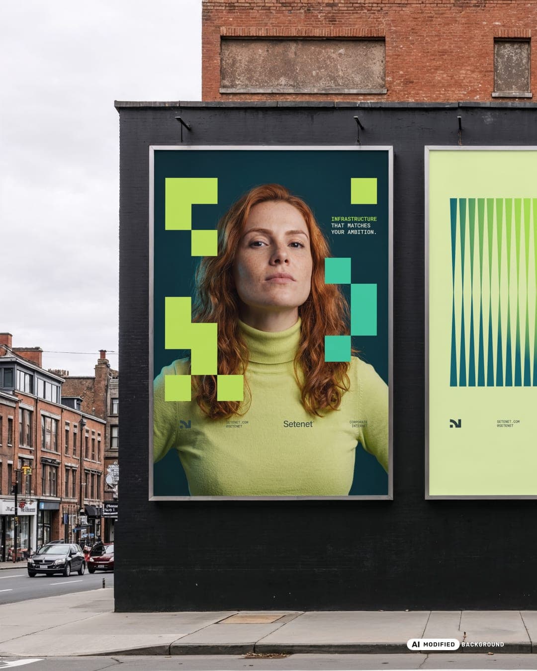
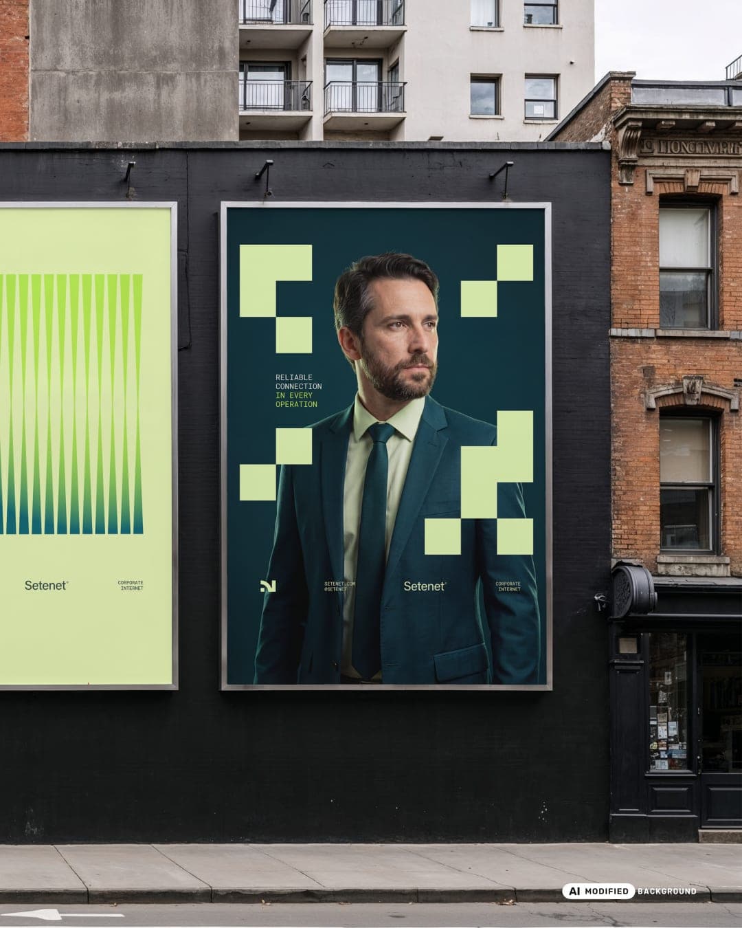
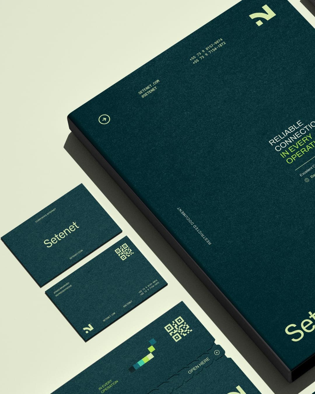
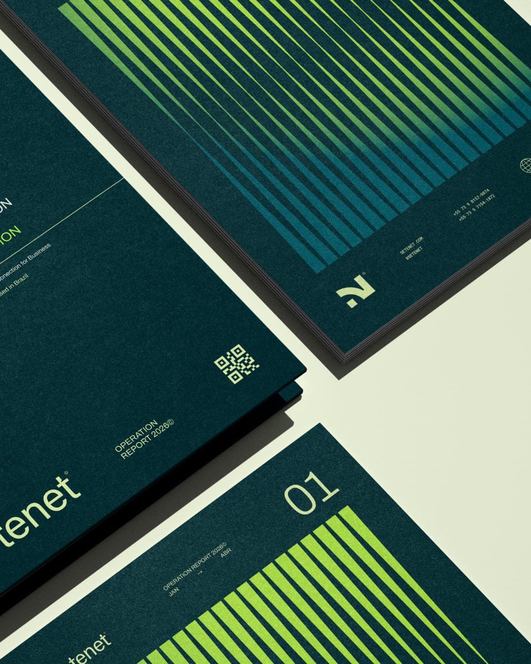
Setenet is a dedicated internet infrastructure provider for large enterprises, offering managed connectivity plans, 24/7 monitoring, and SLA-backed uptime guarantees of up to 99.97%. Their clients are IT directors, CTOs, and operations managers at companies where a dropped connection has a measurable cost per minute. The service was solid. The brand was not. When Setenet approached Estúdio Reven, they had a name and a growing client base, but a visual identity that looked closer to a local ISP than to a serious infrastructure partner. The gap between what they delivered and what they looked like was creating friction at exactly the wrong moment, during enterprise sales conversations. The Challenge Setenet operated in an invisible industry, sold to skeptical buyers, and needed a brand that held up everywhere, from a pitch deck to a technician's uniform. The Approach We built the system from Setenet's core product quality reliability, we stripped out every ISP visual cliché and built the identity from one idea: a brand that feels as stable as the service it represents.
Color Palette
This brand uses a color palette of 3 colors
Click a color to find brands with similar colors.
Tags
Live score
Scores stay hidden while voting is open, so early votes can't anchor the ones that follow. Check back once the countdown ends.
Votes (0)
No votes yet — be the first.