Beauty & Personal Care · by kate-vozniuk
ØYEN
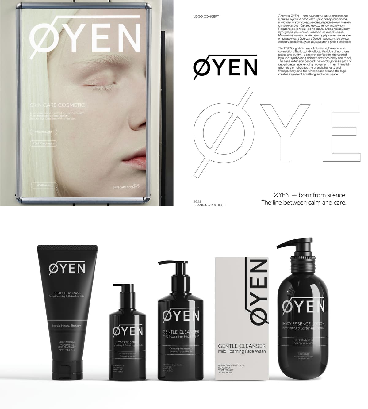
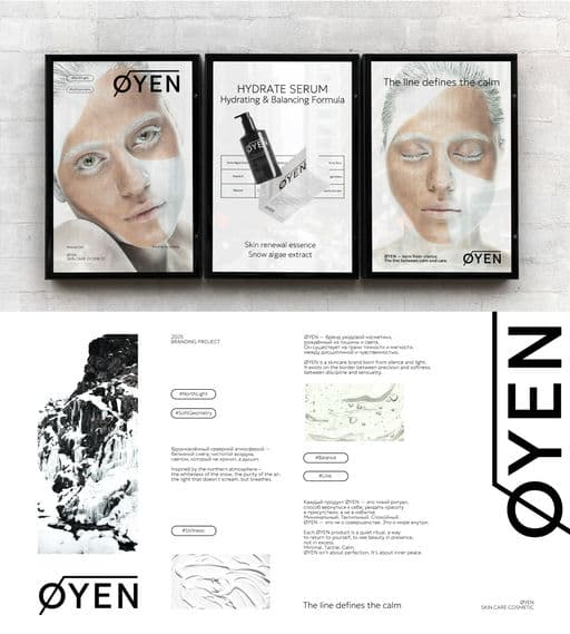
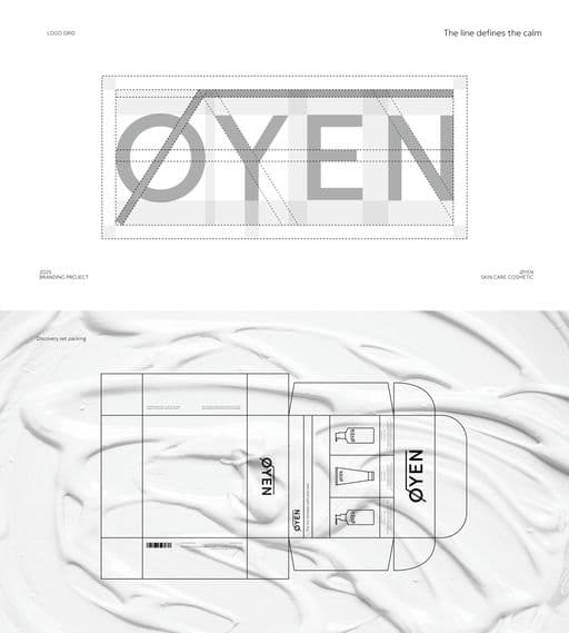
ØYEN is a skincare brand born from silence. It reflects Nordic tranquility, purity, and a sense of inner balance. The project encompasses the full development of strategy, brand identity, and packaging design for a minimalist skincare line. The concept of "The line between calm and care" forms the foundation of the brand's philosophy and is visually expressed through the Ø symbol—a sign of balance, connection, and purity. The identity is built on a combination of clean typography, architectural grids, and tactile materials, conveying the aesthetics of quiet luxury and honest minimalism. Packaging was developed for three core products—Hydrate Serum, Gentle Gel Cleanser, and Purify Clay Mask—united in The Balance Set collection—a daily ritual of care and tranquility. ØYEN is a brand where form and philosophy merge in a single breath.



Color Palette
Tags
Voting is closed for this nominee.