Link copied
Beauty & Personal Care · by Studio Moara
Rae
 Studio MoaraPRO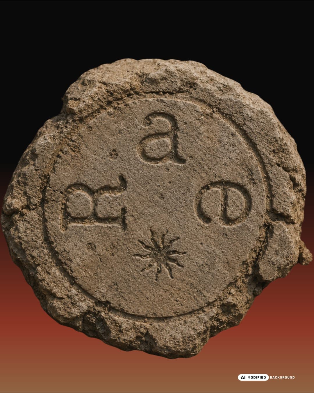
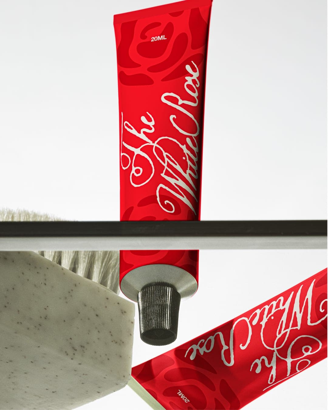
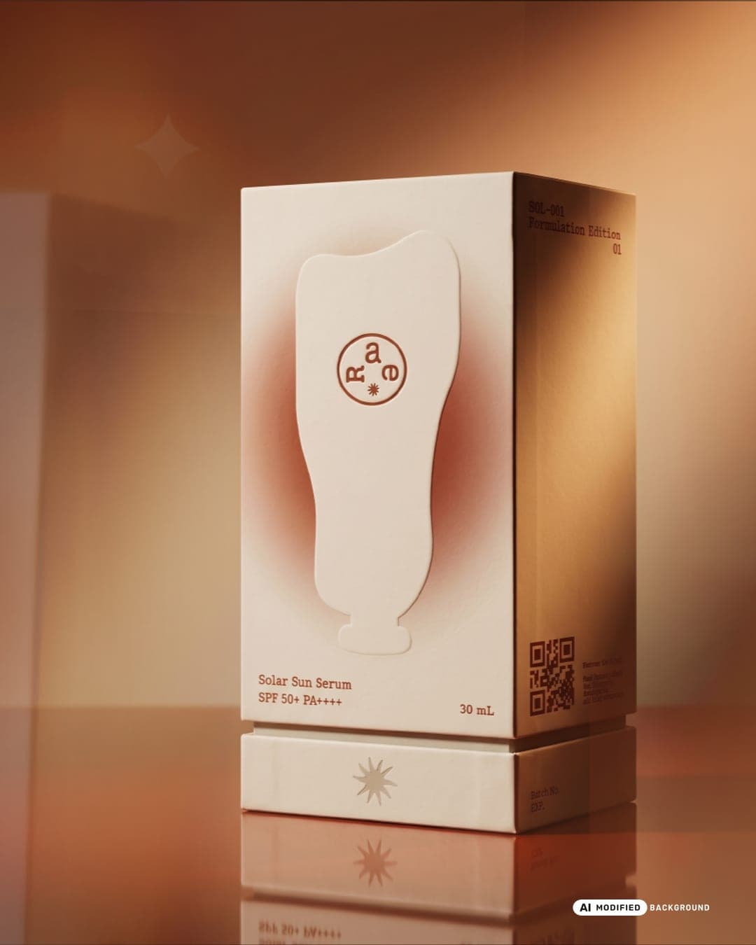
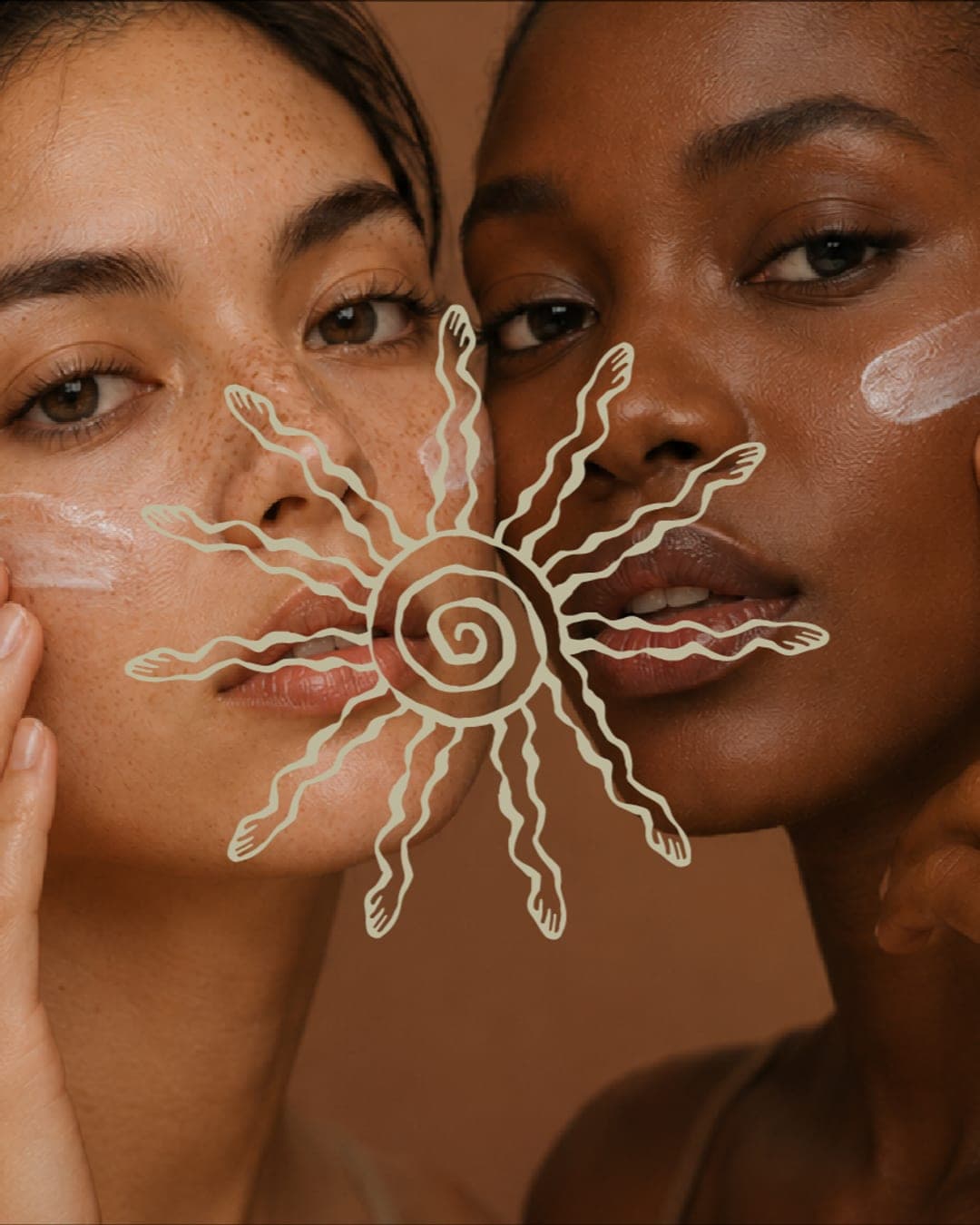
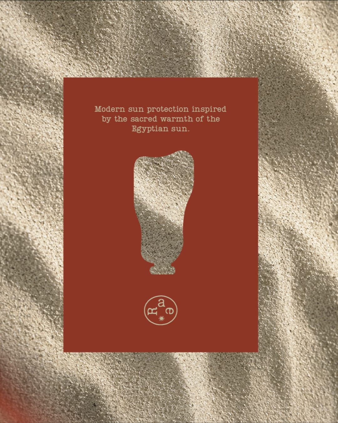
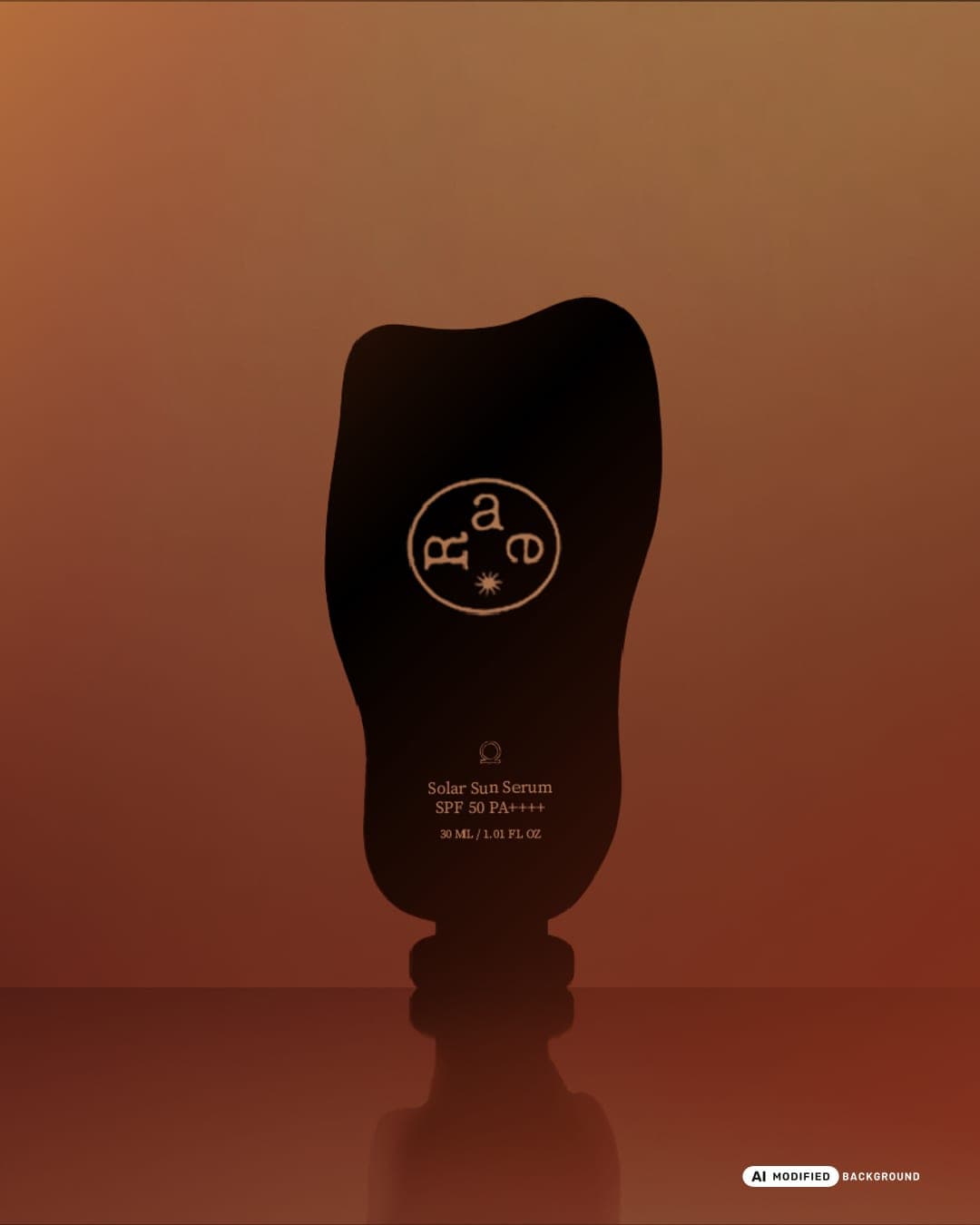
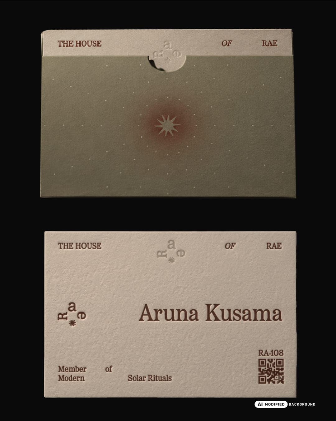
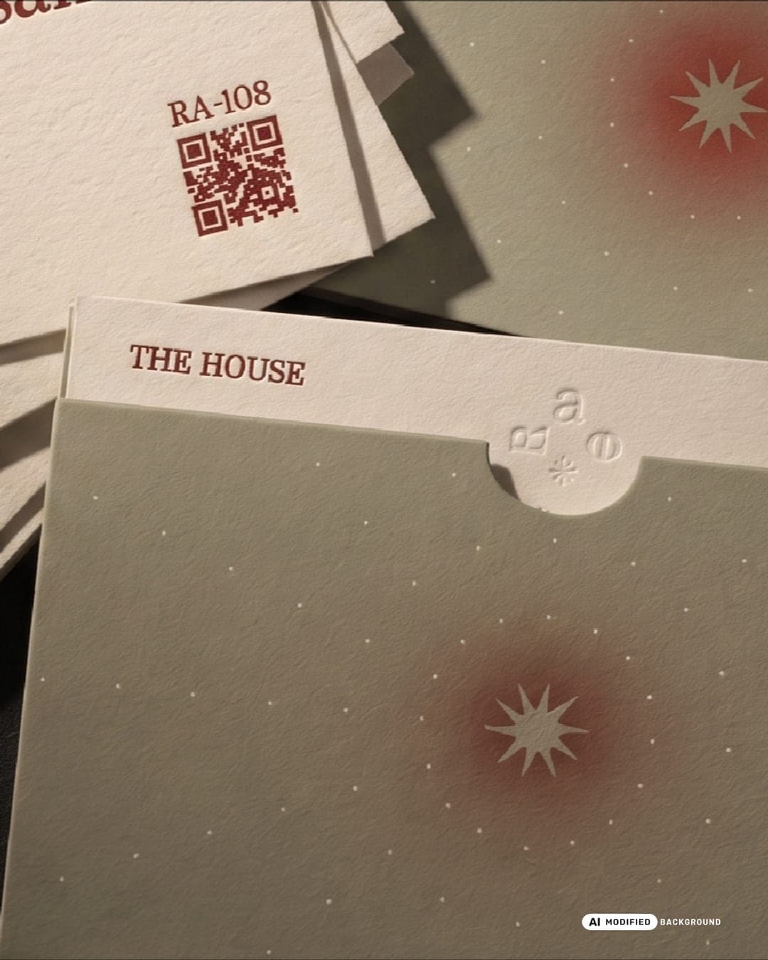
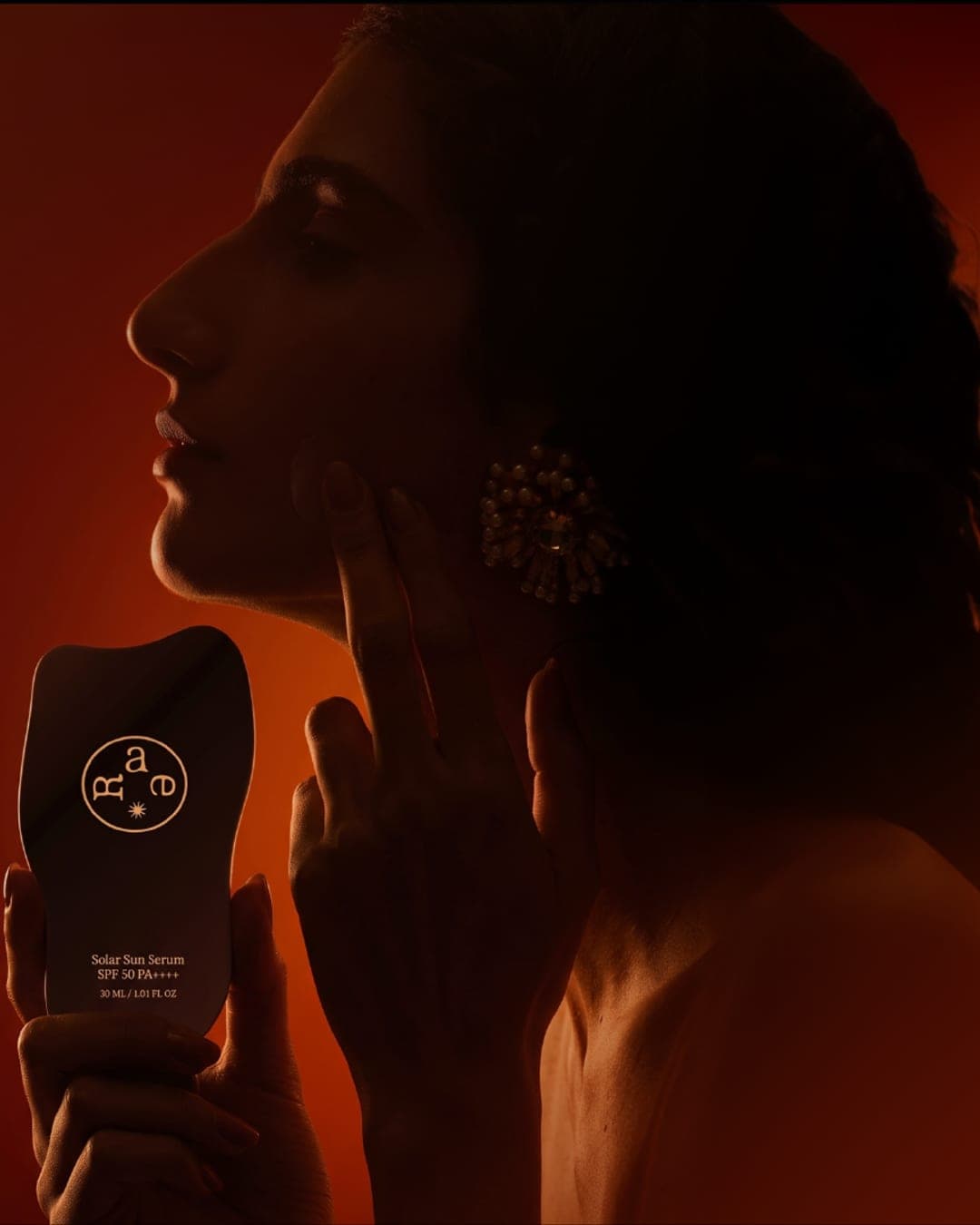
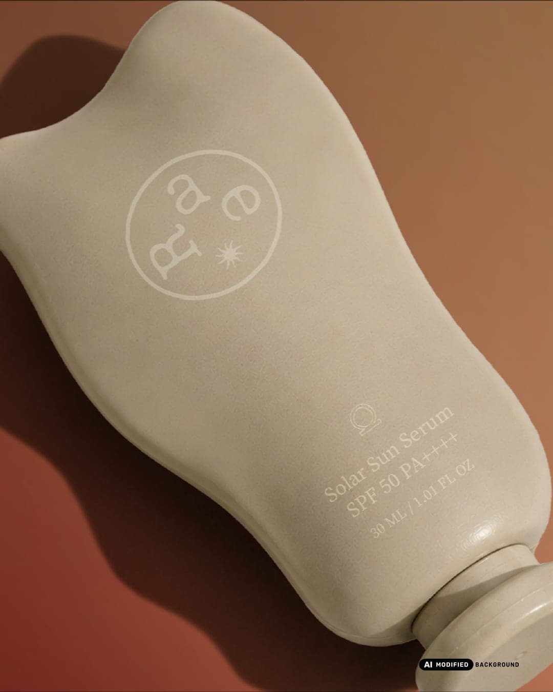
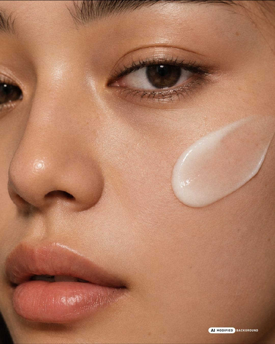
A skincare branding project shaped through an editorial lens, balancing warmth, intimacy, and a quiet sense of ritual. The visual identity explores earthy skin tones, refined typography, delicate symbols, and tactile imagery to create a world that feels both personal and elevated. From packaging to art direction, every detail is designed to celebrate skin in its natural state, turning everyday skincare into a thoughtful and sensory experience.
Color Palette
This brand uses a color palette of 3 colors
Click a color to find brands with similar colors.
Tags
Live score
Scores stay hidden while voting is open, so early votes can't anchor the ones that follow. Check back once the countdown ends.
Votes (0)
No votes yet — be the first.