Food & Beverage · by Design By Sukaina
Sando | Japanese Sandwich Shop Branding
 Design By Sukaina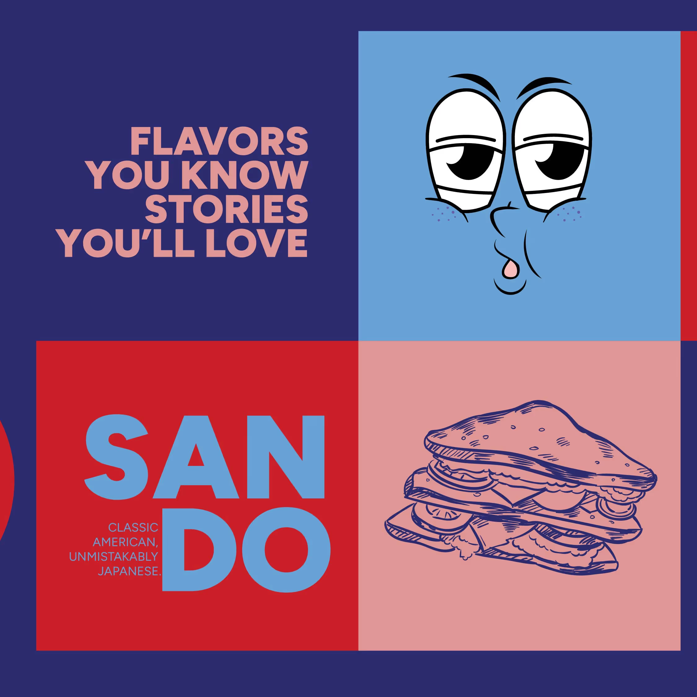
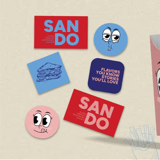
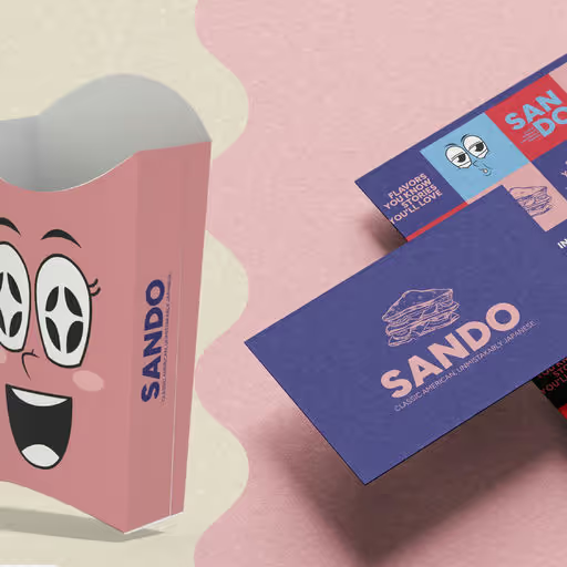
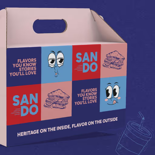
Sando is a fresh and playful Japanese-American sandwich shop that blends Tokyo street-style minimalism with bold, modern branding. The visual identity is built around clean layouts, a vibrant color palette, and type choices that reflect the quirky, compact nature of Japanese “sando” culture. The logotype is simple and geometric, capturing both cuteness and confidence. At the same time, the packaging and in-store materials bring the brand to life through a mix of grid-based balance and fun, icon-driven design. From sandwich wraps to takeaway bags and stickers, every piece is designed to create a memorable, photogenic experience for food lovers. Bold. Fresh. Easy to crave. A visual identity that makes every bite feel like a brand moment.


Color Palette
Tags
Voting is closed for this nominee.