Food & Beverage · by Design By Sukaina
Scoopid an ice-cream brand
 Design By Sukaina
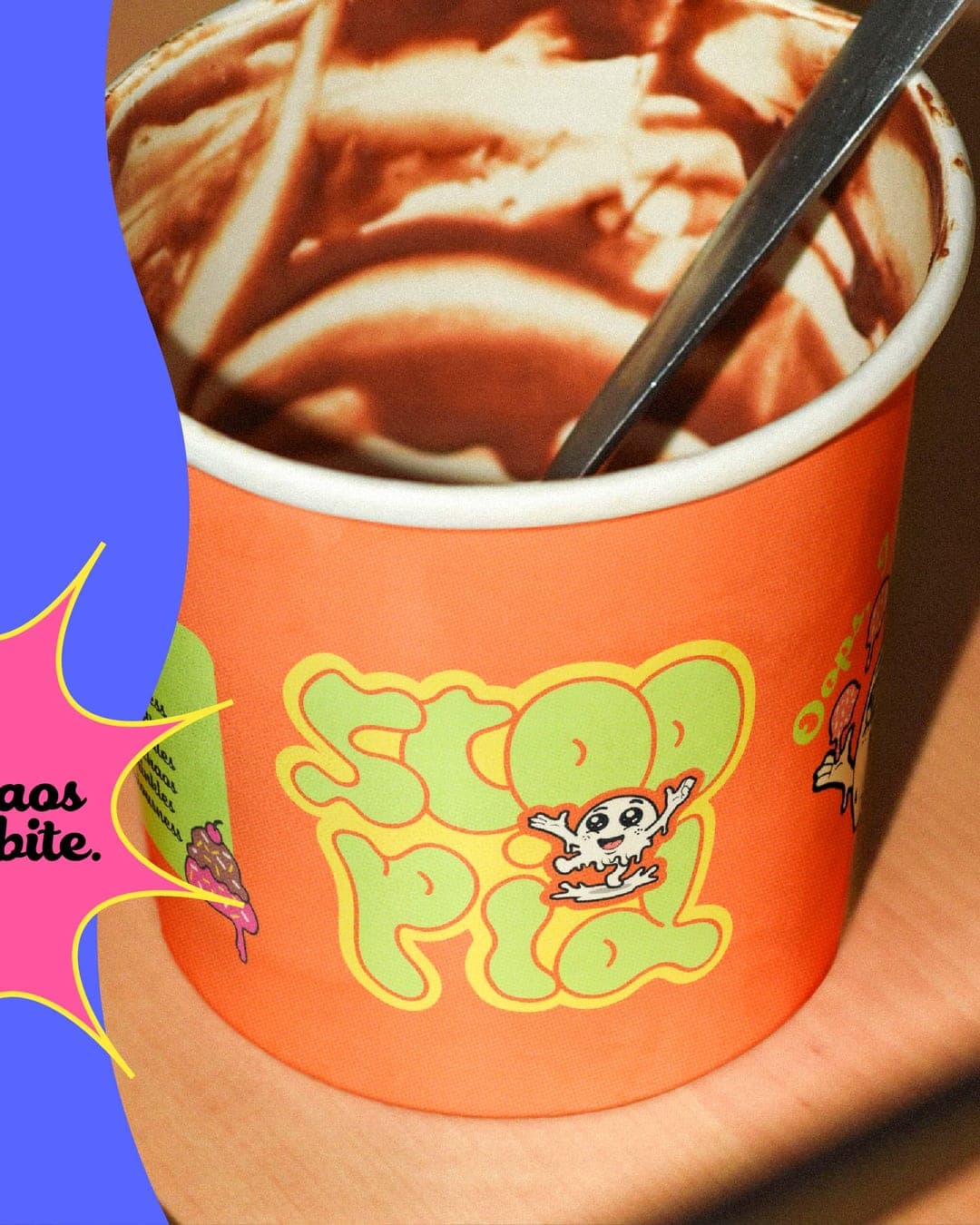
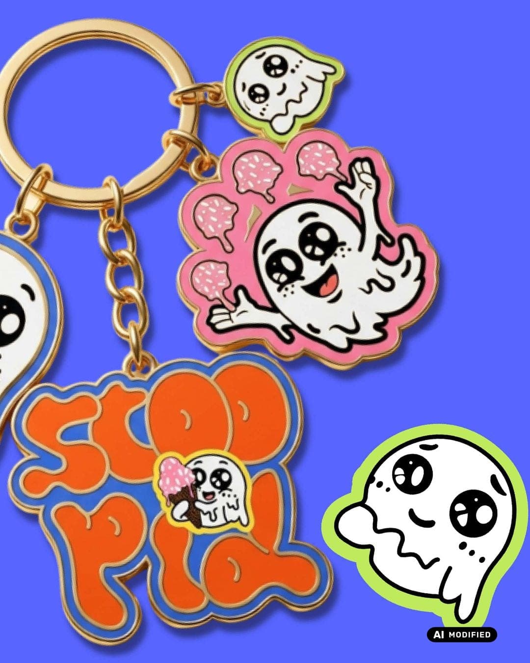
Scoopid was created as a playful ice cream brand designed to bring joy before the first bite. The goal was to build an identity that feels energetic, memorable, and instantly recognizable on shelves and social media. The visual direction combines vibrant colors, bold typography, and cheerful character elements to create a brand experience that feels as delightful as enjoying your favorite ice cream on a summer day. The packaging system was designed to be the hero of the brand, bright, eye-catching, and full of personality. Each touchpoint, from the logo and color palette to the cup design and promotional poster, works together to create a cohesive identity that customers can instantly connect with. For this project, I focused on balancing playful creativity with strategic branding, ensuring the identity could appeal to families, young adults, and modern consumers looking for brands with character. The result is a visual identity that doesn't just sell ice cream; it creates a memorable experience around it. Projects like these remind me why I love working on food and packaging brands. There's something special about transforming a simple product into a brand people can recognize, remember, and enjoy.



Live score
Scores stay hidden while voting is open, so early votes can't anchor the ones that follow. Check back once the countdown ends.
Votes (1)
| Voter | Design | Strategy | Originality | Story | Overall | |
|---|---|---|---|---|---|---|
 | syeda maham from Pakistan | 10 | 10 | 10 | 10 | 10.00 |