Beauty & Personal Care · by Libra Studio
THÉRAPEAU
 Libra Studio
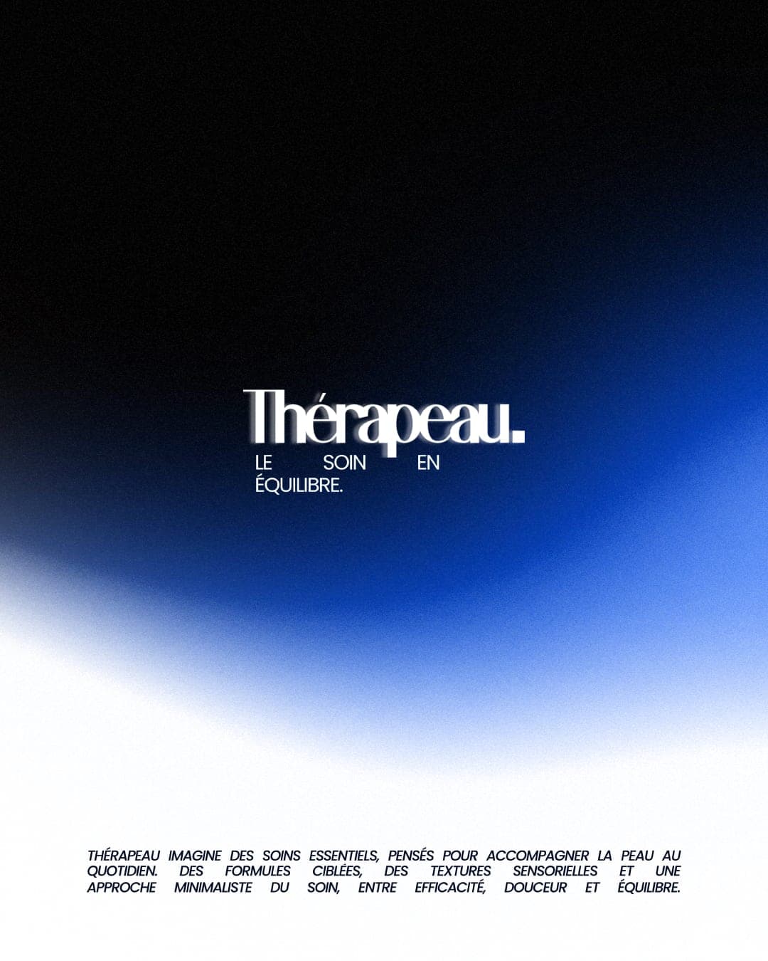
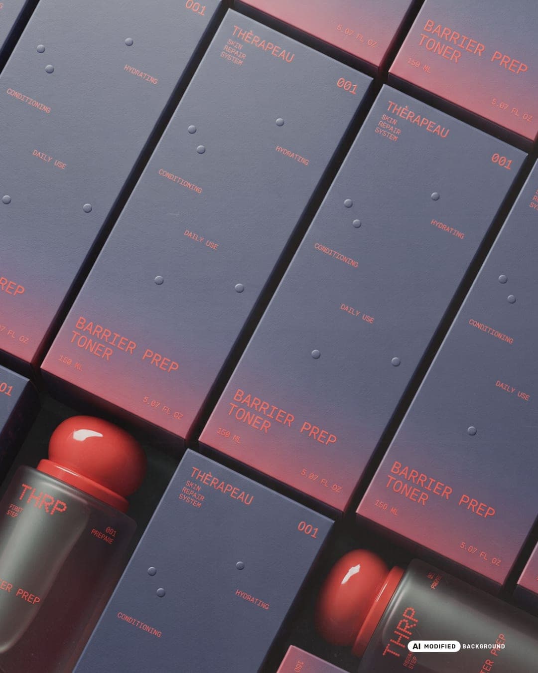
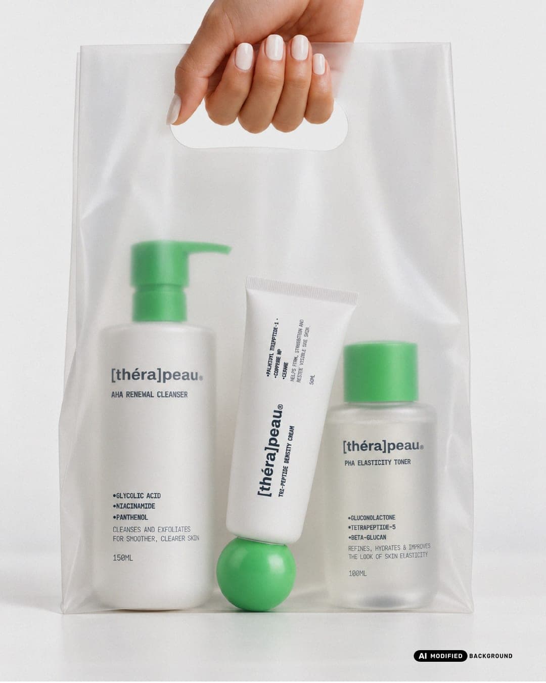
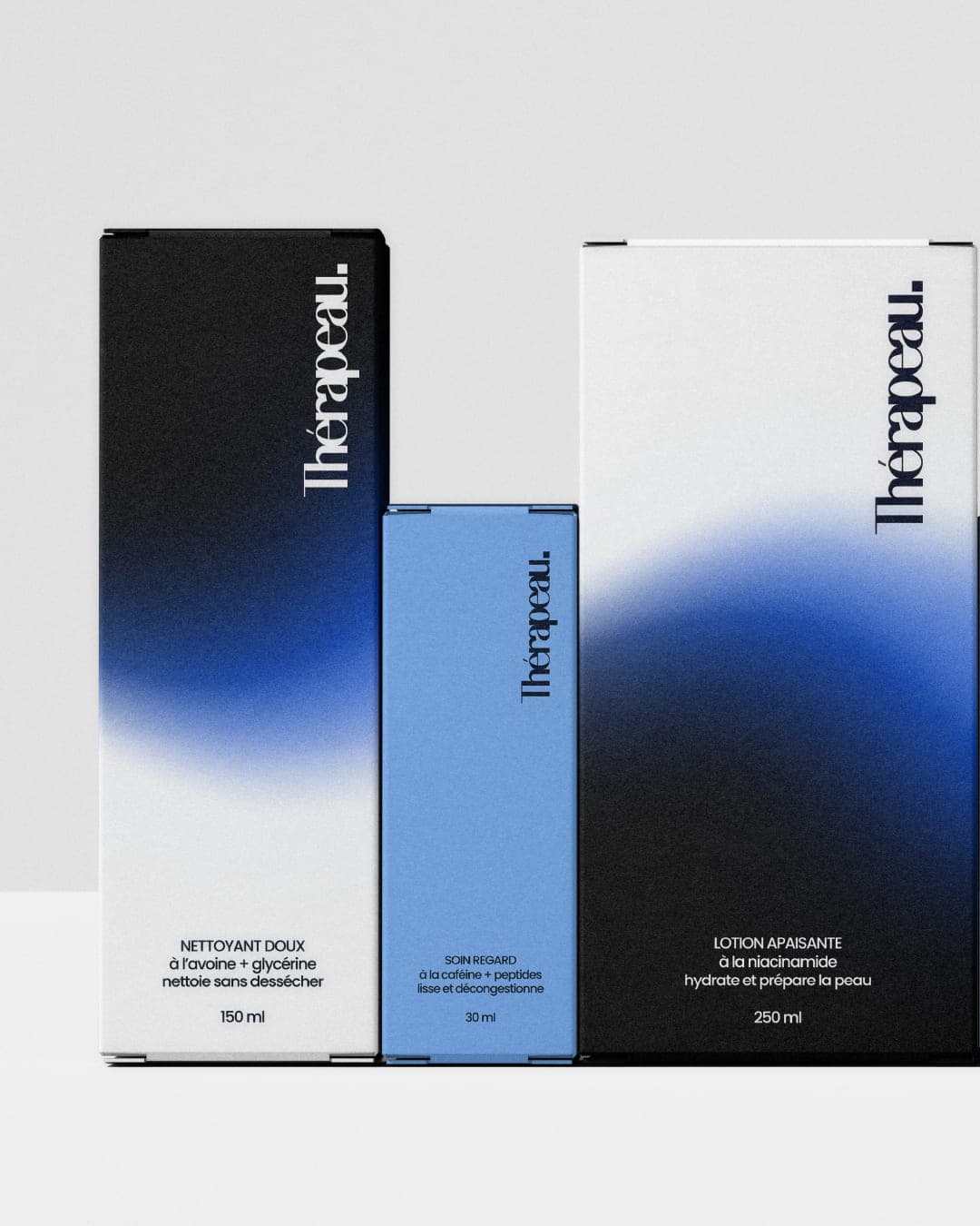
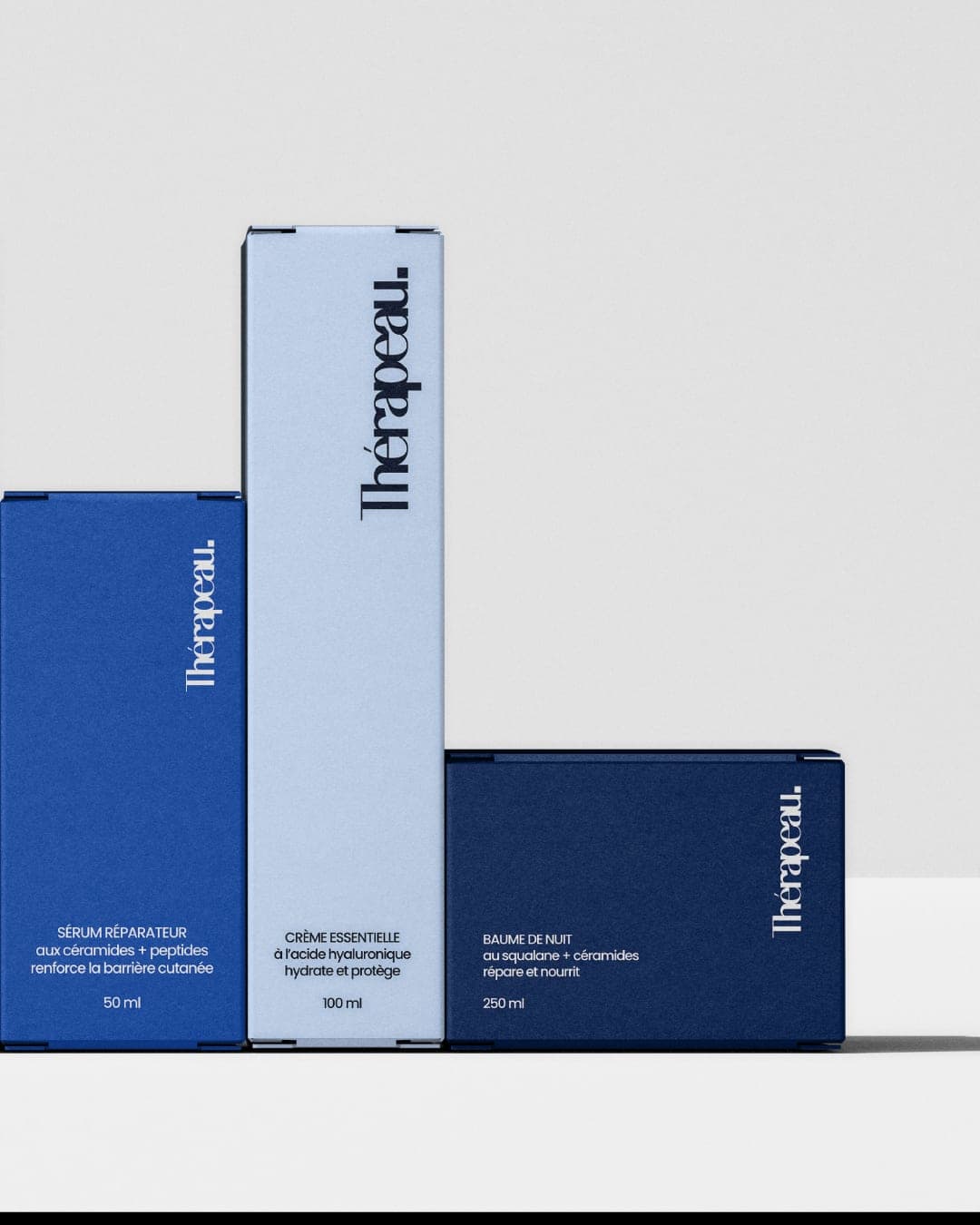
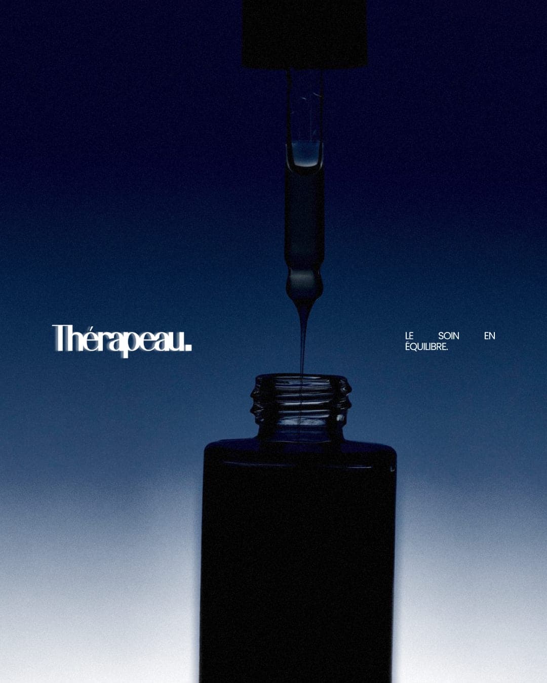
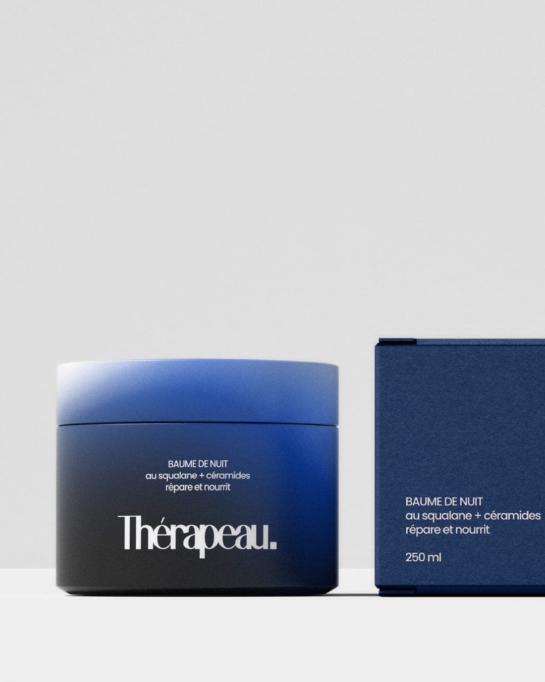
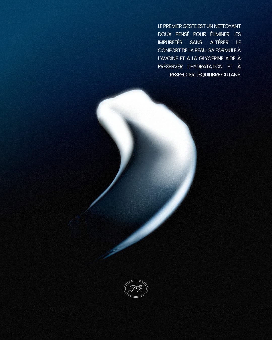
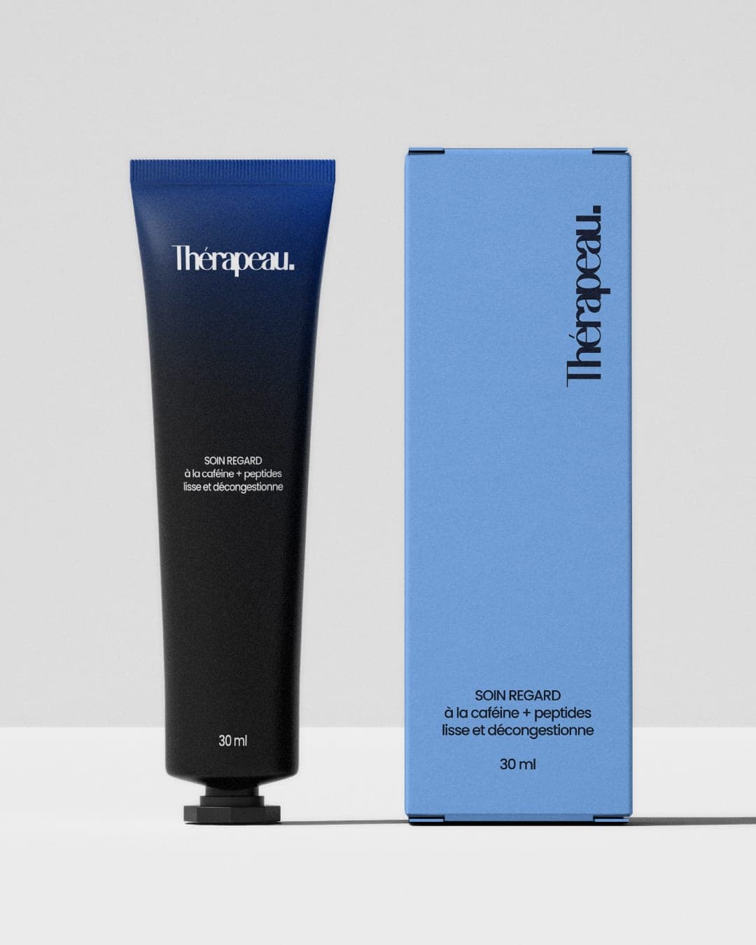
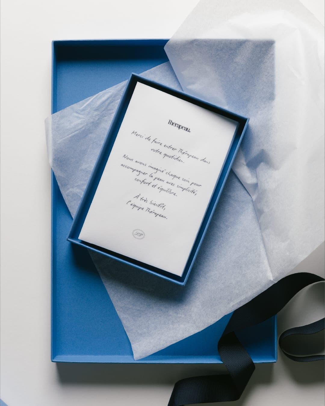
THÉRAPEAU is a skincare brand centered on skin balance, combining efficacy, gentleness, and a sensory experience. For this project, I developed a minimalist, editorial-style visual identity, defined by bold typography, a palette of black, white, and blue, and gradients that evoke the concepts of transformation and balance. The packaging system extends this aesthetic through a cohesive range of essential skincare products, enhanced by varied textures, plays on light, and graphic details that heighten the brand’s sensory dimension.
Color Palette
This brand uses a color palette of 3 colors
Click a color to find brands with similar colors.
Tags
Live score
Scores stay hidden while voting is open, so early votes can't anchor the ones that follow. Check back once the countdown ends.
Votes (0)
No votes yet — be the first.