
A curated selection of modern matcha branding that blends calm minimalism, natural color palettes and refined contemporary identity design.
Matcha branding occupies a unique space in the world of visual identity design. It carries a sense of ritual, calm and cultural depth — yet today’s best matcha brand identities reinterpret that tradition through minimalist layouts, modern typography and soft natural color palettes.
On Braaands™, we see hundreds of brand submissions every month, but only a few stand out with a level of clarity and creative direction that feels both fresh and timeless.
This curated selection highlights six matcha brands that left a mark through their strong identity systems, smart packaging design and distinct visual storytelling.
Each project comes from emerging designers worldwide, and all of them are featured on Braaands™ — where creatives showcase their branding work and connect with a global audience.
Explore our top picks below.

1. SENKA Matcha
Designer: @Floreleroy PRO
Brand Identity: SENKA Matcha Branding
SENKA Matcha captures the quiet elegance of traditional tea culture while feeling unmistakably modern. Its minimalist matcha branding relies on soft green tones, intentional white space and a typography system that communicates calm confidence.
The restrained layout gives the impression of a brand that prioritizes purity and quality. SENKA doesn’t try to overwhelm; instead, it allows the product and the atmosphere around it to breathe — an increasingly strong trend in tea branding and premium packaging design.
This identity stands out through:
- natural, desaturated greens
- refined serif + sans-serif pairing
- clean packaging with a premium tone
A perfect example of how simplicity can elevate a brand’s perceived value.
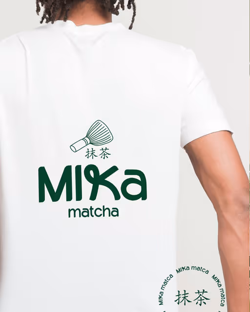
2. MIKA Matcha
Designer: @Khushbu Parikh
Link: MIKA Matcha Branding
MIKA Matcha introduces a fresher, younger approach to modern matcha brand identity. It brings a warm lifestyle energy into the category, pairing soft beiges and natural greens with clear typography and a structured packaging grid.
The brand feels like a contemporary startup — confident, clean and accessible. Its visual world is inviting but still sophisticated, making it ideal for cafés, lifestyle brands or wellness-focused beverage companies.
Key strengths:
- lifestyle-oriented color palette
- balanced typography focused on clarity
- modern packaging structure
MIKA shows how matcha can be repositioned for a younger, design-conscious audience.
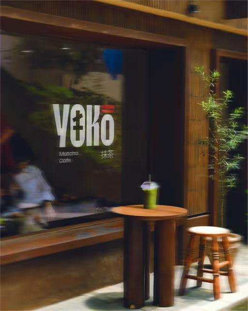
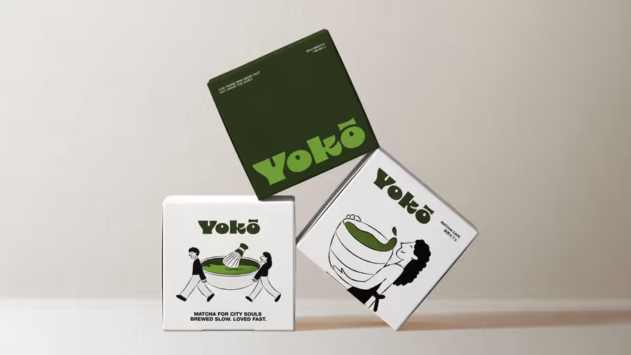
3. YOKO
Designer: @breadfordesign, BreadForDesign
Link: YOKO Brand Identity
YOKO is the boldest interpretation in this collection. It moves away from traditional tea symbolism and instead embraces a more graphic, urban approach. The result is a matcha branding concept that feels like a hybrid between a concept café, a fashion brand and a premium beverage line.
Contrasting colors, strong shapes and a confident typographic system define the identity. YOKO demonstrates that tea branding doesn’t have to be soft — it can be expressive, modern and highly stylized.
Highlights:
- bold color usage beyond green
- structured, editorial typography
- high versatility across formats
A standout example of creative direction with attitude.
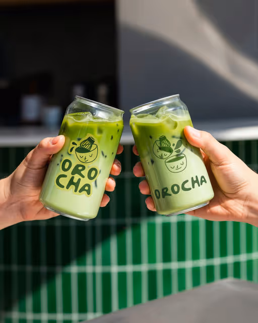
4. Orocha Matcha
Designer: @Khushbu Parikh
Link: Orocha Matcha Brand Identity
Orocha brings a more luxurious aesthetic to the matcha world. The deeper, earthy greens and natural tones give the brand a grounded, premium feel. This is one of the strongest examples of premium matcha brand identity on Braaands™.
The visual system references Japanese aesthetics without falling into clichés — a crucial balance in global tea branding today. Packaging, typography and composition all contribute to a refined, mature look that instantly communicates quality.
Strengths:
- earthy, luxury-oriented palette
- refined typographic hierarchy
- subtle cultural references
- premium packaging appeal
5. YOKO Matcha Café
Designer: @studiorevv
Link: YOKO Matcha Café Branding
YOKO Matcha Café introduces a softer, friendlier take on matcha branding. With gentle illustrations, clean layouts and warm tones, it feels like a calm creative space — the type of café where branding becomes part of the customer experience.
This identity works beautifully for cafés, community spaces or lifestyle beverage brands. It combines minimalism with personality, proving that café branding doesn’t need loud statements to be memorable.
Highlights:
- soft illustrations
- approachable, warm styling
- balanced visual system
- strong lifestyle market fit
6. Daily Cha
Designer: @diisshaakdesigns
Link: Daily Cha Brand Identity
Daily Cha is energetic, editorial and contemporary. It blends matcha culture with modern visual storytelling — a perfect example of branding in the intersection of lifestyle and beverage trends.
Its structured typography, bright accents and clean layout create a fresh, modern expression. Daily Cha feels like a brand that could live on social feeds just as well as on shelves.
Design strengths:
- editorial-style layouts
- contemporary color palette
- modern packaging design
- strong visual rhythm
Key Branding Trends Across All Six Matcha Identities
- soft minimalism with natural greens
- typography-led design systems
- lifestyle-driven visual direction
- premium packaging aesthetics
- modern reinterpretations of traditional tea culture
- muted, natural color palettes replacing “classic matcha green”
These trends reflect a global shift in beverage branding toward calm, thoughtful identity design.
What Designers Can Learn From These Matcha Brands
- Restrained design often feels more premium
- Typographic consistency builds trust
- Matcha can be positioned beyond tradition
- Visual identity systems are more effective than single motifs
- Color nuance is key in modern beverage branding
Want to get featured on Braaands™?
Braaands™ highlights exceptional brand identities every day.
To submit your work:
- Create a free designer profile
- Upload your branding
- Get discovered by designers and businesses worldwide
Submit your brand → SUBMIT
Explore Brand of the Day → Brand of the day
Designer Directory → CREATORS